Cart
0
Selecting colours for your home goes far beyond picking a pretty shade from a paint chart. For British homeowners and interior design fans, every colour choice transforms a room’s atmosphere, shaping energy, comfort, and individuality. By understanding the core principles of colour in design, you move from simply decorating to creating spaces that truly reflect your personality and lifestyle, all while staying stylish and affordable.
Table of Contents
- Core Principles Of Colour In Design
- Psychological Impact Of Colour Choices
- Types, Palettes And UK Design Trends 2026
- Colour Combinations For Modern Home Accessories
- Common Mistakes To Avoid With Colour
Key Takeaways
| Point | Details |
|---|---|
| Understanding Colour Psychology | Different colours evoke specific emotional responses and cultural meanings; thus, colour choices should align with desired moods and contexts. |
| Applying Colour Harmony and Contrast | Strategic use of colour harmony creates visual balance, while contrast adds interest and character to designs. |
| Mindful Colour Selection | Consider personal associations and test colours in varying lighting before finalising choices to ensure satisfaction with the overall aesthetic. |
| Avoiding Common Mistakes | Pay attention to lighting conditions and cultural connotations to prevent oversaturation, poor contrast, and impulsive colour changes that disrupt design cohesion. |
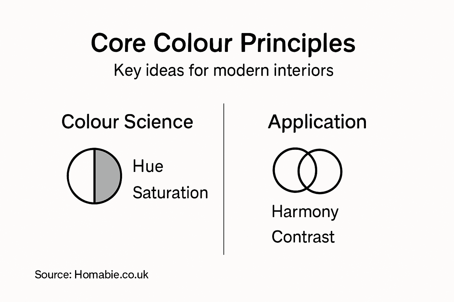
Core Principles Of Colour In Design
Colour isn’t just about aesthetics. It’s a fundamental language that shapes how people feel, behave, and interact with their surroundings. Understanding the core principles of colour in design means grasping how these visual elements work together to create harmony, emphasis, and emotional impact in your home. When you apply these principles thoughtfully, you transform a space from merely decorated into genuinely considered and visually compelling.
The foundation starts with colour psychology and meaning. Different hues trigger distinct emotional responses and carry cultural significance that varies across traditions and regions. Blues and greens typically evoke calm and tranquillity, making them ideal for bedrooms and bathrooms where you want to unwind. Warm tones like oranges and reds energise spaces and encourage conversation, which works brilliantly in living rooms and dining areas. However, colour meaning extends beyond emotion. Research into colour psychology and design application reveals that cultural context matters significantly. What signals luxury in one culture might convey something entirely different elsewhere. The key is recognising that your colour choices communicate before anyone enters your home.
Next comes colour harmony and contrast, the technical relationships that make spaces visually balanced. Harmonious colours sit naturally alongside one another, creating a cohesive, restful environment. Think of how soft greys pair effortlessly with whites and warm beiges. Contrast, conversely, generates visual excitement and draws attention to specific areas. A deep navy accent wall against cream surroundings creates focal points that guide the eye and add personality. Colour theory’s evolution demonstrates that these principles blend classical understanding with modern scientific insights, helping contemporary designers balance tradition with innovation. The practical reality is that most successful interiors use both harmony and contrast strategically—harmony creates the foundation, whilst contrast adds character and prevents monotony.
Three essential principles tie everything together. First, saturation levels determine intensity. Highly saturated colours feel bold and dramatic, whilst muted, desaturated tones feel sophisticated and calming. Second, value contrast (the lightness or darkness of colours) affects how readable and balanced a space feels. Pairing light walls with dark furniture creates definition, whilst similar values blend seamlessly. Third, proportion matters. The 60-30-10 rule suggests using your dominant colour for 60 percent of the room, a secondary colour for 30 percent, and an accent for the remaining 10 percent. This creates visual balance without feeling overwhelming.
Practical tip Start by identifying your room’s purpose, choose your dominant colour based on the mood you want to create, then layer in secondary shades and one accent colour to add depth without chaos.
Psychological Impact Of Colour Choices
Every colour you select for your home triggers a psychological response before your guests even notice the furniture arrangement. The human brain processes colour instantly, often before consciously registering other design elements. This means your colour choices shape moods, influence behaviour, and create lasting impressions within seconds. Understanding these psychological effects transforms you from someone merely picking colours to a thoughtful designer who leverages colour as a powerful tool for enhancing daily life.
Different hues produce distinctly different emotional and physiological responses. Red accelerates heart rate and stimulates energy, making it excellent for spaces where you want movement and conversation, though too much can feel aggressive or exhausting over extended periods. Blue and green calm the nervous system, lowering heart rate and promoting relaxation, which is why these colours dominate bedrooms and wellness spaces. Yellow brightens mood and encourages optimism, though overly bright yellows can overstimulate. Purple conveys creativity and luxury, whilst grey provides neutral sophistication. The fascinating part is that colour psychology influences human behaviour and emotional responses in measurable ways, meaning your colour selections genuinely affect how you and your family feel within that space daily.
Here’s a summary of the psychological effects associated with popular colours in interior design:
| Colour | Typical Emotional Response | Suitable Room Types |
|---|---|---|
| Blue | Calmness, reduced stress | Bedrooms, bathrooms |
| Green | Relaxation, renewal | Bedrooms, wellness spaces |
| Red | Energy, stimulation | Dining rooms, living areas |
| Yellow | Optimism, cheerfulness | Kitchens, playrooms |
| Purple | Creativity, luxury | Studies, feature walls |
| Grey | Sophisticated neutrality | Living rooms, offices |
Cultural context adds another critical layer. A colour considered auspicious and prosperous in one culture might signal something entirely different elsewhere. Colour perception varies significantly across cultural backgrounds and personal experiences, meaning there’s no universally “correct” colour choice. What matters is choosing colours aligned with your own values and how they make you feel. Additionally, individual preferences matter tremendously. Your personal history, memories, and associations with specific colours influence your psychological response. Someone who associates blue with loss experiences it differently than someone for whom blue means calm ocean holidays. This personalisation is what makes colour selection both an art and a psychological exploration unique to each household.
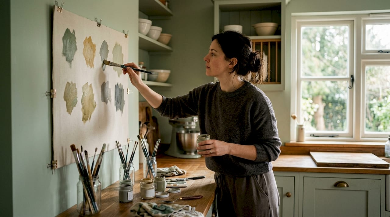
The practical implication is straightforward: be intentional about colour selections by considering both the psychological effect you want to create and your personal associations. Test colours in your actual space under natural and artificial light before committing. Paint samples on large areas and observe them throughout different times of day. Notice how a colour makes you feel when you spend time with it, not just how it looks in isolation.
Practical tip Paint A4 samples of your shortlisted colours on poster board and move them around your room at different times of day, noting which ones feel right for the mood you want to establish.
Types, Palettes And UK Design Trends 2026
Colour palettes in 2026 are moving away from predictable, safe choices towards bold authenticity and environmental consciousness. British interior design is embracing what designers call “grounded maximalism,” which rejects the stark minimalism of recent years in favour of richer, more textured spaces that still maintain clarity and purpose. This shift reflects a broader cultural movement towards celebrating individuality whilst remaining mindful of sustainability and wellness. Understanding the emerging palette types helps you stay current without chasing fleeting trends that will feel dated within months.
The dominant palette categories for 2026 centre on three distinct directions. First, warm earth palettes are experiencing a major resurgence, featuring terracotta, ochre, burnt sienna, and deep chocolate browns paired with cream and soft greens. These colours feel grounding and connect us to natural materials, which appeals to the contemporary UK focus on biophilic design. Second, jewel tones and saturated accents are replacing the desaturated, muted schemes that dominated 2020 to 2024. Deep emerald, rich sapphire, and warm burgundy now pair confidently with neutrals, creating focal points that feel intentional rather than cautious. Third, warm neutral bases with unexpected colour pops represent a middle ground, using soft greens, warm greys, and taupe foundations that allow accent colours to shine without overwhelming. Colour harmony research examining cultural and environmental influences on palette development reveals that current trends increasingly reflect our desire to connect with authenticity and natural contexts, moving away from the cool, sterile aesthetics of the previous decade.
UK-specific trends for 2026 lean heavily into celebrating British heritage whilst embracing contemporary sensibilities. Heritage palettes inspired by traditional Georgian and Victorian colour schemes are resurging, but interpreted through modern eyes. Think deep sage greens on feature walls, rich jewel blues in kitchens, and warm terracottas in bedrooms, paired with contemporary furniture and minimalist accessories. Additionally, the concept of “colour zones” is gaining traction. Rather than committing an entire room to one colour scheme, British homeowners are creating distinct colour experiences within open-plan spaces, using colour to define function without physical walls. A kitchen might feature warm terracottas and golds, whilst an adjacent living area showcases cool greens and charcoal, connected by neutral transitions.
The psychology behind these trends matters. People are choosing colours that make them feel grounded, inspired, and connected to something larger than themselves. Saturated colours improve mood and creativity, whilst earthy tones reduce stress. By understanding these underlying motivations, you can select palettes that genuinely serve your lifestyle rather than following trends blindly. Interior styling approaches that integrate colour intentionally create spaces that feel both current and timeless.
Practical tip Collect colour inspiration from British interiors magazines, Pinterest boards focused on 2026 trends, and social media accounts celebrating UK interior design, then identify which palettes genuinely resonate with you rather than simply copying trending combinations.
Colour Combinations For Modern Home Accessories
Selecting colour combinations for home accessories feels overwhelming until you understand the foundational systems that guide professional designers. The right pairing transforms individual pieces into a cohesive narrative that feels intentional and considered. Modern home accessories thrive when colours work together rather than compete, and knowing which combinations create harmony versus discord takes the guesswork out of shopping and styling. These principles apply whether you’re choosing cushions, throws, artwork, or decorative objects.
Four primary colour schemes drive modern accessory styling. Complementary schemes pair colours opposite each other on the colour wheel, such as deep teal and warm coral or navy and mustard yellow. These create bold, energetic effects perfect for statement pieces like feature cushions or art prints. Analogous schemes use neighbouring colours like soft green, sage, and pale blue, producing serene, cohesive spaces ideal for layered accessories across a room. Triadic schemes balance three equally spaced colours such as emerald, coral, and gold, offering visual interest without chaos when applied thoughtfully to accessories. Monochromatic schemes vary a single colour through different saturations and tones, creating sophisticated, unified looks that work beautifully in minimalist modern interiors. Understanding how colour combinations create visual harmony and balance helps you confidently mix accessories without creating visual discord.
This reference table outlines colour scheme types and their best practical uses for home accessories:
| Scheme Type | Colour Relationship | Best Used For |
|---|---|---|
| Complementary | Opposing colours | Statement accessories |
| Analogous | Neighbouring colours | Layered textiles |
| Triadic | Equally spaced hues | Balanced accent decor |
| Monochromatic | Variations of one colour | Unified modern looks |
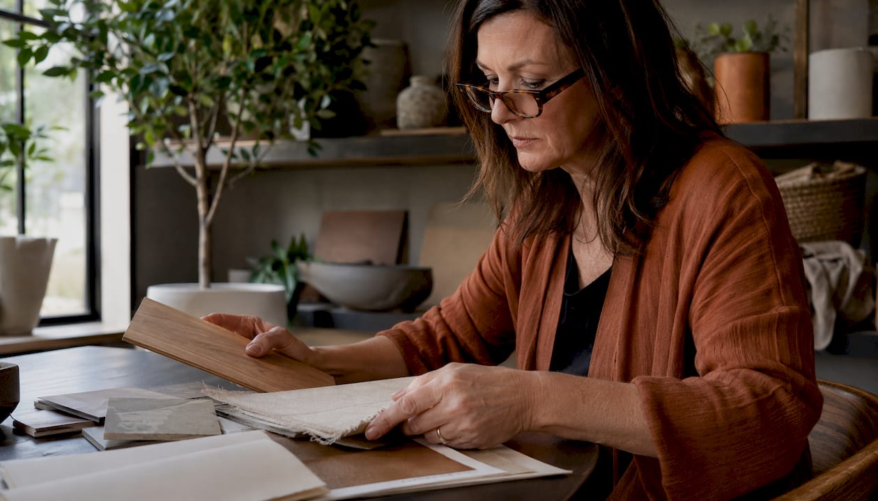
Practical application requires considering saturation and value alongside hue. A rich, saturated emerald green needs careful pairing, perhaps with muted warm greys and soft creams rather than equally saturated reds. Conversely, desaturated colours allow more flexibility. Pale dusty rose pairs easily with soft sage, warm taupe, and cream because their lower saturation prevents conflict. The colour wheel remains invaluable for matching and mixing. Colour wheel theory guides designers in selecting combinations that inherently work together, whether you prefer harmony or intentional contrast. For accessories specifically, think in layers. Your base layer might feature neutral cushions and throws, your secondary layer introduces one accent colour through artwork or decorative objects, and your accent layer adds smaller pieces in complementary or contrasting shades.
When styling modern spaces, successful accessory combinations balance predictability with personality. Neutral rooms benefit from bolder colour combinations in accessories, whilst already coloured walls call for more restrained accessory palettes. Home accessory styling techniques demonstrate how colour works within the broader composition of your room. Test your chosen colour combination by placing accessories together before purchasing. Notice how they interact under your room’s lighting. Some colours that look stunning in isolation clash when combined, whilst unexpected pairings sometimes surprise you with their beauty.
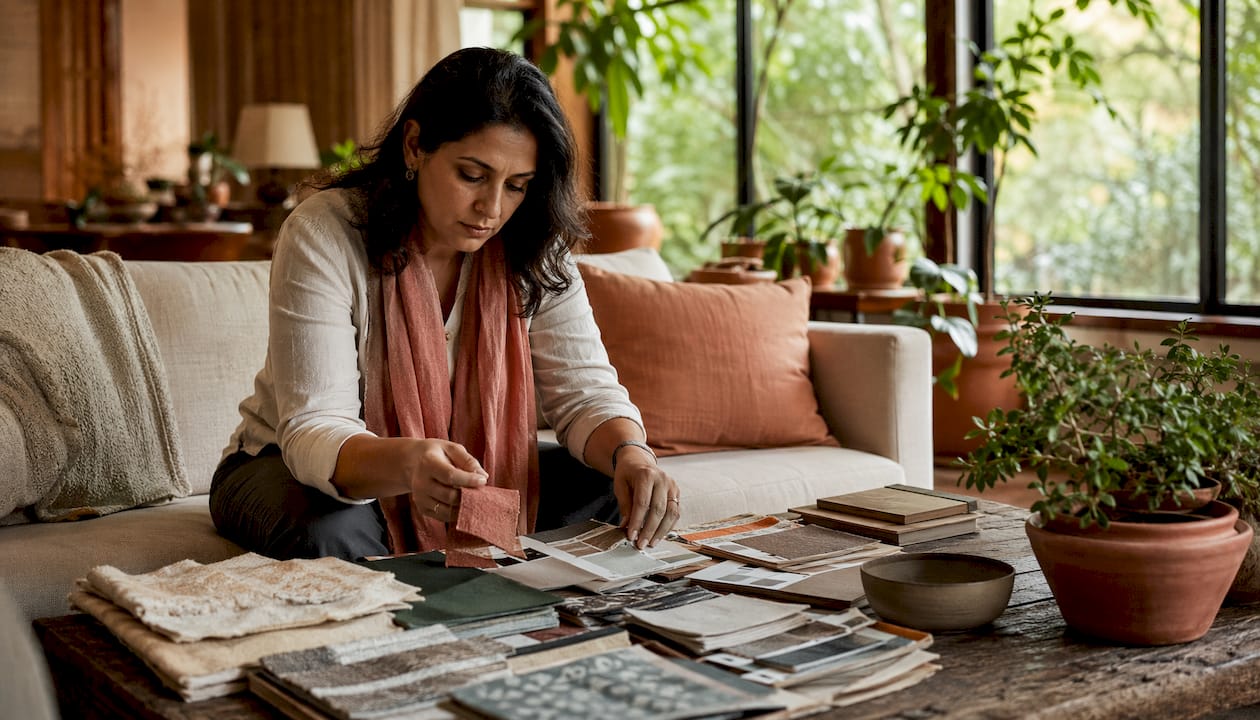
Practical tip Create a mood board using fabric swatches, paint chips, and photographs of accessories you love, grouping them to test colour combinations before committing to purchases.
Common Mistakes To Avoid With Colour
Colour mistakes happen quickly and feel permanent once paint covers your walls or accessories arrive at your door. The good news is that most errors stem from predictable oversights rather than fundamental design flaws. Understanding these pitfalls beforehand saves you money, time, and the frustration of living in a space that doesn’t feel right. The mistakes people make with colour often fall into distinct categories, each with straightforward solutions.
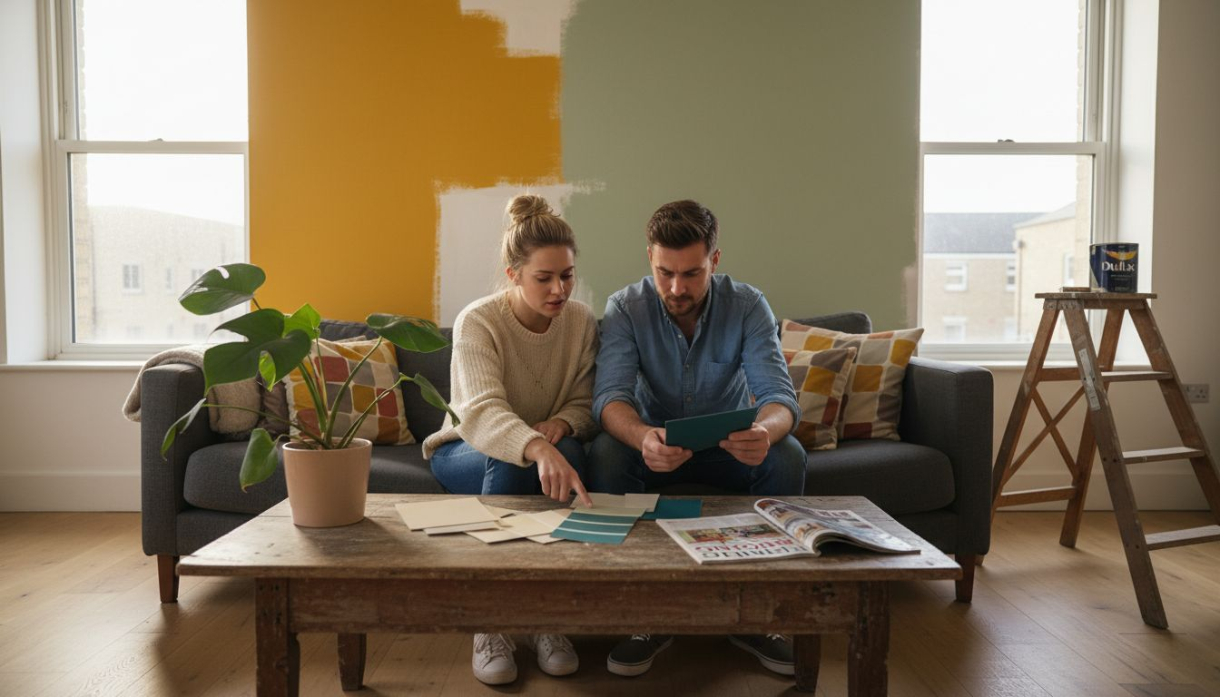
The first major mistake is ignoring lighting context. A colour that looks perfect in daylight transforms dramatically under warm artificial evening lights or cool morning sunlight. Soft peachy tones become orange under warm bulbs, whilst cool greys look dingy in dim spaces. Similarly, bold saturated colours that feel energising in a bright room overwhelm in darker spaces. Another critical error is overusing bold colours without restraint. Filling an entire room with deep jewel tones or bright accent colours creates visual fatigue rather than impact. The 60-30-10 rule exists precisely because humans need visual rest. A third mistake involves neglecting contrast and readability. Dark navy walls with charcoal furniture might feel sophisticated but create a cave-like atmosphere where nothing visually stands out. You need sufficient contrast between major elements so the space feels layered and intentional. Additionally, common colour mistakes include failing to consider contrast, consistency, and accessibility issues that undermine both aesthetics and functionality in your home.
Cultural and personal context present equally important challenges. A colour choice meaningful in one culture carries entirely different connotations elsewhere. Red symbolises luck in Chinese culture but danger in Western contexts. Similarly, many people hold personal colour associations based on memories. Dark green might feel peaceful to one person and melancholic to another. The mistake lies in assuming your colour interpretation applies universally. Additionally, poor colour contrast and inconsistency in palette application create disharmony that undermines your entire design scheme. This happens when you select beautiful colours individually but fail to test them together in your actual space under your actual lighting. Another overlooked mistake is forgetting about colour blindness and accessibility. Approximately one in twelve men and one in 200 women experience some form of colour vision deficiency. Relying solely on colour to convey information, without texture or pattern variation, excludes visitors and limits your design’s universal appeal.
The final common mistake is changing colours impulsively without planning. Repainting every few months because a trend catches your eye exhausts both your budget and your space’s sense of coherence. Strong colour choices require time to feel natural, typically two to four weeks minimum. What feels jarring initially often becomes exactly right once your eye adjusts.
Practical tip Always purchase test paint pots, apply large sample patches to walls, and observe them at different times of day and under various lighting conditions before committing to a full room repaint.
Unlock the Power of Colour to Transform Your Home Today
Choosing the right colours is one of the most challenging yet rewarding aspects of designing modern interiors. This article highlights how colour psychology, harmony, and proportion shape moods and bring spaces to life. If you have struggled with selecting the perfect colour palettes or finding accessories that complement your vision, you are not alone. Understanding saturation levels and colour contrast is only the start. You need stylish, quality pieces that work harmoniously to create the atmosphere you desire — whether calm retreats or energising social spaces.
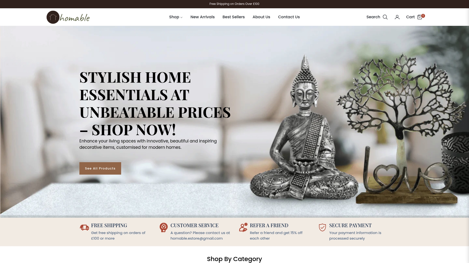
Discover expertly curated home accessories and decorative solutions at Homable.co.uk that empower you to apply these colour principles effortlessly. Explore collections that embrace the latest UK design trends for 2026 including warm earth tones and jewel accents. From cushions and throws to rugs and storage items, our products help you layer colours with sophistication and intent. Start building your ideal interior with confidence and enjoy free shipping on orders over £100. Visit Homable.co.uk now and step into a world where colour meets style. Your perfect colour combination is just a click away.
Frequently Asked Questions
What is the importance of colour psychology in interior design?
Understanding colour psychology is crucial in interior design because different colours evoke distinct emotional responses. For example, blues and greens promote calmness, making them suitable for relaxation spaces, while reds and yellows energise environments, ideal for social areas.
How can I create colour harmony in my home?
To create colour harmony, select colours that sit naturally alongside one another, using the 60-30-10 rule. This involves using a dominant colour for 60% of the room, a secondary colour for 30%, and an accent colour for the remaining 10%. This approach creates balance without overwhelming the space.
Why should I consider lighting when choosing colours for my interior?
Lighting significantly affects how colours appear in a space. A colour that looks perfect in daylight may change dramatically under artificial light, impacting the overall mood and feel of the room. It’s essential to test colours in your actual space to observe their behaviour in different lighting conditions.
What common mistakes should I avoid when selecting colours for my home?
Common mistakes include ignoring the effect of lighting, overusing bold colours, neglecting contrast for readability, and failing to consider individual and cultural colour associations. It’s important to test colour combinations beforehand and plan before making impulsive colour changes.