Cart
0
Struggling to make your home feel inviting rather than bland is a challenge many British homeowners face. Texture is the secret ingredient that transforms a lifeless room into an engaging space, giving it warmth, personality, and visual interest. Understanding how texture encompasses both the tactile quality and visual appearance of materials and finishes can help you redesign your home to feel lively and unique without overspending.
Table of Contents
- Defining Texture In Modern Home Styling
- Types Of Texture And Their Visual Impact
- Layering And Mixing Materials Effectively
- Seasonal Uses For Texture In Interiors
- Common Mistakes When Adding Texture
Key Takeaways
| Point | Details |
|---|---|
| Understanding Texture | Texture influences both the tactile and visual aspects of interior design, creating emotional responses and enhancing the overall atmosphere of a space. |
| Layering Textures | Effective layering involves balancing soft and hard textures to achieve depth and warmth, ensuring cohesion without overwhelming the eye. |
| Seasonal Adjustments | Rotating textures seasonally keeps interiors aligned with changing moods and external environments, enhancing comfort throughout the year. |
| Common Mistakes | Avoid overcrowding spaces with textures, ensuring a balanced mix of tactile and visual elements for a harmonious design. |
Defining Texture in Modern Home Styling
Texture is far more than a visual effect. Texture encompasses both the tactile quality and visual appearance of materials and finishes used throughout your home. Think of it as the bridge between what you see and what you feel when you touch a surface.
When you run your hand across a linen cushion or trace your fingers along a brick wall, you’re experiencing texture. But texture also works visually from across the room, influencing how a space feels before you even touch anything. Surface qualities perceived visually and physically shape the entire mood of a room.
Modern home styling demands a sophisticated understanding of how texture functions. It’s not simply about picking rough or smooth finishes. Texture creates emotional responses, adds personality, and fundamentally changes how you experience your living space. Without it, rooms feel flat and disconnected.
Here’s what texture actually does in your home:
- Creates visual interest and depth without adding clutter
- Establishes warmth and comfort through tactile appeal
- Influences how light moves across surfaces and rooms
- Connects different design elements into a cohesive narrative
- Evokes specific moods, from cosy to sophisticated
- Prevents spaces from feeling monotonous or cold
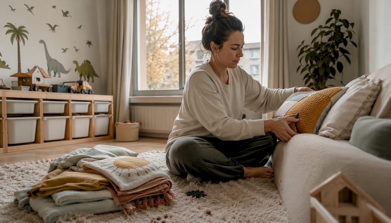
You’ve probably noticed how some homes feel instantly inviting whilst others seem sterile. The difference often comes down to texture layering. A room with only smooth surfaces (glass, polished concrete, sleek wood) can feel cold and impersonal. Add soft textures like wool throws, linen curtains, or natural wood grain, and suddenly the space breathes.
Why layering textures in design creates depth and warmth is crucial for modern homeowners wanting to balance style with comfort.
Understanding texture also means recognising the difference between actual texture and visual texture. Actual texture is something you can physically feel. Visual texture mimics that sensation through patterns and finishes but remains smooth when touched. Both matter equally in creating sophisticated interiors.
For UK homeowners redesigning living spaces, texture becomes especially important. British interiors often blend traditional elements with contemporary styles. Texture helps bridge that gap, allowing you to mix old and new without creating visual chaos.
Texture is the foundational element that transforms a styled room into a home you actually want to live in.
Pro tip: Start identifying textures in spaces you admire, noting which combinations feel cohesive and which create visual interest without overwhelming the eye.
Types of Texture and Their Visual Impact
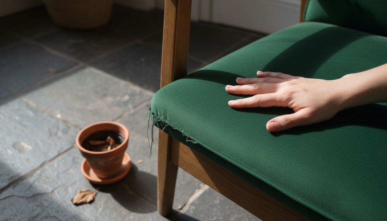
Texture comes in two main categories, and understanding both is key to creating spaces that look and feel right. Tactile textures are ones you can actually touch and feel, whilst visual textures create the impression of surface characteristics through patterns and appearance alone.
Tactile textures are straightforward. When you touch velvet, linen, stone, or wood, you’re experiencing actual physical texture. These materials have real relief and substance. Visual textures work differently—they might look rough or woven but feel smooth when you touch them. A printed image of brick or a glossy photograph of bark creates visual texture without physical variation.
Here’s a concise comparison of tactile and visual textures to guide your interior design choices:
| Texture Type | How It’s Perceived | Example Materials | Effect on Room Atmosphere |
|---|---|---|---|
| Tactile Texture | Felt directly by touch | Velvet, stone, linen | Comfortable and engaging |
| Visual Texture | Seen but feels smooth | Printed wallpaper, glossy photos | Adds interest without tactile depth |
Soft textures evoke warmth and comfort, whilst harder textures suggest sophistication and structure. This emotional distinction matters when you’re deciding what goes where in your home.
Here’s how different texture types influence your spaces:
- Soft textures: wool, linen, cotton, velvet, leather, fur—create cosiness and invite touch
- Hard textures: stone, metal, glass, polished concrete—convey elegance and durability
- Natural textures: raw wood, unfinished brick, jute rope—add warmth and authenticity
- Polished textures: marble, chrome, lacquered finishes—bring refinement and light reflection
The real magic happens when you combine contrasting textures strategically. Combining contrasting textures enhances visual interest and creates rooms that feel dynamic rather than one-dimensional.
Consider a living room with only soft textures—plush sofa, fluffy rug, velvet cushions. It feels inviting but might lack sophistication or visual punch. Add a stone accent wall, a metal coffee table, or glass shelving, and suddenly the space has depth and character.
Texture also influences how light behaves in a room. Rough, matte textures absorb light and create a cosy, intimate atmosphere. Glossy, polished textures reflect light and make spaces feel airier and more open. In UK homes with limited natural light, this distinction becomes particularly important during winter months.
The most effective rooms balance soft and hard textures, creating visual interest whilst maintaining emotional warmth.
Don’t overlook material choice. Wood grain differs from brick texture, which differs from woven fabric—each brings its own personality. Materials carry their own design language that influences whether your space feels contemporary, traditional, or blended.
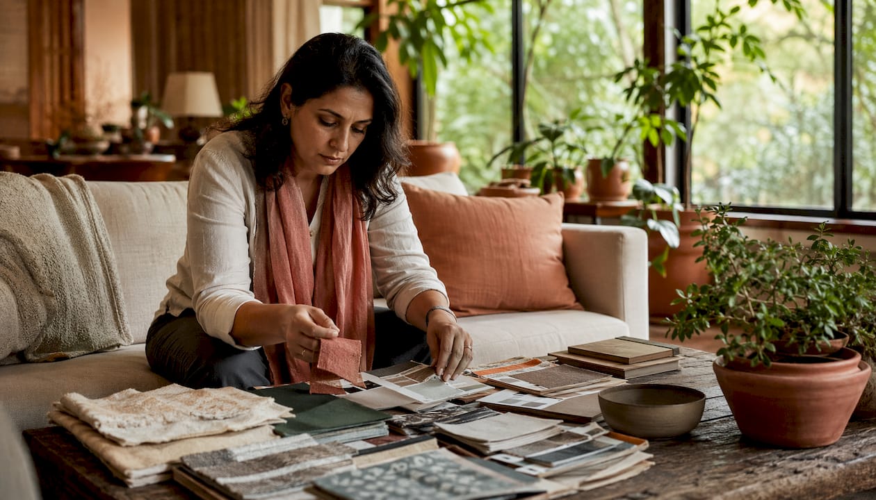
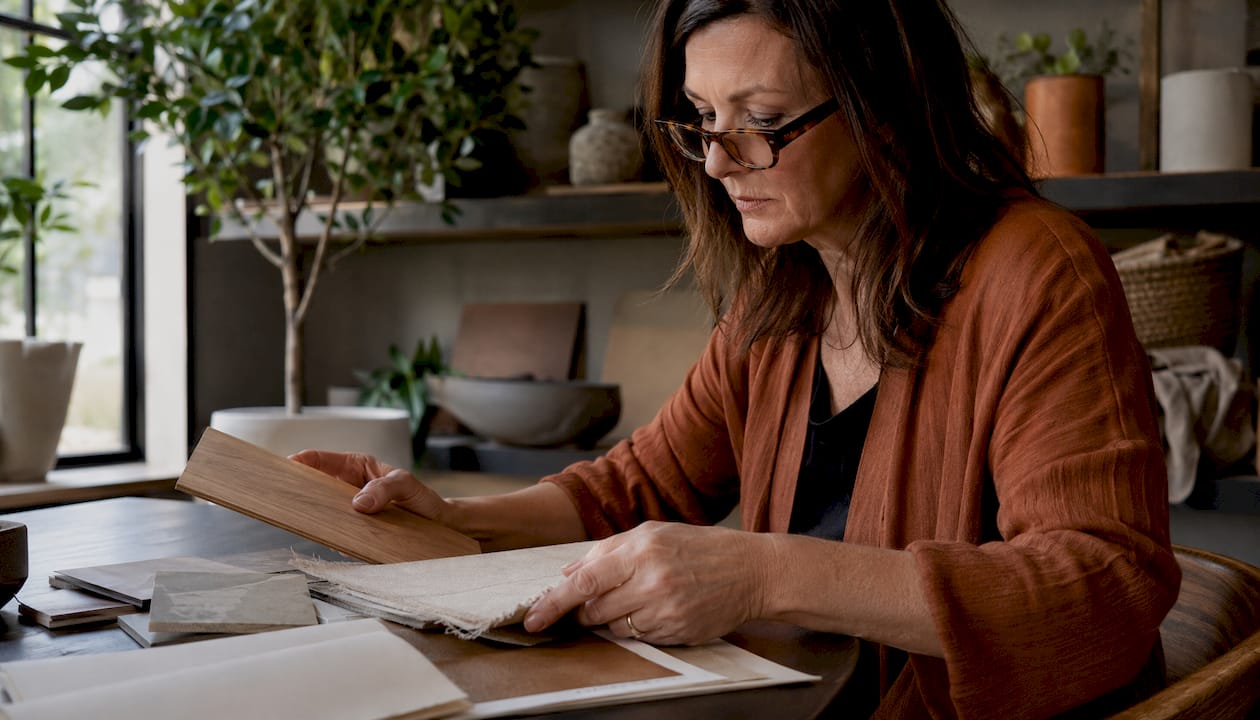
Pro tip: Gather samples of textures you love—fabric swatches, paint finishes, wood samples—and arrange them together to see which combinations feel cohesive before committing to purchases.
Layering and Mixing Materials Effectively
Layering textures isn’t about throwing random materials together and hoping they work. It’s a deliberate process of balancing contrasts, considering proportions, and ensuring every element strengthens the overall design.
Start with a foundation. Most successful interiors begin with a neutral base—think soft walls, natural flooring, or understated furniture. This gives you freedom to add personality through texture without overwhelming the space.
Once your base is established, introduce accent textures through textiles and furnishings. A chunky knit throw over a sleek sofa creates immediate visual interest. Linen curtains next to a metal frame add contrast. Velvet cushions on a wooden chair blend soft and hard seamlessly.
Here’s the practical approach to layering:
- Choose your base materials (walls, flooring, large furniture)
- Add contrasting hard textures (metal, glass, stone accents)
- Layer in soft textures (fabrics, rugs, cushions)
- Incorporate natural elements (wood, plants, natural fibres)
- Balance with metallic or reflective finishes
Effective layering involves balancing contrasting textures like rough wood with smooth metal, and combining soft and hard surfaces to add depth.
Proportion matters enormously. If you use too many textures, spaces feel chaotic. If you use too few, they feel sterile. A good rule: choose three to four main textures per room, then repeat them throughout to create cohesion.
Colour harmony ties everything together. Natural materials tend to blend because they share warm, earthy undertones. When mixing disparate textures—say, industrial metal with vintage velvet—colour unity prevents visual confusion.
Consider how layering builds dimension through thoughtful composition of materials, scales, and finishes that create warmth and interest.
Lighting affects how textures appear. Rough textures catch light and create shadow, whilst smooth surfaces reflect it. In a bedroom, you might favour matte textures for relaxation. In a kitchen, reflective surfaces keep energy levels higher.
Successful texture mixing means every material has a purpose—nothing should feel random or disconnected from the overall narrative.
For UK homeowners, mixing materials becomes particularly effective when balancing modern and traditional styles. A Victorian fireplace paired with contemporary textiles creates engaging contrast without feeling disjointed.
Pro tip: Introduce textures gradually over time rather than all at once, allowing each addition to settle visually and ensuring your space evolves intentionally rather than appearing over-decorated.
Seasonal Uses for Texture in Interiors
Your home shouldn’t feel the same in January as it does in July. Texture is your secret tool for creating spaces that shift with the seasons, keeping your interiors fresh and emotionally aligned with what’s happening outside.
Winter demands warmth. This is when plush velvet, soft wool, and chunky knits become essential. Layer these cosy textures generously—they’re not just visually comforting, they’re emotionally grounding during darker months. A weighted wool throw, velvet cushions, and a textured area rug transform a cold room into an inviting retreat.
Autumn calls for rich, earthy textures that honour the season’s natural palette. Rich cosy textures like plush velvet and chunky knits create warm atmospheres as temperatures drop. Consider reclaimed wood accents, organic linen, and natural fibres that echo the season’s harvest abundance.
Spring requires lightness. Swap heavy textiles for breathable linen, lightweight cotton, and sheer fabrics. Remove dark velvet cushions and introduce pale textures that let light move through your space. Fresh textures signal renewal and align your home with longer days.
Summer thrives on sleekness. Smooth surfaces—polished concrete, glass, cool metals—keep spaces feeling airy and prevent that trapped, humid feeling. Lightweight textures breathe. Linen curtains replace heavy drapes. Smooth ceramic accents replace cosy wool.
Here’s how to rotate textures seasonally:
The table below summarises recommended texture choices for each season, helping you adjust your home’s mood throughout the year:
| Season | Ideal Fabrics & Materials | Colours to Complement | Suggested Room Adjustments |
|---|---|---|---|
| Winter | Wool, velvet, chunky knits | Deep, warm tones | Layer throws, use thick rugs |
| Spring | Linen, lightweight cotton, sheer | Soft pastels, fresh whites | Swap heavy cushions for lighter |
| Summer | Polished concrete, glass, metal | Cool neutrals, pale blues | Opt for minimal textiles, airy |
| Autumn | Reclaimed wood, organic fibres | Rich browns, burnt orange | Add textured blankets, earthy decor |
- Winter: Heavy fabrics, plush surfaces, matte finishes, natural fibres
- Spring: Lightweight linens, sheer layers, fresh botanicals, soft pastels
- Summer: Smooth surfaces, light-reflecting finishes, minimal layering, cool palettes
- Autumn: Rich fabrics, earthy tones, natural materials, layered depth
You don’t need to replace everything with each season. Strategic swaps work brilliantly. Rotate cushion covers, switch throw blankets, change area rugs. These simple adjustments create dramatic shifts in how your space feels without requiring major investment.
Colour pairs beautifully with seasonal texture choices. Warm, muted autumn tones feel right alongside velvet and wool. Cool, pale spring colours suit light linens. This natural pairing makes seasonal transitions feel intentional rather than chaotic.
Seasonal texture adjustments keep your home feeling connected to the world outside whilst maintaining your personal style year-round.
For UK homeowners, seasonal texture rotation becomes particularly valuable given our dramatic weather changes. What feels perfect in cosy autumn becomes stifling by June.
Pro tip: Store off-season textiles in breathable bags rather than plastic, rotating them quarterly to keep fabrics fresh and prevent mustiness between seasons.
Common Mistakes When Adding Texture
Texture is powerful, but it’s easy to get wrong. The most common pitfall is assuming more texture equals better design. It doesn’t. Overloading spaces with too many competing textures creates visual chaos rather than visual interest.
When you introduce texture without strategy, rooms feel cluttered and uncomfortable. A living room with velvet sofa, linen curtains, woven rug, textured wallpaper, brick accent wall, and chunky throws becomes overwhelming. Your eye doesn’t know where to rest. The space feels restless.
Overloading a space with too many textures leads to visual clutter and imbalance, making rooms feel chaotic rather than cohesive.
Another critical error is neglecting balance between tactile and visual textures. Some homeowners focus entirely on how things feel, ignoring visual impact. Others obsess over appearance whilst ignoring comfort. Both approaches backfire. Successful spaces engage multiple senses simultaneously.
Scale and proportion matter enormously. A heavily textured feature wall works in spacious rooms but overwhelms small bedrooms. Chunky knit textures suit large sectionals but look clumsy on delicate chairs. Consider room dimensions when selecting texture intensity.
Here are the mistakes to avoid:
- Too many textures: Limit yourself to three or four main ones per room
- Ignoring balance: Mix tactile and visual equally for harmony
- Wrong scale: Match texture intensity to furniture and room size
- Forgetting cohesion: Ensure textures connect through colour or material family
- Neglecting function: Choose practical textures for high-traffic areas
- Inconsistent repetition: Repeat chosen textures throughout for unity
Colour mismatch creates another common problem. When textures clash in tone—say, warm terracotta wood with cool grey metal—the space feels disjointed. Successful texture mixing requires thoughtful colour consideration.
Function matters too. Shag pile carpet looks beautiful in bedrooms but collects dirt relentlessly in kitchens. Delicate silks enhance bedrooms but deteriorate quickly in living rooms. Choose textures appropriate for how spaces are actually used.
The best texture design is invisible—you notice the beauty and comfort without consciously seeing the strategy behind it.
ManyUK homeowners rush texture selection, buying what looks nice without considering how it fits existing elements. This creates dissonance. Take time. Plan. Visualise combinations before purchasing.
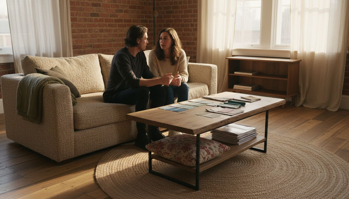
Pro tip: Create a mood board with fabric swatches, paint samples, and photographs of textures you love, then live with it for a week before committing to purchases.
Transform Your Home with Thoughtful Texture Choices
Struggling to add warmth and personality without cluttering your space? This article highlights the crucial role texture plays in creating visually engaging and emotionally inviting rooms. Whether layering soft linens with hard metals or switching seasonal fabrics, mastering texture unlocks your home’s true potential. Discover how purposeful combinations create depth, comfort and style that resonate with your lifestyle.

Ready to elevate your interiors effortlessly The curated collections at Homable.co.uk offer stylish rugs, curtains and accessories designed to help you layer textures beautifully. Embrace the balance of tactile and visual textures with our affordable, quality pieces. Explore fresh ideas, enjoy free shipping on orders over £100 and create living spaces that feel uniquely yours today. Start your textured home transformation now at Homable.co.uk.
Frequently Asked Questions
What is the importance of texture in home styling?
Texture plays a vital role in home styling by adding visual interest, depth, and emotional warmth to a space. It helps create a cohesive narrative and influences how a room feels, making it more inviting or sophisticated.
How can I effectively layer textures in my home?
To layer textures effectively, start with a neutral base, add contrasting hard textures (like metal or stone), then integrate soft textures (like fabrics and cushions). Balance with natural elements and consider proportion to avoid overwhelming the space.
What are the differences between tactile and visual textures?
Tactile textures are those you can physically touch, such as velvet or wood, while visual textures are designed to create an impression of surface characteristics without actual relief, like printed wallpaper that looks rough but feels smooth.
How can I change textures seasonally in my home?
To change textures seasonally, swap out heavier fabrics like wool and velvet in winter for lighter materials like linen and cotton in spring. Simple adjustments like changing cushion covers or throw blankets can create an updated look without major investments.