Cart
0

Every homeowner knows the struggle of making a small urban flat feel both stylish and welcoming. The right colour choices can turn compact rooms into vibrant sanctuaries, helping you express personality without sacrificing comfort or visual space. By harnessing the psychological impact of colour and understanding how different hues influence mood and perception, you can transform even the smallest British city home into a space that feels brighter, larger, and uniquely yours.
Table of Contents
- Defining Colour’s Role in Interior Styling
- Psychology of Colour in Home Environments
- Popular Colour Schemes and Their Effects
- Combining Colours for Small Urban Spaces
- Common Mistakes When Using Colour at Home
Key Takeaways
| Point | Details |
|---|---|
| Colour as a Psychological Tool | Colour significantly influences emotional states and behaviours, making strategic selection crucial in interior design. |
| Impact of Different Hues | Warm colours foster comfort and social interaction, while cooler colours promote calmness, affecting room function and mood. |
| Common Colour Schemes | Understanding schemes like monochromatic, complementary, and analogous helps create harmonious interiors that reflect personal style. |
| Avoiding Colour Mistakes | Test colours in various lighting conditions and maintain a consistent colour theme to enhance spatial harmony and emotional well-being. |
Defining Colour’s Role in Interior Styling
Colour transcends mere aesthetic decoration and functions as a powerful psychological tool within interior design. Colour psychology research demonstrates how strategic colour selection can dramatically transform spatial perceptions, emotional responses, and human behaviour within living environments.
Interior designers understand that colours communicate complex narratives beyond visual appeal. Warm tones like burnt orange and deep terracotta evoke feelings of comfort and intimacy, while cooler blues and greens promote calmness and introspection. Each hue carries inherent psychological properties that subtly influence occupants’ mental states and interactions within a space. Colour theory principles suggest that thoughtful colour selection can create harmonious environments that support specific emotional and functional objectives.
Understanding colour’s multifaceted role requires recognising its three fundamental dimensions: hue (the pure colour), saturation (colour intensity), and brightness (light reflection). These elements interact dynamically, enabling designers to craft nuanced spatial experiences. A muted sage green might create a serene atmosphere in a bedroom, while a vibrant mustard yellow could energise a home office workspace, demonstrating colour’s remarkable capacity to shape environmental character.
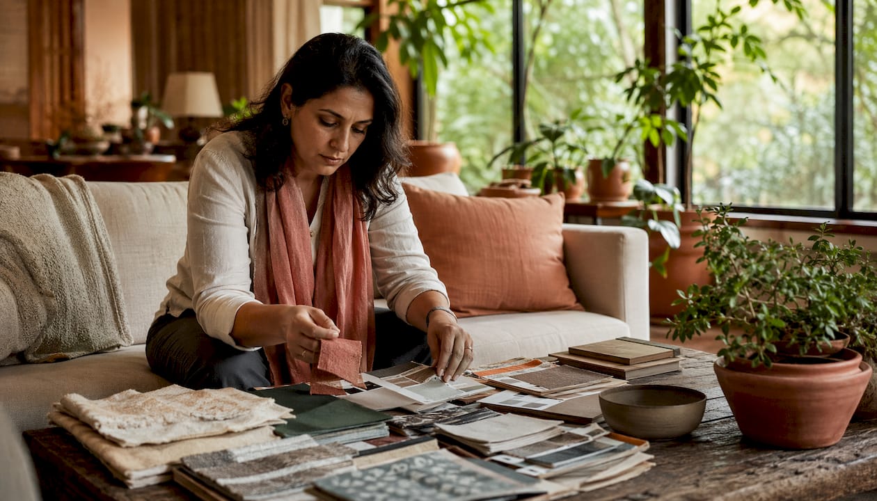
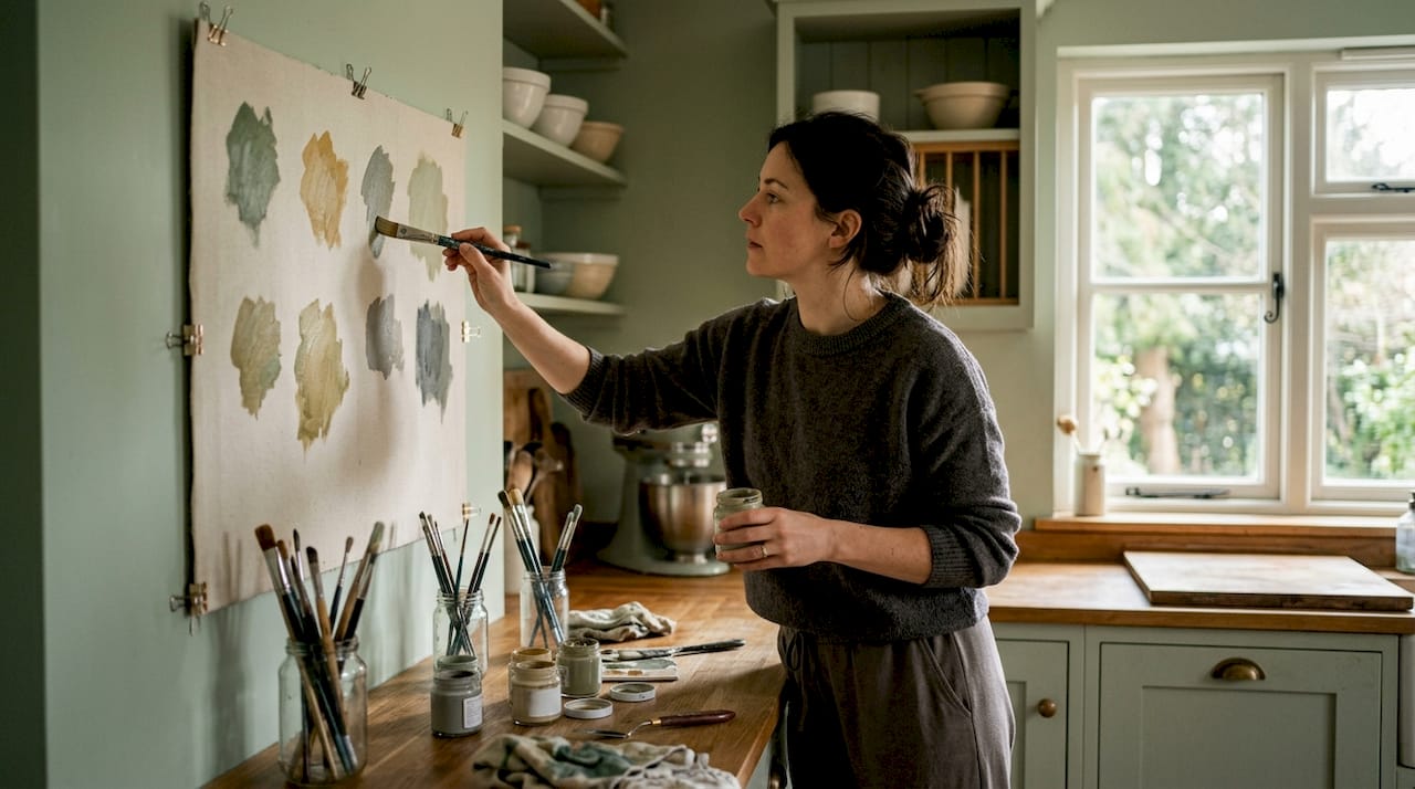
Pro tip: Before committing to a colour scheme, create small painted test patches and observe how natural and artificial light transform their appearance throughout different times of day.
Psychology of Colour in Home Environments
Psychological research on colour reveals profound insights into how different hues fundamentally impact human emotional and cognitive experiences within residential spaces. Colours are not merely visual stimuli but powerful psychological triggers that can significantly modulate mood, energy levels, and overall well-being.
Each colour spectrum carries unique psychological properties that subtly influence our mental states. Blues and greens typically evoke calmness and serenity, making them ideal for bedrooms and relaxation spaces. Warmer tones like oranges and yellows stimulate creativity and social interaction, perfect for communal areas like living rooms and kitchens. Urban colour psychology studies demonstrate how strategic colour selection can transform living environments into emotionally supportive landscapes that nurture psychological health.
The impact of colour extends beyond mere aesthetic preference. Neuroscientific research suggests that certain colour wavelengths can trigger specific neurochemical responses, affecting stress levels, concentration, and emotional regulation. A soft lavender might reduce anxiety, while a vibrant red can increase alertness and stimulate energy. Understanding these nuanced psychological interactions allows homeowners to design spaces that actively support their mental and emotional needs.
Pro tip: Create a mood board with colour swatches and observe how different combinations make you feel before committing to a final interior design palette.
Popular Colour Schemes and Their Effects
Colour harmony principles reveal sophisticated strategies for creating visually compelling and emotionally resonant interior spaces. Understanding these principles allows homeowners to transform rooms from mere functional areas into carefully curated environments that reflect personal style and psychological well-being.
The most prevalent colour schemes offer distinct emotional landscapes. Monochromatic palettes create serene, sophisticated environments by using varying shades and tints of a single colour, ideal for creating visual cohesion and calm. Complementary colour schemes, which combine opposite colours on the colour wheel, generate dynamic energy and visual excitement. Design colour combinations demonstrate how thoughtful pairings like deep navy with warm mustard or soft sage with blush pink can transform ordinary spaces into extraordinary experiences.
Analogous colour schemes, which incorporate neighbouring colours on the colour wheel, provide subtle sophistication and natural harmony. These combinations often mimic natural environments, such as blues and greens or oranges and yellows, creating intuitive and restful interiors. By understanding these nuanced approaches, homeowners can move beyond arbitrary colour selection and craft intentional spaces that support emotional well-being and aesthetic pleasure.
Pro tip: Use a colour wheel as a visual guide and limit your chosen palette to three to four colours for balanced, harmonious interior design.
Here’s a concise summary of how major colour schemes influence interior spaces:
| Scheme Type | Visual Effect | Emotional Impact | Popular Room Uses |
|---|---|---|---|
| Monochromatic | Unified and serene | Calm and sophisticated | Bedrooms, living rooms |
| Complementary | Bold and dynamic | Energetic and uplifting | Kitchens, lounges |
| Analogous | Natural and balanced | Relaxed and harmonious | Bathrooms, offices |
| Neutral with Accents | Spacious and clean | Subtle with personality | Small urban spaces |
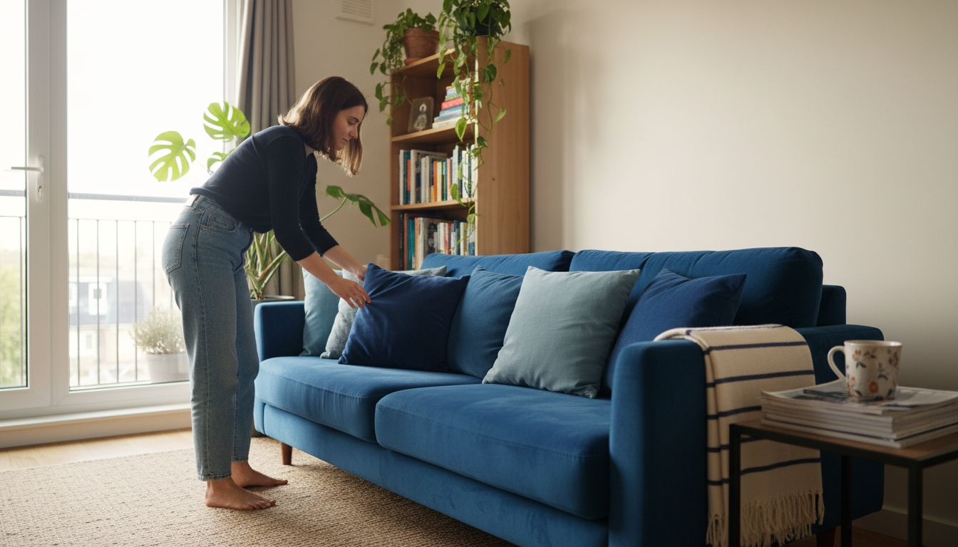
Combining Colours for Small Urban Spaces
Urban interior design strategies reveal sophisticated approaches to maximising visual space and psychological comfort in compact living environments. Small urban spaces demand intelligent colour selection that creates an illusion of expansiveness while maintaining aesthetic coherence and personal style.
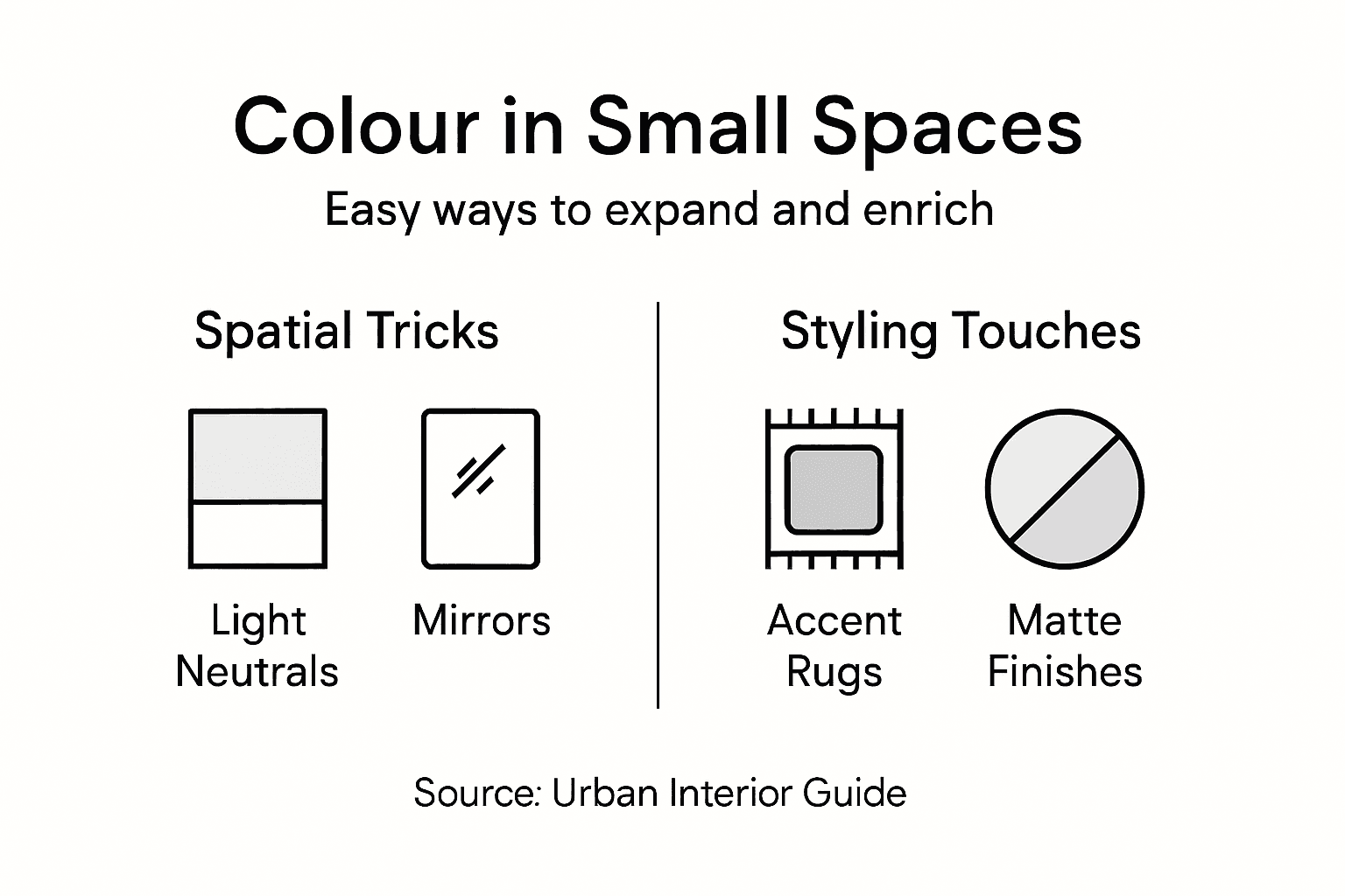
Light neutral palettes serve as fundamental tools for spatial enhancement. Soft whites, pale greys, and delicate beiges visually expand room dimensions by reflecting natural light and creating seamless visual transitions. Complementary accent colours strategically placed can add depth and personality without overwhelming limited square footage. Colour theory techniques suggest incorporating vertical colour gradients or monochromatic schemes to create vertical visual continuity that draws the eye upward, effectively making spaces feel taller and more spacious.
Texture becomes a critical companion to colour in small urban spaces. Mixing matte and glossy finishes within a consistent colour family adds visual complexity and prevents monotony. Reflective surfaces like metallic accents or glass elements can amplify light and create depth, while soft textural elements such as wool throws or velvet cushions provide visual warmth without consuming precious physical space. By understanding these nuanced colour manipulation techniques, urban dwellers can transform compact interiors into dynamic, breathable environments.
Pro tip: Use mirrors and light-reflective paint finishes to optically expand your space, creating an illusion of greater depth and openness.
Common Mistakes When Using Colour at Home
Colour application errors frequently stem from impulsive design choices that prioritise temporary trends over personal comfort and spatial harmony. Homeowners often fall into predictable traps that compromise the emotional and aesthetic potential of their living spaces, making understanding these common pitfalls crucial for successful interior styling.
One significant mistake is over-saturating rooms with intense colours that overwhelm sensory perception. Vibrant hues like electric blue or aggressive red can create psychological tension and visual fatigue when applied excessively. Interior colour theory recommends using bold colours sparingly as accent elements, allowing neutral tones to provide visual breathing room and maintain emotional balance. Another critical error involves neglecting natural and artificial lighting conditions, which dramatically transform colour perceptions throughout different times of day.
Inconsistent colour themes represent another widespread design misstep. Many homeowners select colours randomly without considering how different hues interact and flow between connected spaces. This approach creates visual fragmentation and disrupts the subtle psychological continuity that makes homes feel cohesive and peaceful. Successful colour application requires thoughtful consideration of how individual room palettes communicate with one another, creating a harmonious narrative that supports both aesthetic appeal and emotional well-being.
Pro tip: Always test paint colours using large sample patches and observe them under different lighting conditions before committing to a full room transformation.
To help avoid common colour selection mistakes in home design, consider these practical comparisons:
| Mistake Type | Why It Happens | Impact on Space | Simple Solution |
|---|---|---|---|
| Overuse of Intense Colour | Follows bold trends | Causes visual fatigue | Use bold colours as accents |
| Ignoring Lighting | Neglects light effects | Colours appear different | Test colours in all lighting |
| Random Theme Selection | Chooses without plan | Creates visual fragmentation | Maintain palette consistency |
Transform Your Urban Space with Colour and Style
Choosing the right colours for small urban homes can be challenging when aiming to balance visual space and emotional well-being. This article reveals that selecting light neutral palettes combined with thoughtfully placed accent colours can expand rooms and create harmony. Avoid common mistakes like overwhelming intense colours or inconsistent themes that disrupt your home’s flow. At Homable, we understand these challenges and offer a carefully curated range of home accessories designed to complement your ideal colour schemes and optimise your space.
Discover stylish curtains, rugs, and decorative accents that bring together texture, light, and colour theory principles. Whether you want to enliven a compact living room or create serene bedroom vibes, Homable.co.uk provides quality, affordable solutions tailored for modern urban interiors. Elevate your home’s emotional and visual appeal today by browsing our latest collections and turn your colour ideas into beautiful reality. Start now to enjoy free shipping on orders over £100 and secure online payments.
Frequently Asked Questions
How does colour affect the mood in a small urban space?
Colour significantly influences the mood by evoking emotional responses. For example, cooler tones like blues and greens promote calmness, making them ideal for relaxation areas, while warmer colours like oranges and yellows can stimulate energy and creativity, suitable for communal spaces.
What are the best colour schemes for creating a more spacious feel in compact living environments?
Light neutral colour schemes, such as soft whites or pale greys, help to visually expand space by reflecting light. Incorporating complementary accent colours can add depth and personality without overwhelming the area.
How can I avoid common mistakes when selecting colours for my home?
To avoid mistakes, refrain from overusing intense colours that can be overwhelming. Always consider natural and artificial lighting when testing colours, and maintain a consistent colour palette throughout connected spaces for visual harmony.
What role does texture play in the use of colour for interior styling?
Texture enhances the visual complexity of colour schemes. Mixing finishes within a consistent colour family can create depth and interest. Reflective surfaces can amplify light, while soft textures provide warmth, making the space feel inviting without taking up physical room.
Recommended
- What Is Interior Styling and Its Impact on Homes – Homable
- Why Personalise Your Space – Boost Comfort and Expression – Homable
- Step by Step Home Accessory Styling for Modern Spaces – Homable
- Curated Home Decor: How Thoughtful Design Transforms Living Spaces – Homable
- Inspiring Shutter Colour Options for Homes in 2025!