Cart
0
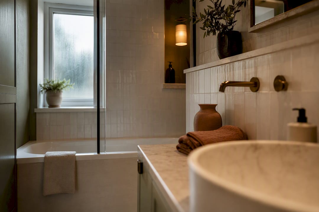
The most reliable bathroom colour scheme is a neutral base warmed with an earthy accent, terracotta, teal or sage, rather than a full block of trend colour. Save bold, saturated shades for small or windowless rooms, where limited sightlines make daring choices easier to manage. Whatever direction you choose, get the paint finish and lighting right first, because both change how any colour actually reads on the wall.
TL;DR:
- Barely visible bright, saturated colours should be limited to small or windowless bathrooms to avoid overwhelming the space.
- A neutral base with earthy accents, such as terracotta or sage, remains the most versatile and on-trend choice for various bathroom layouts.
- Matching undertones between tiles, paint, and sanitaryware is crucial to prevent clashes and ensure a cohesive look.
- Application details like tiling wet zones, using moisture-resistant finishes, and lighting choices significantly influence the final colour effect.
- Consistent metal finishes and textured accessories are necessary to complement the colour scheme and prevent a sterile, flat appearance.
Table of Contents
- Bathroom colour scheme ideas worth stealing
- How to choose a bathroom colour scheme: a practical checklist
- Small, windowless and powder-room guidance
- Applying colour: paint, tiles, trims and ceilings
- Pairing colours with fittings, metals and wood
- Cristiano’s expert notes on getting the details right
- Why your bathroom deserves the same thought as your living room
- Finishing touches that pull a bathroom colour scheme together
- Sources
- FAQ
Bathroom colour scheme ideas worth stealing
Every one of these schemes has been chosen because it solves a specific problem, whether that’s a north-facing window, a boxy layout, or fittings you can’t afford to replace. The 2026 trend toward “earthy vibrancy” runs through several of them, but so does the enduring appeal of a well-judged neutral.
-
Warm neutrals. A soft greige or oatmeal base suits almost any bathroom and ages well. Best for family bathrooms and ensuites. Pair with brushed brass. Layer in a jute mat or rattan storage basket so the room doesn’t feel flat.
-
Layered beiges and greiges. Rather than one tone, use two or three closely related shades across walls, tiles and cabinetry. Works well in larger family bathrooms. Pair with matt black. Keep undertones consistent, pink-beige against yellow-beige clashes badly.
-
Serene pale blue and white. A classic for a reason: it reads clean without feeling clinical. Ideal for guest bathrooms and small ensuites. Pair with chrome or polished nickel. Choose a blue with a grey undertone rather than a bright sky blue for a calmer finish.
-
Nature green with terracotta accents. Sage or olive walls paired with terracotta towels or a clay planter bring the earthy vibrancy trend indoors without a full colour commitment. Best for main bathrooms with some natural light. Pair with brass. Add a wooden stool for warmth.
-
Dusky plaster pink with black and white contrast. Pink has grown up, this is a muted, almost clay-like pink rather than anything sugary. Suits period homes and ensuites with character. Pair with matt black. Use black on taps and mirror frame only, not everywhere.
-
Dark inky blue with nickel. A moody, enveloping scheme for bathrooms with strong artificial lighting. Best in larger, well-lit main bathrooms or windowless powder rooms. Pair with polished nickel. Balance dark walls with a pale stone or marble-effect floor.
-
Terracotta with warm wood. Full commitment to the earthy vibrancy trend, a genuinely warm, grounding scheme. Suits bathrooms with wooden vanities or flooring already in place. Pair with brass or bronze. Keep sanitaryware off-white, not stark white, or the contrast fights the wall colour.
-
Sunshine yellow tempered with muted blue. Full yellow walls can feel like a nursery, so use it as an accent against a soft blue-grey base instead. Works in smaller cloakrooms. Pair with chrome. Keep yellow to one wall or the joinery only.
-
Classic white with textural accents. White still works, but only with texture layered on top: ribbed towels, a wooden mirror frame, woven baskets. Best for small bathrooms needing maximum light. Pair with brass. Avoid stark brilliant white next to white sanitaryware, it flattens the room and looks clinical.
-
Tile-drenching in pattern for powder rooms. Covering walls and even the ceiling in a single patterned tile turns a tiny guest cloakroom into a design moment. Designers favour this move precisely because the room is too small to overwhelm anyone. Pair with black or brass depending on the tile’s undertone. Keep the sanitaryware plain white to let the pattern do the work.
How to choose a bathroom colour scheme: a practical checklist
Before you commit to any of the schemes above, run the room through a few honest checks. These are the factors that decide whether a colour looks considered or accidental once it’s on the wall.
- Assess light and orientation first. A north-facing bathroom needs warmer undertones to counteract the cool, flat daylight it gets.
- Map sightlines from the doorway. Whatever colour you’ll see first when the door opens should be the one you’re most confident about.
- Match undertones between tile and paint. A grey tile with blue undertones will clash with a paint that leans green, even if both are technically “grey.”
- Limit yourself to one to three tones, and decide where each sits (walls, trim, accessories) before you buy anything.
- Choose a satin or eggshell finish, both resist moisture better than matt and wipe clean more easily.
- Think about resale. Bold main-bathroom colours can narrow your buyer pool; neutrals with removable accents keep options open.
Avoid pairing pure brilliant white paint with white sanitaryware, the two whites rarely match exactly, and the mismatch looks unfinished rather than clean.
Pro Tip: Buy a tester pot before a tin. Paint a sheet of card, not the wall, and move it around the room at 9am, 1pm and 8pm under artificial light. Colours shift more across a day than most people expect.
Small, windowless and powder-room guidance
Compact bathrooms play by different rules than large ones, and trying to force big-room logic into a small space usually backfires.
- In a small bathroom, stick to one primary tone, or two closely related shades at most. Multiple contrasting colours in a tight footprint make the room feel busier and smaller.
- A windowless bathroom can absolutely go dark, so long as the lighting plan compensates. Layer a ceiling light with a wall-mounted mirror light, and choose warm bulbs at around 2700K.
- Powder rooms are the safest place to be bold. With no bath or shower and limited floor area, designers consistently reach for saturated or patterned schemes here precisely because the risk is so contained.
For windowless rooms that need to feel bigger rather than moodier, a tight two-tone palette in soft white or pale blue reflects artificial light more effectively than a single flat colour.
Applying colour: paint, tiles, trims and ceilings
Getting the scheme right on paper is only half the job, application decisions make or break the final result.
- Tile the wet zone, paint the rest. Full-height tiling around the bath or shower protects against splashback; painted walls elsewhere keep costs down and allow easier colour changes later.
- Use satin or eggshell paint throughout, both stand up to humidity far better than a flat matt finish.
- Paint the ceiling a shade lighter than the walls to lift the room, or match it to the walls entirely in a small space to make the ceiling disappear and the room feel taller.
- Match grout tone to the tile, not the wall. A stark white grout against a coloured tile creates a grid pattern that fights your scheme.
- Consider humidity-resistant wallpaper on a dry wall away from direct splash, it adds pattern that plain paint can’t.
- Test everything at different times of day before committing, artificial light in the evening can pull surprising undertones out of a colour that looked neutral at noon.
Pairing colours with fittings, metals and wood
A well-chosen wall colour still falls flat if the metals and materials around it don’t agree with it. Warm accents, brass, terracotta, timber, are what stop a cool grey scheme from feeling sterile, and texture does the same job for neutrals, keeping them from reading as flat or corporate.
- Choose one metal finish and use it everywhere, mixing chrome taps with a brass mirror frame reads as unplanned rather than eclectic.
- Go off-white rather than pure white for paint if your bath, basin or toilet aren’t brand new, matching the paint closer to the fitting’s actual white avoids an awkward two-tone clash.
- Bring in timber or woven texture, a stool, a mirror frame, a storage basket, to warm up any scheme that’s leaning cool.
Pro Tip: Match your metal finish to the accent colour, not to the sanitaryware. Brass sits naturally with terracotta and warm wood; nickel suits blues and greys. Chasing a “matching” metal to a white toilet is the wrong brief entirely.
Cristiano’s expert notes on getting the details right
Cristiano, who writes on colour and interiors, has covered this ground before in a piece on stylish colour palette examples for modern homes and in a recent 2026 design trends analysis. His advice for this room specifically: test your sample at night under your actual bathroom bulb, and add one warm-toned accessory before judging whether a scheme feels finished.
Why your bathroom deserves the same thought as your living room
Most people treat the bathroom as an afterthought, four walls to make watertight, not a room to design. That’s backwards. It’s the room you use daily, often at your least composed moments, and the 2026 shift toward earthy, grounding tones reflects a wider realisation that small rooms carry real emotional weight. Be braver in your second bathroom than you’d dare be in your kitchen. One rule stands above the rest: get the base neutral right, then let the accent do the talking.
— Cristiano
Finishing touches that pull a bathroom colour scheme together
A wall colour is only ever half the room. The accessories you choose next, towel rails, trays, storage baskets, are what stop a fresh coat of paint looking like an unfinished job. Homable’s decorative silver flower candle holder works well as a small styling moment on an open shelf or windowsill, catching light against a warm neutral or terracotta wall in exactly the way this article’s schemes are built around.
If you’re partway through a bathroom refresh and need the small pieces that make a scheme feel complete rather than half-finished, browse Homable’s full range of home accessories for storage, trays and decorative pieces that suit your chosen palette, and order what fits before you finish the room.
Sources
- Bathroom colour ideas (Homes & Gardens)
- How to brighten a bathroom with zero windows (Apartment Therapy)
- Bathroom inspiration (Behr)
- Bathroom paint trends for 2026 (The Coolist)
FAQ
What is the best colour for a bathroom?
There’s no single best colour, but a warm neutral base, greige, oatmeal or soft white, works in the widest range of bathrooms because it flatters most lighting conditions and pairs easily with accent tones.
What is the latest colour trend for bathrooms?
The dominant 2026 direction is “earthy vibrancy”, warm, grounding tones like terracotta and teal used as accents against a neutral base rather than covering the whole room.
What are some good colour schemes for a bathroom?
Strong options include warm neutrals with brass, pale blue and white for guest bathrooms, dark inky blue with nickel for a moody main bathroom, and terracotta with warm wood for a fully earthy scheme.
What are the most trendy colours for bathrooms in 2026?
Terracotta, teal and warm sage lead the trend list, each pulled from the earthy vibrancy movement, and each works best as an accent layered over a neutral wall rather than used across every surface.
Should a small bathroom use light or dark colours?
Small bathrooms with natural light generally suit soft, reflective shades, but a small windowless room can take a dark, moody palette successfully if the artificial lighting is planned to compensate.