Cart
0
Many homeowners underestimate how profoundly colour schemes shape their living spaces, often treating them as afterthoughts rather than foundational design elements. The truth is that thoughtful colour choices do more than simply make rooms look pretty. They influence mood, alter spatial perception, and serve as the backbone of cohesive interior styling. Whether you’re refreshing a single room or reimagining your entire home, understanding how colour psychology influences home décor empowers you to create environments that truly reflect your personality and enhance daily living. This guide will walk you through the psychological impact of colour, current trends shaping UK interiors in 2026, and practical steps to select and apply schemes that elevate your home’s aesthetic and functional appeal.
Table of Contents
- Understanding The Psychological Impact Of Colour Schemes
- Role Of Colour Schemes In Modern Home Styling And Trends
- Practical Guidance For Selecting And Applying Colour Schemes At Home
- Discover Stylish Home Décor Essentials At Homable
Key takeaways
| Point | Details |
|---|---|
| Psychological influence | Colour schemes directly affect mood, energy levels, and how you experience each room in your home. |
| Modern trends in 2026 | Balanced neutrals paired with bold accents and nature-inspired tones dominate contemporary UK interiors. |
| Practical application | Testing samples under varied lighting and using accent walls allow flexible, impactful colour introductions. |
| Space perception | Light hues expand small rooms visually, whilst strategic accent colours redirect focus from awkward layouts. |
| Seasonal refreshes | Small decorative updates keep your colour scheme evolving without requiring full repaints or major expense. |
Understanding the psychological impact of colour schemes
Colour psychology reveals how different hues trigger distinct emotional and physiological responses, making it essential knowledge for anyone designing or refreshing their home. When you walk into a room painted in warm tones like terracotta or burnt orange, your body responds with increased energy and alertness. These colours stimulate conversation and activity, which is why they work brilliantly in social spaces like dining rooms or kitchens. Conversely, cool shades such as soft blues and sage greens lower heart rate and promote relaxation, ideal for bedrooms and reading nooks where you seek calm.
Neutral tones occupy a unique middle ground in colour psychology. Beiges, greys, and warm whites provide visual rest, allowing your mind to focus without distraction. They serve as anchoring elements that prevent colour schemes from becoming overwhelming or chaotic. Many homeowners make the mistake of choosing colours based solely on current trends or personal favourites, ignoring how those hues will actually make them feel day after day. A vibrant red accent wall might look striking in a magazine spread, but living with it in a small bedroom could create restlessness rather than the cosy retreat you envisioned.
The interplay between multiple colours in a scheme adds another layer of psychological complexity. Complementary colours (opposites on the colour wheel) create visual tension and energy, whilst analogous colours (neighbours on the wheel) produce harmony and flow. Understanding these relationships helps you avoid jarring combinations that tire the eye. For instance, pairing a cool grey with warm wood tones balances temperature, preventing a space from feeling either sterile or overly busy.
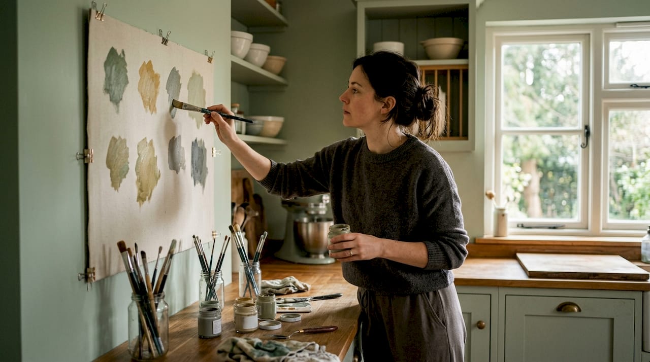
Pro Tip: Before committing to a colour scheme, spend time in rooms painted in those hues at different times of day. Morning light reveals cool undertones, whilst evening artificial light can shift colours dramatically, affecting the psychological impact you experience.
Common pitfalls include selecting colours in isolation rather than considering how they interact with existing furnishings, flooring, and natural light. A colour that feels soothing in a paint shop under fluorescent lighting might appear dull or garish in your north-facing living room. Testing large samples on your actual walls and observing them over several days prevents costly mistakes and ensures your chosen scheme delivers the emotional atmosphere you’re seeking.
Key psychological effects by colour family:
- Warm reds and oranges: stimulate appetite, conversation, and physical energy
- Cool blues and greens: lower stress, enhance focus, promote restful sleep
- Neutrals (greys, beiges, whites): provide visual balance, highlight other design elements, create timeless backdrops
- Yellows: boost optimism and creativity but can overwhelm in large doses
- Purples: encourage luxury and contemplation, work well as accents rather than dominant hues
“The right colour scheme doesn’t just decorate a space; it fundamentally shapes how you inhabit and experience your home every single day.”
Role of colour schemes in modern home styling and trends
The UK interior design landscape in 2026 showcases a fascinating blend of balanced, harmonious colour palettes that prioritise both aesthetic appeal and psychological wellbeing. Natural neutrals remain foundational, but they’re increasingly paired with unexpected pops of saturated colour rather than the all-neutral schemes that dominated previous years. Think warm oatmeal walls punctuated by deep forest green velvet cushions or terracotta ceramic vases. This approach allows flexibility, letting you refresh your space through accessories without repainting entire rooms.
Bold accent colours have surged in popularity as homeowners seek to inject personality into their spaces. Jewel tones like sapphire blue, emerald green, and rich burgundy appear in strategic doses, often through statement furniture pieces or feature walls. These saturated hues create focal points that draw the eye and add depth to otherwise neutral schemes. The key is restraint: one or two bold elements per room prevent visual chaos whilst still delivering impact.
Muted pastels represent another significant trend, particularly in bedrooms and bathrooms where calm atmospheres matter most. Dusty pinks, soft lavenders, and pale sage greens offer colour without overwhelming the senses. These tones work beautifully in modern minimalist interiors, providing just enough visual interest to prevent starkness. They also photograph exceptionally well, which partly explains their prevalence on social media and design blogs.
Pro Tip: Combine one trending colour (like a bold jewel tone) with two timeless neutrals to create schemes that feel current without dating quickly. This 60-30-10 rule (60% dominant neutral, 30% secondary neutral, 10% accent colour) ensures longevity whilst allowing seasonal updates through that accent percentage.
Regional and cultural factors continue shaping colour preferences across the UK. Scottish interiors often incorporate deeper, moodier tones that complement shorter daylight hours, whilst southern coastal homes favour brighter, airier palettes reflecting abundant natural light. Understanding these contextual influences helps you choose schemes that work with your specific environment rather than against it.
| Palette type | Characteristics | Best suited for | Longevity |
|---|---|---|---|
| Natural neutrals | Warm beiges, soft greys, creamy whites | Living rooms, hallways, versatile spaces | High (5+ years) |
| Bold jewel accents | Deep emerald, sapphire, burgundy | Feature walls, statement furniture | Medium (3-4 years) |
| Muted pastels | Dusty pink, pale sage, soft lavender | Bedrooms, bathrooms, nurseries | Medium (3-5 years) |
| Earthy terracottas | Warm oranges, clay tones, rust | Kitchens, dining areas, eclectic spaces | High (4+ years) |
The integration of these colour trends with broader styling movements creates cohesive, thoughtful interiors. Minimalist spaces use colour sparingly but intentionally, often limiting schemes to two or three hues maximum. Eclectic interiors embrace more adventurous combinations, mixing patterns and saturations with confidence. Both approaches require understanding colour relationships and psychological impact to succeed. Refreshing your space strategically through colour updates delivers immediate visual transformation without requiring structural changes or major investment.
Practical guidance for selecting and applying colour schemes at home
Selecting an effective colour scheme begins with honest assessment of your room’s function, natural light, and existing architectural features. Start by identifying the primary purpose of each space. A home office requires colours that enhance focus and productivity, typically cool blues or greens, whilst a family living room benefits from warmer, more sociable tones. Natural light dramatically affects how colours appear, so observe your room at different times throughout the day before making decisions.
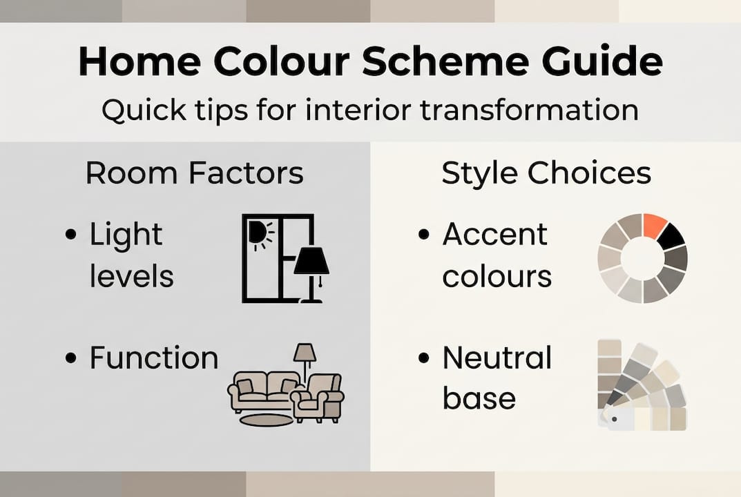
Testing is non-negotiable for successful colour selection. Purchase sample pots of your top three choices and paint large swatches (at least 60cm square) on different walls. View these samples in morning daylight, afternoon sun, and evening artificial light over several days. Colours shift dramatically based on light temperature and intensity. What looks like a soft grey in afternoon sun might appear stark blue-grey under evening LED lighting. This testing phase prevents the common mistake of committing to a full room paint only to discover the colour feels wrong in your actual living conditions.
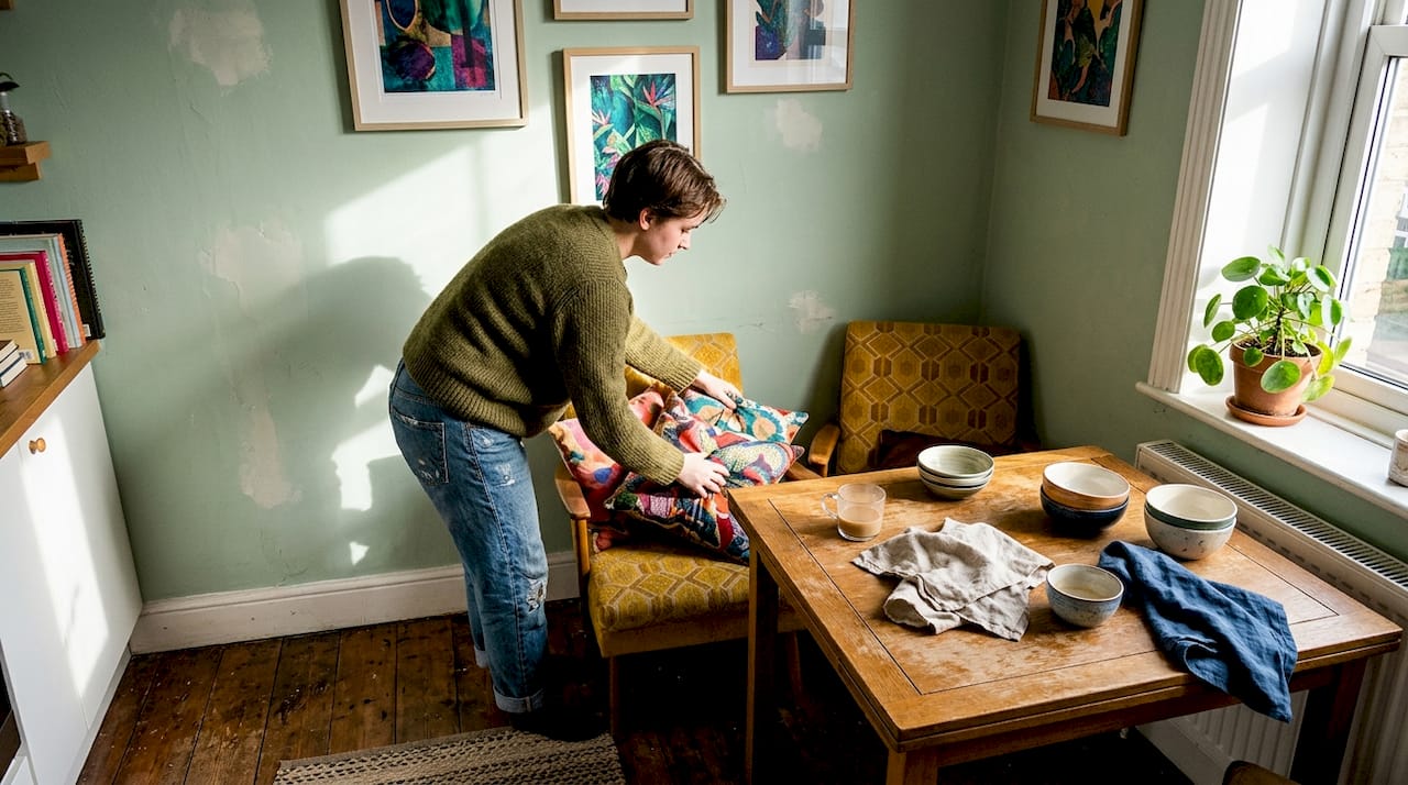
Accent walls and accessories offer flexible, low-commitment ways to introduce colour impact. Rather than painting an entire room in a bold hue, select one wall as a feature and keep remaining walls neutral. This creates visual interest without overwhelming the space. Alternatively, introduce colour through easily changeable elements like cushions, throws, artwork, and decorative objects. This approach allows seasonal refreshes and trend experimentation without permanent commitment.
Follow these steps for foolproof colour scheme selection:
- Assess room function and desired mood (energising, calming, focused)
- Evaluate natural and artificial lighting conditions throughout the day
- Test large paint samples on actual walls for at least three days
- Consider existing fixed elements (flooring, cabinetry, architectural details)
- Choose a dominant colour (60%), secondary colour (30%), and accent colour (10%)
- Implement through paint, furnishings, and accessories in that proportion
Common mistakes to avoid when combining colours:
- Matching colours too perfectly, creating flat, lifeless schemes
- Ignoring undertones, leading to clashing rather than complementing hues
- Choosing colours in isolation without considering adjacent rooms and flow
- Overlooking the impact of flooring and fixed elements on overall palette
- Following trends blindly without considering personal preference and lifestyle needs
Pro Tip: Refresh your colour scheme seasonally through small decorative changes rather than full repaints. Swap cushion covers, throws, and artwork to introduce new accent colours that reflect the season, keeping your interior feeling current and intentional without major expense or effort.
The strategic use of colour optimises room brightness and spatial perception, particularly valuable in smaller UK homes where maximising every square metre matters. Light colours reflect more light, making compact rooms feel airier and more spacious. Conversely, darker colours absorb light, creating cosy intimacy in larger spaces that might otherwise feel cavernous. Understanding the role of colour in design empowers you to manipulate these perceptions deliberately.
When applying your chosen scheme, work from largest to smallest elements. Paint walls first, then introduce furniture in your secondary colour, finishing with accent accessories. This progression ensures proper colour balance and prevents the common pitfall of over-accessorising. Remember that white and neutral spaces still constitute colour schemes; they simply prioritise texture, form, and subtle tonal variation over saturated hues. Expert guidance on colour application extends beyond interiors, ensuring cohesive schemes flow from exterior to interior spaces for comprehensive home styling.
Discover stylish home décor essentials at Homable
Now that you understand how colour schemes transform interiors, bringing those principles to life requires the right decorative elements. Homable offers carefully curated home décor that complements any colour palette you’ve chosen, from subtle neutrals to bold statement pieces. Whether you’re introducing texture through a charming woven fabric rabbit doorstop or exploring our full range of stylish home décor and essentials, you’ll find pieces that enhance your chosen scheme rather than fighting against it.
Our collections emphasise quality, affordability, and design versatility, allowing you to refresh your space without compromising on style or budget. From ornaments and storage solutions to curtains and rugs, each item is selected to work within modern colour trends whilst maintaining timeless appeal. Small decorative updates deliver immediate visual impact, letting you experiment with accent colours and seasonal refreshes confidently. Explore our curated selections today and discover how the right accessories complete your colour scheme vision.
FAQ
What role do colour schemes play in home interiors?
Colour schemes create emotional atmosphere, influence how spacious or intimate rooms feel, and unify disparate décor elements into cohesive designs. They’re fundamental to effective interior styling because they affect both aesthetic appeal and psychological wellbeing. Without intentional colour planning, even well-furnished rooms can feel disjointed or uncomfortable.
How can I choose a colour scheme that suits my home?
Consider your room’s natural light levels and size when selecting colours, as these factors dramatically affect how hues appear and feel. Use colour psychology principles to match schemes with desired moods: cool tones for calm spaces, warm tones for social areas. Always test paint samples on your actual walls under different lighting conditions before committing to full application.
What are the latest colour trends for UK homes in 2026?
Balanced neutral bases paired with bold jewel-tone accents dominate contemporary UK interiors in 2026, offering both versatility and personality. Muted pastels and nature-inspired earth tones remain popular, particularly in bedrooms and wellness-focused spaces. The key trend is intentional restraint: using colour strategically rather than overwhelming entire rooms with saturated hues.
Can colour schemes improve small or awkward spaces?
Light colours make small rooms feel larger and brighter by reflecting more natural and artificial light, effectively expanding perceived space. Strategic accent colours draw attention to attractive features whilst minimising focus on awkward architectural elements like odd angles or low ceilings. Monochromatic schemes in lighter tones work particularly well for compact spaces, creating visual flow that enhances spaciousness.
Recommended
- Role of Colour in Home Styling – Elevating Urban Spaces – Homable
- Role of Colour in Design – Enhancing Modern Interiors – Homable
- Colour Psychology in Home Décor – Enhancing Mood and Style – Homable
- 7 Essential Tips for Stylish Home Accessories – Homable
- TOP 20 Tips for Interior Paint Colors in 2021-2022 with Ginger Curtis