Cart
0
TL;DR:
- Effective room-by-room decor involves tailoring design choices to each space’s specific function rather than applying a uniform aesthetic. Using principles like the 60-30-10 colour rule and layered lighting, designers create coherent identities that prevent chaos or flatness. Focus on functional clarity, correct rug sizing, balanced layout, and layered lighting to achieve a well-designed, personalized home environment.
Effective room-by-room decor is defined by matching design decisions to the specific function of each space, not applying one aesthetic across the board. Professional interior designers rely on principles like the 60-30-10 colour rule and layered lighting to give every room its own coherent identity. Decorating each room with intention prevents the two most common failures: spaces that feel chaotic because nothing relates, and spaces that feel flat because everything matches too precisely. This guide covers the practical room-by-room decor tips that make a genuine difference, whether you own your home or rent it.
1. How to apply the 60-30-10 colour rule room by room
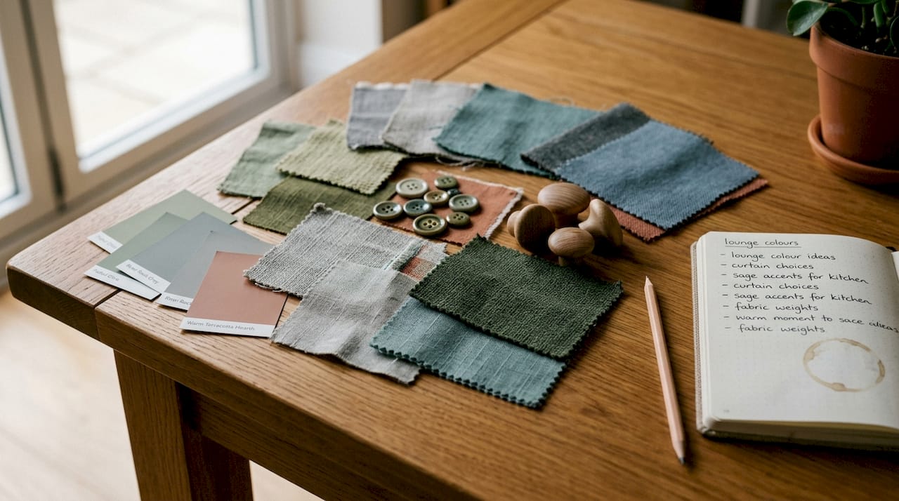
The 60-30-10 rule is the single most reliable colour strategy in interior design, and it works because it mirrors the way the human eye naturally seeks visual balance. The principle is straightforward: 60% of a room’s colour comes from the dominant tone (walls and large furniture), 30% from a secondary colour (upholstery, rugs, and curtains), and 10% from accent pieces (artwork, cushions, and decorative objects). Rooms that ignore this split tend to feel either monotonous or visually noisy. The rule gives you permission to use bold colours without overwhelming a space.
Application varies meaningfully by room:
- Bedroom: A soft, muted dominant colour such as sage green or warm grey at 60% creates calm. Layer in deeper tones through bedding and a statement headboard at 30%, then introduce a single accent colour through cushions or a bedside lamp.
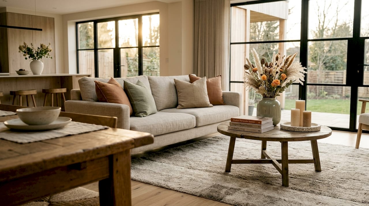
- Living room: Warm neutrals at 60% (think linen sofas and painted walls in off-white) pair well with a richer secondary like terracotta or navy at 30%. The 10% accent is where personality enters: a cobalt blue vase, a rust-coloured throw.
- Kitchen: Cabinetry and walls carry the dominant 60%. Worktop materials and open shelving fill the 30%. Hardware, pendant lights, and small appliances deliver the accent.
The most common mistake is matching rather than complementing. Two shades of the same blue across walls, sofa, and cushions reads as monotone, not cohesive. Introduce texture and pattern at the 30% and 10% levels to add depth without adding more colours.
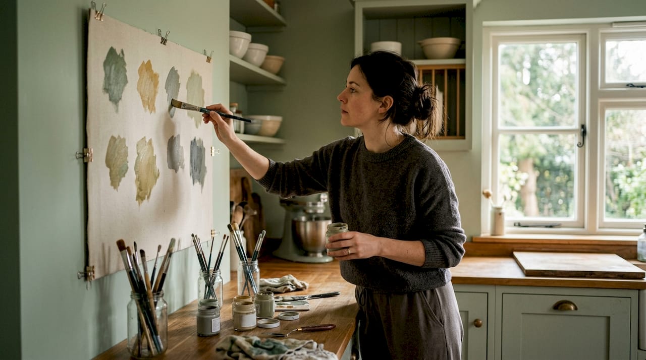
Pro Tip: Lay fabric swatches, paint chips, and small accessories together on a flat surface before committing to purchases. Seeing the three proportions side by side in natural light reveals clashes that digital mood boards miss.
2. Furniture layout and accessory placement for balance and flow
Functional clarity is the correct starting point for any layout decision. Before moving a single piece of furniture, write one sentence describing what the room must do. “This living room is for evening conversation and occasional film watching” produces entirely different layout decisions than “this room is a children’s play space that doubles as a reading corner.” That sentence filters every purchase and placement choice that follows.
Traffic flow is the most neglected factor in furniture arrangement. A path of at least 90 centimetres between pieces allows comfortable movement without the room feeling sparse. Pulling sofas and chairs slightly away from walls, rather than pushing everything to the perimeter, creates a more intimate and visually balanced arrangement. Rooms where all furniture touches the walls tend to feel like waiting rooms.
Rug sizing is where many layouts fall apart. A rug must be large enough that front legs of furniture rest on it within a seating group. A small rug placed in the centre of a room with furniture floating around it creates a disconnected, unfinished look. For a standard living room, a 200 x 300 cm rug is usually the minimum that works.
| Layout principle | Why it matters |
|---|---|
| Front legs on the rug | Unifies seating into one cohesive group |
| 90 cm traffic paths | Prevents cramped movement and visual clutter |
| Furniture off the walls | Creates conversation zones and visual depth |
| Vary accessory heights | Distributes visual weight evenly across surfaces |
For a deeper look at spatial arrangement, Homable’s guide on optimising room layout covers furniture placement across different room types in practical detail.
3. Layering lighting to transform atmosphere in every room
Lighting is the most underused tool in home styling, and it is also one of the most affordable to improve. Professional designers work with three distinct layers: ambient lighting (the general overhead source), task lighting (directed light for specific activities), and accent lighting (decorative sources that add mood and highlight features). Most rooms in British homes rely on a single overhead fitting, which flattens the space and removes all atmosphere after dark.
Practical examples by room:
- Living room: A ceiling pendant or recessed lights provide ambient light. A floor lamp beside the sofa adds task light for reading. A small table lamp or LED strip behind a shelving unit creates accent warmth.
- Bedroom: Overhead ambient light should be dimmable. Bedside lamps handle task lighting. A low-wattage lamp in a corner or behind a headboard adds accent softness.
- Kitchen: Under-cabinet strip lights are the single most effective task lighting upgrade. Pendant lights over an island add ambient and accent in one fitting.
Dimmer switches are among the highest-impact, lowest-cost upgrades available. A basic dimmer installation transforms a room’s flexibility, allowing the same space to feel bright and functional during the day and warm and relaxed in the evening. Colour temperature matters just as much as brightness. Warm bulbs at 2700K to 3000K suit living rooms and bedrooms, while cooler bulbs at 3500K to 4000K work better in kitchens and home offices. Mixing temperatures within a single room creates a subtle visual incoherence that is hard to identify but easy to feel.
Pro Tip: Install curtain rods 15 to 20 centimetres above the window frame and extend them 20 centimetres beyond each side. This tricks the eye into reading the window as taller and wider, making the whole room feel larger without a single structural change.
4. Room-specific decoration: the five key spaces
Each room has a distinct function, and the best home styling tips are the ones that serve that function directly. Generic advice applied across every room produces generic results.
Bedroom
The bedroom’s primary job is rest, and every decor decision should support that. A calming palette using the 60-30-10 rule with muted dominants (soft whites, warm greys, dusty blues) sets the tone. Quality bedding in natural fabrics such as linen or cotton percale has more visual impact than most decorative accessories. Clear surfaces on bedside tables reduce visual noise, which directly affects how restful the room feels. For bedroom lighting inspiration, layering a dimmable overhead with two bedside lamps is the minimum effective setup, even in awkward layouts.
Living room
The living room carries the heaviest decorating expectations because it is the most visible space. A conversation-focused layout, with seating angled slightly inward rather than all facing the television, makes the room feel more social and less like a home cinema. Large rugs, layered throw cushions in two or three complementary textures, and a styled bookshelf with a mix of books, plants, and objects all contribute to the “finished” quality that distinguishes a styled room from a furnished one.
Kitchen
The kitchen responds well to small, high-visibility upgrades. Replacing cabinet hardware is the fastest way to shift the room’s character without touching the cabinetry itself. Open shelving styled with a mix of functional items (stacked plates, glass jars) and decorative ones (a small plant, a ceramic bowl) adds personality. Countertop styling should follow a strict edit: keep only what is used daily, and make those items visually intentional.
Bathroom
A bathroom’s decor impact comes from texture and detail rather than large furniture. Plush towels in a consistent colour palette, a statement mirror that fills the wall above the basin, and one or two natural elements such as a small potted plant or a wooden soap dish shift the room from functional to considered. Window treatments in bathrooms are often overlooked. A simple roller blind in a water-resistant fabric completes the room in a way that bare glass never does.
Home workspace
Colour choice in a workspace directly affects concentration. Cooler tones such as soft blue-greens and warm whites support focus better than saturated or warm colours. Task lighting at the correct height (the light source should sit just above eye level when seated) prevents eye strain. Organised shelving with labelled storage keeps the visual field clean, which reduces cognitive load during work.
| Room | Colour priority | Key decor focus | Lighting layer |
|---|---|---|---|
| Bedroom | Muted, calming tones | Quality bedding, clear surfaces | Dimmable overhead, bedside lamps |
| Living room | Warm neutrals with rich accents | Rug size, conversation layout | Floor lamps, accent table lamps |
| Kitchen | Neutral cabinets, accent hardware | Hardware, countertop edit | Under-cabinet task lighting |
| Bathroom | Consistent towel palette | Mirror, natural textures | Bright ambient, no harsh shadows |
| Workspace | Cool, focus-supporting tones | Organised shelving, task light | Directional desk lamp |
Key takeaways
Effective room-by-room decor requires functional clarity first, then colour balance, correct rug sizing, and layered lighting to complete each space.
| Point | Details |
|---|---|
| Start with function | Write one sentence defining what the room must do before buying anything. |
| Apply the 60-30-10 rule | Assign 60% dominant, 30% secondary, and 10% accent colour to every room. |
| Size rugs correctly | Front legs of all seating must rest on the rug to unify the layout. |
| Layer three lighting types | Combine ambient, task, and accent lighting in every room for flexibility. |
| Match colour temperature | Use warm bulbs (2700K to 3000K) in living spaces and cooler bulbs in kitchens and offices. |
Why I stopped decorating by mood board
The most useful shift I made was treating the “in-between” phase as part of the process rather than a problem to solve. Leaving paint swatches on walls for three days before committing, or placing a new rug and living with it for a week before buying the cushions to match, sounds slow. It saves significant money and prevents the specific regret of a room that looks exactly like a mood board but feels wrong to actually live in.
The three-day observation method changed how I approach layout. Watching how a room is actually used, where people naturally sit, where bags get dropped, where the light falls at different times of day, produces better layout decisions than any floor plan. I also stopped pushing furniture against walls after seeing how much more alive a room becomes when seating floats slightly inward.
The one upgrade I recommend to everyone without hesitation is a dimmer switch. It costs very little, takes under an hour to install, and the difference in evening atmosphere is immediate and significant. A room that felt harsh and flat under full overhead light becomes genuinely pleasant with the same bulb at 60% brightness. Small lighting changes have more impact than most furniture purchases.
The step-by-step decorating guide on the Homable blog captures this iterative approach well. Decor is not a project with a completion date. It is a process of observation, adjustment, and gradual refinement.
— Cristiano
Style your home with Homable
Homable brings together a curated range of home accessories, rugs, curtains, and decorative objects designed to support exactly the kind of room-by-room styling this guide describes. Whether you are refreshing a bedroom with quality textiles or sourcing the right statement mirror for a bathroom, the collections are built around modern aesthetics and practical function.
Explore the Homable home decor range to find pieces that work with your colour palette, layout, and lighting plan. Free shipping is available on orders over £100, and the curated best-seller collections make it straightforward to find pieces that work together. For seasonal updates without a full redecoration, the Homable guide on rotating seasonal decor shows how to keep rooms feeling fresh without starting from scratch.
FAQ
What is the 60-30-10 rule in interior design?
The 60-30-10 rule divides a room’s colour into 60% dominant (walls and large furniture), 30% secondary (upholstery and rugs), and 10% accent (cushions and art). It prevents rooms from feeling monotonous or visually chaotic.
How large should a living room rug be?
A rug should be large enough for the front legs of all seating in the arrangement to rest on it. A small rug placed in the centre with furniture floating around it creates a disconnected, unfinished look.
What lighting colour temperature suits a bedroom?
Warm bulbs between 2700K and 3000K are best for bedrooms and living rooms, as they support relaxation and complement soft colour palettes. Cooler bulbs at 3500K to 4000K suit kitchens and workspaces where focus matters more than atmosphere.
How do I make a small room feel larger?
Install curtain rods 15 to 20 centimetres above the window frame and extend them beyond each side of the window. This creates the optical impression of a taller, wider space without structural changes.
Where should I start when decorating a room?
Write one sentence defining what the room must do before purchasing anything. This functional brief filters every layout and decor decision that follows, reducing costly mistakes and impulse buys that do not serve the space.