Cart
0

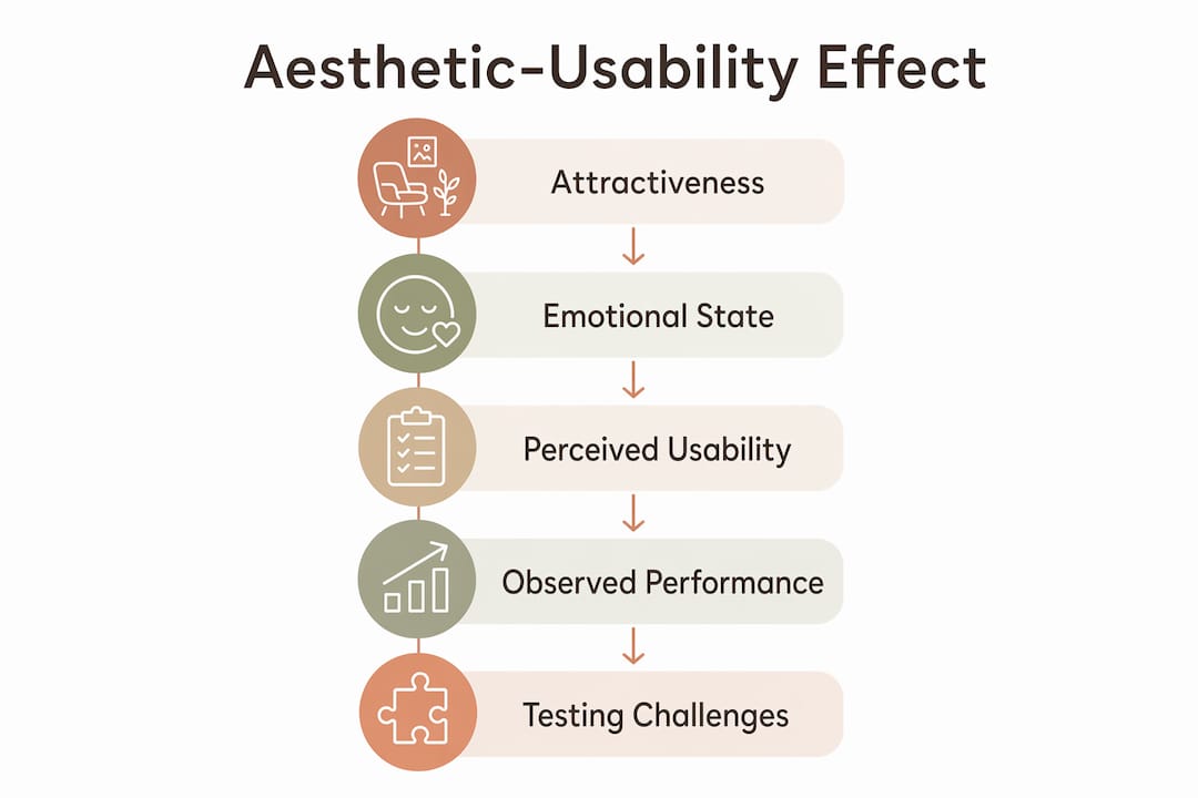
Visual appeal does not just make an interface look good. It actively changes how users perceive whether that interface works well. This is the aesthetic-usability effect: when a design looks attractive, users tend to rate it as more usable, even before they have completed a single task. The effect was first documented by Noam Tractinsky in 1997, building on earlier work in product design, and it has since become one of the most replicated findings in human-computer interaction research.
Understanding how design affects usability means grasping a few core mechanisms at once:
- Aesthetic appeal raises tolerance. Users forgive minor friction more readily when they find an interface visually pleasing.
- Consistency builds trust. Predictable layouts, type hierarchies, and colour palettes reduce cognitive load and help users form accurate mental models.
- Affordance signals action. Visual cues that suggest how an element behaves (a raised button, an underlined link) reduce errors and speed up task completion.
- Feedback confirms progress. Clear visual responses to user actions, whether a loading indicator or a success message, prevent confusion and abandonment.
Each of these operates partly through emotion. A well-designed interface puts users in a positive state, and that state makes them more patient, more exploratory, and more forgiving of small imperfections.
How aesthetics shape user experience and usability outcomes
The influence of visual design on usability is not merely subjective. A 2009 Applied Ergonomics study found that users completed tasks faster on a more visually appealing mobile interface, even when the underlying functionality was identical. The implication is striking: aesthetics can improve measured performance, not just reported satisfaction.
Statistic to note: The Applied Ergonomics study by Sonderegger and Sauer demonstrated that visual appearance alone reduced task completion times in usability tests, independent of any functional difference between interfaces.
Credibility follows a similar pattern in outdoor branding through awning design, which shows how balancing professional appearance and functional usability is essential for user trust. Users make rapid judgements about whether a product or service is trustworthy based on visual quality, and those judgements are sticky. A poorly presented interface signals carelessness, regardless of how well the underlying system actually works. This is particularly relevant for digital products in competitive markets, where a user’s first impression often determines whether they stay or leave.
Emotional state also mediates how users process difficulty. When positive affect is high, users tend to attribute problems to themselves rather than the interface, which means they persist longer before abandoning a task. That persistence is valuable, but it cuts both ways: it can mask genuine usability problems during research, which is addressed in more detail later.

The connection between form, function, and design runs through every layer of a product, from the macro layout down to the weight of a single icon stroke.

Why aesthetics alone cannot carry a design
The aesthetic-usability effect has real limits, and misreading them is one of the more common mistakes in product design. Visual appeal raises user tolerance for minor friction. It does not neutralise serious usability failures.
- Broken navigation is not forgiven. If users cannot find what they need, no amount of visual polish will keep them engaged. Frustration overrides goodwill quickly.
- Slow load times erode trust. Performance problems undercut the positive emotional state that aesthetics create, often within seconds.
- Confusing information architecture persists. A beautiful hierarchy that is logically wrong still produces errors and abandonment.
- Inaccessible design excludes users entirely. Colour contrast failures, missing alt text, and non-keyboard-navigable interfaces cannot be compensated for by attractive typography.
Research confirms this boundary. NNG’s documentation of the aesthetic-usability effect explicitly notes that aesthetics mask only minor problems. When core functions are difficult to use, users lose patience regardless of how the interface looks. There is also a subtler risk: when aesthetics are poor and usability is also poor, users become more critical of both. The relationship is not simply additive.
The practical lesson is that visual design should enhance a solid functional foundation, not substitute for one. Treating aesthetics as a shortcut to perceived usability is a strategy that fails the moment a user encounters a real obstacle.
How the aesthetic-usability effect complicates usability testing
Testing is where the aesthetic-usability effect causes the most practical damage. Users who find an interface attractive often rate it as more usable than their actual behaviour supports. They complete tasks more slowly, make more errors, and still report high satisfaction. That gap between self-report and observed performance is the core problem.
Verbal feedback during moderated sessions is particularly unreliable in this context. Participants tend to comment on what is easiest to articulate, and visual design is far more accessible as a topic than the cognitive friction of a poorly structured flow. A user who struggled to find the checkout button may leave a session saying the interface “looked really clean.”
Pro Tip: Track task completion times and error rates as your primary usability metrics. Subjective satisfaction scores are useful context, but they should never be the headline finding when you are evaluating a visually polished interface. The gap between the two is often where the real problems live.
Observational methods help close that gap. Eye-tracking, screen recording, and think-aloud protocols (analysed for hesitation and backtracking, not just verbal content) give you behavioural data that self-reports cannot distort. Separating the aesthetic evaluation from the usability evaluation, by running them as distinct tasks in a study, also reduces contamination between the two.
Reading user feedback on visual design accurately
Users commenting on aesthetics during a usability study are not necessarily telling you the interface works well. They are often telling you it looks good, which is a different thing entirely.
Common patterns to watch for:
- “It looks really professional” often follows a task where the user succeeded, but may have taken longer than expected.
- “I love the colours” frequently appears when a user has just encountered a confusing interaction but cannot easily articulate why.
- “It feels modern” is almost always a visual judgement, not a functional one.
The reason users default to aesthetic commentary is partly social. Criticising a design’s appearance feels safer and more concrete than saying “I didn’t understand what to do next.” NNG’s research confirms that participants comment more readily on visual design than on complex interaction issues, because the latter requires them to identify and articulate a cognitive process they may not fully understand.
The corrective is to cross-reference every verbal comment with the behavioural record. If a user praised the layout but spent 45 seconds trying to find the primary call to action, the behavioural data takes precedence. Feedback analysis that treats aesthetic praise as a usability signal will consistently underreport real problems.
Understanding how reviews shape trust in digital products reinforces why separating aesthetic from functional feedback matters so much in research.
What the research and experts say about design and usability
The academic literature on this topic is richer than most practitioners realise, and some of its findings run counter to intuition.
“Designers must never let fashion or superficial aesthetics trump core usability. User testing of both visual and behavioural design is mandatory to ensure effective interfaces.” — Bruce Tognazzini, First Principles of Interaction Design
Tognazzini’s position reflects a broader consensus in the field: aesthetics and usability are not in opposition, but neither are they interchangeable. The ScienceDirect study on usability and aesthetics adds an important reversal to the usual framing. Good usability positively influences how users perceive visual design after extended use, while poor usability lowers aesthetic ratings over time. The relationship runs in both directions.
Research finding: Empirical studies show that post-use aesthetic ratings are significantly shaped by usability quality, meaning a functionally frustrating product will eventually be perceived as less attractive, regardless of its visual design.
Stanford’s usability principles reinforce the practical side of this. Integrating usability expertise early in the design process allows teams to identify and address gaps before launch, rather than discovering them through poor retention data after release.
Progressive disclosure is one technique that bridges aesthetic simplicity with functional depth. By revealing advanced controls only when users need them, interfaces can appear clean without hiding essential functionality. This is distinct from the “illusion of simplicity” that hides controls users actually need, which harms usability without improving aesthetics in any meaningful way. The difference between the two is whether the hidden element is genuinely advanced or merely inconvenient to surface.
The smart home design space illustrates this tension well: interfaces that look minimal but bury critical controls consistently generate higher error rates and lower satisfaction scores in post-launch research.
Key takeaways
Good visual design measurably improves usability perception and task performance, but only when it sits on top of a functionally sound interface.
| Point | Details |
|---|---|
| Aesthetics raise tolerance | Users forgive minor friction more readily on visually appealing interfaces, per Nielsen Norman Group research. |
| Performance improves with appeal | A study found task completion times fell on more attractive interfaces, even with identical functionality. |
| Aesthetics mask only minor flaws | Serious usability failures override positive aesthetic response; visual polish cannot compensate for broken navigation or slow load times. |
| Testing requires behavioural data | Task completion times and error rates reveal what satisfaction scores conceal when interfaces are visually polished. |
| Usability shapes aesthetic perception | Post-use aesthetic ratings fall when usability is poor, meaning the relationship between design and usability runs in both directions. |
At Homable, the same principle applies to physical products. Every piece in the collection, from bamboo door curtains to washable kitchen rugs, is chosen because it works as well as it looks. Good design is not decoration. It is function made visible.