Cart
0
TL;DR:
- Color palettes in home decor involve selecting three to five hues to create visual cohesion and emotional tone. They influence mood and wellbeing by utilizing principles like the 60-30-10 rule and matching hue to room function, lighting, and saturation levels. Proper application relies on testing samples in real conditions and building from fixed elements to achieve harmony and lasting impact.
A colour palette in home decor is a deliberate grouping of three to five hues applied across walls, furniture, and accessories to create visual cohesion and shape the emotional atmosphere of a space. The role of colour palettes in decor extends far beyond aesthetics. Colour is a measurable design variable that influences psychological comfort, spatial perception, and even daily wellbeing. Understanding concepts like colour psychology and the 60-30-10 rule gives you a practical framework for making choices that genuinely transform how a room feels to live in.
How do colour palettes influence mood and wellbeing in interiors?
Colour psychology is the study of how specific hues affect human emotions and behaviour. In interior design, this translates directly into how a room makes you feel the moment you walk in. Bright warm colours such as yellow and orange stimulate energy and happiness, while cool subdued tones like soft blue and sage green promote calm and focus. This is not guesswork. It is a pattern that designers and psychologists consistently observe across residential and commercial spaces.
The significance of colour in decor becomes clearest when you match hues to room function. Consider these examples:
- Bedrooms: Soft blues, muted greens, and warm greys support rest and reduce mental stimulation before sleep.
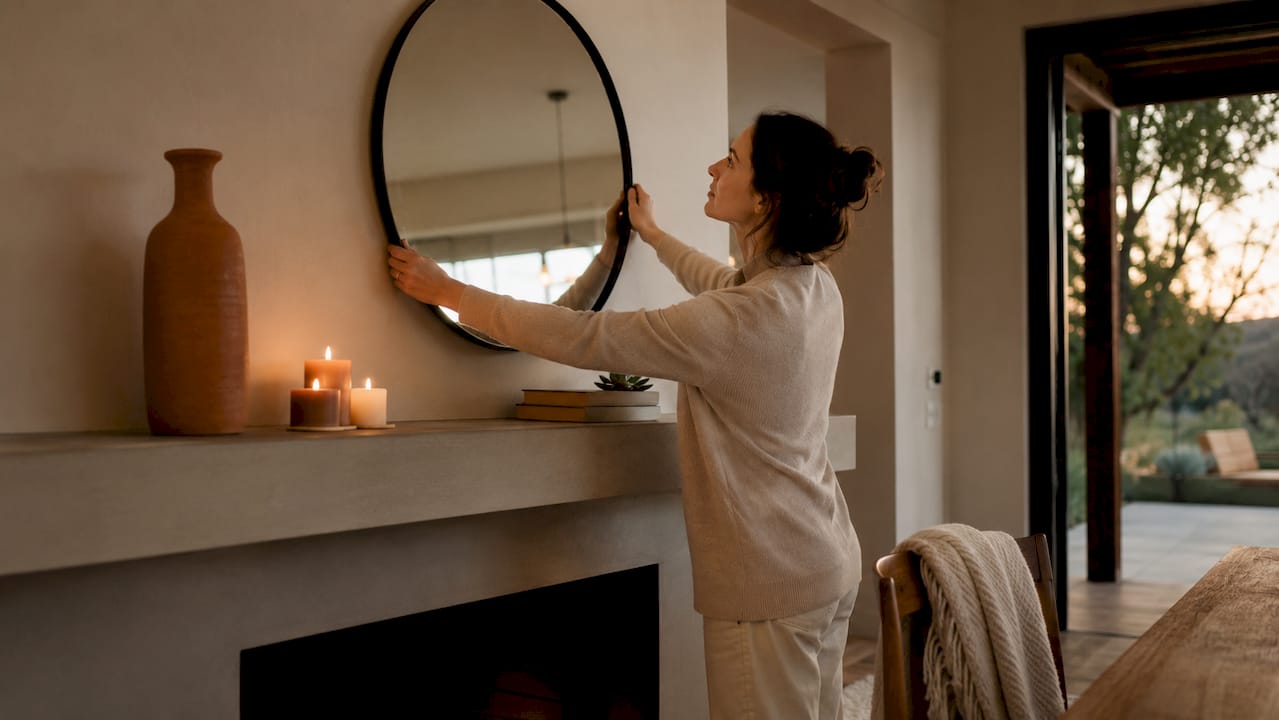
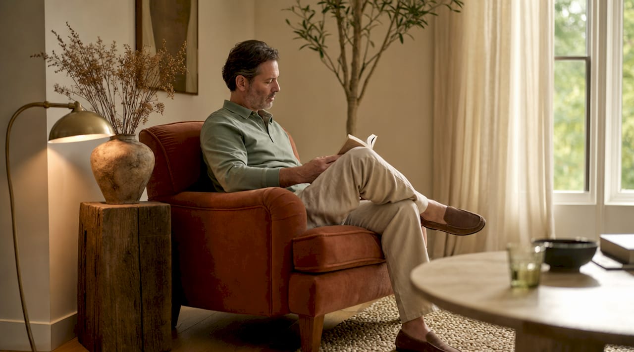
- Living rooms: Warm neutrals and earthy terracotta create a welcoming, sociable atmosphere without overwhelming guests.
- Home offices: Muted greens and cool blues support concentration, while avoiding the fatigue that comes from overly vivid walls.
- Kitchens: Warm whites and soft yellows feel clean and energising without the aggression of saturated reds.
Saturation matters as much as hue. Low to mid-saturation colours are preferable for long-term comfort, since hyper-bright shades cause sensory overload over time. A deep cobalt blue might look striking in a showroom but feel relentless in a bedroom you spend eight hours in each night. Mid-saturation versions of the same hue deliver the mood benefit without the fatigue.
Pro Tip: If you are redecorating a room where you spend significant time, choose a hue you find instinctively calming rather than one that simply photographs well. Your daily experience of the colour matters far more than its appearance in a single image.
What are the key principles for creating harmonious colour schemes?
The foundation of colour theory in interior design rests on proportion and relationship. Two concepts do most of the heavy lifting: the 60-30-10 rule and the four main palette types.
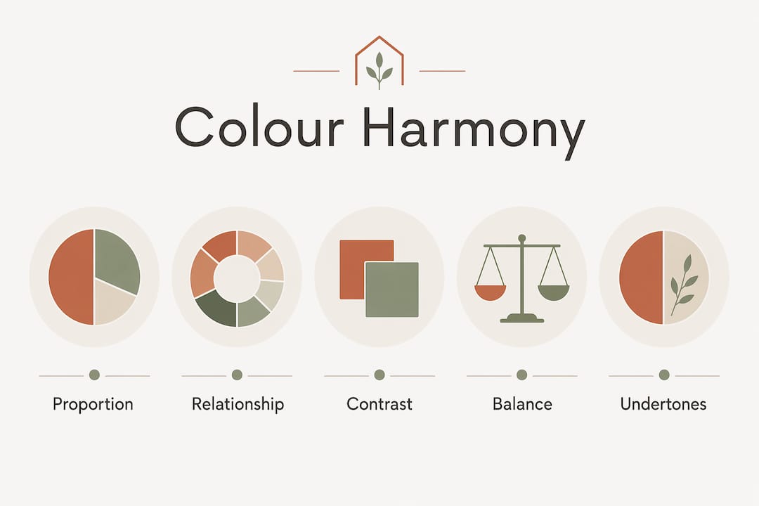
The 60-30-10 rule explained
The 60-30-10 rule divides colour use across a room into three proportions. Sixty per cent goes to the dominant colour, typically walls and large floor coverings. Thirty per cent goes to the secondary colour, usually upholstered furniture and curtains. Ten per cent goes to accent colours in cushions, artwork, and accessories. This ratio maintains visual interest without creating chaos. It is the reason a room with three colours can feel more balanced than one with two colours applied in equal measure.
The rule is flexible. In an open-plan kitchen and living space, cabinetry might take the dominant role while walls shift to secondary. Adapting the ratio to fixed features like flooring or built-in storage is always more effective than forcing a predetermined scheme onto an existing layout.
The four main palette types
- Monochromatic: One hue in varying tones and saturations. Creates a calm, sophisticated look. Works particularly well in bedrooms and bathrooms.
- Analogous: Two or three colours sitting adjacent on the colour wheel, such as blue, blue-green, and green. Produces natural, harmonious transitions between surfaces.
- Complementary: Two colours directly opposite on the colour wheel, such as navy and burnt orange. High contrast and visually energising. Best used with one colour dominant and the other as an accent.
- Triadic: Three colours evenly spaced on the colour wheel. Vibrant and bold. Requires careful proportion management to avoid visual noise.
| Palette type | Best suited for | Key risk |
|---|---|---|
| Monochromatic | Bedrooms, bathrooms | Can feel flat without tonal variation |
| Analogous | Living rooms, open plans | Needs contrast in texture to avoid blandness |
| Complementary | Accent-focused rooms | Dominant colour must be clearly established |
| Triadic | Playrooms, creative spaces | Easily becomes overwhelming without restraint |
Undertones deserve attention before you commit to any palette. A white wall with a pink undertone will clash with warm beige furniture even though both colours appear neutral in isolation. Always view paint samples against your existing fixed elements, not against a white card.
Pro Tip: Paint a large piece of white card with your chosen colour and move it around the room at different times of day. Morning light and evening lamplight can make the same shade look like two entirely different colours.
How do context and lighting affect colour perception in a room?
The impact of colour schemes changes dramatically depending on the light a room receives. This is where many homeowners make costly mistakes, choosing a colour from a small swatch and finding it looks nothing like expected once it is on the wall.
Light reflectance value, or LRV, measures how much light a paint colour reflects on a scale from zero to one hundred. Paint colours with different LRV ratings behave very differently depending on room size and ambient light. A mid-grey with an LRV of 55 will feel airy in a south-facing room with large windows but oppressive in a north-facing box room with a single small window. Two paints with identical names from different manufacturers can have LRV values that differ by 20 points, producing entirely different results on the same wall.
Room orientation shapes the colour of natural light throughout the day. North-facing rooms receive cool, indirect light that amplifies the blue and grey undertones in any colour. South-facing rooms receive warm, direct light that enriches yellows and reds. East-facing rooms are warm in the morning and cool by afternoon. West-facing rooms do the opposite. Choosing a colour without accounting for orientation is one of the most common reasons a palette fails in practice.
Swatch-based colour preferences do not reliably predict how a colour will feel at room scale. Research confirms that moderately chromatic colours tend to be more pleasing in real spatial contexts than vivid colours that look appealing on a small sample. This means the bolder choice on the card is rarely the better choice on the wall.
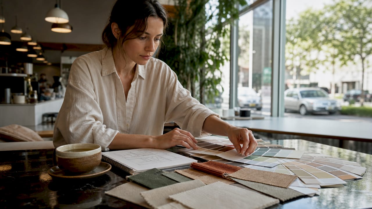
Pro Tip: Test at least two large paint samples, each at least A3 size, on different walls of the room. Live with them for 48 hours across different lighting conditions before making a final decision.
What practical steps help homeowners choose and apply colour palettes?
Choosing a colour palette for your rooms works best when you start with what you cannot change rather than what you want to add.
- Begin with fixed elements. Your flooring, cabinetry, and any large built-in features set the undertone baseline for the entire room. Pull the dominant undertone from these elements and build your palette around it rather than against it.
- Assess your natural light. Identify your room’s orientation and note how the light changes from morning to evening. This determines whether warm or cool hues will feel comfortable over time.
- Sample before committing. Paint large swatches directly on the wall and observe them across multiple lighting conditions. Never rely on a paint chip or a screen image.
- Plan for multi-room flow. In open floor plans, colour wheel adjacency creates smooth transitions between spaces. Design expert Andrea Magno recommends building palettes around one or two adjacent colour families and layering light to dark values to avoid jarring shifts between rooms.
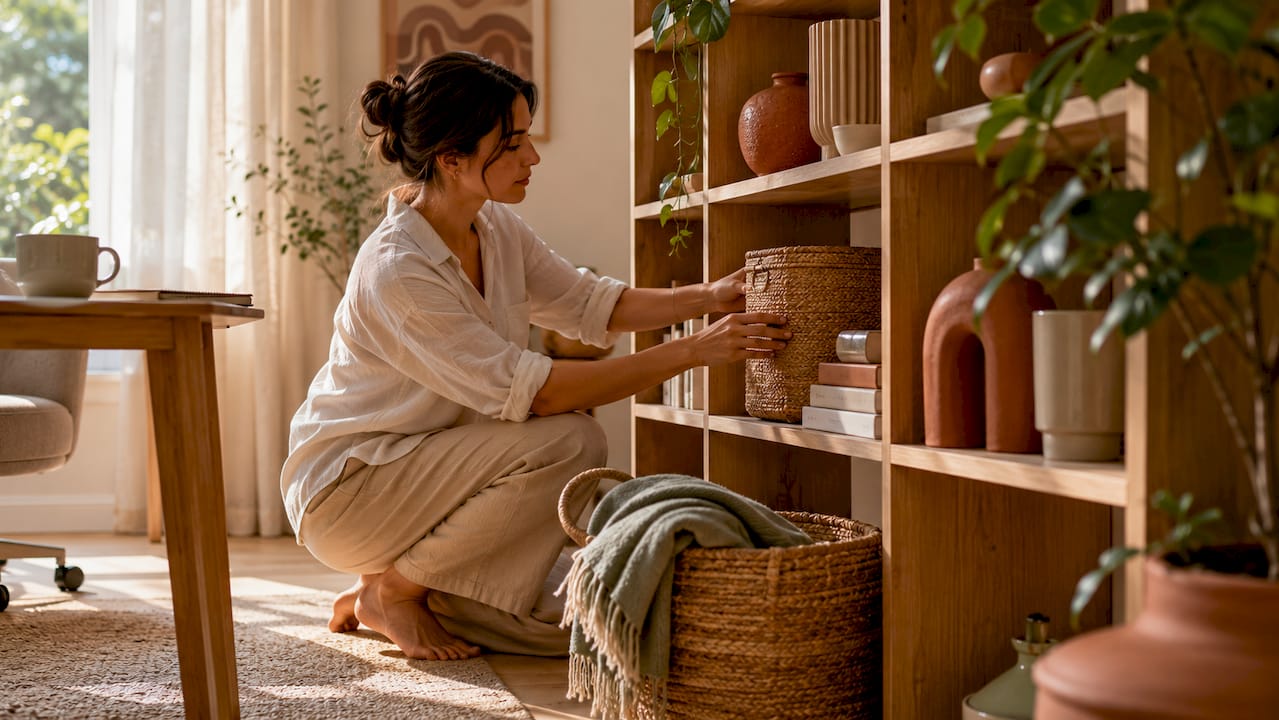
- Layer across surfaces. Apply your palette across walls, soft furnishings, and accessories rather than concentrating all colour in one place. A rug, a set of cushions, and a piece of artwork can carry your accent colour without requiring a feature wall.
- Avoid the most common mistakes. Using more than five colours in a single space creates visual noise. Ignoring undertones causes clashes between elements that appear neutral in isolation. Choosing colours based solely on trends rather than your room’s specific light and layout leads to palettes that feel dated within a year.
The significance of colour in decor is most apparent when a palette is applied with consistency. A room where the wall colour, curtain fabric, and cushion tones all share the same undertone family feels finished and considered, even when the individual pieces are modest in price.
Key takeaways
Colour palettes work because they create visual cohesion and psychological comfort through deliberate proportion, hue relationships, and context-aware selection.
| Point | Details |
|---|---|
| Start with fixed elements | Build your palette from flooring and cabinetry undertones before choosing wall colours. |
| Apply the 60-30-10 rule | Distribute dominant, secondary, and accent colours in proportion to avoid visual imbalance. |
| Test in real conditions | Evaluate large paint samples across different lighting conditions before committing to a colour. |
| Match hue to room function | Use cool, low-saturation tones for rest spaces and warm or energising hues for social areas. |
| Prioritise cohesion over trends | A palette built around undertone consistency outlasts seasonal colour trends every time. |
Colour palettes are design decisions, not decoration choices
I have seen homeowners spend thousands on furniture and accessories, then wonder why a room still feels off. Nine times out of ten, the issue is the colour palette. Not the individual colours, but the relationship between them and the light the room actually receives.
The most useful shift in thinking is treating colour as a structural decision rather than a finishing touch. When you choose your palette before you buy a single cushion or curtain, every subsequent purchase becomes easier. You are not hunting for something that “goes with” what you already have. You are selecting pieces that belong to a system you designed deliberately.
I would also push back on the idea that following trends is a useful starting point. Colour trends in home decor shift annually, but the principles of undertone harmony, saturation management, and proportion do not. A palette built on those principles will still feel right in five years. One built around whatever shade appeared in a magazine this spring probably will not.
The other thing worth saying plainly: colour choices affect daily living in ways that are easy to underestimate until you experience the difference. A bedroom repainted in a genuinely restful tone feels different to sleep in. A home office with the right balance of cool and warm tones feels different to work in. These are not subtle effects. They are the reason colour deserves the same careful attention as layout or lighting.
— Cristiano
Bring your colour palette to life with Homable
Once you have your palette planned, the next step is finding pieces that carry it through every corner of your home. Homable offers a curated selection of home decor and accessories designed to complement modern colour schemes, from textured cushions and statement rugs to ornaments and curtains that work across analogous and complementary palettes alike.
Every product at Homable is chosen with cohesion in mind, making it straightforward to layer your accent colours across soft furnishings and decorative accessories without the guesswork. Orders over £100 include free shipping, so you can build out your palette properly without compromise. Explore the full range and find the pieces that make your chosen scheme feel complete.
FAQ
What is a colour palette in interior design?
A colour palette in interior design is a curated selection of three to five hues applied across walls, furniture, and accessories to create visual cohesion and set the emotional tone of a space. The 60-30-10 rule is the most widely used guideline for distributing these colours in balanced proportions.
How does colour affect mood in a home?
Warm colours such as yellow and orange stimulate energy, while cool tones like blue and green promote calm. Low to mid-saturation shades are generally more comfortable for long-term living than vivid, high-saturation versions of the same hue.
Why does my paint colour look different on the wall than on the swatch?
Paint colours behave differently at room scale because light reflectance value, room orientation, and ambient lighting all shift how a colour reads. Swatch preferences do not reliably predict how a colour will feel in a real space, which is why testing large samples on-site is always necessary.
What is the 60-30-10 rule in home decor?
The 60-30-10 rule divides colour use into 60% dominant (walls and floors), 30% secondary (large furniture and curtains), and 10% accent (cushions, artwork, and accessories). It maintains visual interest and prevents any single colour from overwhelming the space.
How many colours should a room have?
Most well-balanced rooms use three to five colours, including neutrals. Using more than five distinct hues in a single space typically creates visual noise and makes the room feel unsettled rather than layered.