Cart
0

TL;DR:
- Creating a finished interior moodboard involves six key steps, from writing a clear brief to annotating each item with sourcing details.
- A tight, decision-focused board helps translate inspiration into a practical shopping list that can be acted on.
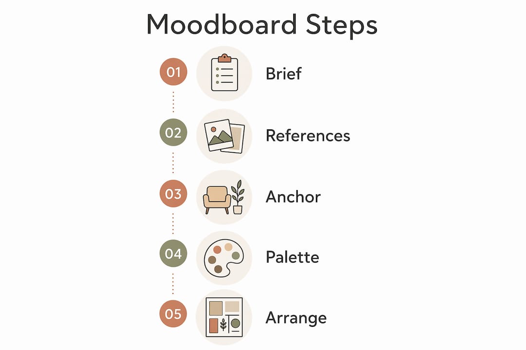
A finished, shopping-ready interior moodboard takes six steps: write a one-line brief, gather references with source metadata, choose an anchor piece, build a core colour palette with real swatches, arrange elements by decision, then annotate every item with a link, price and dimension. That sequence turns an inspiration collage into a document you can actually buy from.
Your six-step plan at a glance:
- Write a one-line design brief
- Gather references (save URL, price, dimensions for each)
- Choose your anchor piece
- Build palette and collect physical swatches
- Arrange elements by decision group
- Annotate and create your shopping list
The expected outcome: a tight board of a moderate number of elements and a procurement list ready to order from. Homable.co.uk is a practical sourcing option for rugs, curtains and accessories at each stage.
Table of Contents
- How do you build a moodboard step by step, from brief to finished board?
- How do you choose a colour palette that actually works in a room?
- Which tools should you use, and when is a roomboard better than a moodboard?
- How do you turn a moodboard into an actual shopping list?
- What mistakes do most people make, and how do you avoid them?
- Where do UK homeowners find the best moodboard inspiration?
- Key takeaways
- The moodboard as a decision document, not a mood
- Find the pieces for your board at Homable
How do you build a moodboard step by step, from brief to finished board?
The one-line design brief is the highest-leverage step most homeowners skip. Write it before you open Pinterest. Something like: “Calm, airy bedroom using natural linen, pale oak and a single terracotta accent.” Pin it at the top of your board and read it before adding anything.
Step 1: Write the brief. One sentence. Name the mood, the dominant material and the accent. If an image you find later does not serve that sentence, it does not belong on the board.
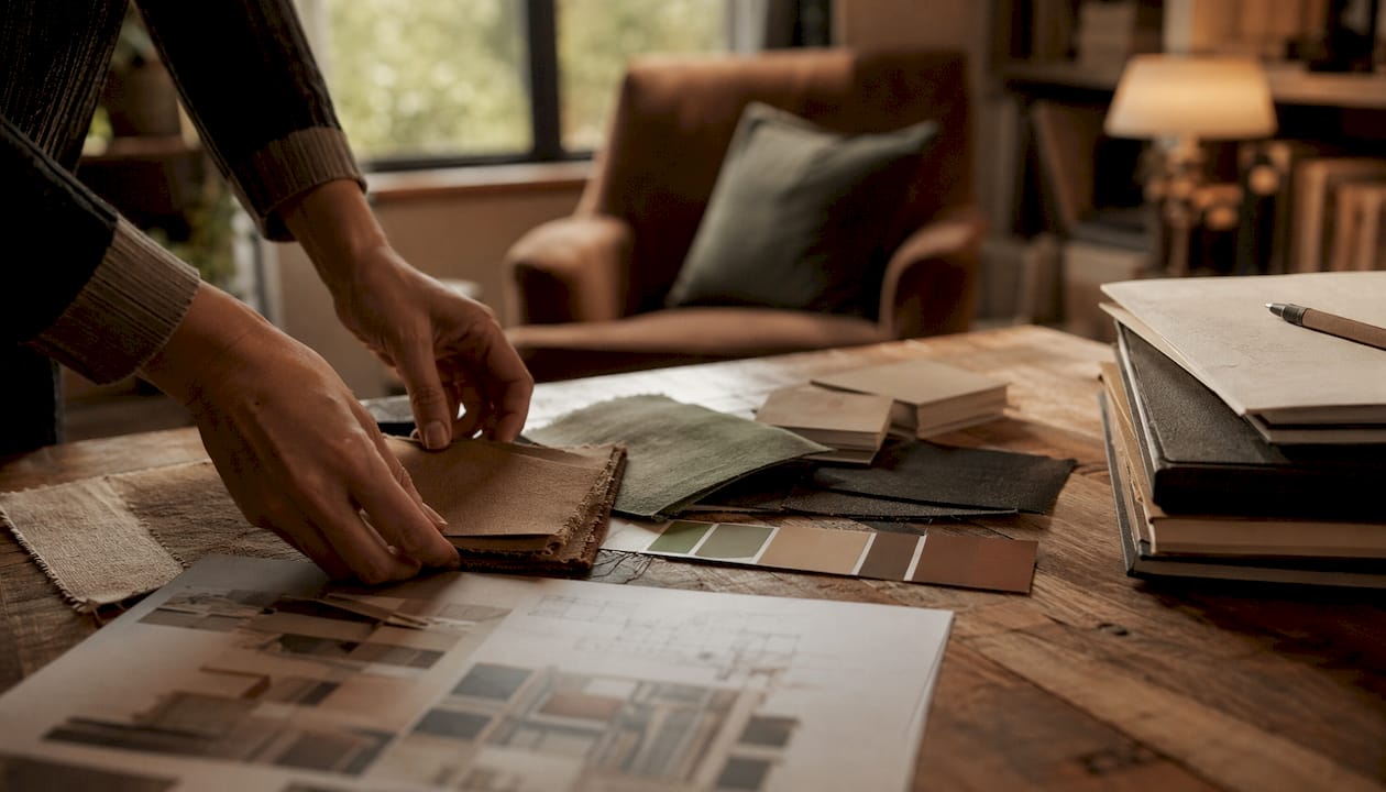
Step 2: Gather references. Collect full-room shots, product images and texture close-ups. For every image, save the source URL, the price and the key dimension. This metadata is what separates a shopping list from a pretty collage. Also measure your room at this stage: wall lengths, ceiling height, window widths and doorway clearances. Furniture that cannot fit through the door is a costly lesson.
Step 3: Choose your anchor piece first. Matching colours to the anchor reduces rework later. The anchor is usually the most permanent or expensive item: a sofa, a rug, a fitted wardrobe. Everything else responds to it.
Step 4: Build palette and gather swatches. Keep the palette to 3–5 colours: a base neutral, 1–2 supporting tones and 1–2 accent hues. Fewer than three and the room feels flat; more than five and it starts to fight itself. Order physical samples where possible; a paint chip photographed next to your anchor piece tells you more than any screen.
Step 5: Arrange by decision group. Place palette swatches together, materials together, furniture together. This layout makes gaps obvious: if you have no flooring swatch, you know what is missing.
Step 6: Annotate and tighten. Write one short rationale next to each element linking it back to the brief. Then edit ruthlessly: a concise board with a limited number of elements beats an overly large collection. Remove anything that does not serve the brief.
Printable step checklist:
- [ ] One-line brief written and pinned
- [ ] Room measured (walls, ceiling, doorways, windows)
- [ ] References gathered with URL, price, dimensions
- [ ] Anchor piece confirmed
- [ ] Palette swatches ordered or photographed
- [ ] Elements arranged by decision group
- [ ] Each item annotated with rationale and procurement details
- [ ] Board edited to roughly 12–20 elements
Pro Tip: When gathering images, remove backgrounds and keep swatch sizes consistent across the board so the layout reads as decisions, not decoration.
How do you choose a colour palette that actually works in a room?
Design experts recommend a core palette of several colours: a base neutral, supporting tones, and accent hues. Fewer than three and the room feels flat; more than five and it starts to fight itself.
The 60/30/10 layering rule distributes visual weight: 60% base colour, 30% secondary tones, and 10% accent hues to keep the room balanced. It is not a rigid formula, but it prevents any single colour from dominating accidentally.
| Palette layer | Visual weight | Typical elements |
|---|---|---|
| Base neutral | 60% | Walls, main sofa or bed frame |
| Supporting tone | 30% | Rug, curtains, secondary furniture |
| Accent hue | 10% | Cushions, ceramics, artwork |
Name your palette’s temperature in one word before you finalise it: warm, cool, earthy or moody. That single word becomes a quick decision test. If a swatch you love does not fit the word, it will cause style drift. The Homable colour palette guide and palette examples for UK homes are useful references when you are narrowing down options.
Swatch testing in practice:
- View swatches in the room at morning, midday and evening light
- Photograph samples together against the anchor piece
- Check for temperature clashes: a cool grey beside a warm cream reads as dirty, not neutral
- For window treatments, shutter colour matching against fixed finishes is worth checking before committing
Pro Tip: Photograph all your swatches together on a white sheet of paper. The camera does not lie about temperature clashes the way your eye does under artificial light.
Which tools should you use, and when is a roomboard better than a moodboard?
For most homeowners, Canva or Milanote cover the basics well. Canva’s background-removal tool is particularly useful for cleaning up product images. Milanote suits those who want a more freeform, pinboard-style layout. MoodBoardAI generates initial layouts quickly if you are starting from scratch.
Physical samples remain superior for tactile accuracy. A linen swatch beside a painted wall tells you something a screen cannot replicate.
Moodboard vs roomboard: which format fits your situation?
| Format | Best for | Limitation |
|---|---|---|
| Classic moodboard | Aesthetic alignment, early-stage mood setting | Does not show scale or placement |
| Roomboard (perspective scene) | Emotional buy-in and scale visualisation | Takes longer to build |
A roomboard places furniture and accessories into a perspective view of the actual room. It is the format to use when you need to confirm that a sofa fits visually, not just on paper. For sharing with a tradesperson or taking to a tile shop, a PDF roomboard printed at A4 is the most useful format. For quick phone reference while shopping, a JPG of the classic moodboard works fine.
Pro Tip: When preparing images for a roomboard, crop product shots to remove packaging and keep all swatches at the same physical size on screen. Inconsistent sizing is the fastest way to misjudge scale.
How do you turn a moodboard into an actual shopping list?
The moodboard becomes a procurement document the moment you attach metadata to every element. For each item, record: product name, supplier URL, dimensions, price and any relevant batch or finish code. This converts a concept into a procurement list and removes guesswork at the point of purchase.
Measurement checklist before ordering:
- Wall lengths (all four walls, including alcoves)
- Ceiling height
- Window width and drop
- Doorway width and height (for furniture delivery)
- Existing furniture footprint if keeping any pieces
For budget allocation, invest most heavily in the anchor piece, the rug and lighting. These three elements have the greatest visual impact and are the hardest to swap out later. Accessories and soft furnishings can be refreshed seasonally at lower cost.
| Budget priority | Rationale |
|---|---|
| Anchor piece (sofa, bed, fitted unit) | Most permanent; sets the palette |
| Rug | Defines zones; affects acoustics and warmth |
| Lighting | Changes the mood of every other element |
| Curtains and window treatments | Large visual area; affects light quality |
| Accessories and ceramics | Easiest to swap; buy last |
For UK homeowners, allow four to eight weeks between ordering samples and placing final orders, particularly for made-to-measure curtains or bespoke rugs. Build in a returns window: most UK retailers offer 14–30 days, so stagger orders rather than buying everything at once.
Pro Tip: Always record the batch or lot number when ordering tiles, paint or fabric. Reordering from a different batch can produce a visible colour shift, even within the same product line.
What mistakes do most people make, and how do you avoid them?
The most common failure is collecting without editing. A board with 60 images is not a plan; it is a mood. The second is using non-purchaseable inspiration: a hotel lobby photograph looks beautiful but cannot be sourced. Every image on a working board should link to something you can actually buy.
Final checklist before you buy:
- [ ] One-line brief still matches the finished board
- [ ] Palette temperature consistent throughout (all warm or all cool)
- [ ] Materials compatible (no clashing finishes, e.g. high-gloss beside rough-hewn)
- [ ] All measurements confirmed against room dimensions
- [ ] Every item has a supplier link, price and dimension noted
- [ ] Largest or most permanent item ordered first
- [ ] Swatch samples received and approved in situ
Scale errors are the most expensive mistake. A rug that looks generous on screen can look like a bath mat in a large living room. Always check the stated dimensions against your floor plan before ordering.
Pro Tip: Buy the largest or most permanent item first. Once the sofa or fitted wardrobe is in place, every subsequent decision becomes easier and cheaper to get right.
Where do UK homeowners find the best moodboard inspiration?
Curated sources worth bookmarking:
- Livingetc, House & Garden and Homes & Gardens for UK-relevant room photography
- Homable’s room-by-room decor guide for practical, purchase-ready ideas
- Pinterest boards organised by room type and palette temperature
- Retailer lookbooks (particularly useful for seeing products styled in context)
- Texture layering examples for understanding how finishes interact
Three ready-to-use one-line briefs by room:
- Living room: “Cosy mid-century sitting room using warm walnut, rust velvet and an off-white plaster wall.”
- Bedroom: “Calm, airy retreat with pale linen, bleached oak and a single sage green accent.”
- Kitchen: “Durable, tactile kitchen using matte slate tiles, brushed brass and natural wood open shelving.”
Each of these works as a brief for a board covering an open-plan space too: simply extend the palette to include a transitional zone colour that connects the two areas without repeating the accent hue.
Key takeaways
A shopping-ready interior moodboard requires a one-line brief, a core colour palette following the 60/30/10 rule, and product metadata attached to every element before you buy.
| Point | Details |
|---|---|
| Start with the brief | Write one sentence naming mood, material and accent before gathering any images. |
| Anchor piece first | Choose the most permanent item before finalising the palette to reduce rework. |
| Palette limit: 3–5 colours | Use the 60/30/10 rule to distribute base, supporting and accent tones across the room. |
| Annotate every element | Attach name, URL, price and dimensions to each item so the board doubles as a procurement list. |
| Homable for curated sourcing | Browse Homable’s rugs, curtains and accessories to find purchaseable items ready to add to your board. |
The moodboard as a decision document, not a mood
The most useful thing a moodboard does is force a decision before money is spent. The brief is not a creative exercise; it is a filter. Every image that does not pass the filter is a potential purchase mistake waiting to happen.
Where most guides focus on making boards look beautiful, the more useful skill is making them tight. A board that a builder, a delivery driver or a shop assistant can read and act on is worth ten beautifully curated collages that exist only on screen.
The anchor-first approach changes how the whole process feels. Instead of chasing a mood and hoping products materialise, you start with something real and let everything else respond to it. That shift from aspiration to decision is where moodboards become genuinely useful tools rather than pleasant distractions.
Find the pieces for your board at Homable
Once your board is annotated and your measurements are confirmed, the next step is sourcing. Homable stocks a curated range of rugs, mats and curtains chosen for modern UK homes, with free shipping on orders over £100.
For living-room boards, the Baluchi Cannon Pink Woolen Rug works as a warm anchor layer in earthy or mid-century palettes. Kitchen boards benefit from a practical option like the washable coffee-black velvet rug, which holds up to daily use without sacrificing texture. For bathrooms, the soft bath and pedestal mat set adds a tactile finishing layer that photographs well on a board and performs in practice.
Browse the full collection at Homable.co.uk and add product links directly to your moodboard annotations as you shop.