Cart
0

TL;DR:
- Colour influences user impressions before reading any text and should be used systematically within a governed system. Research shows that up to 90% of snap judgments and 80% of brand recognition rely on effective colour use, emphasizing the importance of contrast and consistency to improve usability and accessibility. Testing luminance contrast and validating emotional associations through A/B tests ensures colour decisions positively impact user experience and meet accessibility standards.
Colour is one of the fastest signals in UX. Before a user reads a word, colour has already shaped their first impression, directed their attention, and begun forming a judgement about quality. Applied as a governed system, it changes task success rates, reduces cognitive load, and strengthens brand recognition. Applied carelessly, it creates fatigue, confusion, and accessibility failures that quietly drive users away.
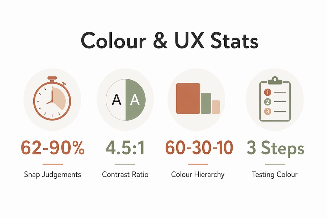
The evidence is hard to ignore. Research cited by the Institute for Color Research shows that 62–90% of snap product judgements are based on colour alone. A University of Loyola study found that effective colour use can increase brand recognition by up to 80%. And the W3C’s WCAG standards set the accessibility floor: 4.5:1 contrast for normal text, 3:1 for large text.
The practical implication: build a colour system using the 60-30-10 rule for hierarchy, and test CTAs by luminance contrast against their background, not by hue alone.
Table of Contents
- What does the research actually say about colour and UX?
- How does colour actually work in the mind?
- What design principles help you build a colour system that works?
- What are the accessibility requirements for colour in the UK?
- How do you test whether a colour decision actually works?
- Which tools help you build and verify accessible colour systems?
- Six steps to implement colour as a UX system
- Key takeaways
- Why colour deserves more rigour than it usually gets
- Useful sources and further reading
What does the research actually say about colour and UX?
The headline figures above deserve context, because they are often cited without nuance.
| Finding | Figure | Source |
|---|---|---|
| Snap product judgements based on colour | 62–90% | Institute for Color Research |
| Brand recognition improvement with effective colour | Up to 80% | University of Loyola |
| WCAG contrast ratio, normal text | 4.5:1 | W3C WCAG 2.2 |
| WCAG contrast ratio, large text | 3:1 | W3C WCAG 2.2 |
| Most common web accessibility failure | Low-contrast text | WebAIM Million 2026 |
The snap-judgement figure is particularly striking. It does not mean users consciously evaluate colour; it means the judgement happens before deliberate thought kicks in. That is the preattentive processing system at work, and it is why colour decisions made late in a project, as an afterthought, tend to undermine work done everywhere else.
A cross-cultural study on colour in HCI found that consistent colour principles improve usability across cultural contexts, which matters for any UK product with an international audience. Colour, used systematically, functions as a shared design language.
The WebAIM Million 2026 analysis confirms that low-contrast text remains the most frequent accessibility failure on the web. That is not a niche concern: it affects every user under poor lighting conditions, on low-quality screens, or with any degree of visual impairment.
How does colour actually work in the mind?
Colour is processed preattentively, meaning the visual system registers it before conscious attention is directed. That gives it outsized influence on first impressions and time-to-first-action. A red error state or a high-contrast CTA button registers before the user has decided where to look.
Consistent colour mapping reduces cognitive load by building pattern recognition. When green always means success and amber always means a warning, users stop spending mental effort decoding status and spend it on the task instead. Inconsistency does the opposite: it reads as instability and erodes trust.
Hue, saturation, and value each carry different functional weight in a UI. Hue signals association; saturation controls visual intensity; value (lightness) is the primary driver of contrast and legibility. Designers who adjust only hue while ignoring value often produce interfaces that look fine on a calibrated monitor but fail in real-world conditions.
Emotional associations are real but context-dependent. Blue reads as trustworthy in a banking app and cold in a food-delivery interface. Red signals urgency in a sale banner and danger in an error message. Cultural context shifts these associations further.
Pro Tip: Treat every colour–emotion association as a testable hypothesis, not a fact. Specify the hue, saturation, and lightness values, then run an A/B test with your actual audience before committing.
What design principles help you build a colour system that works?
System thinking is the difference between colour that holds together across a product and colour that drifts into inconsistency the moment a second designer joins the project.
Define roles before choosing shades. Assign a primary colour (dominant, ~60% of visual space), a secondary colour (~30%), and an accent (~10%). The 60-30-10 rule creates hierarchy without chaos. Research also suggests cool-hue backgrounds increase focus in extended work sessions, while warm accents boost engagement during browsing.

Contrast is a function of luminance, not hue. CTA performance depends on luminance contrast with the surrounding background, not on the button’s colour. A green button on a green page will underperform a grey button on a white page. Test CTAs in their live environment, because isolated lab results can reverse when the surrounding colour context changes.
Semantic mapping prevents confusion. Reserve specific colours for status states: success, warning, error, and information. Keep those mappings consistent across every component. If green means “success” in a form, it cannot mean “premium tier” in a pricing table.
Palette fit matters as much as palette beauty. Consumers judge colour–brand fit more than individual colour meaning. A palette that differentiates from category conventions while still signalling category belonging is more effective than one chosen purely for aesthetic appeal.
Tokenise everything. Design tokens (named variables for each colour role) prevent palette drift when teams scale. Document light and dark mode variants, component states, and session-type recommendations.
Pro Tip: When a stakeholder requests “use blue because it means trust,” convert that into a scoped hypothesis: specify the exact lightness and saturation values, define the metric, and plan the test. That conversation alone often surfaces assumptions worth examining.
What are the accessibility requirements for colour in the UK?
WCAG 2.2 sets the baseline: 4.5:1 contrast ratio for normal body text, 3:1 for large text (18pt or 14pt bold). These are not aspirational targets; for public-sector and regulated-service interfaces in the UK, meeting WCAG 2.1 AA is a legal expectation under the Public Sector Bodies Accessibility Regulations 2018.
The GOV.UK Design System applies these principles in practice, with documented colour roles, semantic usage patterns, and accessible component states. Even teams building commercial products benefit from aligning with its approach, particularly for form elements and status indicators.
The two most common failures are low-contrast body copy (often faint grey on white, chosen for a “modern” aesthetic) and relying on colour alone to convey status. Faint grey-on-white text measurably increases reading effort and is a documented source of user fatigue. Colour-blind users, roughly 8% of men and 0.5% of women, cannot distinguish red from green at similar values, making a red/green success-error pattern invisible to a significant portion of your audience.
Accessibility checklist before shipping any colour decision:
- Run automated contrast checks using axe or Lighthouse against WCAG thresholds.
- Export the design in greyscale and verify that all status and hierarchy information is still legible.
- Run a colour-blindness simulation (Coblis or Sim Daltonism) for deuteranopia and protanopia.
- Confirm every status indicator has a redundant cue: an icon, a label, or a pattern alongside the colour.
- Test on a low-quality or mobile screen in bright ambient light.
How do you test whether a colour decision actually works?
Opinion about colour is cheap. Evidence is not, but it is achievable with a clear methodology.
Start by converting the decision into a hypothesis: “Increasing the luminance contrast of the primary CTA button from 3.2:1 to 7:1 against its background will increase click-through rate by at least 10% over four weeks.” That format forces specificity about what is being changed, what is being measured, and what counts as a meaningful result.
For A/B testing colour decisions:
- Define primary metrics before the test: click-through rate, conversion rate, time-to-task, or task success rate.
- Track secondary signals: scroll depth, error rate, and session duration.
- Avoid running tests on pages with insufficient traffic; underpowered tests produce noise, not signal.
- Control for confounding variables: do not change copy, layout, or placement at the same time as colour.
- Watch for seasonality effects, particularly relevant for retail and home décor audiences.
When traffic is too low for a clean A/B test, staged rollouts with instrumentation or qualitative usability sessions are more honest than a statistically underpowered split test. A moderated session asking users to complete a task on two colour variants, with think-aloud protocol, often surfaces problems that quantitative data misses entirely.
Practical effect size matters as much as statistical significance. A 1% lift that reaches p < 0.05 in a large-traffic test may not justify the engineering cost of a colour change. Set a minimum detectable effect threshold before the test begins.
Which tools help you build and verify accessible colour systems?
Contrast and accessibility:
- axe DevTools and Google Lighthouse for automated WCAG audits
- WebAIM Contrast Checker for quick ratio verification
- Coblis and Sim Daltonism for colour-blindness simulation
- GOV.UK Design System colour documentation for semantic role references
Palette building and visualisation:
- Adobe Color for palette generation and harmony checking
- Coolors for rapid palette exploration and export
- Figma’s built-in contrast plugin for in-context checks during design
Design system references:
- W3C WCAG 2.2 documentation for contrast thresholds and success criteria
- GOV.UK Design System for accessible component patterns
- Homable’s colour psychology blog posts as working examples of palette application in a real product context
Prefer tools that report luminance-based contrast ratios rather than hue-only metrics. A tool that tells you two colours “look different” without measuring their luminance relationship is not sufficient for accessibility compliance.
For teams working on home services or renovation projects, commercial renovation contexts often surface colour validation challenges that parallel digital UX decisions, particularly around how colour signals quality and trust to first-time visitors.
Six steps to implement colour as a UX system
- Map category conventions. Research what colours dominate your product category and identify visual white space where your palette can differentiate while still signalling category belonging.
- Define brand personality and colour roles. Set primary, secondary, and accent colours using the 60-30-10 rule. Assign semantic roles: success, warning, error, information.
- Create design tokens. Document light and dark mode variants, component states, and session-type colour recommendations. Name tokens by role, not by value (“colour-success” not “colour-green”).
- Run accessibility checks. Use axe and Lighthouse for automated audits, then run the greyscale and colour-blindness simulation tests from the checklist above. Fix every low-contrast area before shipping.
- A/B test key CTAs. Frame each test as a luminance-contrast hypothesis, define your metrics, and run the test in the live environment with sufficient traffic.
- Ship tokens to engineering and set governance. Assign a governance owner, document the token library, and schedule a quarterly palette review to catch drift before it compounds.
Pro Tip: Assign a named governance owner for the colour system, not just a document. Without a person responsible for quarterly reviews, palette drift is inevitable as new components get added outside the system.
Key takeaways
Colour shapes user experience before a single word is read: build it as a governed system, test it with luminance-contrast hypotheses, and validate it against WCAG thresholds before shipping.
| Point | Details |
|---|---|
| Colour drives snap judgements | 62–90% of product judgements are based on colour alone, before copy is read. |
| Systems beat ad-hoc choices | Apply the 60-30-10 rule and tokenise colour roles to prevent palette drift. |
| Luminance trumps hue for CTAs | CTA performance depends on luminance contrast with the background, not button colour. |
| Test colour–emotion links | Treat associations as hypotheses; specify hue, saturation, and lightness, then A/B test. |
| Accessibility is the baseline | Meet WCAG 4.5:1 and 3:1 thresholds and add redundant cues for every status indicator. |
Why colour deserves more rigour than it usually gets
Most colour decisions in product teams are made by feel, defended by analogy (“our competitor uses blue”), and never tested. The research tells a different story. Colour is processed before attention, shapes trust before interaction, and fails users silently when contrast is inadequate.
At Homable, applying these principles means more than choosing a palette that looks appealing. Our colour palette guides and interior colour posts reflect the same system-level thinking: define roles, test contrast, and validate emotional associations with real audiences rather than inherited assumptions.
The gap between what colour promises and what it actually delivers in UX almost always comes down to one thing: teams treat it as decoration rather than as a functional system. When you tokenise roles, test luminance contrast, and run accessibility checks before shipping, colour stops being a source of debate and starts being a source of measurable performance.
Useful sources and further reading
| Source | What it supports |
|---|---|
| Institute for Color Research / University of Loyola | Snap judgement (—) and brand recognition (up to 80%) statistics |
| Cross-cultural HCI colour study (DOI) | Evidence that consistent colour principles improve cross-cultural usability |
| Capicua: colour theory in UX | Cognitive load, WCAG ratios, low-contrast failure data, grey-text fatigue |
| ColorArchive: colour psychology in product design | Luminance contrast for CTAs; colour–emotion hypothesis testing |
| Smashing Magazine: psychology of colour in UX | Hue, saturation, and value functional roles in UI |
| Nielsen Norman Group: colour in design | 60-30-10 rule; session-type colour effects |
| W3C WCAG 2.2 | Contrast ratio thresholds (4.5:1 and 3:1) and accessibility success criteria |
| GOV.UK Design System | UK-relevant accessible component patterns and semantic colour roles |
| UserTesting: colour and UX | Colour blindness prevalence; contrast and CTA click-through evidence |
| Homable colour psychology blog | Applied palette examples in a real product context |
| Decorative Silver Flower Candle Holder | Homable product example illustrating colour and styling principles |