Cart
0
TL;DR:
- Color is the most impactful element in interior design, shaping impressions within seconds and affecting mood and behavior. Choosing appropriate hues based on room function, using color schemes like complementary or analogous, and testing colors under different lighting conditions are essential for effective room styling. Personal preferences and emotional goals should guide color choices, while small changes like accent pieces can create a significant mood impact.
Colour is the single most powerful tool in interior design, shaping how a room feels before you notice a single piece of furniture. Visitors judge a room within 90 seconds, with up to 90% of that assessment based on colour alone. That figure reframes colour from a decorative afterthought into a primary design decision. The role of colour in interior design extends well beyond aesthetics: it governs mood, alters perceived space, and directly affects how you behave in a room. Understanding colour psychology gives you the tools to make those effects work in your favour.
How does colour affect mood and behaviour in the home?
Colour is a functional tool for well-being, not mere decoration. The psychological effects of different hues are well documented, and they operate whether you are conscious of them or not.
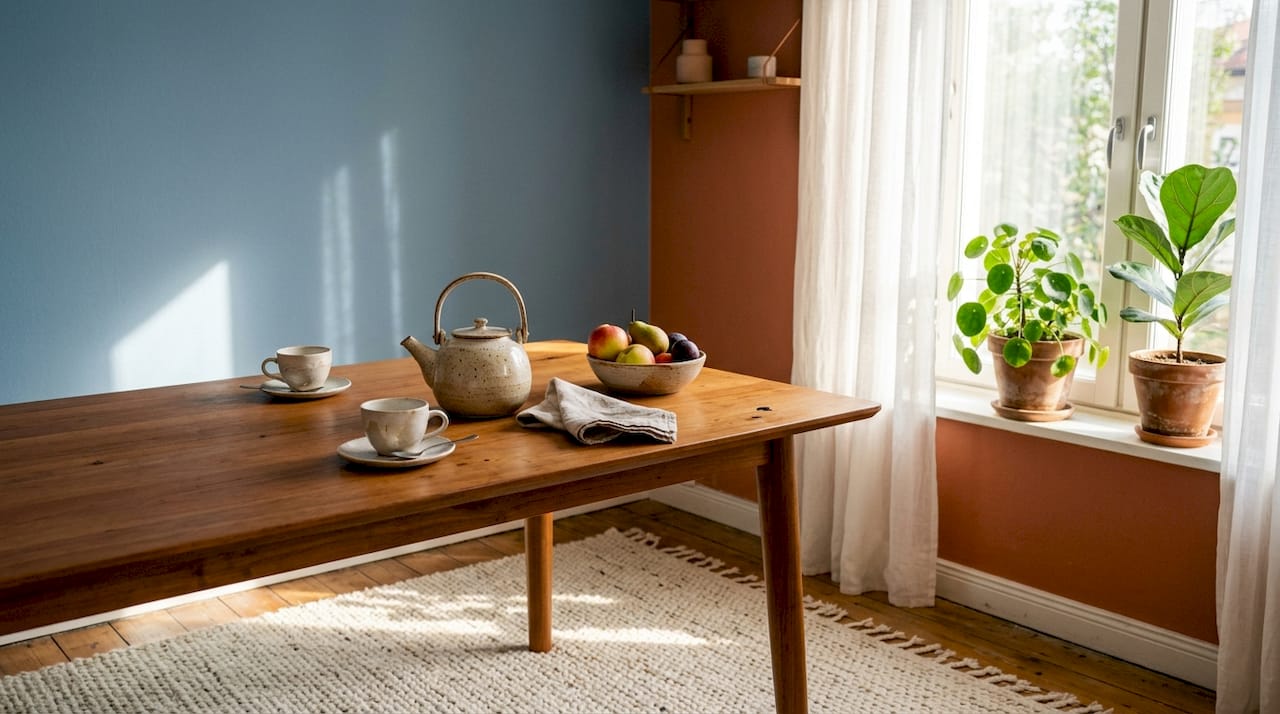
Warm colours sit at the red, orange, and yellow end of the spectrum. Warm colours stimulate energy and appetite, which is why they work well in dining rooms and kitchens where you want conversation and activity. A terracotta accent wall in a living room creates a sense of warmth and sociability that a grey wall simply cannot replicate.
Cool colours, particularly blues and greens, do the opposite. Cool colours promote calm and focus, making them the natural choice for bedrooms, bathrooms, and home offices. A sage green bedroom feels physically quieter than a red one. That is not imagination; it is colour psychology at work.
The emotional impact of a colour does not rest on hue alone. Purity and saturation shape emotional impact as much as the colour itself. A dusty, muted blue reads as restful. A vivid cobalt of the same hue reads as energising. Colour effects are also mediated by personal history, cultural background, and the quality of natural light in your home. A shade that feels cheerful in a south-facing room can feel cold in a north-facing one.
Ingrid Fetell Lee, author of Joyful, argues that colour is one of the most direct routes to emotional experience in a physical space. Her research points to saturated, pure colours as the strongest mood signals, while muted tones create subtler, more sustained emotional effects.
- Red and orange: stimulate appetite, energy, and conversation. Best used in dining rooms and social spaces.
- Yellow: lifts mood in small doses. Excess bright yellow can cause sensory overload, so use it as an accent rather than a dominant wall colour.
- Blue: reduces heart rate and promotes calm. Ideal for bedrooms and bathrooms.
- Green: balances energy and calm, and connects a space to nature. Works well in home offices and living rooms.
- Neutral tones: provide visual rest and flexibility, but undertones matter enormously (more on this below).
Pro Tip: Before committing to a wall colour, live with a large painted swatch for at least a week. Observe it in morning light, afternoon sun, and under your evening lamps. The colour you see on a paint chip is rarely the colour you live with.
What principles guide effective colour scheme selection?
Professional designers use the colour wheel as a roadmap to build harmony. The three most useful relationships are complementary, analogous, and triadic.
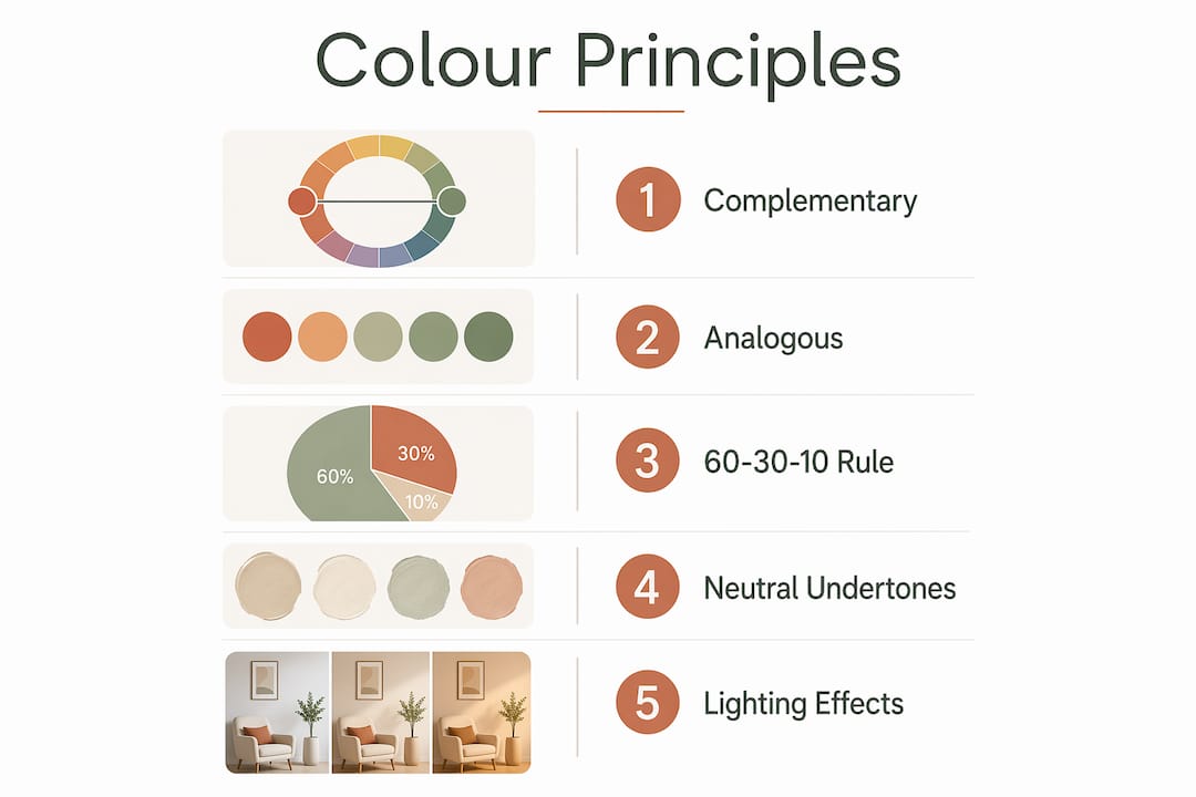
Complementary colours sit opposite each other on the wheel, such as navy and burnt orange, or forest green and terracotta. They create visual tension and energy. Used well, they make a room feel dynamic. Used carelessly, they create visual noise.
Analogous colours sit next to each other on the wheel: sage green, olive, and warm yellow, for example. They produce a calm, cohesive feel. Most restful interiors rely on analogous palettes. Triadic schemes use three colours equally spaced around the wheel and work best when one colour dominates and the other two appear as accents.
The 60-30-10 rule is the industry-standard framework for colour balance. Sixty percent of the room uses the dominant colour, typically walls and large upholstery. Thirty percent goes to a secondary colour, often curtains, rugs, or a sofa. Ten percent is the accent, applied through cushions, artwork, or accessories. This ratio prevents a room from feeling either chaotic or flat.
One of the most common mistakes homeowners make is ignoring undertones in neutrals. Mismatched undertones cause visible clashes even when all the colours appear neutral at first glance. A warm-toned cream wall paired with a cool-grey sofa will fight each other. Identifying whether your neutrals lean warm (yellow, red, or brown undertones) or cool (blue, green, or purple undertones) and keeping them consistent is the single fastest way to improve a room’s cohesion.
Pro Tip: Pull the undertone from your largest fixed element, whether that is your flooring, kitchen cabinetry, or a stone fireplace, and build your palette from there. Fixed elements cannot be changed easily; your paint colour can.
For practical palette inspiration tailored to modern British homes, the stylish colour palette examples at Homable show how these principles translate into real rooms.
How to choose colours for different rooms and spaces?
The function of a room should drive its colour palette. A bedroom serves a different purpose to a kitchen, and the colours you choose should reflect that difference.
Living rooms
Colour schemes for living rooms benefit from warm, mid-toned hues that encourage sociability without overstimulating. Terracotta, warm taupe, dusty rose, and olive green all work well. Avoid very dark walls unless the room receives strong natural light; dark colours in poorly lit rooms can feel oppressive rather than cosy.
Bedrooms
Cool, muted tones are the strongest performers in bedrooms. Soft blue, lavender, sage green, and warm grey all support the calm that sleep requires. Avoid high-saturation colours on all four walls; if you want a bold bedroom, apply it to a single feature wall behind the headboard.
Home offices
Green and blue hues enhance focus and reduce eye fatigue during long working hours. A muted teal or soft sage on the walls of a home office creates a productive environment without the clinical feel of stark white.
Small spaces
Warm colours advance visually while cool colours recede, which means cool tones genuinely make small rooms feel larger. Pale blue, soft grey, and off-white are the best colours for small spaces. Painting the ceiling in the same tone as the walls, rather than white, also removes the visual boundary that makes a room feel box-like.
| Room | Recommended palette | Effect |
|---|---|---|
| Living room | Warm taupe, terracotta, olive | Sociable, energising, welcoming |
| Bedroom | Soft blue, sage green, warm grey | Restful, calming, sleep-supportive |
| Home office | Muted teal, sage, soft white | Focused, clear-headed, low fatigue |
| Small spaces | Pale blue, off-white, cool grey | Visually expansive, airy |
| Dining room | Deep red, warm amber, rich ochre | Appetite-stimulating, convivial |
For room-by-room guidance that goes beyond colour into furniture and accessories, Homable’s room-by-room decor tips offer practical starting points for each space.
What role does lighting play in colour perception indoors?
Lighting does not just illuminate colour. It actively changes it. The same paint colour can appear warm and inviting under incandescent light and cold and flat under cool LED light. This is why testing paint samples in situ at different times of day is non-negotiable before committing to a colour.
Lighting colour temperature modulates mood and alertness in measurable ways. Warm light (below 3,000 Kelvin) creates a relaxed, intimate atmosphere. Cool, bluish light (above 5,000 Kelvin) increases alertness and focus. Matching your lighting temperature to your colour palette amplifies the intended mood of the room.
Morning exposure to bright bluish-toned light for around 30 minutes improves mood, reduces depressive symptoms, and supports better sleep quality. This is a strong argument for designing east-facing rooms, particularly kitchens and breakfast areas, to maximise morning light rather than blocking it with heavy window treatments.
Practical lighting strategies that complement your colour scheme:
- Layer your light sources. Combine ambient, task, and accent lighting rather than relying on a single overhead fitting. This gives you control over the mood of a room at different times of day.
- Match bulb temperature to room function. Use warm bulbs (2,700–3,000 Kelvin) in bedrooms and living rooms. Use cooler bulbs (4,000–5,000 Kelvin) in home offices and kitchens.
- Use lighting to test colour. Before painting a full wall, observe your sample under every light source in the room, including lamps, overhead fittings, and daylight at different hours.
- Consider art and colour together. The way art shapes the mood of a room depends heavily on how it is lit; a warm spotlight on a cool-toned print will shift its perceived colour significantly.
Key takeaways
Colour is the most immediate and controllable factor in how a room feels, and applying it with intention produces measurably better results than choosing by instinct alone.
| Point | Details |
|---|---|
| Colour drives first impressions | Up to 90% of a room’s initial assessment is based on colour, making it the primary design decision. |
| Match hue to room function | Warm colours energise social spaces; cool colours support rest and focus in bedrooms and offices. |
| Use the 60-30-10 rule | Distribute colour as 60% dominant, 30% secondary, and 10% accent to prevent visual chaos. |
| Check undertones in neutrals | Mismatched undertones between walls, flooring, and upholstery create clashes even in neutral schemes. |
| Test colour under all light sources | Paint samples look different under natural, incandescent, and LED light; always test in situ before committing. |
Colour is personal, and that is the point
The most common mistake I see homeowners make is treating colour as a trend exercise. They pick a shade because it appeared in a magazine or performed well on social media, then wonder why it feels wrong in their own home. Colour psychology is real, but it is also personal. The effects of blue on mood vary with your history, your culture, and the quality of light in your specific room.
My honest advice is to start with how you want to feel in a space, not with how you want it to look. A bedroom should make you feel calm. A kitchen should feel energising. A living room should feel welcoming. Once you have that emotional brief, the colour choices become much easier to narrow down.
I also think homeowners underestimate the power of tonal layering. You do not need multiple colours to create depth and interest. A room decorated entirely in shades of warm white, from cream to linen to soft ivory, can feel extraordinarily rich if the textures and finishes vary. Colour does not always mean contrast. Sometimes it means nuance.
The practical tools available now, from digital room visualisers to large paint sample pots, remove most of the risk from colour decisions. Use them. Paint a metre-square swatch directly on the wall, live with it for a week, and observe it honestly. That one step eliminates the most expensive colour mistakes I have ever seen.
Bold colours work best as accents, not as the dominant note. A single terracotta cushion or a deep green ceramic vase can do more for a room’s mood than repainting every wall. Start small, observe the effect, and build from there.
— Cristiano
Colour inspiration and home styling ideas at Homable
Knowing the theory is one thing. Applying it to your own home is another. Homable brings together colour psychology guidance and a curated range of home accessories to help you put these principles into practice without the guesswork.
Whether you are refreshing a living room with new textiles, adding accent pieces to a bedroom, or rethinking an entire colour scheme, Homable’s colour palette resources give you a practical starting point. The range includes rugs, cushions, curtains, and ornaments chosen to complement modern British interiors across a range of palettes. Free shipping applies to orders over £100, and the collections are updated regularly with new arrivals. Visit Homable to find pieces that bring your colour choices to life.
FAQ
What is the role of colour in interior design?
Colour shapes mood, alters perceived space, and drives the first impression of any room. Up to 90% of an initial room assessment is based on colour alone, making it the most powerful single design decision a homeowner can make.
How does colour affect mood in the home?
Warm colours such as red, orange, and yellow stimulate energy and appetite, while cool colours like blue and green promote calm and focus. The saturation and purity of a colour also affect its emotional impact, with vivid tones producing stronger psychological signals than muted ones.
What are the best colours for small spaces?
Cool tones such as pale blue, soft grey, and off-white are the best colours for small spaces because cool colours recede visually, making a room feel larger and more open than warm tones do.
What is the 60-30-10 rule in interior design?
The 60-30-10 rule is the industry-standard framework for colour balance: 60% dominant colour on walls and large surfaces, 30% secondary colour on soft furnishings, and 10% accent colour on accessories and decorative objects.
How does lighting change the appearance of colour indoors?
Lighting colour temperature actively shifts how a paint colour appears. Warm bulbs make colours look richer and more amber-toned, while cool bulbs push colours towards blue and grey. Always test paint samples under every light source in a room before committing to a colour.