Cart
0
TL;DR:
- Use the 60-30-10 rule to create balanced and harmonious interior color schemes.
- Warm neutrals and earthy greens remain timeless, versatile choices for UK homes in 2026.
- Bold accents like deep blues and terracotta add drama and personality when applied thoughtfully.
Choosing a colour palette for your home can feel genuinely overwhelming. With hundreds of paint shades on the market, competing trends, and the unique challenge of British light (which is rarely as generous as a showroom suggests), many UK homeowners end up playing it safe with magnolia and beige. But there are proven frameworks and designer-approved palette combinations that make the process far more manageable, and far more rewarding. This article walks you through everything from foundational colour rules to the boldest 2026 trends, so you can choose with real confidence.
Table of Contents
- Frameworks for constructing a balanced colour palette
- Warm neutrals: Sophisticated and timeless schemes
- Earthy greens and olives: Returning to nature indoors
- Moody blues, terracotta, and bold accents: Dramatic and contemporary choices
- Testing and adapting palettes: Ensuring real-life success
- Our take: The overlooked art of building palettes with personality
- Enhance your home with statement accents
- Frequently asked questions
Key Takeaways
| Point | Details |
|---|---|
| Use the 60-30-10 rule | Balance dominant, secondary, and accent shades for a harmonious interior. |
| Warm and earthy tones win | Neutrals, olives, and chocolate browns are top UK trends in 2026. |
| Test in real conditions | Always check colours at different times of day and light directions. |
| Accent for personality | Try mustard, plum, or ‘unexpected red’ for a contemporary twist. |
Frameworks for constructing a balanced colour palette
With the complexity of colour choices in mind, let’s start by grounding ourselves in the key frameworks that designers use to craft harmonious palettes.
The most reliable starting point for any interior is the 60-30-10 rule, a core methodology for creating balanced colour palettes in interior design. In practical terms, this means 60% of your room uses a dominant, often neutral colour (think walls and large furniture), 30% uses a secondary tone (upholstery, curtains, a feature wall), and 10% lands as an accent (cushions, artwork, ornaments). The beauty of this formula is that it gives every colour a purpose and prevents any single shade from dominating to the point of fatigue.
Understanding the role of colour in design is also about knowing how the three categories relate to one another:
- Neutral base sets the overall mood and gives the eye somewhere to rest.
- Dominant colour creates atmosphere and personality across larger elements.
- Accent colour adds surprise, energy, and visual focus to the space.
“Colour palettes should integrate a neutral base, dominant colour for atmosphere, and accent for surprise, with materials like wood and metal as integral parts of any scheme.”
This is a point that many DIY decorators miss: materials are not separate from your palette. The warm honey of a solid oak floor, the cool gleam of brushed steel handles, and the soft nap of a wool rug are all contributing colours in the room’s composition. Deciding on these early, before you open a paint chart, is one of the most effective moves you can make.
When you are ready for the paint chart, the colour wheel offers a practical structure. Analogous palettes use colours sitting beside each other (sage, olive, and ochre), creating calm, unified rooms. Complementary palettes use opposites (navy and terracotta), generating contrast and energy. Monochromatic schemes layer one hue in different tones for a sophisticated, tailored effect. Understanding these relationships transforms colour selection from guesswork into a deliberate design decision.
Warm neutrals: Sophisticated and timeless schemes
Now that you know the basics, let’s explore some of the most popular palettes, starting with timeless warm neutrals.
Warm neutrals have long been a staple of British interiors, and in 2026 they remain firmly at the forefront. Popular 2026 palettes for UK modern homes lean heavily on warm neutrals such as Jitney from Farrow & Ball and Rolling Fog from Little Greene. These are not flat, cold whites or sterile greys; they carry undertones of pink, yellow, or stone that read as warmth against the grey skies typical of most of the UK.
What makes warm neutrals so enduring is that they do not tire. A living room dressed in a sandy, creamy palette still looks inviting after five years; a room painted in a saturated trend colour may feel dated in eighteen months. This is especially valuable for larger investments like sofas or fitted furniture.
Key elements of a warm neutral scheme include:
- Paint choices: Jitney (Farrow & Ball), Rolling Fog (Little Greene), and similar off-whites with pinkish or buff undertones
- Flooring and furniture: Pale oak, limed wood, and rattan for a relaxed, contemporary feel
- Textiles: Boucle, linen, and chunky knit throws in ivory, oatmeal, or sand
- Metals: Brushed brass and warm copper rather than chrome, which can read as cold
- Accent colours: Chocolate brown or caramel to add grounding depth
The interest in earthy tones is very much data-backed. UK search data shows earthy tones are up 22% year on year, with chocolate brown up 120% and khaki up 100%, confirming that this is not simply a niche interior design trend but a mainstream consumer shift. Following the latest design trends in 2026 means incorporating these earthy tones thoughtfully rather than chasing them blindly.
“Warm neutrals create a feeling of being held and sheltered, which is particularly powerful in UK homes where natural light is limited.”
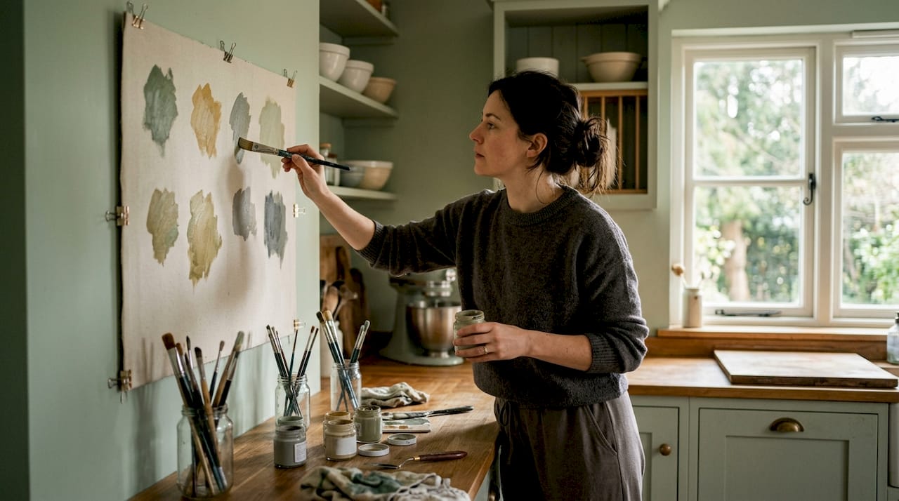
Pro Tip: If your living room feels cold or uninviting despite using neutral tones, check the undertone of your chosen paint. A neutral with a blue or green undertone will appear grey and stark in dim natural light. Always view paint samples in the evening under your home’s actual lighting, not just in the midday sun.
Pairing warm neutrals with affordable UK decor ideas does not mean sacrificing style. Layering textures (rough linen beside smooth ceramic, weathered wood beside polished stone) gives the palette dimension that keeps it visually interesting without needing bold colour.
Earthy greens and olives: Returning to nature indoors
Having explored the comforting role of neutrals, let’s look at nature-inspired greens, another pillar of 2026 palette trends.
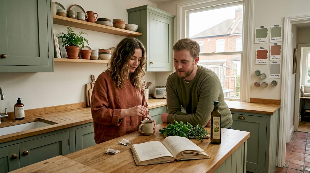
Green has moved decisively from bathroom feature wall novelty to a serious primary colour in modern British homes. Earthy greens and olives are among the most popular 2026 palettes for UK modern homes, and it is easy to understand why. They connect interior spaces to the natural world, reduce visual stress, and pair beautifully with the warm wood tones and natural materials that UK homeowners already love.
Olive and sage read very differently from each other in practice. Sage is softer and more silvery, lending itself to bedrooms and bathrooms where a gentle, spa-like calm is the goal. Olive is richer and more complex, working brilliantly as a kitchen cabinet colour or a dining room feature wall where you want presence without aggression. Both shades are remarkably versatile when used as stylish room accents or as the dominant colour in a room.
| Shade | Best used as | Pairs with | Ideal rooms |
|---|---|---|---|
| Sage | Secondary or accent | Cream, blush, pale oak | Bedroom, bathroom |
| Olive | Dominant or secondary | Warm wood, terracotta, rust | Kitchen, dining room |
| Forest green | Statement or drenching | Brass, leather, dark walnut | Living room, study |
| Moss | Accent or secondary | Stone, cream, linen | Any room |
Knowing which rooms suit green most naturally is important. North-facing rooms benefit enormously from olive and forest green tones because these warm up the cool blue light that north-facing aspects cast throughout the day. Kitchens are perhaps the most fashionable location for green in 2026, with painted cabinetry in deep olive or sage becoming a widely desirable alternative to grey.
Key tips for using green effectively:
- Start with green cabinetry or a single feature wall before committing to full room drenching
- Pair with warm brass hardware rather than chrome to keep the look grounded rather than clinical
- Add terracotta or rust as a complementary accent to prevent the scheme from feeling too cold or botanical
- Use natural materials such as jute, rattan, or unfinished wood to reinforce the nature-inspired theme
Pro Tip: If you are unsure whether a green shade suits your room, hold the paint swatch next to the natural materials already in the space (your floor, a wooden door frame, a piece of furniture). Green that clashes with the existing wood tones will rarely improve over a full wall.
Moody blues, terracotta, and bold accents: Dramatic and contemporary choices
For those craving more drama or personality, the next colour families unlock contemporary style and bold statements.
Deep blues and terracotta represent a distinctly confident direction in British interior design. Moody blues, navy, terracotta, and clay are among the standout palette directions for UK homes in 2026, and they reward bold application. Navy on all four walls of a dining room, for instance, creates an intimate enclosure that makes candlelit dinners feel genuinely atmospheric. Terracotta in a living room brings warmth that artificial lighting flatters brilliantly during the long British evenings.
The accent colours that work best with these deeper tones might surprise you:
- Mustard yellow beside navy reads as classically sophisticated, reminiscent of traditional British townhouse interiors updated for modern tastes.
- Plum and aubergine beside a clay or terracotta base creates a richly layered, almost jewel-like effect that photographs beautifully.
- Unexpected red used sparingly in artwork, a single chair, or a throw can act as the most effective accent of all, lifting a moody scheme with striking energy.
“Contrast the 60-30-10 harmony with ‘unexpected red’ or drenching for drama; experts favour natural pigment paints for psychological warmth.”
One technique worth knowing is colour drenching: painting not just the walls but also the ceiling, skirting boards, and architrave in the same or very similar shade. This approach removes all the visual interruptions in a room and makes the chosen colour feel intentional and immersive rather than accidental. It works particularly well with deep blues, greens, and terracotta in rooms where natural light is limited. When done with the right shade, it can feel genuinely luxurious rather than heavy.
Staying current with design trends that enhance UK homes in 2026 means understanding that restraint is not always the most effective strategy. Sometimes commitment to a bold scheme is exactly what a space needs. Looking at best sellers for 2026 confirms that consumers are increasingly choosing accessories and textiles in deeper, richer tones to match these ambitious palette choices.
Testing and adapting palettes: Ensuring real-life success
Selecting colours is only half the journey; now, discover how to adapt and perfect your palette in real spaces.
One of the most expensive decorating mistakes UK homeowners make is choosing a paint colour from a tiny chip and only checking it in the shop. Test colours in situ at different times of day, as light alters perception significantly; north-facing rooms need warm tones to counter cool light, while south-facing rooms suit richer hues that would feel overwhelming under weaker natural light. This one action prevents costly repaints and second-guessing.
Practical testing guidance:
- Paint large A3-sized swatches (or larger) on the actual wall rather than on card
- Observe each swatch at morning, midday, and evening light
- Check swatches under both natural light and your artificial lighting (warm bulbs vs. cool bulbs read very differently)
- Consider the colour at floor level where rugs and furniture will interact with it
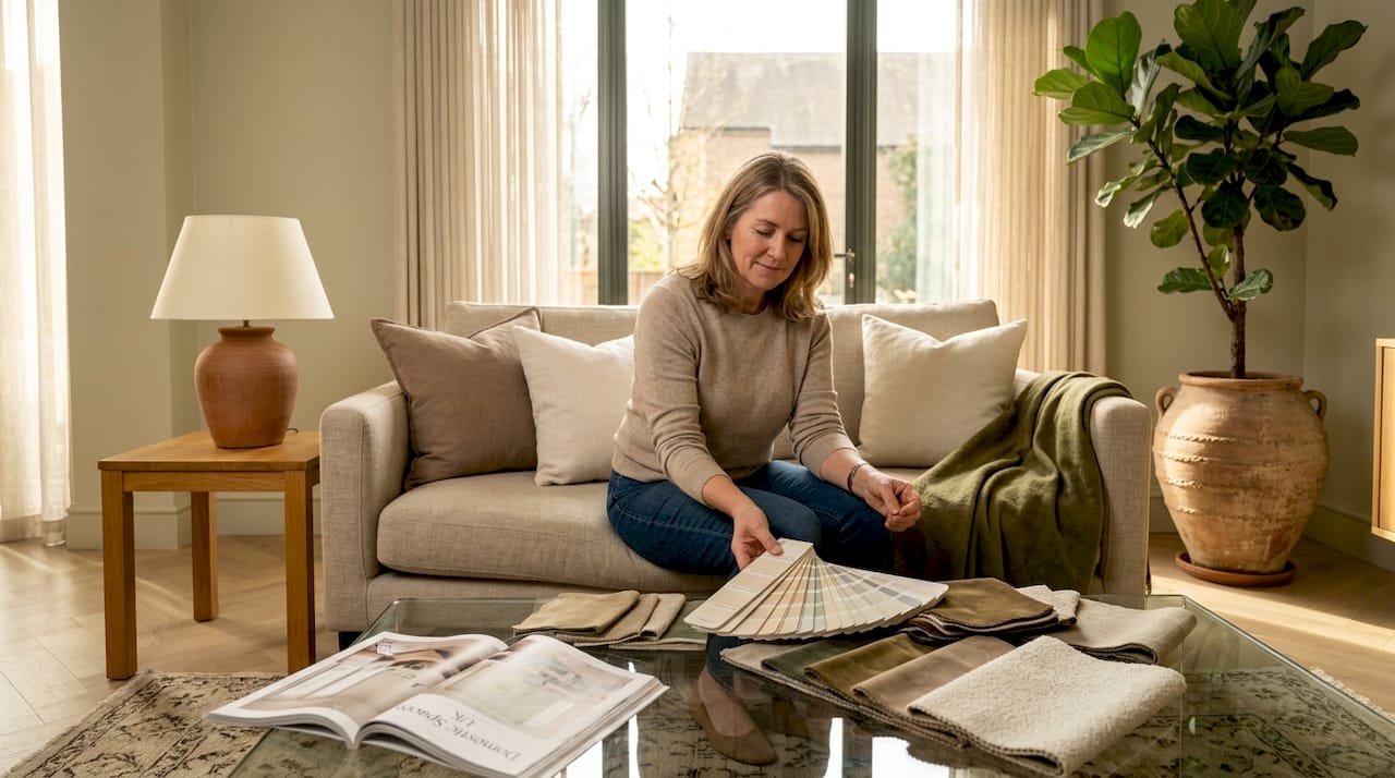
- Test the full 60-30-10 split by placing fabric and material samples beside the wall swatch
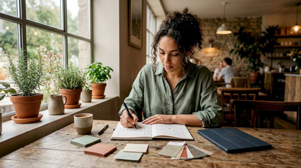
Beyond paint, build your palette from inspiration such as art, fabric, or a rug you already love, then use the colour wheel to find the paint shades that relate to those anchor pieces. This method ensures the final scheme feels unified rather than assembled from separate decisions.
| Room direction | Light quality | Recommended approach |
|---|---|---|
| North-facing | Cool, flat | Warm neutrals, deep ochres, rich greens |
| South-facing | Bright, changing | Rich or deeper hues, earthy tones |
| East-facing | Morning warmth | Pale warm tones, sage, blush |
| West-facing | Evening warmth | Mid tones, terracotta, olive |
Reading up on bedroom styling tips and using a decorating checklist before you begin ensures you are thinking about every variable before the first brush stroke falls.
Pro Tip: Use a piece of artwork or a patterned textile as your starting point rather than a paint chart. If you love the piece, the colours within it are already proven to work together. Pull those shades out and use the colour wheel to translate them into a room-wide palette.
Our take: The overlooked art of building palettes with personality
Here at Homable, we have noticed something slightly uncomfortable in conversations about colour: the frameworks and rules that are genuinely useful can also produce safe, predictable, slightly soulless spaces when followed too rigidly. A room that perfectly executes the 60-30-10 rule in a neutral palette is technically correct. But it is not always memorable. It does not always feel like you.
The most striking homes we see are not the ones that followed every rule. They are the ones where someone made a brave, personal decision and committed to it. A terracotta ceiling that should not work but absolutely does. An olive green kitchen that the owner was terrified to choose but now considers the single best decision in the house. These moments of creative risk are what transform competent interiors into genuinely exciting ones.
Our view is that materials deserve equal billing with paint colours in any palette conversation. A beautifully aged leather sofa is a colour choice. So is a hand-knotted wool rug with a complex pattern. When you think of your room’s palette as including every surface and object within it, rather than just the walls, the whole process becomes richer and more expressive. Start selecting the perfect decor theme from your most beloved material or object rather than from a trend board.
UK homeowners are often more daring in private than their colour choices suggest. If your instinct says deep blue walls, trust it. The worst outcome is a repaint. The best outcome is a room that feels entirely, unmistakably personal.
Enhance your home with statement accents
With your colour inspiration in place, now’s the time to bring it to life in your home décor.
The right accent object can anchor an entire palette or introduce the contrast that makes a room complete. At Homable, we have curated a selection of decorative pieces that translate directly into the 2026 palette trends explored in this article.
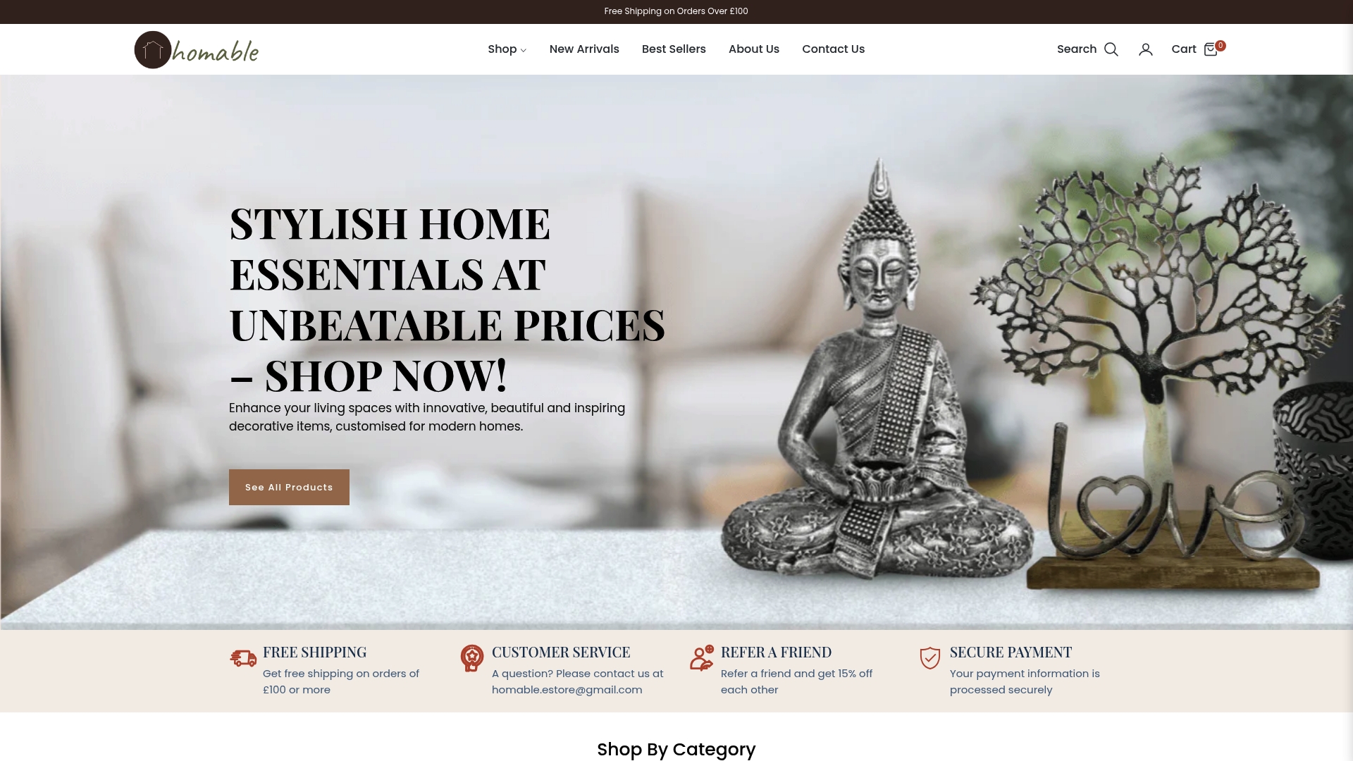
The abstract silver ornament in a wooden circle is a perfect example of a piece that bridges warm neutrals and metallic accents, fitting beautifully into any earthy or neutral scheme. If you are working with a warmer, bolder palette and want to introduce a grounding textile layer, the Baluchi Cannon pink woolen rug delivers rich colour and texture in equal measure. Explore the full range across categories to find the pieces that bring your chosen palette to life, with free shipping on orders over £100.
Frequently asked questions
How do I make a small room look larger with colour palettes?
Choose lighter shades for walls and ceiling and keep contrasts low, using the 60-30-10 rule to distribute tones evenly for an airy, open feel.
Which palette is best for north-facing rooms in the UK?
Warm tones and deep colours counteract the cool, flat light; avoid pale pastels and always test samples at multiple times of day before committing.
What are the trendiest colour accents for UK homes in 2026?
Mustard, plum, and the much-discussed ‘unexpected red’ are the standout accent choices gaining momentum in modern UK interiors this year.
How do I include natural materials in my palette?
Introduce elements like wood and metal at the earliest planning stage, as materials are integral to the palette rather than afterthoughts alongside your chosen paint shades.