Cart
0
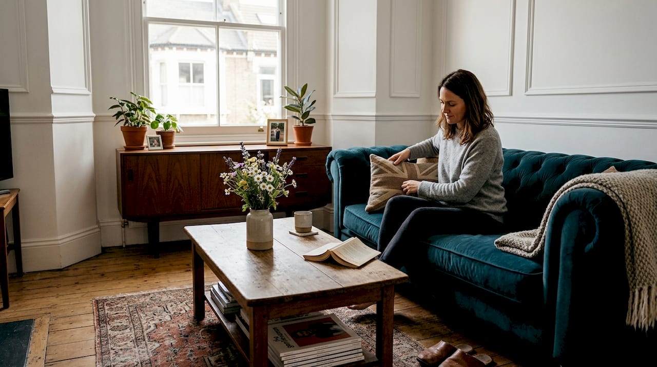
Tired of walking into your living room and feeling uninspired? You’re not alone. Many UK homeowners struggle with spaces that feel bland or lack personality, even when the basics are in place. The good news is that transforming your home doesn’t require a complete renovation. Strategic room accents can elevate your interiors from ordinary to extraordinary. This guide walks you through selecting and arranging stylish, functional accents that reflect your taste whilst enhancing everyday living. You’ll learn proven techniques for colour, texture, and furniture selection tailored to British homes.
Table of Contents
- Key takeaways
- Planning your stylish room accents: what you need to know
- Executing your accent layering with textures and patterns
- Choosing functional and stylish accent furniture for UK homes
- Refining your accent arrangement: troubleshooting and best practices
- Explore stylish home accents with Homable
- Frequently asked questions about stylish room accents
Key Takeaways
| Point | Details |
|---|---|
| Colour balance rule | Apply a 60 per cent, 30 per cent and 10 per cent split across walls, furnishings and accents to create balance. |
| Texture layering for depth | Layer textures such as velvet, linen and knits to add warmth and visual interest. |
| Functional accent furniture | Choose practical accent pieces that suit typical UK living spaces and daily use. |
| Less is more approach | Start with two or three statement pieces and gradually add to avoid clutter and overwhelm. |
Planning your stylish room accents: what you need to know
Before rushing to buy cushions or vases, you need a solid foundation. Understanding core design principles saves you from costly mistakes and ensures every accent serves a purpose. The 60-30-10 colour rule is your starting point: allocate 60% to your dominant colour (typically walls), 30% to secondary tones (furniture and larger textiles), and 10% to bold accents like cushions, artwork, or decorative objects. This ratio creates balance and prevents any single element from overpowering your space.
British interiors have distinct character. Incorporating British design details like saturated earth tones, decorative plates as wall art, kitchen dressers, layered prints, and sisal rugs adds authenticity and warmth. These elements connect your home to a rich design heritage whilst feeling fresh and relevant. Understanding the role of colour in home styling helps you make confident decisions that reflect your personality.
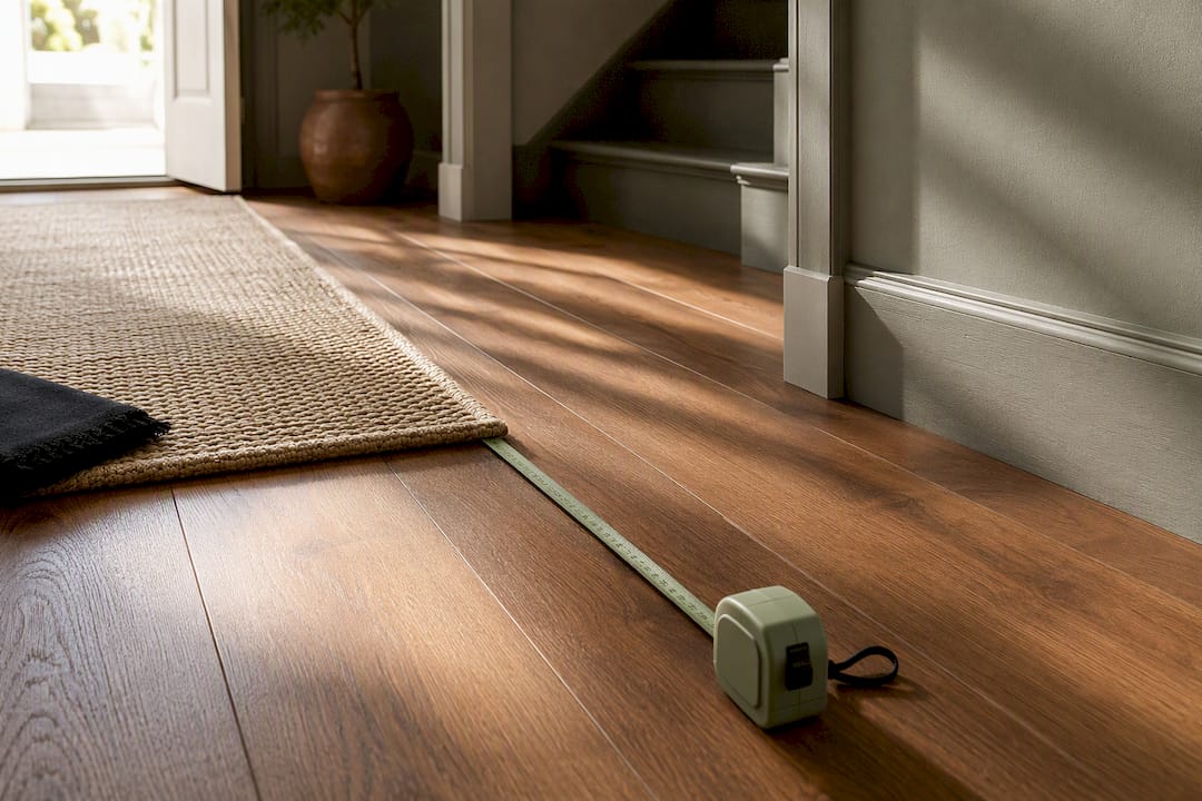
Initial considerations matter enormously. Assess your room size, natural lighting, and existing furniture style before selecting accents. A small Victorian terrace demands different choices than a modern semi-detached property. Measure your spaces and note how light changes throughout the day. This information guides your colour and material selections.
Essential materials and accessories for planning:
- Fabric swatches in potential accent colours
- Measuring tape for furniture dimensions
- Mood board (digital or physical) to visualise combinations
- Sample paint cards from existing room colours
- Lighting assessment at different times of day
Recommended colour proportions for UK living rooms:
| Element | Percentage | Typical application |
|---|---|---|
| Dominant colour | 60% | Walls, large rugs, main sofa |
| Secondary colour | 30% | Curtains, accent chairs, secondary upholstery |
| Accent colour | 10% | Cushions, throws, vases, artwork frames |
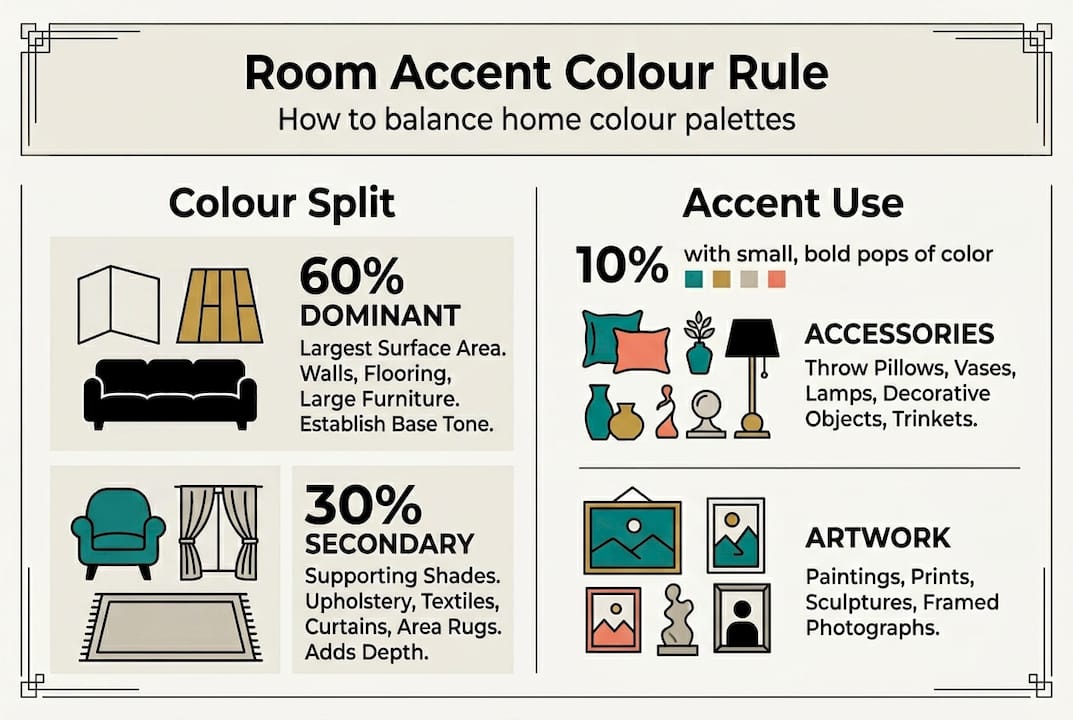
Pro Tip: Pull your accent colour from existing artwork or a favourite fabric piece. This creates instant cohesion and ensures your new accents feel intentional rather than random.
Start minimal. You can always add more accents, but removing excess clutter is harder psychologically and practically. Begin with two or three statement pieces per room and build from there. This approach prevents the overwhelming feeling that comes from over-accessorising and lets each piece shine.
Executing your accent layering with textures and patterns
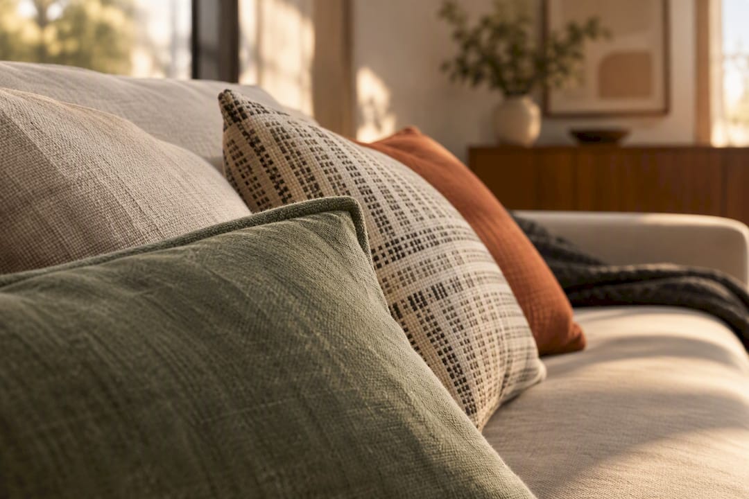
Once your plan is solid, layering transforms good rooms into exceptional ones. Texture adds depth and warmth that flat surfaces simply cannot achieve. Think about how velvet cushions feel against linen sofas, or how a chunky knit throw contrasts with smooth leather. These tactile differences create visual interest even in monochromatic schemes.
Mixing patterns requires confidence but follows simple rules. Layer textures and patterns by combining large bold prints with smaller intricate ones, unified through a common colour palette. A large floral cushion pairs beautifully with thin striped pillows when they share two or three colours. Group accessories in odd numbers, particularly threes, for natural visual balance. This principle applies to everything from candles on a mantelpiece to cushions on a sofa.
Understanding why layering textiles matters in UK homes helps you appreciate this technique’s practical benefits. British weather means we spend considerable time indoors, making comfort and visual warmth essential.
Step-by-step layering process:
- Establish your base layer with foundational textiles like rugs and curtains in neutral or dominant colours
- Add mid-layer pieces such as throws and larger cushions in secondary colours with subtle patterns
- Introduce accent layers through smaller cushions, decorative objects, and artwork in your bold 10% colour
- Adjust groupings until you achieve visual balance, removing anything that feels excessive
Textures to combine for depth:
- Velvet for luxury and light reflection
- Sisal or jute for natural, grounded elements
- Linen for relaxed, breathable sophistication
- Wool for warmth and traditional British character
- Metallic finishes for contemporary edge
- Ceramic and glass for smooth contrast
Pro Tip: Maintain a unified colour palette across all patterns. Even wildly different prints feel cohesive when they share three core colours. Test combinations by laying items together before committing.
Seasonal refreshes keep your space feeling current without major investment. Swap lighter linens and pastels for spring and summer, then introduce richer velvets and deeper tones for autumn and winter. Small changes like cushion covers, candles, and throws make dramatic differences. This approach also prevents boredom and lets you experiment with trends without permanent commitment.
Choosing functional and stylish accent furniture for UK homes
Accent furniture serves dual purposes: visual interest and practical function. The right pieces complement your existing decor whilst solving everyday needs. Popular options include accent chairs, ottomans, side tables, console tables, and occasional seating. Each brings distinct benefits depending on your space and lifestyle.
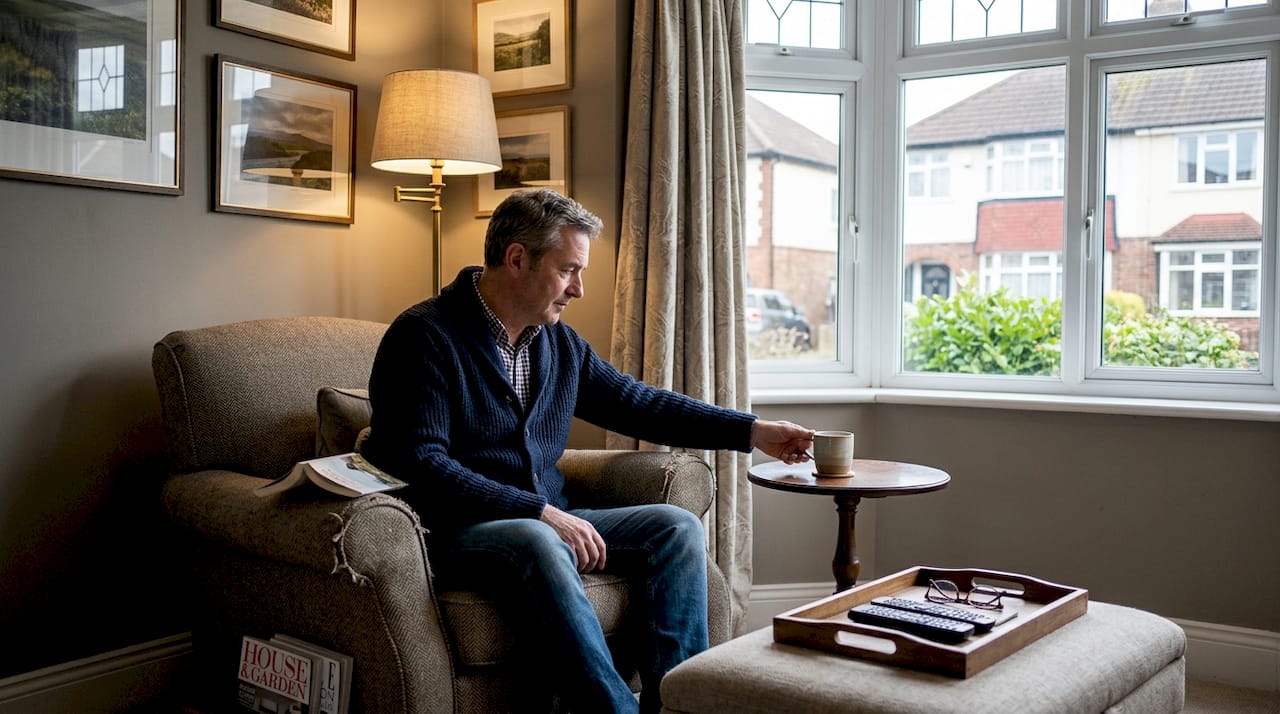
Sizing matters enormously in British homes, where rooms tend towards cosy rather than sprawling. Side tables should measure 40-60cm in diameter for most living rooms, with height matching your sofa arm within 2-5cm for comfortable reach. Oversized pieces overwhelm small spaces, whilst tiny furniture looks lost in larger rooms. Always measure before purchasing and consider traffic flow around each piece.
Understanding your decorating workflow for small spaces helps you make smarter furniture choices that maximise limited square footage.
Accent furniture comparison:
| Furniture type | Ideal size for UK homes | Primary function | Style impact |
|---|---|---|---|
| Side table | 40-60cm diameter, 50-60cm height | Surface for drinks, books, lighting | Anchors seating areas, adds material contrast |
| Accent chair | 70-80cm wide, 80-90cm high | Extra seating, visual focal point | Introduces bold colour or pattern |
| Ottoman | 50-70cm square or diameter | Footrest, storage, occasional seating | Softens hard edges, adds texture |
| Console table | 90-120cm wide, 30-40cm deep | Display surface, entryway storage | Defines spaces, showcases collections |
Tips for selecting accent furniture:
- Match the overall style (traditional, contemporary, eclectic) to your existing pieces
- Prioritise pieces offering storage or multi-use functionality
- Choose contrasting materials to highlight accents (wood against upholstery, metal with soft textiles)
- Consider sight lines and ensure furniture doesn’t block natural pathways
- Test scale by using cardboard cutouts before purchasing large items
Pro Tip: Select accent furniture that offers hidden storage or converts for multiple uses. An ottoman with interior storage or a side table with shelving maximises functionality without sacrificing style, crucial in compact British homes.
Contrast makes accents pop. If your sofa is neutral fabric, choose a side table in rich wood or sleek metal. If your room feels heavy with dark furniture, introduce lighter accent pieces to create breathing room. This principle applies to colour, material, and form. The goal is harmony with intentional focal points, not matching everything perfectly.
Refining your accent arrangement: troubleshooting and best practices
Even with solid planning, styling challenges emerge. Over-accessorising ranks as the most common mistake. Too many small objects create visual chaos and make spaces feel cluttered rather than curated. Mismatched colours that don’t follow your 60-30-10 rule confuse the eye. Wrong scale furniture overwhelms or underwhelms rooms. Recognising these issues early lets you correct course quickly.
Troubleshooting steps for accent arrangements:
- Remove half your accessories and live with the space for two days to identify what you genuinely miss
- Photograph your room from multiple angles to spot imbalances invisible to the naked eye
- Verify all accent colours relate to your dominant and secondary palette
- Check furniture heights and proportions against room dimensions and adjacent pieces
- Assess lighting at different times to ensure accents remain visible and appealing
- Invite a trusted friend for fresh perspective on what works and what feels off
Best practices for lasting success:
- Use complementary colours from opposite sides of the colour wheel for vibrant contrast
- Unify disparate elements through repeated colours, materials, or shapes
- Mind visual flow by arranging accents to guide eyes naturally around the room
- Leave negative space to let important pieces breathe and stand out
- Group similar items by colour, material, or theme rather than scattering randomly
- Update one element seasonally to keep the space feeling fresh
Less is more: curate fewer larger quality pieces over cluttered small items. Start minimal and scale up to avoid overwhelming your space whilst maintaining flexibility.
Assessing visual balance requires stepping back, literally and figuratively. Stand in your doorway and scan the room. Does your eye travel smoothly, or does it snag on cluttered corners? Are there dead zones lacking interest? Balance doesn’t mean symmetry; it means thoughtful distribution of visual weight. A large piece on one side can balance multiple smaller items on the other.
Functional comfort matters as much as aesthetics. Can you easily reach your side table from the sofa? Do accent chairs actually invite sitting, or are they purely decorative? The best interiors merge beauty with usability. Understanding modern interior design workflows helps you create spaces that work for daily life whilst looking magazine-worthy.
Seasonal refreshes need not be expensive or time-consuming. Swap cushion covers, rotate artwork, change candle scents, or introduce seasonal flowers. These small touches keep your home feeling current and responsive to the changing year. British seasons are distinct; embrace them through your accents rather than fighting for eternal summer.
Explore stylish home accents with Homable
Transforming your living spaces with carefully chosen accents becomes simpler when you have the right resources. Homable offers curated collections of stylish room accents and functional furniture designed specifically for UK homes. Whether you’re searching for the perfect side table, statement cushions, or decorative accessories, you’ll find pieces that match your style and space requirements.
Our expert guides provide deeper insights into specific styling challenges. Explore our colour home styling guide for advanced techniques on creating cohesive palettes, or discover our small spaces decorating tips for maximising compact British homes. Each resource connects practical advice with beautiful products that bring your vision to life.
Pro Tip: Use Homable’s room-specific collections to quickly identify furniture and accents matched to your space and aesthetic. Filter by style, size, and colour to streamline your search and avoid overwhelming choices.
Frequently asked questions about stylish room accents
What is the 60-30-10 colour rule and why is it important?
The 60-30-10 rule allocates 60% of your room to a dominant colour (usually walls), 30% to secondary tones (furniture and larger textiles), and 10% to bold accents like cushions or artwork. This proportion creates visual balance and prevents any single element from overwhelming your space, making it essential for cohesive, professional-looking interiors.
How can I mix patterns without clashing?
Combine large bold patterns with smaller intricate ones whilst maintaining a unified colour palette across all prints. Choose patterns that share at least two or three colours, and vary the scale significantly so they complement rather than compete. Group patterned items in odd numbers for natural balance.
What size side table works best in a small living room?
For most small UK living rooms, choose side tables measuring 40-50cm in diameter with heights matching your sofa arm within 2-5cm. This ensures comfortable reach without overwhelming limited space. Prioritise tables with lower shelves or storage to maximise functionality without increasing footprint.
How often should I update room accents for a fresh look?
Refresh small accents seasonally by swapping cushion covers, throws, candles, and decorative objects every three to four months. Larger accent furniture like chairs or tables can remain for years if chosen well. This approach keeps spaces feeling current without constant major investment.
Can I use bold colours as accents in neutral rooms?
Absolutely. Neutral rooms provide the perfect canvas for bold accent colours. Stick to your 10% allocation for vibrant hues through cushions, artwork, vases, or small furniture pieces. This creates striking focal points whilst maintaining the calm, sophisticated feel that neutral palettes offer.