
Cart
0
TL;DR:
- Matching room accessories using a coordinated color palette, material finish, or design language makes spaces appear more complete and inviting. Professionals treat accessories as the finishing layer that adds personality and balance, with sets offering consistency, time savings, and a polished look. Avoid the matching set trap by introducing variation, personal items, and texture contrast to create a more authentic and lively room.
Matching room accessories is defined as the practice of selecting decorative and functional items that share a consistent colour palette, material finish, or design language across a single space. Rooms with coordinated colour stories and consistent finishes are perceived as more complete and inviting. The difference between a room that feels polished and one that feels unfinished almost always comes down to accessories. This guide explains the importance of matching accessories, the benefits of coordinated sets, and how to avoid the most common styling mistakes.
Why match room accessories: the core design case
Accessories are the language of design. They express personality and bring energy to a room. Without them, even well-furnished spaces feel bare and unresolved.
The term “coordinated decor” is the standard industry phrase for what most people call matching accessories. Coordinated decor does not mean every item is identical. It means every item belongs to the same visual story, whether through shared colour, material, or proportion. A brass lamp, a brass picture frame, and a brass candle holder do not need to be from the same range. They simply need to speak the same design dialect.
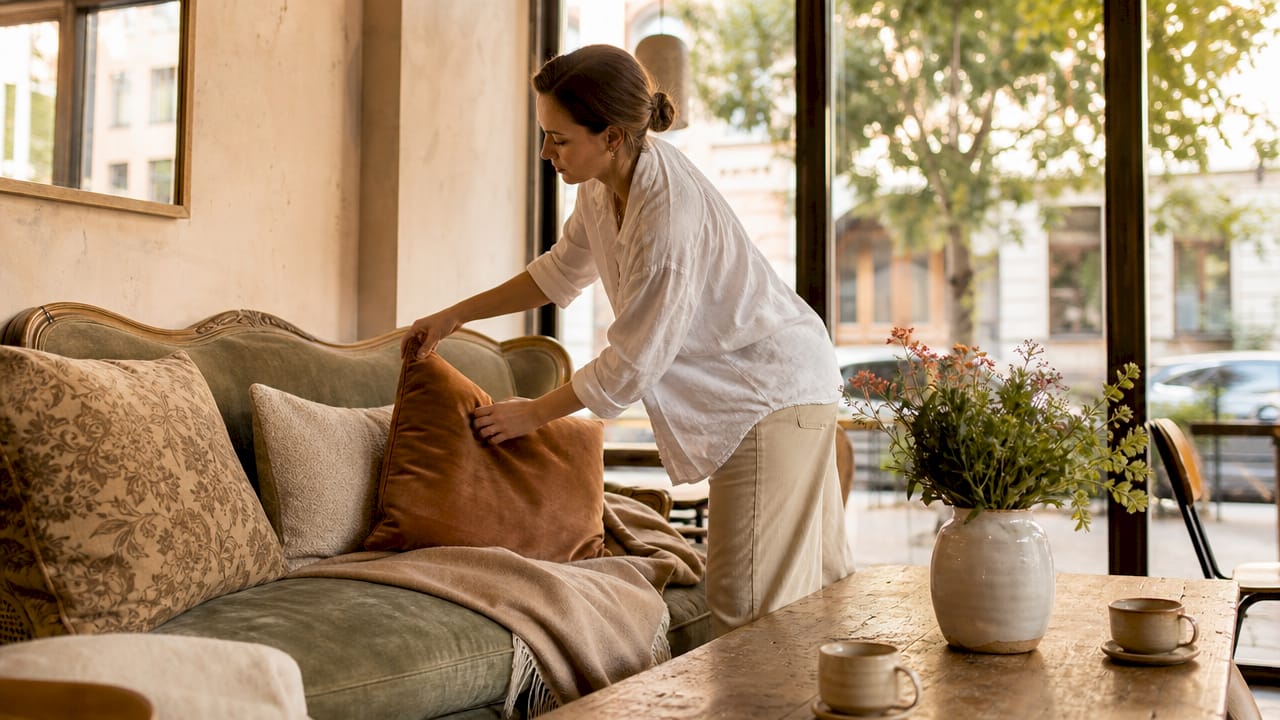
Professional interior designers treat accessories as the final layering step that transforms a house into a home, adding personality and balance. That layering process starts with foundational furniture and rugs, then builds upward through lamps, art, and personal accents. Each layer adds dimension. Without coordination between layers, the result is visual noise rather than character.
The practical case for coordinated decor is straightforward. A room where accessories share a finish or palette reads as intentional. A room where they do not reads as accidental. Intention is what separates a styled space from a cluttered one.
What benefits do coordinated accessory sets provide?
Coordinated accessory sets reduce decision-making time and ensure uniformity in finishes across specific room zones. That consistency matters because mismatched finishes, even subtle ones, create a low-level visual tension that makes a room feel unsettled.
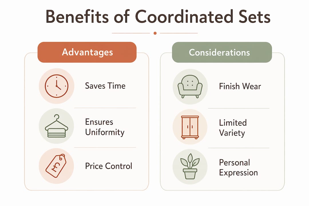
Sets also tend to offer a combined price advantage over purchasing individual components separately. The finish matching is guaranteed rather than approximate. Mounting styles, proportions, and material weights are designed to work together. For homeowners who want a polished result without spending hours sourcing individual pieces, a coordinated set is the most direct route.
Benefits of coordinated sets at a glance:
- Finish consistency: All pieces share the same material coating, preventing tonal drift between items.
- Time saving: No need to cross-reference individual pieces for compatibility.
- Price efficiency: Sets frequently carry a combined discount versus individual pricing.
- Proportional harmony: Items within a set are designed to scale with each other.
- Reduced risk: The guesswork of whether two pieces will work together is removed entirely.
One caveat applies. Metal coatings on cheaper sets may wear inconsistently compared to individually selected higher-grade pieces. A budget bathroom set might look cohesive on day one and mismatched by year two. Quality matters as much as coordination.
| Approach | Finish consistency | Time investment | Price control | Personal expression |
|---|---|---|---|---|
| Coordinated set | Guaranteed | Low | Fixed | Limited |
| Individual selection | Approximate | High | Flexible | High |
| Hybrid (set plus accents) | Strong | Moderate | Balanced | Good |
The hybrid approach, using a coordinated set as the foundation and adding individually chosen accent pieces, delivers the best of both methods for most rooms.
Why the matching set trap can hurt your decor
The matching set trap is what happens when every item in a room is too perfectly coordinated. The result looks staged rather than lived in. Designers caution against this outcome and recommend the 80/20 rule: 80% neutral and coordinating accessories, 20% accent pieces that introduce contrast or personality.
The modern philosophy in interior design has shifted from rigid matching toward what practitioners call “artful arrangement.” This approach focuses on harmony of colour, proportion, and texture rather than identical items. A room styled this way feels curated rather than catalogue-bought.
The trap is easy to fall into because sets feel safe. When every cushion, throw, and ornament comes from the same collection, the room loses the sense that a real person lives there. Successful coordinated looks rely on shared colour or material themes, not exact duplication.
How to avoid the matching set trap:
- Introduce one accent colour that does not appear in the main palette. A terracotta vase in a grey and white room adds life without disrupting cohesion.
- Mix two or three textures within the same colour family. Linen, ceramic, and wood can all read as warm neutrals while adding visual depth.
- Vary the scale of accessories. A tall floor lamp, a mid-height plant, and a low tray of candles create rhythm. Three items of identical height create monotony.
- Include at least one piece with personal meaning. A travel souvenir or inherited object signals that the room belongs to someone.
Pro Tip: Swap one accessory from a coordinated set for a vintage or handmade equivalent. The slight imperfection makes the whole room feel more authentic and less like a showroom.
How to choose and arrange matching accessories effectively
Effective accessory selection starts with the room’s foundational elements. The sofa, rug, and curtains set the colour and material story. Accessories should respond to that story rather than compete with it.

The layering hierarchy used by industry practitioners runs from foundational furnishings through mid-level pieces such as lamps and artwork, then to personal accents like books, plants, and ornaments. Using this layering hierarchy optimises visual flow and avoids decor clutter. Each layer should feel like a natural extension of the one beneath it.
Step-by-step selection process:
- Identify your anchor colours. Pull two or three colours from your existing furniture or rug. These become the palette your accessories must reference.
- Choose a dominant material. Decide whether the room leans toward warm metals, natural wood, ceramic, or glass. Accessories in the same material family will always feel cohesive.
- Apply the tray method. Grouping candles, books, and sculptures on a tray turns scattered objects into an intentional vignette, enhancing cohesion immediately. The tray acts as a frame that signals intention.
- Edit ruthlessly. Effective accessorising relies on intentional layering and editing, not simply adding more pieces. If removing an item makes the arrangement look better, remove it.
- Rotate seasonally. Moving accessories between rooms refreshes decor without adding clutter, maintaining a balanced feel over time. A ceramic bowl that lives on the kitchen shelf in summer can anchor a living room console in winter.
Pro Tip: Before buying new accessories, photograph your room and view it in black and white. Tonal contrast becomes immediately visible. If everything reads as the same grey, you need more variation in light and dark values, not necessarily more colour.
The tray method is a professional technique used to unify disparate items and create elegant accent groupings efficiently. It works in every room because it imposes visual order without requiring the items themselves to match exactly.
For homeowners who want room-by-room styling guidance, starting with one room and applying these steps consistently before moving to the next prevents the common mistake of spreading effort too thinly across the whole house.
Where does matching matter most? Bathrooms, living rooms, and utility spaces
Matching accessories are not equally important in every room. The degree of coordination required depends on the room’s function and how closely items are viewed.
Bathrooms
Bathrooms benefit most from precisely matched accessories for both functional and aesthetic reasons. Towel rings, toilet roll holders, soap dispensers, and mirror frames are all viewed at close range and used daily. A chrome fitting next to a brushed nickel equivalent is immediately noticeable. In bathrooms, finish consistency is not a stylistic preference. It is a baseline requirement for the room to look considered.
Living rooms
Living rooms require coordinated but not identical accessories. The space is larger, viewed from a distance, and needs to feel personal and inviting rather than uniform. A living room where every cushion, throw, and ornament matches exactly feels like a hotel lobby. The goal is a shared palette and material story, with enough variation to feel inhabited.
Kitchens and hallways
Utility zones such as kitchens and hallways sit between the two extremes. Functional items like canisters, utensil holders, and coat hooks benefit from finish consistency. Decorative accents like artwork or plants can be more freely chosen. The rule here is: match the functional, personalise the decorative.
| Room | Matching priority | Best approach |
|---|---|---|
| Bathroom | High | Coordinated set for all hardware and fixtures |
| Living room | Medium | Shared palette with varied textures and scales |
| Kitchen | Medium | Match functional items, vary decorative accents |
| Hallway | Low to medium | Consistent finish on hooks and storage, free choice on art |
| Bedroom | Medium | Coordinate bedside lamps and textiles, personalise shelving |
Industry practitioners recommend blending coordinated sets in functional areas with individually curated accessories in living spaces. That combination delivers both the visual tidiness of a set and the warmth of personal expression.
Key takeaways
Coordinated room accessories create visual harmony by sharing a consistent colour, material, or finish story rather than being identical in every detail.
| Point | Details |
|---|---|
| Coordination beats matching | Shared colour or material themes create cohesion without the staged look of identical sets. |
| Sets work best in functional rooms | Bathrooms and utility zones benefit most from precisely matched accessory sets. |
| The 80/20 rule prevents over-matching | Use 80% coordinating pieces and 20% accent items to keep rooms feeling personal and lived in. |
| The tray method unifies any grouping | Placing disparate objects on a tray creates an intentional vignette without requiring them to match exactly. |
| Edit before you add | Removing one item often improves an arrangement more than adding another piece ever could. |
The case for intention over perfection
I have spent years watching homeowners buy entire matching sets and then wonder why their rooms still feel flat. The problem is almost never the accessories themselves. It is the absence of intention behind the arrangement.
The shift away from rigid matching toward artful coordination is the most useful development in accessible interior design in recent years. It gives homeowners permission to use what they already own, to mix a charity shop find with a quality set piece, and to trust that a room does not need to look like a catalogue page to feel beautiful.
What I have found consistently is that the rooms people love most are the ones where one or two pieces carry genuine personal meaning. A handmade pot from a market, a lamp inherited from a grandparent, a print bought on holiday. Those pieces do not match anything perfectly. They make everything else feel more real.
The practical lesson is this: buy your bathroom set, coordinate your living room palette, and then break one rule deliberately. That single act of intention is what separates a styled room from a decorated one.
— Cristiano
Homable’s curated collections for coordinated home styling
Pulling together a cohesive room can feel like a puzzle with too many pieces. Homable takes a different approach, offering home accessories selected for their ability to work together across rooms and styles, so you spend less time second-guessing and more time enjoying your space.
From ornaments and rugs to curtains and storage, every Homable collection is built around the principle that good design should be accessible without compromise. Free shipping on orders over £100 makes it straightforward to build a coordinated look without the cost of individual sourcing. For deeper styling guidance, the Homable styling blog walks through the exact process of layering accessories for any room type, from bathroom hardware to living room accents.
FAQ
Why do matching room accessories make a room look better?
Coordinated accessories create visual harmony by giving the eye a consistent colour or material story to follow. Rooms with shared finishes and palettes are perceived as more complete and intentional.
What is the 80/20 rule in accessory coordination?
The 80/20 rule means 80% of your accessories should share a neutral or coordinating palette, with 20% acting as accent pieces that introduce contrast or personality. This prevents the over-matched, staged look that makes rooms feel impersonal.
Are coordinated accessory sets worth buying?
Coordinated sets are worth buying in functional rooms like bathrooms, where finish consistency is viewed at close range daily. In living spaces, a hybrid approach using a set as a foundation with individually chosen accents delivers better results.
How do I choose accessories that match without looking too uniform?
Start with your room’s anchor colours from existing furniture, choose a dominant material, and then vary the scale and texture of pieces within that palette. The tray method groups items into intentional vignettes without requiring them to be identical.
How often should I update or rotate my room accessories?
Rotating accessories between rooms seasonally keeps decor feeling fresh without adding clutter. Moving a ceramic bowl or a set of candles from one room to another costs nothing and prevents the visual fatigue that comes from seeing the same arrangement every day.