Cart
0
TL;DR:
- The decor accessory placement process involves deliberate organization of items to create visual balance and style. Applying rules like the 3-5-7 guideline, height variation, and textured mixing helps achieve a curated look. Regular editing and thoughtful placement ensure surfaces are stylish, balanced, and reflect personal character.
The decor accessory placement process is a structured method for arranging decorative items on surfaces to achieve visual balance, proportion, and style. Done well, it transforms a room from merely furnished to genuinely considered. This guide covers the core frameworks designers rely on, including the 3-5-7 rule championed by stylists like Kimberly Oxford, the vignette principles taught by Homeology, and a step-by-step process you can apply to any surface in your home. Follow these techniques and your shelves, tables, and mantels will look curated rather than cluttered.
What is the decor accessory placement process and why does it matter?
The decor accessory placement process is the deliberate sequencing of decisions about what to place, where to place it, and how many items to group together on a given surface. Most homeowners skip this sequencing entirely. They buy pieces they love, set them down, and wonder why the result looks busy or flat. The process fixes that by giving you a repeatable framework.
Homeology advises starting with a design alignment phase, reviewing your existing furniture and architectural features before touching a single accessory. Accessories should reinforce the room’s design narrative, not compete with it. A brass candlestick on a mid-century sideboard works. The same candlestick next to a heavily rustic farmhouse lamp does not.

The payoff for following a structured process is consistency. You stop making one-off decisions and start building a visual language that carries through every room.
What is the 3-5-7 rule and how does it guide accessory quantity?
The 3-5-7 rule is the standard guideline for deciding how many decor items to place on a surface based on its size: 3 items for small surfaces, 5 for medium, and 7 for large. The rule works because odd numbers create asymmetry, and asymmetry is what the human eye reads as natural rather than staged.
Applying the rule to real surfaces
| Surface type | Recommended item count | Example grouping |
|---|---|---|
| Side table | 3 | Lamp, small plant, single decorative object |
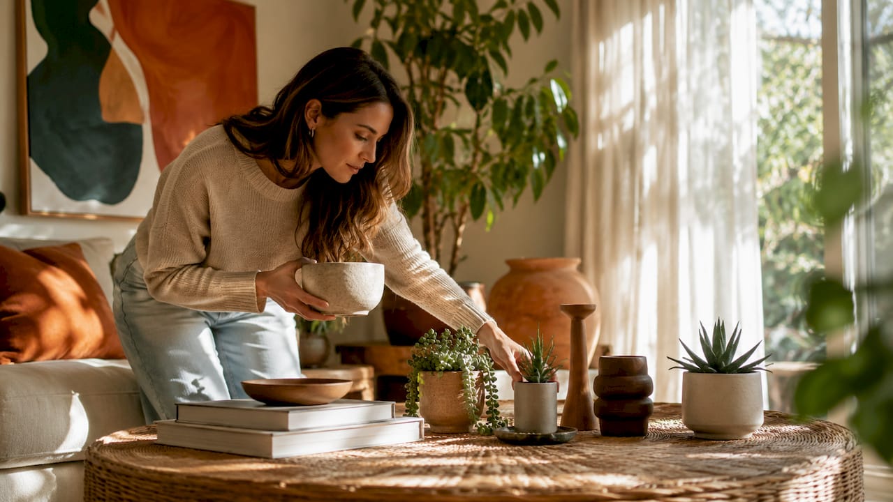
| Coffee table | 5 | Tray, candle, books, small sculpture, plant |
| Console table | 5–7 | Mirror, vase, books, candles, small bowl, framed art |
| Bookshelf (per section) | 3–5 | Books, plant, decorative object, small frame |
| Mantel | 5–7 | Central artwork, two candlesticks, two flanking objects |

The most common mistake is applying the rule to the wrong scale. Placing 7 items on a small side table does not follow the spirit of the rule. It just creates clutter. The number scales with the surface, not with how many pieces you own.
A second common error is treating the rule as a hard ceiling rather than a guide. If 5 items on your coffee table still looks busy, edit down to 3. The rule gives you a starting point, not a final answer.
- Use the rule to set an upper limit before you begin, not after
- Count items before placing them so you are not editing from a cluttered surface
- Treat trays and books as single items when they anchor a grouping
- Reassess after stepping back at least two metres from the surface
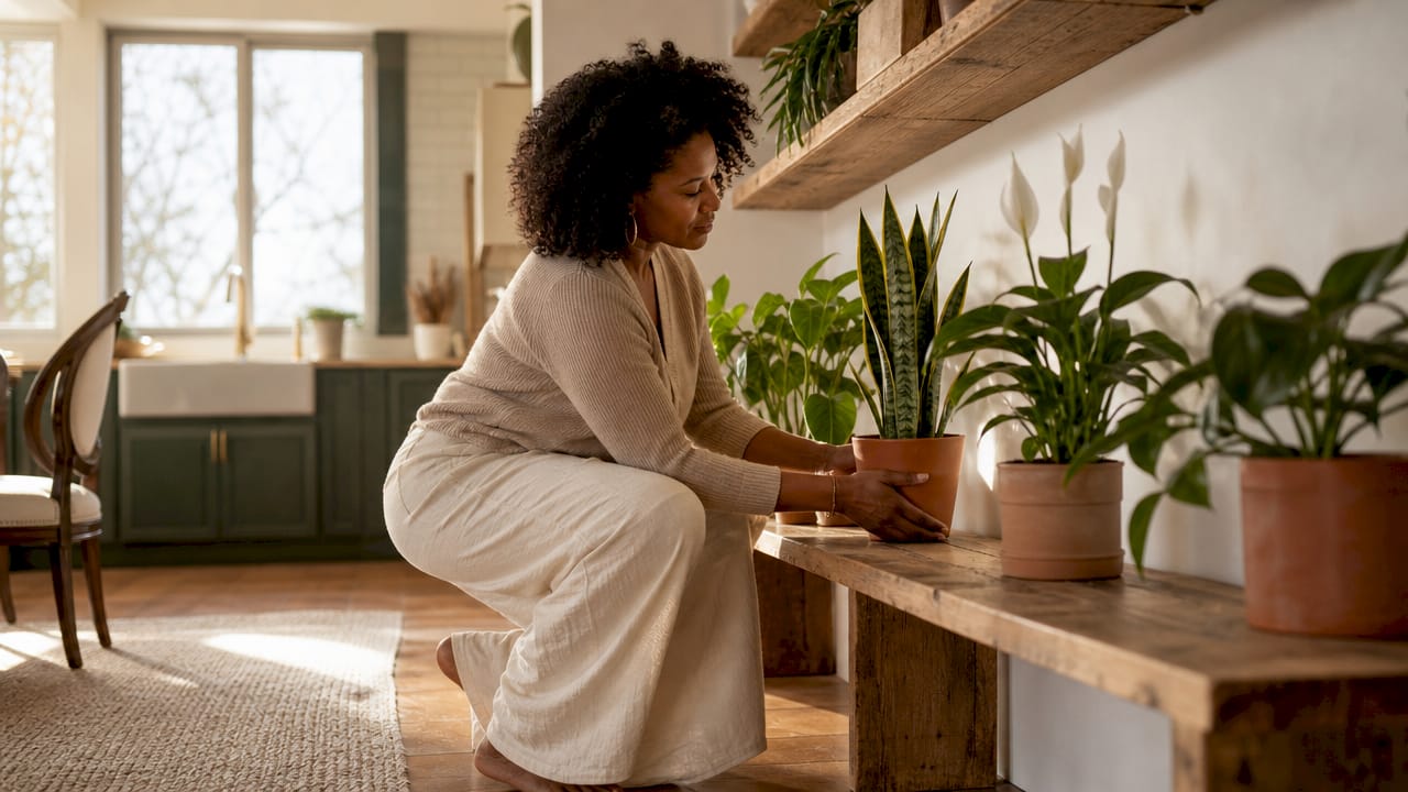
How do you create a balanced vignette with height and texture?
A vignette is a small, intentional grouping of decorative items that tells a visual story on a surface. The term comes from professional interior styling and describes the difference between objects that simply coexist and objects that genuinely relate to one another.
The focal point anchor
Every vignette needs one dominant piece that anchors the group. Kimberly Oxford describes this as making objects converse with each other, with one piece leading the conversation. On a console table, that might be a tall ceramic vase. On a coffee table, it could be a large art book laid flat. Everything else in the grouping responds to that anchor in scale and proportion.
Height variation and the triangle silhouette
Raghunandan Saraf warns that constant height among grouped accessories creates a flat line effect. The viewer’s eye has nowhere to travel, so the arrangement reads as dull. The fix is to arrange items so their tops form a rough triangle: one tall piece, one medium, one low. This forces the eye to move across the grouping and creates a sense of depth.
Creating a triangle silhouette with varied heights prevents decor from looking like a flat horizontal line and maintains visual depth and movement. That movement is what makes a shelf or table feel styled rather than stacked.
Mixing textures for visual richness
Balanced vignettes must include at least three distinct textures to appear visually layered and intentional. A practical formula is one soft element (a folded linen, a woven basket), one hard element (ceramic, glass, or metal), and one natural element (a plant, driftwood, or stone). This mix prevents the monotony that comes from grouping items of similar material.
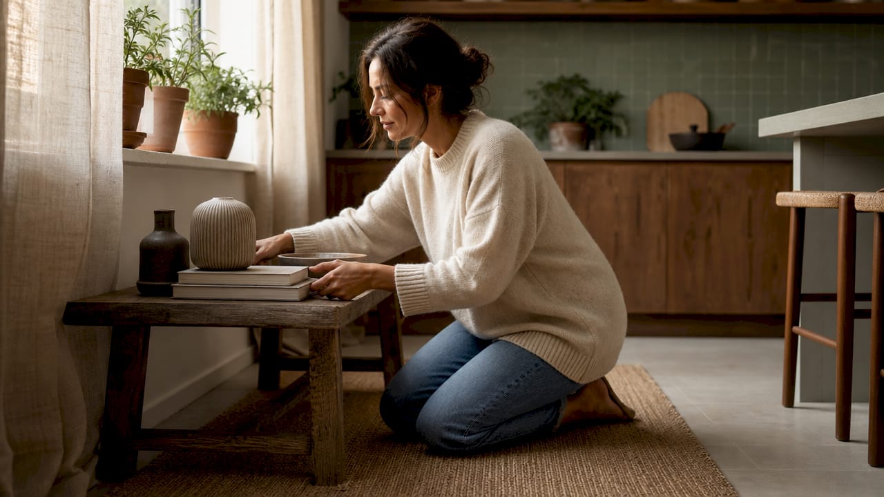
Pro Tip: Stack two or three hardback books under a shorter object to lift it into the triangle silhouette without buying anything new. Professional stylists call this the pedestal trick, and it is one of the most used techniques in editorial home photography.
Step-by-step home accessory styling for any surface
This is the practical sequence for accessory styling on any surface, from a bedside table to a large open shelving unit.
-
Clear and clean the surface completely. Start with nothing. A blank surface forces you to make deliberate choices rather than working around what is already there.
-
Select your anchor piece first. Choose the tallest or most visually dominant item in your grouping. Place it slightly off-centre rather than dead centre. Centred anchors read as formal; off-centre reads as considered.
-
Layer in supporting pieces by height. Place the medium-height item next, then the lowest. Check that the tops of the three items form a rough triangle from the side.
-
Introduce texture contrast. If your anchor is ceramic, add something woven or metallic. If it is glass, add something matte or organic. Texture contrast is what separates a styled surface from a display shelf.
-
Check your negative space. Designers recommend leaving at least 30% of a surface empty. That empty space is not wasted. It gives the eye a place to rest and makes the objects you have placed look more intentional.
-
Edit ruthlessly. Step back two metres and look at the surface. If anything feels crowded, remove it. The one-in-one-out rule is the professional standard: before adding a new piece, remove an existing one. This keeps surfaces from accumulating clutter over time.
Pro Tip: Photograph the surface on your phone and look at the image rather than the surface itself. The camera flattens perspective and makes imbalances far easier to spot than standing in the room.
Common pitfalls to avoid
| Mistake | Why it fails | The fix |
|---|---|---|
| Uniform item height | Creates a flat line with no visual movement | Vary heights to form a triangle silhouette |
| Too many items | Surfaces look cluttered and retail-like | Apply the 3-5-7 rule as an upper limit |
| Matching textures throughout | Grouping feels one-dimensional | Mix soft, hard, and natural textures |
| Centring everything | Looks rigid and overly formal | Place anchor pieces slightly off-centre |
| Ignoring negative space | Items compete rather than breathe | Leave at least 30% of the surface clear |
How does accessory placement change by room and surface?
Decorative accessory placements are not one-size-fits-all. The function of a room changes what works on its surfaces. Grouping objects in odd numbers and layering at varying heights creates more natural arrangements compared to even numbers or linear placement, but the specific items and scale shift significantly by room.
Living room surfaces
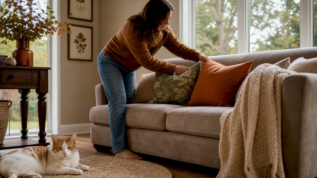
Living rooms accommodate the largest surfaces and the most complex groupings. Coffee tables benefit from a central tray that corrals smaller items (candles, a small plant, a decorative object) into a single visual unit. Console tables behind sofas suit taller arrangements because they are viewed from a distance. Symmetry works well on mantels when you want formality. Asymmetry works better on shelves and sideboards where a relaxed, collected feel is the goal.
Bedroom and bathroom placement
Bedrooms call for restraint. A bedside table with a lamp, one book, and a single small object is usually enough. Overcrowding a bedside table makes the room feel anxious rather than restful. For bedroom decor without overwhelming the space, keep surfaces minimal and prioritise items that serve a function alongside their decorative role.
Bathrooms reward small, cohesive groupings. A tray on a vanity holding two or three items (a candle, a small plant, a soap dish) looks deliberate. Items scattered across the surface without a tray look like clutter regardless of their individual quality.
Shelves and mantels
Shelves require the most editing discipline because they offer the most surface area. Treat each shelf section as its own vignette with its own anchor, height variation, and texture mix. Avoid filling every section to the same density. Leaving one section lighter than the others creates rhythm across the whole unit. For detailed guidance on mantel styling, the same triangle silhouette principle applies but at a larger scale.
Key takeaways
The most effective decor accessory placement process combines the 3-5-7 rule, height variation, texture mixing, and disciplined editing to create surfaces that look styled rather than accumulated.
| Point | Details |
|---|---|
| Apply the 3-5-7 rule | Use 3 items for small surfaces, 5 for medium, and 7 for large to maintain visual balance. |
| Build a triangle silhouette | Vary item heights so their tops form a triangle, preventing the flat line effect. |
| Mix three textures | Combine one soft, one hard, and one natural element in every vignette for visual depth. |
| Preserve negative space | Leave at least 30% of every surface clear so placed items have room to breathe. |
| Edit with the one-in-one-out rule | Remove an existing piece before adding a new one to prevent surfaces from accumulating clutter. |
Why the editing step is the one most people skip
I have styled a lot of surfaces over the years, and the step that makes the biggest difference is almost always the one people rush past: editing. Most homeowners add items until a surface feels full, then stop. Professional stylists add items, step back, remove two, add one back, and repeat. That iterative process is where the real work happens.
The rules around quantity and height give you a scaffold, but they do not do the work for you. I have seen perfectly proportioned groupings that still felt wrong because every item was bought at the same time from the same collection. They matched too well. The surfaces that genuinely impress are the ones where you can see a bit of history: a piece picked up on holiday, a gift, something inherited. The rules create structure. Your choices create character.
My honest advice is to treat your first arrangement as a draft, not a finished result. Live with it for a week. You will notice what bothers you far more clearly after seven days than after seven minutes. Then edit. The layering process is not a one-time event. The best-styled rooms are the ones that get quietly refined over time.
— Cristiano
Find the right pieces at Homable

Knowing the process is half the work. Finding pieces that actually fit your groupings is the other half. Homable curates home decor accessories with proportion, texture, and style in mind, so you are not hunting through thousands of options to find the three that work together. From ornaments and vases to trays and decorative objects, the collections are built for the kind of considered, layered styling this guide describes. Browse the full range at Homable and use the 3-5-7 rule as your shopping guide: decide your surface size first, then select your pieces with a clear number in mind.
FAQ
What is the 3-5-7 rule in home decor?
The 3-5-7 rule is a guideline for how many decorative items to place on a surface based on its size: 3 for small surfaces, 5 for medium, and 7 for large. It uses odd numbers to create natural-looking asymmetry and prevent overcrowding.
How much empty space should I leave on a styled surface?
Designers recommend leaving at least 30% of a surface as empty (negative) space. This gives placed items visual breathing room and prevents the surface from looking cluttered or retail-like.
What is a vignette in interior styling?
A vignette is a small, intentional grouping of decorative accessories on a surface, built around one anchor piece with varied heights and mixed textures. The goal is for the objects to relate to one another visually rather than simply coexist.
How do I stop my shelves from looking cluttered?
Apply the one-in-one-out rule: remove an existing item before adding a new one. Treat each shelf section as its own vignette, vary heights within each section, and leave at least one section lighter than the others to create rhythm across the whole unit.
Does accessory placement differ between rooms?
Yes. Living rooms support larger, more complex groupings on coffee tables and consoles. Bedrooms call for minimal surfaces with functional decorative pieces. Bathrooms work best with small, tray-corralled groupings on vanity surfaces.