Cart
0
TL;DR:
- Common home styling mistakes include improper furniture scale, small rugs, and over-sterilized decor that undermine comfort. Layered lighting, personal touches, and floating furniture create inviting, balanced spaces. Proper planning and ongoing adjustments are key to achieving a warm, proportionate, and personalized home.
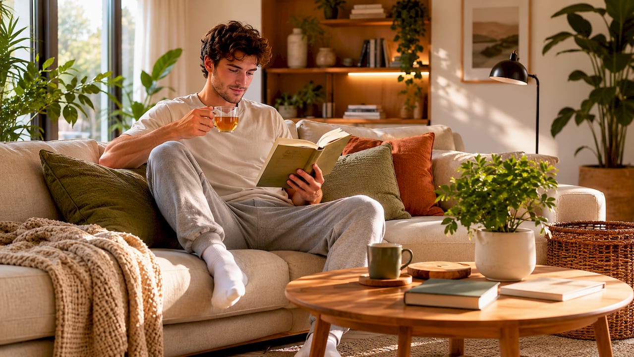
Common home styling mistakes are errors in scale, lighting, rug sizing, and over-presentation that quietly undermine the comfort and balance of a living space. Interior designers call this category of errors “proportion and atmosphere failures,” and they appear in nearly every home, regardless of budget. Mistakes like undersized rugs, a single overhead light source, and furniture pushed flat against walls are among the most frequently spotted by professionals. This guide covers the most impactful styling pitfalls and gives you the practical fixes to address each one.
1. Why furniture scale is the first thing designers notice
Poor proportion is the top reason rooms feel “off” to designers. A sofa that is too large crowds a room visually, while a chair that is too small looks lost and unanchored. Both errors communicate the same thing: the space was not planned before the shopping started.
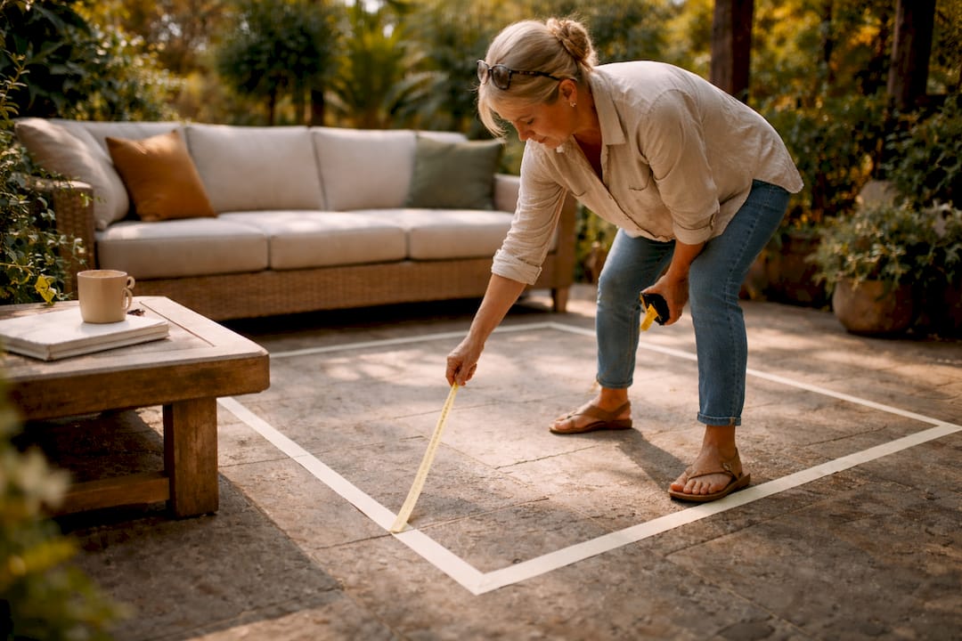
The fix begins before you buy anything. Measure your floor space and sketch a rough layout, noting doorways, windows, and traffic paths. This prevents the most common decorating blunder of purchasing a piece that looks right in a showroom but overwhelms your actual room.
Mixing furniture sizes deliberately adds depth. Pair a substantial sofa with a slimmer coffee table, or balance a large dining table with lighter, open-frame chairs. The contrast creates visual rhythm rather than a flat, one-note arrangement.
- Measure the room length and width before browsing furniture
- Note the ceiling height, as taller ceilings can carry larger pieces
- Leave at least 90 centimetres of clear walkway around major furniture
- Avoid buying entire matching sets, as mixing pieces of varying style adds depth and individuality
Pro Tip: Use masking tape on the floor to mark out the footprint of a sofa or wardrobe before you buy. It takes five minutes and prevents expensive mistakes.
2. How rug size affects the cohesion of a living room
An undersized rug is a top three decorating error. A rug that is too small makes furniture look like it is floating on an island, disconnected from the rest of the room. The visual effect is fragmented, even when every individual piece is attractive on its own.
The industry standard is clear: a rug should be large enough for at least the front legs of all primary seating to sit on it. This anchors the furniture grouping and signals to the eye that the pieces belong together. For a living room, a 200 x 300 centimetre rug is often the minimum worth considering.
For open-plan spaces, a rug defines a zone. It tells the eye where the sitting area ends and the dining or kitchen area begins. Without it, the room reads as one undifferentiated expanse.
Pro Tip: Lay out newspaper or a dust sheet in the exact dimensions of a rug before you order. You will immediately see whether the size works or whether you need to go larger.
3. What role does lighting play in flat, uninspiring interiors?
Relying solely on recessed spotlights creates a flat, harsh atmosphere that no amount of beautiful furniture can fix. A single overhead source casts uniform light with no shadow, no warmth, and no sense of depth. The room looks like a shop floor rather than a home.
The solution is layered lighting. Interior designers recommend combining ambient, task, and accent lighting at varying heights. Ambient light sets the overall tone, task lighting serves specific functions like reading or cooking, and accent lighting draws attention to artwork, shelving, or architectural features.
“Lighting is the single most transformative element in a room. Get it wrong and even the most expensive furniture looks flat. Get it right and even modest pieces look considered.” — Interior design principle cited by The English Home
Practical steps to layer your lighting:
- Add a floor lamp in a dark corner to lift the room’s warmth
- Use wall sconces at eye level to create intimacy
- Place a table lamp on a sideboard or console to add a mid-height light source
- Match bulb temperatures across all sources; mixing warm and cool tones creates visual discord
For kitchen-specific lighting advice, the guide on illuminating your kitchen covers layering strategies in practical detail.
4. Why “show-home syndrome” strips a space of personality
Show-home syndrome is the result of over-styling a room until it looks perfect but feels sterile. Every cushion is plumped, every surface is clear, and every piece matches. The room communicates nothing about the people who live in it.
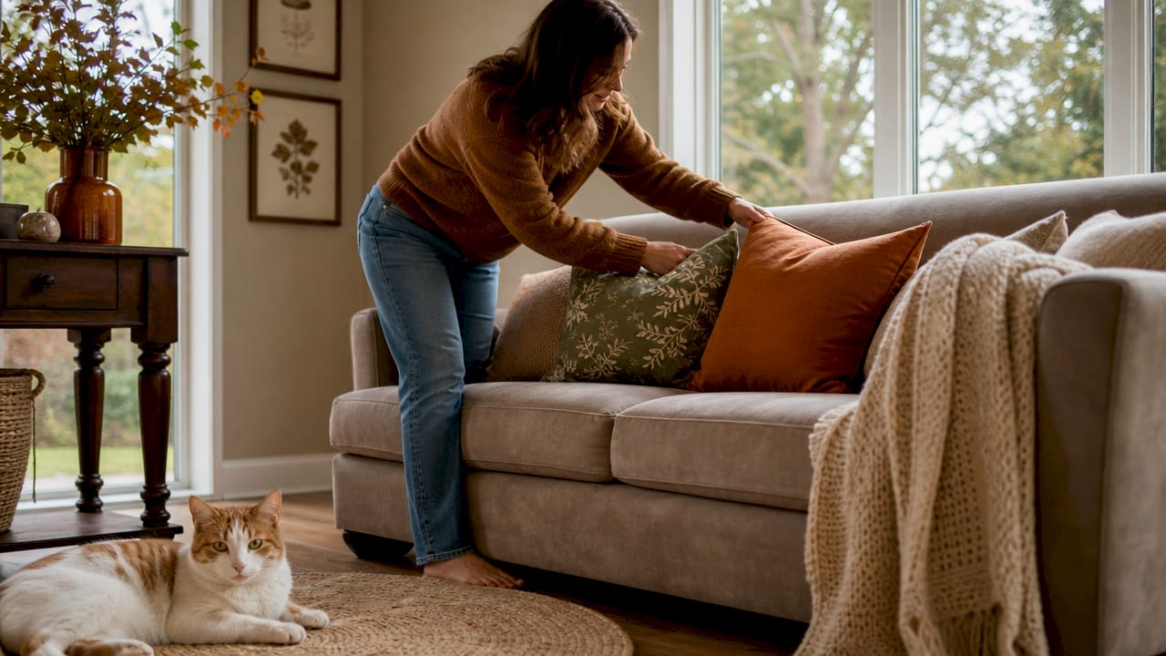
Design experts are consistent on this point: balance high-ticket furniture with personal items and eclectic textures. A linen sofa gains warmth from a worn leather cushion. A glass coffee table becomes interesting when it holds a stack of books, a ceramic bowl, and a single candle. The mix is what creates soul.
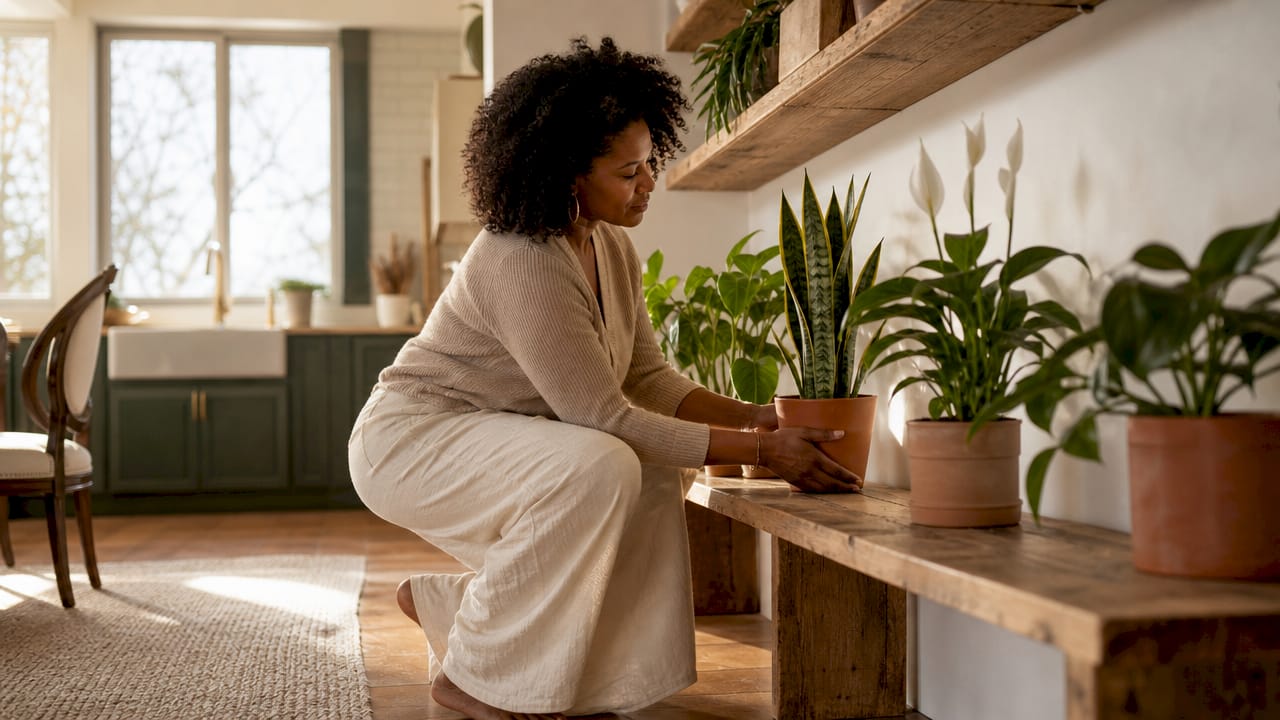
Personal items do not mean clutter. They mean deliberate choices that reflect your taste, travels, or history. A framed photograph, a piece of pottery, or a plant all signal that a real person lives here.
- Layer textures: combine wool, linen, ceramic, and wood in the same room
- Avoid buying every piece from the same retailer or collection
- Display one or two personal objects on shelves alongside decorative items
- Read Homable’s guide on modern home styling steps for practical advice on incorporating personal touches without creating visual noise
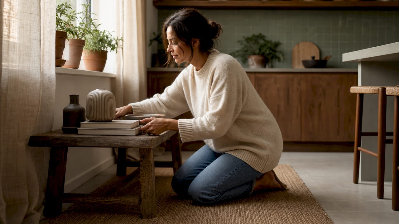
Pro Tip: Style surfaces in odd numbers. Three objects on a shelf feel more natural than two or four. Vary the height of each item to create movement.
5. What other decorating blunders should homeowners address?
Several house styling errors appear repeatedly in professional assessments, and each has a straightforward fix. Pushing furniture against walls is one of the most common. The instinct is to create more floor space, but the result is a room that feels static and cold. Floating furniture closer to the centre creates conversation areas and makes the room feel more used and welcoming.
Artwork hung too high is another frequent home design faux pas. The professional standard places the centre of a piece 57 to 60 inches from the floor. This keeps art connected to the furniture below it rather than floating near the ceiling. For a gallery wall, treat the grouping as a single piece and centre the whole arrangement at that height. For further guidance on wall styling, the resource on styling art walls offers detailed techniques.
Overdecorating or underediting surfaces is a third error. Shelves and coffee tables benefit from deliberate styling rather than random accumulation. Too many objects create visual noise; too few create an unfinished look. The goal is a considered arrangement with breathing room between pieces.
| Mistake | The problem | The fix |
|---|---|---|
| Furniture against walls | Creates static, disconnected spaces | Float pieces closer to the room centre |
| Artwork hung too high | Art looks disconnected from furniture | Centre artwork 57–60 inches from the floor |
| Oversized or undersized rug | Furniture appears unanchored | Size rug to fit front legs of all seating |
| Over-matched furniture sets | One-note look lacking richness | Mix styles, materials, and scales |
| Cluttered or bare surfaces | Feels unfinished or sterile | Style in odd numbers with varied heights |
For room-specific advice on layout and placement, Homable’s guide on optimising room layout covers furniture positioning in practical detail.
Key takeaways
Avoiding common home styling mistakes comes down to three fundamentals: correct proportion, layered atmosphere, and deliberate personalisation rather than trend-chasing.
| Point | Details |
|---|---|
| Furniture scale matters most | Measure your room and plan a layout before buying any piece of furniture. |
| Rug size anchors a room | Choose a rug large enough for the front legs of all seating to sit on it. |
| Layer your lighting | Combine floor lamps, wall sconces, and table lamps to add warmth and depth. |
| Avoid show-home sterility | Mix textures and personal items to give your space character and warmth. |
| Float furniture inward | Pull seating away from walls to create intimacy and better conversation areas. |
What I have learned from years of watching rooms go wrong
The mistake nobody talks about enough
Most articles focus on what to buy. The real problem is usually what people do before they buy anything. Rooms go wrong at the planning stage, not the shopping stage. I have seen beautifully chosen furniture ruin a room simply because nobody measured the space first or thought about how light would fall at different times of day.
The second thing I have noticed is that people treat styling as a one-time event. They finish a room and consider it done. The rooms that feel genuinely good are the ones that have been adjusted over time. A cushion moved, a lamp repositioned, a piece of art rehung slightly lower. That kind of ongoing attention is what separates a room that looks styled from one that feels lived in.
My honest advice is to invest in timeless foundational pieces first: a well-proportioned sofa, a correctly sized rug, and a layered lighting plan. Everything else can be added gradually. Chasing trends before the foundations are right is the most expensive mistake of all. Get the bones right, then build personality on top of them. That approach works every time, regardless of budget.
— Cristiano
How Homable helps you style with confidence

Avoiding interior design mistakes is far easier when you start with well-chosen, correctly sized pieces. Homable stocks a curated range of home accessories designed to address the most common styling pitfalls directly. The Baluchi Cannon Pink Woolen Rug is a strong example: a generously sized, textured piece that anchors seating arrangements and adds the kind of warmth that sterile, over-matched rooms lack. For bathrooms, the soft non-slip bath rug set combines practical function with considered design. Homable also publishes guides on layering textures and depth to help you build a space that feels personal, not staged.
FAQ
What is the most common home styling mistake?
Using an undersized rug is consistently cited as a top three decorating error by interior designers. A rug that is too small leaves furniture looking disconnected and the room feeling unfinished.
How high should artwork be hung on a wall?
Artwork centres should sit 57–60 inches from the floor. This keeps pieces visually connected to the furniture below rather than floating awkwardly near the ceiling.
Why does my room feel cold even with nice furniture?
A single overhead light source is usually the cause. Layering floor lamps, table lamps, and wall sconces at different heights adds warmth and depth that no amount of furniture can replicate on its own.
Should furniture always be pushed against the walls?
No. Floating furniture away from the walls and closer to the room centre creates more intimate conversation areas and makes the space feel more welcoming and functional.
What is show-home syndrome in interior design?
Show-home syndrome describes a room that is so perfectly styled it feels sterile and impersonal. The fix is to mix textures, vary furniture styles, and include personal objects that reflect the people who actually live there.