Cart
0

Future design aesthetics describe the visual languages, material choices, and conceptual frameworks designers use to imagine what tomorrow looks and feels like. The most useful working definition: they are the set of motifs, palettes, and methods that signal a designed future, whether that future is optimistic, critical, or somewhere between the two. Right now, every creative working across interiors, branding, fashion, or digital interfaces needs to understand them, because the dominant shift in 2026 is away from cold, AI-generated uniformity and toward humanised, imperfect, and deliberately crafted work.
Three signposts you will see across all future-facing work:
- Motifs: chrome surfaces, bioluminescent glows, glitch textures, mythic tech objects, and neo-brutal silhouettes
- Palettes: pastel pop futurism (soft lilac, mint, peach) at one end; saturated neon cyberpunk at the other; organic earth-tones for eco-futures in the middle
- Methods: generative image pipelines combined with deliberate hand-finishing to create what practitioners call “aesthetic proof of work”
Table of Contents
- Where do future aesthetics come from?
- What does a future aesthetic actually look like?
- How future aesthetics translate across disciplines
- How speculative, generative, and retro-futurist design connect
- A practical workflow for designing in a future aesthetic
- UK practitioners and projects worth studying
- Which tools do designers actually use?
- How to bring future aesthetics into your UK home
- Where to go next: books, exhibitions, and tools
- Key takeaways
- Why forensic craft is the real future of design
- Style your home with Homable’s future-inspired collections
- Useful sources
Where do future aesthetics come from?
The lineage is longer than most creatives realise, and tracing it explains why certain motifs keep resurfacing.
The early 20th century gave us Italian Futurism: speed, machinery, and the rejection of the past as a visual programme. By the 1930s and 1940s, streamlining in industrial design (think Raymond Loewy’s locomotives and household appliances) translated that energy into consumer objects. The mid-century is where retrofuturism properly crystallises: the Googie architecture of American diners, the Space Age interiors of the 1960s, and the optimistic chrome-and-white domestic futures promised at world fairs. These images were sincere predictions. The fact that they did not come true is precisely what makes them so potent as aesthetic source material now.
The late 1970s and 1980s introduced a darker register. Cyberpunk, shaped by Ridley Scott’s Blade Runner and William Gibson’s fiction, replaced optimism with gritty neon-soaked urbanism. Computers were no longer clean white boxes; they were tools of surveillance and corporate power. That visual grammar, high-tech low-life, still runs through streetwear, game design, and editorial photography today.
The 1990s and 2000s brought digital maximalism, then a backlash into flat design, then a second backlash into skeuomorphism-lite. What is different in 2026 is the saturation of AI-generated imagery. When any prompt can produce a plausible sci-fi render in seconds, the visual economy shifts. Designers who studied at the Royal College of Art or Central Saint Martins are now asking a harder question: what does a designed future look like when the tools that make it are themselves the subject of cultural anxiety?
That question is where speculative design enters. Anthony Dunne and Fiona Raby, who taught at the RCA for years before founding their own practice, established speculative design as a discipline that uses designed objects and scenarios to ask “what if?” rather than “how do we make this?” Their work does not sell products; it provokes conversations about the futures we are building. Superflux, the London-based studio co-founded by Anab Jain and Jon Ardern, extended that practice into immersive installations that put audiences inside possible futures, often uncomfortable ones, to generate genuine empathy for what is at stake.
“Design can no longer be about making things look good. It has to be about making things mean something — and speculative practice is the clearest route to that.” This is the shift Dunne & Raby and Superflux have made central to contemporary design discourse.
A compressed timeline:
- 1909–1940s: Italian Futurism and streamline modernism
- 1950s–1960s: Space Age retrofuturism, Googie architecture, world fair optimism
- 1970s–1980s: Cyberpunk, dystopian urbanism, early digital aesthetics
- 1990s–2000s: Digital maximalism, flat design cycles, early generative art
- 2010s: Speculative design goes mainstream via Dunne & Raby and Superflux
- 2020s–2026: Post-AI aesthetics, Pop Futurism, Glitch Gothic, forensic craft
What does a future aesthetic actually look like?
The visual vocabulary is specific enough to learn and apply deliberately.
Core motifs
- Chrome and reflective metallics (often distorted, not pristine)
- Bioluminescent colour bleeds, as if light comes from inside the material
- Holographic textures and iridescent surfaces
- Glitch artefacts: scan lines, pixel corruption, data-moshing effects
- Neo-brutal silhouettes: heavy, asymmetric, unresolved forms
- Mythic tech objects: items that look both ancient and impossibly advanced
Glitch Gothic is the most pointed 2026 expression of this. It pairs classical ruin imagery, crumbling stone, gothic arches, medieval script, with high-tech materials and deliberate digital decay. The effect is a kind of temporal collision: something that feels simultaneously centuries old and post-human.
Palettes
Three distinct palette families cover most future-facing work:
Pop Futurism draws on Y3K and K-Pop visual culture: soft lilac, baby blue, peach, and mint, punctuated with 3D metallic accents. The mood is playful and optimistic. Gen-Z audiences respond to it because it feels genuinely hopeful rather than dystopian.
Neon Cyberpunk stays in the saturated register: electric blue, acid green, hot magenta, against near-black. High contrast, high tension.
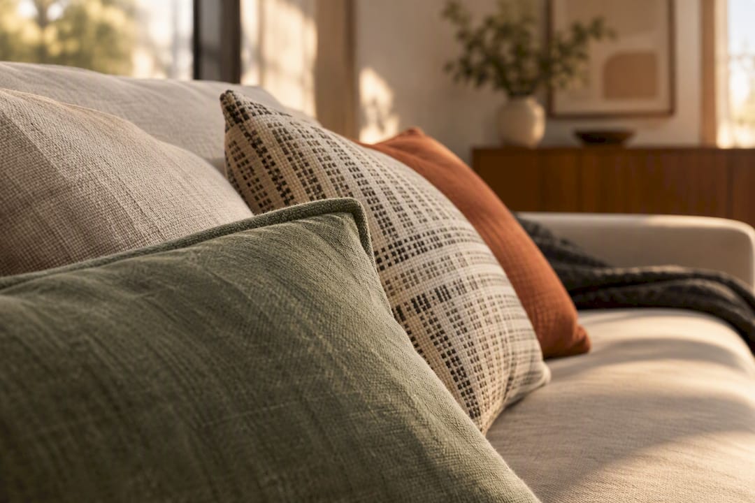
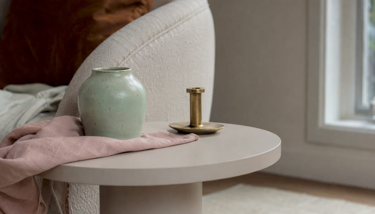
Eco-Future uses warm terracotta, sage, moss, and undyed linen alongside matte bioplastics. The palette signals that the future is grown, not manufactured.
Typography and layout
Variable fonts that shift weight and width in response to context are the typographic signature of the moment. Spatial depth cues, layered type at different z-depths, type that appears to sit inside or behind surfaces, replace the flat grid. Neural-responsive scale, where type size and chromatic weight adapt to user context, is already appearing in living UI systems built on “Aesthetic Probabilities” frameworks.
Materials and finishing for physical work
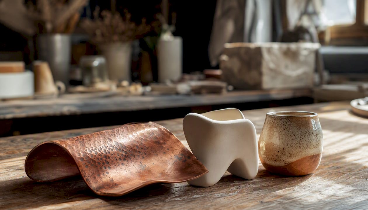
Metallics (brushed aluminium, oxidised copper), matte bioplastics, and handcrafted imperfection are the three material registers. The imperfection is not accidental: it is the physical equivalent of forensic intent, a signal that a human made deliberate choices.
Legacy UI versus generative design: a quick comparison
| Dimension | Legacy UI / visual norms | Generative / agentic design |
|---|---|---|
| Colour system | Fixed hex palette, sRGB | Adaptive OKLCH, context-sensitive |
| Typography | Static type scale | Variable, neural-responsive |
| Layout | Grid-locked, predictable | Probabilistic, spatially layered |
| Texture | Flat or skeuomorphic | Glitch, bioluminescent, material-led |
| Human signal | Craft assumed | Forensic detail as explicit proof |
Pro Tip: Add at least one element that a basic generative model cannot easily replicate: a hand-drawn texture scan, a physical material photograph with genuine depth, or a typographic choice that requires real font licensing. This “aesthetic proof of work” is what separates considered design from AI-junk in 2026.
How future aesthetics translate across disciplines
The visual language shifts register depending on the field, but the underlying logic stays consistent.
Fashion and textiles
Silhouette is the primary carrier: exaggerated shoulders, asymmetric hems, and structural volumes that reference both 1960s Space Age tailoring and contemporary biomechanical armour. Fabrication choices matter as much as cut. Reflective technical fabrics, laser-cut bioplastics, and hand-dyed natural fibres appear in the same collection, often in the same garment. The sustainability dimension is not optional here: lifecycle thinking, where a garment is designed to be composted or disassembled, is now a design constraint rather than a marketing add-on.
Product design
Haptics are the frontier. Products that feel as considered as they look, surfaces with deliberate texture variation, weights that communicate quality without excess material, closures that click with satisfying precision. Materials increasingly come from bio-based sources, and the aesthetic of those materials (the slight translucency of mycelium composites, the warm grain of compressed agricultural waste) is being embraced rather than hidden.
Architecture and interiors
Spatial lighting is the single most powerful tool. Bioluminescent-inspired LED installations, programmable colour temperature, and surfaces that appear to glow from within transform a room’s register entirely. Speculative furniture, pieces that look like they belong in a possible future rather than a catalogue, anchors the aesthetic. Smart home technology is increasingly integrated into surfaces rather than bolted onto them, which changes the visual grammar of domestic space significantly.
UI and UX
Neural-responsive patterns are moving from experimental to expected. Interfaces that adapt chromatic weight, type scale, and spatial depth to user cognitive load represent a genuine shift in how designers think about state. The challenge is maintaining legibility and accessibility as systems become more dynamic. The WCAG 2.2 guidelines remain the baseline; future-facing UI work layers aesthetic ambition on top of that foundation, not instead of it.
Games and media
Worldbuilding is where future aesthetics have the longest tradition and the richest vocabulary. The visual design of a game like Fallout 4 is a masterclass in retrofuturism: 1950s Americana colliding with post-nuclear decay, every prop carrying a story about the future that never arrived. For media and games, the aesthetic is inseparable from lore. Every material choice, every typeface, every colour decision is a piece of narrative evidence.
How speculative, generative, and retro-futurist design connect
These three movements are related but distinct, and conflating them produces muddled work.
Retrofuturism is primarily an aesthetic mode. It recycles past visions of the future, the chrome rockets, the bubble cars, the push-button kitchens, and uses them as visual material in the present. The intent is usually nostalgic, ironic, or celebratory. The audience is anyone who finds that temporal collision pleasurable.
Speculative design is a critical practice. Dunne & Raby and Superflux use designed objects and scenarios to interrogate the futures we are building, not to sell them. The intent is to provoke, to make the audience uncomfortable enough to think. The audience is often institutional: galleries, policy makers, academic conferences.
Generative design is a method, not an aesthetic. It uses algorithms, data, and AI models to produce forms, patterns, and compositions that a human designer then curates and refines. It can serve any aesthetic, retrofuturist, speculative, or otherwise.
Where they converge:
- All three treat the future as a design material, something to be shaped rather than predicted
- All three are currently reacting to AI saturation, either by embracing it (generative), critiquing it (speculative), or retreating to pre-digital visual languages (retro)
- All three feed visual language back into commercial design, even when their origins are academic or critical
Where they diverge:
- Retrofuturism is backward-looking in its sources; speculative design is forward-looking in its questions; generative design is process-focused
- Speculative design resists commercial application by design; retrofuturism and generative design are both commercially mainstream
The aesthetics of intelligence framework from the International Journal of Design proposes five qualities for working with AI as an aesthetic domain: uncertainty, instability, agency, intentionality, and emergence. These five qualities function as a practical compass. When you are designing a generative system or an AI-assisted interface, asking “where is the uncertainty visible?” or “how does emergence manifest in the output?” gives you design decisions to make rather than a blank prompt.
A practical workflow for designing in a future aesthetic
This is a numbered process, not a checklist of optional steps. Each stage builds on the last.
- Define the brief’s temporal register. Is this optimistic (Pop Futurism), critical (speculative), nostalgic (retrofuturist), or anti-aesthetic (Glitch Gothic)? Write it down. Ambiguity here produces incoherent work.
- Research and reference gathering. Pull references from museum archives (Design Museum, Science Museum), film, game art books, and academic sources. Avoid pulling references from social media alone; the algorithm will homogenise your inputs.
- Build a physical or analogue moodboard first. Print references, pin them, annotate them by hand. This step forces you to make decisions about what actually matters before you open any software.
- Set material and palette constraints. Choose one palette family (Pop Futurism pastels, neon cyberpunk, eco-future earth tones) and one material register (metallics, bioplastics, handcraft). Constraints are generative, not limiting.
- Sketch and prototype in low fidelity. Use pencil, marker, or basic vector tools. Generative tools come later; early-stage AI use tends to lock you into the first plausible output.
- Run generative iteration with tight prompts. Use tools like Midjourney, Adobe Firefly, or Stable Diffusion with highly specific prompts that reference your constraints. Treat outputs as raw material, not finished work.
- Apply forensic finishing. Add hand-drawn textures, real material photography, or typographic choices that require genuine craft decisions. This is the “aesthetic proof of work” step.
- Test for accessibility and sustainability. Check colour contrast against WCAG 2.2. For physical work, verify material sourcing against sustainable design principles. Neither is optional.
- Deliver with documentation. Include a short rationale explaining the temporal register, palette choices, and material decisions. This documentation is itself part of the aesthetic; it signals intentionality.
Pro Tip: When briefing a generative model, specificity beats creativity. Instead of “futuristic interior”, write “1960s Space Age lounge, chrome and white, bioluminescent ceiling panel, matte bioplastic side table, warm tungsten accent light, photorealistic.” The model needs constraints to produce work you can actually use.
Pro Tip: For “aesthetic proof of work”, scan a physical texture (crumpled foil, pressed botanical, woven textile) at high resolution and composite it into your digital work. The depth and grain are genuinely difficult for basic generative pipelines to replicate, and they signal human presence immediately.
UK practitioners and projects worth studying
Dunne & Raby
Anthony Dunne and Fiona Raby’s practice, developed largely during their time at the RCA, produced objects that look like products but function as philosophical propositions. Their Designs for an Overpopulated Planet: Foragers project imagined humans with modified digestive systems eating non-human food sources. What to study: the relationship between object plausibility and conceptual provocation. The objects are believable enough to make the scenario feel real.
Superflux
The London-based studio’s Mitigation of Shock installation placed audiences inside a future flat adapted for climate disruption: food growing under artificial light, water rationing, a domestic space under siege. What to study: how spatial design and material choices create emotional truth. The installation works because every prop is specific and considered, not generic.
Design Museum, London
The Design Museum holds a permanent collection and rotating exhibitions that regularly engage with speculative and future-facing work. Their archive includes material from the Designs of the Year awards, which have featured speculative and social design projects alongside commercial work. Worth visiting the online archive for exhibition catalogues and curator essays.
Science Museum, London
The Science Museum’s curatorial projects on technology and society frequently intersect with future aesthetics, particularly around AI, climate, and biotechnology. Their Medicine: The Wellcome Galleries and technology-focused exhibitions show how institutions frame the designed future for a broad public audience. The approach is instructive for anyone working on speculative or educational design.
Tom Dixon
The British designer’s work sits at the intersection of industrial craft and future-facing material exploration. His use of brass, copper, and smoked glass, often in forms that reference both industrial heritage and speculative futures, is a masterclass in how to make an object feel simultaneously timeless and forward-looking. Study his lighting work in particular: the Beat and Melt collections show how material behaviour (the way light moves through a surface) can be the primary design decision.
Which tools do designers actually use?
The toolkit divides into three areas: creative coding, generative image pipelines, and fabrication.
Creative coding
- p5.js is the most accessible entry point for generative visual work in a browser environment; the p5.js community has extensive tutorials for beginners
- Processing remains the standard for complex generative systems and data-driven visuals; practitioner-level
- three.js handles 3D in the browser and is the tool of choice for neural-responsive UI prototyping
Generative image and text pipelines
- Midjourney produces the most aesthetically coherent outputs for visual reference work, but requires tight prompting to avoid generic results
- Adobe Firefly integrates into existing Creative Cloud workflows and respects commercial licensing, which matters for client work
- Stable Diffusion (via ComfyUI or Automatic1111) gives the most control for practitioners who want to fine-tune models on specific visual references
Colour management
OKLCH colour space gives perceptually uniform results across devices and is the right choice for any future-facing UI work. sRGB remains necessary for broad compatibility, but designing in OKLCH and converting down is the current best practice.
Fabrication
- CNC routing for architectural and furniture-scale work with precise material removal
- FDM and resin 3D printing for prototyping objects and testing material combinations
- Hybrid craft: laser-cut base forms finished by hand with traditional techniques (hand-stitching, natural dyeing, hand-polishing) produce the forensic detail that purely digital fabrication cannot
When to choose real materials and hand finishing: whenever the work will be experienced physically, or whenever the brief requires a signal of human presence. A matte bioplastic surface hand-polished with beeswax reads differently from the same surface left as-printed, and that difference is legible to anyone who touches it.
How to bring future aesthetics into your UK home
Translating these ideas into a domestic interior does not require a full renovation. The most effective approach is additive: introduce one or two considered pieces that shift the register of a room, then build from there.
A practical shopping checklist
- Lighting: look for fittings with warm-to-cool colour temperature control, or statement pieces in brushed metal or smoked glass (Tom Dixon’s influence is visible across the mid-market here)
- Textiles: matte, tactile fabrics in eco-future palettes (sage, terracotta, undyed linen) or Pop Futurism pastels (soft lilac, mint); texture matters as much as colour
- Storage: pieces that look considered rather than purely functional; matte finishes, organic forms, materials with visible grain or texture
- Ornaments and accessories: objects that feel like they have a story, whether that is a handcrafted ceramic with visible tool marks or a geometric metal form that could be a scale model of something larger
Building a moodboard for a UK home
Start with three reference images: one from a museum archive (Design Museum or Science Museum online collections), one from a contemporary designer’s portfolio, and one from your own home as it currently stands. The gap between the third image and the first two is your design brief. Pin them physically, annotate what specifically appeals (a material, a colour relationship, a form), and use those annotations to guide purchases rather than whole-room overhauls.
For colour palette guidance that maps directly to these aesthetics, Homable’s resources cover the specific combinations that work in UK domestic light conditions, which tend to be cooler and more diffuse than the Mediterranean or Californian interiors that dominate design media.
Pro Tip: Mix Homable’s storage and textile categories deliberately: a sage-green woven storage basket next to a brushed-metal ornament and a matte ceramic vase creates the eco-future palette in miniature without requiring a single piece of furniture to change. The combination signals future aesthetic awareness while keeping the space warm and liveable.
The smart home aesthetics guide on Homable covers how technology integration changes the visual grammar of domestic space, which is directly relevant if you are thinking about lighting control or connected accessories as part of a future-facing interior.
Where to go next: books, exhibitions, and tools
Books worth reading
- Anthony Dunne and Fiona Raby, Speculative Everything (MIT Press, 2013): the foundational text for speculative design practice; accessible to non-specialists and essential for anyone working in the field
- Bruce Sterling, Shaping Things (MIT Press, 2005): a short, dense argument for designed objects as carriers of future scenarios; practitioner-level
- Rick Poynor, Obey the Giant (Birkhäuser, 2001): covers the visual culture of the late 20th century that feeds directly into contemporary retrofuturism; good for historical context
- Ellen MacArthur Foundation resources on circular design: free online; essential for anyone working with sustainable design principles at a serious level
Exhibitions to look up
- Design Museum, London: check the Designs of the Year archive and any current exhibitions on technology and society; the museum’s online collection is searchable
- Science Museum, London: the Information Age gallery and technology-focused temporary exhibitions; particularly useful for understanding how institutions frame AI and biotechnology for public audiences
- V&A: the Rapid Response Collecting programme acquires objects that respond to current events; a useful barometer of what designers are making right now
Online communities and tutorials
- The p5.js community and its associated learning resources are the best starting point for generative visual practice
- Are.na is the research and moodboarding platform most used by speculative and future-facing designers; far better signal-to-noise than Pinterest for this kind of work
- Domestika and Skillshare both carry courses on generative design and speculative practice; Domestika tends to have stronger craft-focused content
For beginners, Speculative Everything and the p5.js tutorials are the right entry points. For practitioners already working in the field, the IJDesign article on the aesthetics of intelligence and the Lucky Graphics generative aesthetics update are the most current theoretical and practical references available.
Key takeaways
Future design aesthetics in 2026 are defined by the tension between AI-generated uniformity and deliberate human craft, and the designers who navigate that tension most effectively are the ones who understand both the visual vocabulary and the underlying conceptual frameworks.
| Point | Details |
|---|---|
| Recognise the three palette families | Pop Futurism pastels, neon cyberpunk, and eco-future earth tones each signal a distinct future register. |
| Follow the nine-step workflow | From brief to forensic finishing, each stage builds on the last; skipping the analogue moodboard step produces incoherent generative outputs. |
| Prioritise forensic detail | Adding hand-scanned textures or craft-finished surfaces creates “aesthetic proof of work” that distinguishes considered design from AI-junk. |
| Mix retro with humane tech | Retrofuturist motifs combined with warm materials and optimistic palettes produce the most resonant domestic interiors in 2026. |
| Homable for home application | Homable’s curated textiles, storage, and accessories map directly to eco-future and Pop Futurism palettes for UK domestic interiors. |
Why forensic craft is the real future of design
The conversation around future aesthetics tends to get captured by the tools: which AI model, which generative pipeline, which software stack. That framing misses what is actually interesting about where design is heading.
The practitioners who are producing the most compelling work right now, whether that is Superflux building immersive climate futures in East London or Tom Dixon finishing a brass fitting by hand in his Portobello Road studio, share one quality: they treat the evidence of human decision-making as a design material in itself. The glitch is intentional. The imperfect texture is chosen. The unexpected material combination is argued for, not generated.
What the AI saturation of the past few years has done, paradoxically, is make craft legible again. When a perfectly rendered image costs nothing, the image with visible human fingerprints becomes the premium object. That is not nostalgia. It is a rational response to a changed economy of attention.
For creatives working in the UK, this is genuinely good news. The tradition of craft-led design, from the Arts and Crafts movement through to contemporary makers working in ceramics, textiles, and metalwork, is a competitive advantage in a global visual economy where most outputs look the same. The future aesthetic that will matter most is not the one that looks most like the future. It is the one that most clearly shows a human being made it.
Style your home with Homable’s future-inspired collections
Translating future aesthetics into a real home is easier when the products are already curated for you. Homable’s collections bring together the specific combinations that work: matte-finish storage in organic forms, textiles in eco-future palettes, and decorative accessories that carry the kind of considered detail that makes a room feel designed rather than assembled.
The practical pairings are straightforward. A brushed-metal ornament alongside a sage woven basket and a matte ceramic vase delivers the eco-future palette in a single shelf arrangement. A smoked-glass candle holder next to a geometric metal doorstop introduces the retrofuturist material register without a single piece of furniture changing. These are not expensive interventions; they are considered ones.
Free shipping makes it easy to experiment with a small collection of pieces before committing to a larger styling direction. Browse Homable’s home decor collections to find the accessories, textiles, and storage pieces that map to the future aesthetic checklist in this article.
Useful sources
- Teen Vogue: Glitch Gothic (2026) — cultural reporting on Glitch Gothic as a post-AI anti-aesthetic; informs the motifs and influences sections
- IJDesign: Designing Aesthetics of Intelligence — academic framework proposing five qualities (uncertainty, instability, agency, intentionality, emergence) for AI-aware design; informs the speculative and generative design section and further reading
- ASID Principles of Sustainable Design — professional framework for regenerative built environment design; informs the sustainability notes in the workflow section
- Wikipedia: Retrofuturism — encyclopaedic overview of retrofuturism’s history and cultural context; informs the history and origins section
- Homable: Smart home aesthetics guide — Cristiano’s practical guide to future-forward domestic styling; informs the home application and perspective sections