Cart
0
TL;DR:
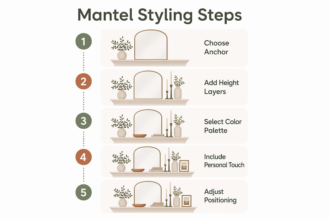
- Step-by-step mantel styling involves deliberate arrangement of decorative items to create a balanced focal point that anchors a living room. The process emphasizes choosing a central anchor piece spanning 60 to 75% of the mantel’s width and using height layering with one tall, one medium, and one low item in each cluster for visual balance. Limiting the number of items, maintaining negative space, and applying cohesive color palettes and seasonal touches ensure an elegant, intentional display.
Step by step mantel styling is the process of deliberately arranging decorative items on your fireplace shelf to create a balanced, proportionate focal point that anchors your entire living room. The mantel is the most visible surface in most sitting rooms, yet it is also the most frequently cluttered or neglected. Get it right and the whole room feels considered. Get it wrong and even expensive furniture cannot save the space. This guide walks you through every stage, from choosing your central anchor piece to weaving in seasonal touches, using the same principles professional interior stylists apply to every project.
How to start step by step mantel styling with the right anchor piece
The anchor piece is the single most important decision in any mantel arrangement. It sets the scale, tone, and visual weight for everything else you place on the shelf. Think of it as the spine of the display. Every other item exists in relation to it.
According to proportion guidelines used by interior designers, an anchor piece should span roughly 60 to 75% of the mantel’s total width and fill approximately two thirds of the vertical wall space between the shelf and the ceiling or crown moulding. That is not a loose suggestion. It is the ratio that prevents the display from looking either dwarfed by the wall or cramped by oversized decor.
Common anchor choices include:
- Large mirror — reflects light, adds depth, and works in almost every interior style
- Framed artwork — introduces colour and personality; works best when the frame material echoes other metals or woods in the room
- Oversized vase or sculptural object — ideal for contemporary or eclectic spaces where a mirror would feel too traditional
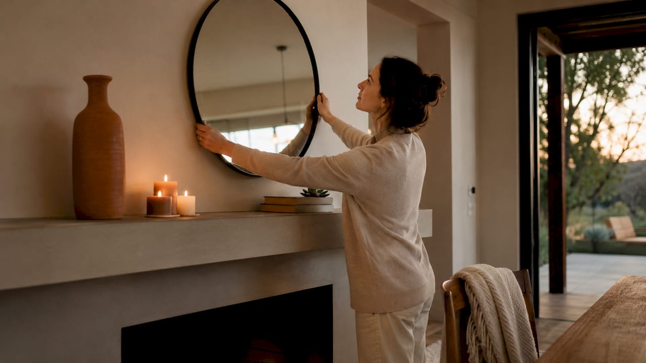
Positioning matters as much as the piece itself. Leaning a mirror or large artwork against the wall rather than hanging it creates a relaxed, gallery-style effect and allows for easy seasonal rotation without touching the masonry. If you do hang a heavy piece, use hidden earthquake straps or wall studs rather than standard picture hooks. Standard hooks are not rated for the weight of a large framed mirror and the consequences of failure above a fireplace are serious.
Pro Tip: Place your anchor piece slightly off-centre if your mantel is wider than 120 cm. A centred anchor on a very wide shelf can look institutional. Shifting it 10 to 15 cm to one side immediately introduces a more relaxed, editorial quality.
| Anchor type | Best for | Positioning note |
|---|---|---|
| Large mirror | Small or dark rooms | Lean or hang centred; reflect a window if possible |
| Framed artwork | Colour-led or eclectic rooms | Off-centre lean works well on wide mantels |
| Sculptural vase | Contemporary or minimal rooms | Place slightly left or right of centre |
What is the ideal number of items for different mantel sizes?
Overcrowding is the most common mantel mistake, and it almost always comes from adding items without a clear count in mind. The number of decorative pieces you use should be determined by the width of your shelf, not by how many things you own or love.
Design standards recommend a clear item count based on mantel width:
- Mantels under 48 inches: use 3 to 4 decorative items. Any more and the shelf reads as a storage surface rather than a styled display.
- Standard 60-inch mantels: 5 to 6 items is the recommended range. This gives you enough variety to create visual interest without tipping into clutter.
- Mantels wider than 72 inches: up to 7 items, arranged in two or three distinct clusters rather than spread evenly across the shelf.
The principle of negative space is equally non-negotiable. At least 30% of the mantel surface should remain clear at all times. That open space is not wasted. It is what allows the eye to rest and gives each object room to be seen properly. A mantel where every centimetre is filled reads as anxious rather than styled.
Arrange items using the rule of thirds. Divide the mantel into three equal horizontal zones and place your clusters within those zones rather than distributing objects randomly. This creates a horizontal rhythm that feels deliberate without being rigid.
“The best-styled mantels feel like they happened naturally, but every single item was placed with intention. Negative space is the invisible ingredient most people forget.” — Interior styling principle cited across professional design guides.
For readers interested in applying the same restraint principles to other surfaces, the approach to minimalist home design translates directly to mantel work.
How does the ‘1 tall, 1 medium, 1 low’ formula work?
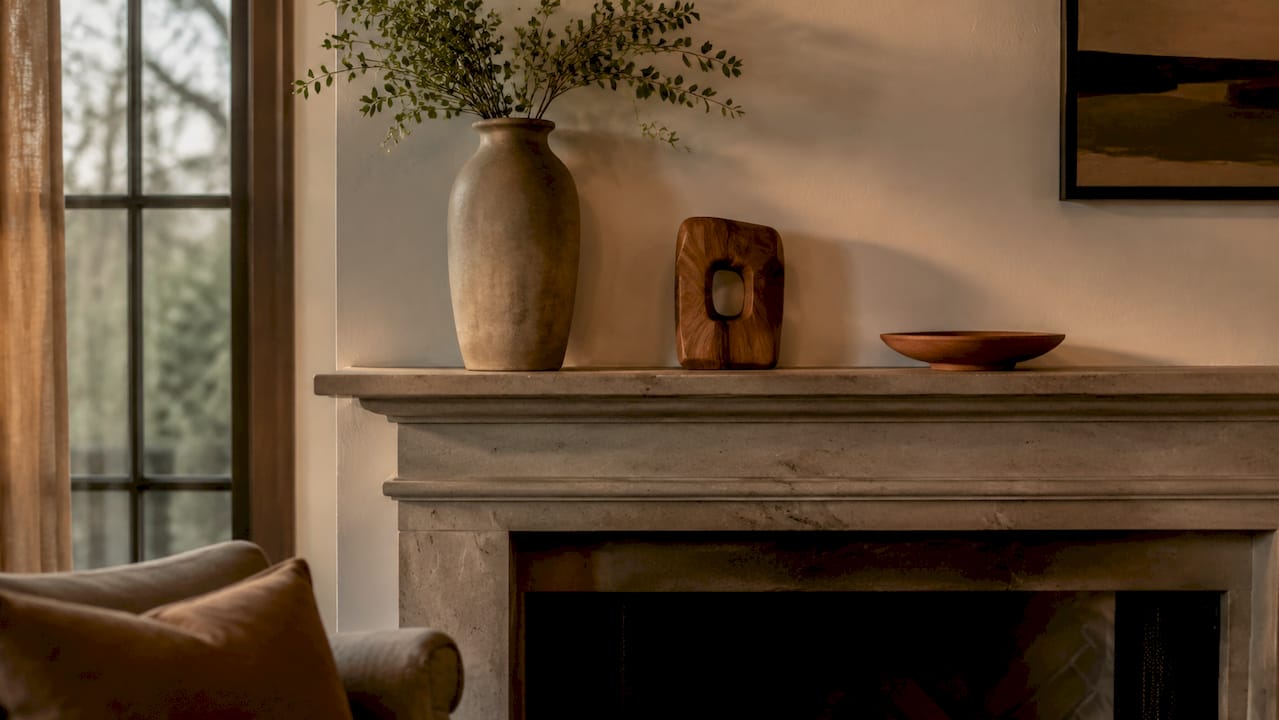
Height variation is what separates a flat, forgettable mantel from one that holds your attention. The height layering formula used by professional stylists is straightforward: within each side cluster, include one tall item, one medium item, and one low item. This creates a triangular silhouette that the eye reads as balanced and complete.
The tallest items in your side clusters should not exceed 75% of the anchor piece’s height. If your mirror is 90 cm tall, your candlesticks or tall vases should sit no higher than 67 cm. Exceeding this ratio makes the side items compete with the anchor rather than support it.
Here is how the three height tiers typically translate into real objects:
- Tall (60 to 75% of anchor height): Taper candlesticks, slender ceramic vases, tall lanterns, or a stack of hardback books standing upright
- Medium (40 to 55% of anchor height): Small framed prints, squat candles in glass vessels, potted trailing plants, or decorative boxes
- Low (under 30% of anchor height): Small figurines, smooth stones, a single stem in a bud vase, or a folded textile
| Height tier | Example objects | Common mistake |
|---|---|---|
| Tall | Candlesticks, ceramic vases | Placing too close to anchor, creating visual collision |
| Medium | Framed prints, glass vessels | Using two items of identical height side by side |
| Low | Figurines, bud vases, stones | Forgetting this tier entirely, leaving the base flat |
Texture is the other variable in this formula. Pair smooth surfaces with rough ones: a polished marble object next to a woven basket, or a matte ceramic beside a glass hurricane. The overlap technique reinforces this further. Place a smaller object partially in front of a larger one rather than beside it. This creates depth and makes the arrangement read as a unified composition rather than a row of separate items.
Pro Tip: Photograph your mantel on your phone and look at the image rather than the shelf itself. The camera flattens the scene and makes height imbalances and texture gaps far easier to spot than when you are standing in front of it.
How to choose a colour palette that ties your mantel together
Colour is the fastest way to create cohesion across a group of unrelated objects. A mantel that holds items in three or more competing colour families will always look busy, regardless of how well the individual pieces are chosen.
The rule is simple: limit your palette to 2 to 3 tonal colours. Structure it as follows:
- Dominant neutral (50 to 60% of the display): cream, warm white, soft grey, or natural wood tones. This is the background colour that lets everything else breathe.
- Primary accent (25 to 35%): one deliberate colour that appears in at least two or three objects. Terracotta, sage green, dusty blue, and aged brass are all currently strong choices for British interiors.
- Secondary tone (10 to 15%): a quieter supporting colour that bridges the neutral and the accent. Soft blush alongside terracotta, or warm bronze alongside sage, for example.
Repeat the accent colour in at least two places across the mantel. If your primary accent is sage green, it might appear in a ceramic vase on the left and a small framed print on the right. That repetition is what makes the display feel planned rather than assembled from whatever was available. For broader guidance on building a palette that works across an entire room, Homable’s guide to colour palettes for UK homes is a useful companion resource.
How to personalise your mantel with seasonal and meaningful touches
A mantel that never changes becomes invisible. Seasonal updates and personal objects are what keep the display feeling alive and connected to the people who live in the home. The challenge is doing this without losing the structure you have built.
Seasonal decor should not exceed 20% of your total item count. On a 60-inch mantel with five items, that means one seasonal piece at most. This constraint sounds limiting but it is actually liberating. It forces you to choose one strong seasonal object rather than covering the shelf in themed accessories that date quickly.
Practical ideas for seasonal and personal touches:
- Biological elements: A single branch of blossom in spring, dried seed heads in autumn, or a small potted evergreen in winter. These add organic texture that no manufactured object can replicate.
- Antiques and collectibles: One inherited or found object grounds the display in personal history. A vintage clock, a ceramic piece from a market, or a framed photograph in a beautiful frame all work well.
- Leaning art: Swapping a leaned print for a seasonal alternative takes thirty seconds and requires no wall damage. Keep a small rotation of three or four prints and change them with the seasons.
- Textiles: A small folded throw draped over one end of the mantel shelf adds warmth in winter without requiring any new purchases.
Pro Tip: Store your off-season mantel pieces together in one labelled box. When you rotate, you are not hunting through storage. The discipline of a single box also limits how much seasonal decor you accumulate over time.
Key takeaways
A well-styled mantel depends on proportion, restraint, and deliberate layering rather than the number or cost of the objects you own.
| Point | Details |
|---|---|
| Anchor piece proportion | Choose an anchor that spans 60 to 75% of mantel width and two thirds of the wall height above. |
| Item count by size | Use 3 to 4 items on small mantels and 5 to 6 on standard 60-inch shelves to avoid clutter. |
| Height layering formula | Apply one tall, one medium, and one low item per cluster for visual rhythm and balance. |
| Colour restraint | Limit the palette to a dominant neutral plus one or two accent tones, repeated across the display. |
| Seasonal discipline | Keep seasonal pieces to no more than 20% of total items to maintain a refined look year-round. |
Why symmetry is overrated (and what actually works)
I have styled a lot of mantels, and the single most common trap I see homeowners fall into is treating symmetry as the goal. Perfectly mirrored arrangements feel safe but they also feel static. The approach that design professionals actually recommend is to start with a symmetrical base and then deliberately unravel it. Move one item slightly forward. Replace a matching pair with two objects of similar visual weight but different form. That small act of intentional asymmetry is what makes a mantel look styled rather than staged.
The other lesson I keep returning to is that breathing room is not empty space. It is an active design choice. Every time I have been tempted to add one more object, the display has suffered. The mantels I am most pleased with are always the ones where I removed something at the last moment. That restraint is harder than it sounds, especially when you have a collection of things you love. But the overlap technique gives you a way to include more without crowding: layer objects in front of each other rather than beside each other, and the shelf gains depth without gaining clutter.
My honest advice is to photograph the mantel before you commit to any arrangement. The camera does not lie. If something looks off in the image, it is off in real life. Trust the photograph over your instinct when you are standing close to the shelf.
— Cristiano
Complete your room with Homable’s home décor
A beautifully styled mantel deserves a room that matches it. Homable stocks a curated range of home décor pieces designed to complement the kind of considered, layered interiors this guide describes. From natural bamboo rugs that ground a sitting room with organic texture, to stylish woollen rugs that introduce the kind of accent colour your mantel palette needs to breathe through the whole space, Homable makes it straightforward to pull a room together. Free shipping is available on orders over £100, and the full collection is updated regularly with new arrivals suited to modern British homes.
FAQ
What should I put in the centre of my mantel?
Place your anchor piece at or near the centre. A large mirror, framed artwork, or sculptural vase that spans 60 to 75% of the mantel width works best and sets the proportional foundation for everything else.
How many items should I put on my mantel?
Use 3 to 4 items on mantels under 48 inches and 5 to 6 items on standard 60-inch mantels. Keeping at least 30% of the surface clear prevents the display from looking cluttered.
How do I make my mantel look less flat?
Apply the height layering formula: include one tall, one medium, and one low item in each side cluster. Use the overlap technique to place smaller objects partially in front of larger ones, which adds depth and visual cohesion.
How often should I change my mantel decor?
Seasonal updates work well, but limit seasonal pieces to no more than 20% of your total item count. Leaning art and mirrors make rotation quick and damage-free, so a light refresh every three months is realistic for most households.
What colours work best for mantel styling?
Limit your palette to two or three tonal colours: a dominant neutral, one primary accent, and one quieter supporting tone. Repeating the accent colour in at least two objects across the display is what creates cohesion among varied decorative pieces.