Cart
0
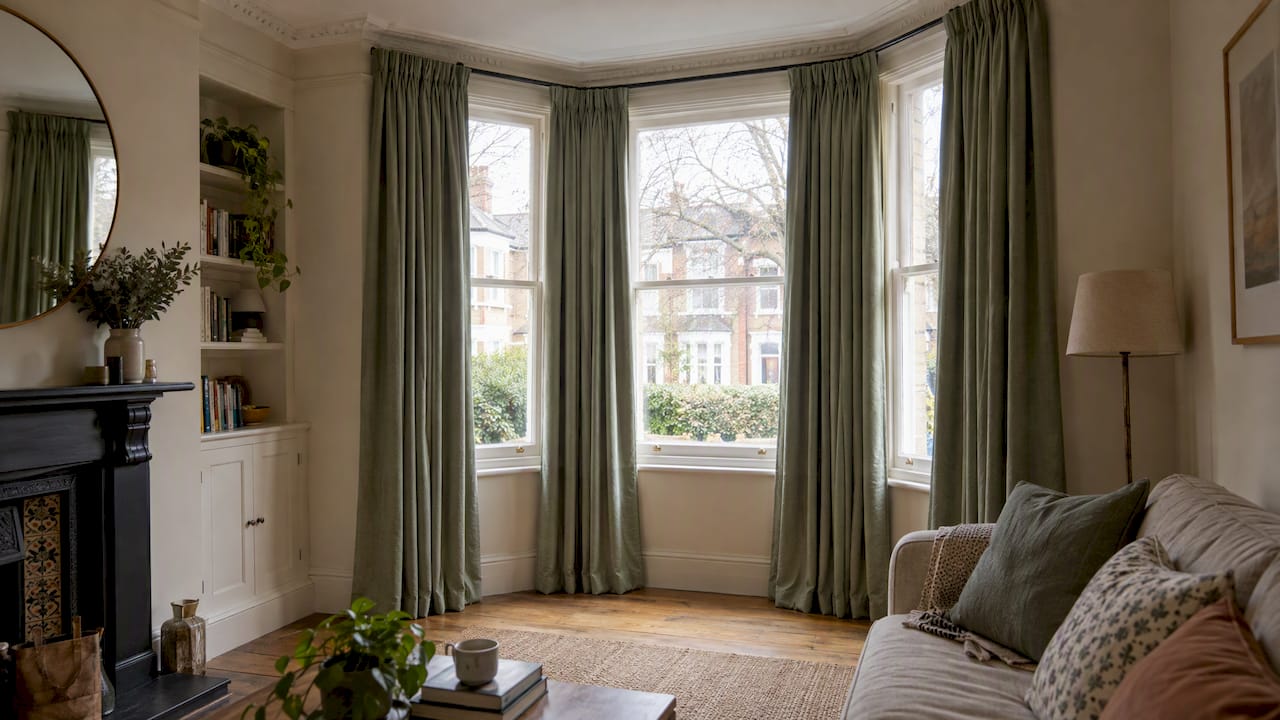
The elements of curated design are a tight, repeated colour palette, layered materials and textures, purposeful lighting, meaningful objects grouped with intent, and a layout that respects scale and function. Together they turn a room from “decorated” into “collected”, where every piece earns its place. Interior editors at Elle Decoration describe this same mix of cohesive colour, varied texture and layered light as the backbone of any curated interior. Here’s the shortlist:
- A cohesive, limited colour palette with a repeated accent colour
- Layered materials and textures for depth
- Intentional lighting across three layers (ambient, task, accent)
- Art and object groupings with real narrative
- Scale, proportion and functional zoning
- A disciplined edit, so nothing competes for attention
- A deliberate mix of old and new
Key Takeaways
Curated design succeeds when a limited palette, layered materials, structural lighting, and disciplined editing all work towards one room narrative, rather than as separate decorating tasks.
| Point | Details |
|---|---|
| Fix your palette early | Choose one dominant neutral, one secondary tone, and one accent repeated at least three times. |
| Treat lighting as structure | Layer ambient, task, and accent lighting before arranging objects or vignettes. |
| Edit with a method | Use keep, donate, pause and a 30-day rule for uncertain items rather than guessing. |
| Leave room to breathe | Keep 30 to 40% of shelf and surface space empty so hero pieces stand out. |
| Source with intent | Homable’s curated collections group pieces by finish and tone, making it easier to repeat a material without duplicating what you own. |
Table of Contents
- The core elements of curated design explained
- How do you curate a room step by step?
- How do you mix materials without it looking random?
- Why is lighting a structural element, not a finishing touch?
- What editing rules keep a curated home from becoming cluttered?
- A 7-step checklist for curating any room
- Sources
The core elements of curated design explained
Each element does a specific job. Get one wrong and the room reads as cluttered rather than collected, no matter how expensive the pieces are.
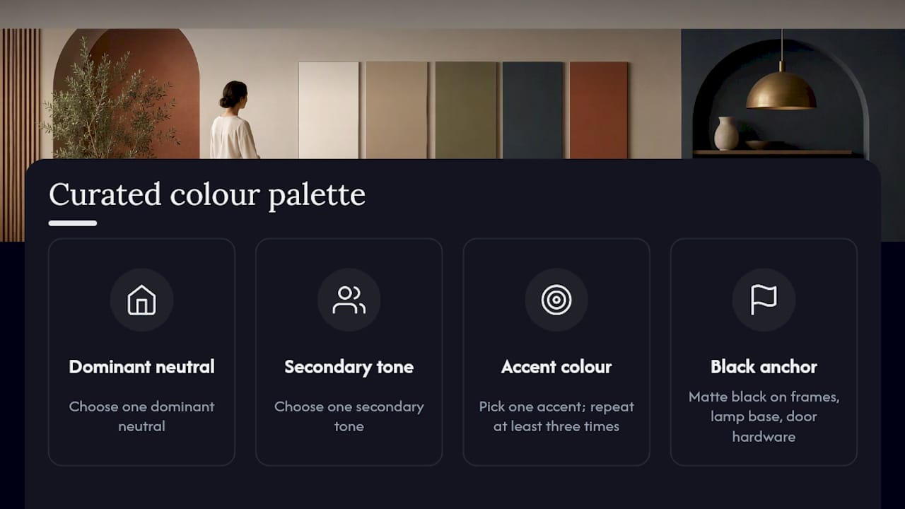
Colour palette. Pick one dominant neutral, one secondary tone, and one accent colour repeated at least three times across the room. Designer Tineke Triggs uses matte black as a small, repeating anchor in her schemes. It shows up on picture frames, a lamp base, or door hardware, grounding a palette without ever dominating it, according to Homes & Gardens. The common mistake: introducing a fourth or fifth colour “because it’s pretty”, which dilutes the story instantly.
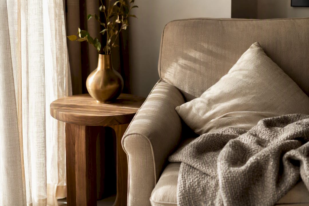
Materials and texture. Mix hard and soft finishes deliberately, linen against stone, brushed metal against wood. The mistake is choosing only glossy or only matte surfaces, which flattens the room visually.
Lighting. Treat it as structure, not decoration (more on this below).
Art and vignettes. Group objects in odd numbers, vary their heights, and leave gaps between them so relationships are visible, a technique curators use in gallery displays and one that Ideal Home recommends for domestic groupings too.
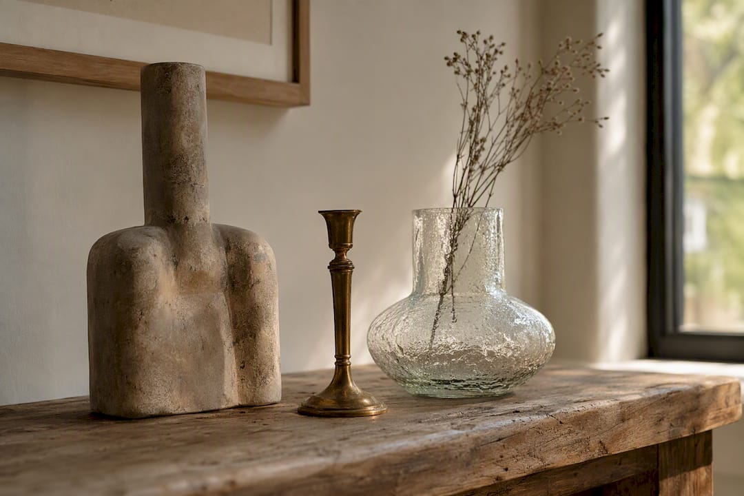
Scale and layout. Match furniture size to the room’s actual traffic flow, not to what looked good in a showroom.
Anchors and repetition. One dominant neutral, one secondary hue, one accent, repeated at least three times.
Mixing eras. Pair one antique, one mid-century, and one contemporary piece for controlled contrast rather than visual noise.
Pro Tip: Repeat one finish, brass, oak, or black iron, in at least two objects in the same room. That single repetition is often what makes an eclectic mix read as intentional rather than accidental.
How do you curate a room step by step?
Curating one room well beats decorating five rooms half-heartedly. Start with a single space and one sentence describing how it should feel, “a calm reading corner” does more work than “nice living room”.
- Survey and edit. Remove everything, then reintroduce only pieces that support your one-sentence narrative.
- Define palette and materials. Lock in your dominant neutral, secondary tone, and accent before buying anything new.
- Anchor with a hero piece. A sofa, a sideboard, or a rug sets the scale for everything else.
- Layer the lighting. Add ambient, task, and accent sources before you arrange smaller objects.
- Arrange vignettes. Group objects in threes, varying height and material.
- Test circulation. Walk the room as you would daily. Adjust anything that blocks a natural path.
- Final edit. Remove one more thing than feels comfortable. It usually improves the room.
Checklist: narrative written down, palette fixed, hero piece placed, lighting layered, vignettes grouped, pathway clear, one item removed.
How do you mix materials without it looking random?
Consistency in undertone matters more than variety in material. Pair warm woods with warm metals, cool stones with cool metals, and avoid mixing the two families in the same vignette.
A dependable combination is linen, honed stone, and brushed brass, one soft, one solid, one metallic, which gives contrast without chaos. Ideal Home suggests a similar rule of three: pick three eras and three textures, then let patina do the rest, since a worn wooden bowl or a tarnished brass handle signals genuine provenance rather than a showroom purchase.
Pro Tip: Vary scale deliberately. Choose one large anchor material (a stone worktop, a substantial rug) and let smaller accents in different finishes orbit around it, rather than giving every material equal visual weight.
Why is lighting a structural element, not a finishing touch?
Lighting decides which parts of a curated room the eye notices first, so it belongs in the planning stage, not the styling stage. Ideal Home frames layered lighting, ambient, task, and accent, as the tool that turns a random collection of objects into a deliberate vignette.
- Ambient fills the room generally: overhead fittings or a pendant.
- Task supports a function: a reading lamp beside a chair.
- Accent draws the eye to something specific: a wall sconce beside a shelf, or a small spotlight on artwork.
Pro Tip: Angle a low-level lamp across a textured surface, linen, stone, aged wood, rather than straight at it. Raking light reveals patina that flat overhead lighting flattens out.
What editing rules keep a curated home from becoming cluttered?
A curated look degrades fast without ongoing discipline. The keep, donate, pause method, recommended by interior designer Linda Crammond, gives you a decision framework rather than a mood-based guess.
- Keep anything that supports your room’s one-sentence narrative.
- Donate anything that doesn’t, regardless of sentimental value.
- Pause anything you’re unsure about for 30 days before deciding.
Ask three questions before adding a new object: does it match my palette rules, does it support the room’s story, and does it replace something rather than add to the pile.
- Do create landing zones, a tray by the door, a bowl for keys, so daily clutter has a home.
- Don’t fill every shelf or surface. Leave roughly 30 to 40% of shelf space empty so statement pieces can breathe.
Pro Tip: On a sideboard or shelf, count your objects, then remove one. That final gap is usually what separates “curated” from “crowded”.
A 7-step checklist for curating any room
- Survey the room. List every object currently in it before changing anything.
- Choose your narrative. Write the one sentence the room needs to express.
- Set your palette. Fix a dominant neutral, secondary tone, and repeated accent, borrowing ideas from Homable’s colour palette guides if you need a starting point.
- Pick a hero piece. A rug, sofa, or storage piece that anchors scale.
- Layer materials. Balance hard and soft, repeat one finish twice.
- Define lighting zones. Assign ambient, task, and accent sources before styling.
- Final edit. Remove one object more than feels natural, then stop.
Curating versus decorating
Curating takes longer than decorating because you’re editing against a narrative, not filling gaps. I’ve come to think the slowest part, the pause before buying, is the part people skip first. Homable’s approach to functional, considered decor reflects that same patience: fewer pieces, chosen for a reason, not a trend.
Where to find pieces that fit a curated scheme
Once your palette, materials, and hero piece are decided, the harder part is sourcing objects that actually match the narrative instead of pieces that simply look nice in isolation. Homable’s curated collections are grouped by finish and tone rather than by trend cycle, which makes it easier to find a lamp, tray, or storage piece that repeats an existing material without duplicating what you already own.
Browsing by category also helps you test the rule of three, spotting a stone accessory, a brushed brass fixture, or a linen textile without wading through mismatched inventory. No personal data is collected beyond what’s needed to process an order, and all transactions run through secure checkout.
If you’re ready to fill that one remaining gap on your shelf or sideboard, start with Homable’s home page and search by the material or tone your room’s narrative already calls for.