Cart
0
TL;DR:
- Choosing appropriately scaled wall art creates visual balance and prevents it from looking lost.
- Hanging art at 145–150 centimeters from the floor and maintaining a 15–20 centimeter gap ensures a natural, cohesive look.
Selecting wall art is the process of matching size, placement, medium, and style to your home’s decor and your personal taste. The best wall art selection tips centre on four principles: scale, placement, style, and personal meaning. Get these right and your walls stop being blank surfaces. They become the most expressive part of your home. The two-thirds rule and the standard gallery hanging height of 145–150 cm from the floor are the two benchmarks every homeowner should know before buying a single piece.
1. How to choose the right size for your wall art
Size is the single most common mistake homeowners make. Most people choose art that is far too small for the wall or the furniture beneath it.
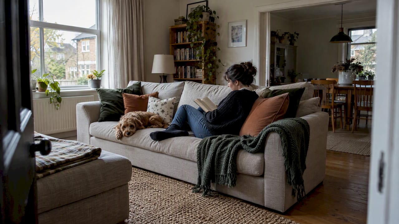
The two-thirds rule is the professional standard: artwork should be roughly 60–75% the width of the furniture it hangs above. For a 2-metre sofa, that means choosing a piece between 1.2 and 1.5 metres wide. That width creates visual balance rather than leaving the art looking stranded above the furniture.
Interior stylist Maxine Brady puts it plainly: going bigger rather than smaller helps the piece anchor the space and prevents it from looking lost. A small print above a large sofa reads as an afterthought. A properly scaled piece reads as a deliberate design choice.
Pro Tip: Before you buy, cut newspaper or brown paper to the exact dimensions of the artwork you are considering. Tape it to the wall and live with it for a day. You will know immediately whether the scale works.
- For a standard 2-metre sofa, aim for artwork 1.2–1.5 metres wide.
- For a double bed headboard, artwork should span roughly two-thirds of the headboard width.
- For a fireplace, match the artwork width to the mantelpiece or go slightly narrower.
- In small rooms, one large piece creates more visual space than several small ones.
2. Getting the hanging height right
Hanging height affects how art feels in a room more than most homeowners realise. Art hung too high looks disconnected. Art hung too low looks awkward.
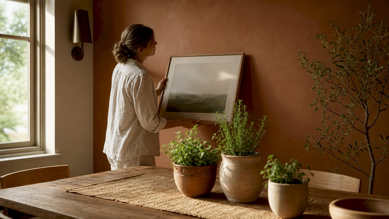
The standard gallery height places the centre of the artwork at 145–150 cm from the floor. This matches average eye level and mirrors how professional galleries display work. It creates a natural, comfortable viewing experience without anyone craning their neck.
The gap between the top of your furniture and the bottom of the artwork matters just as much. Maintain 15–20 cm between the furniture’s top edge and the artwork’s bottom edge. This spacing visually connects the art to the furniture below it. Without this gap, the piece floats on the wall with no relationship to the room.
Room height changes the calculation slightly. In rooms with ceilings above 2.7 metres, you can raise the artwork a few centimetres to fill the vertical space. In low-ceilinged rooms, keep strictly to the 145 cm centre-point rule.
3. Matching art style to your interior decor
Art style and interior style need to speak the same language. A heavily ornate oil painting in a minimal Scandi living room creates visual noise rather than character.
Match the artwork’s mood to your existing decor. Minimalist interiors suit abstract prints, line drawings, and monochrome photography. Farmhouse and country styles suit botanical illustrations, landscape prints, and hand-lettered pieces. Boho and eclectic rooms welcome woven textiles, earthy tones, and mixed-media work. For cohesive home decor, the art should feel like it belongs to the same visual family as your furniture and textiles.
Framing style carries as much weight as the artwork itself. Slim black or white frames suit modern and contemporary rooms. Natural wood frames work well in Scandi and organic interiors. Ornate gold or antique frames suit maximalist and traditional spaces. The frame is not a neutral container. It is part of the design decision.
Pro Tip: Pull one colour from your existing soft furnishings, such as a cushion or rug, and use it as a guide when choosing artwork. Art that echoes a colour already in the room feels intentional rather than random.
4. Choosing the right medium and material
The medium you choose affects both the look and the longevity of your wall art. Canvas, framed prints, metal, wood, and woven textiles each bring different textures and visual weight to a wall.
Canvas prints suit relaxed, informal rooms and work well in living spaces and bedrooms. Framed prints under glass feel more considered and suit dining rooms, studies, and hallways. Metal and wood art add three-dimensional texture, which reads well in rooms that already have tactile surfaces like exposed brick or natural stone. Woven textiles and macramé bring warmth and softness, particularly in bedrooms and boho-styled spaces.
Handmade and original art carries a quality that prints cannot replicate. The brushwork, texture, and uniqueness of an original piece add genuine depth to a room. That said, high-quality giclée prints on archival paper are a practical and affordable alternative that holds up well over time.
- Canvas: casual, warm, suits living rooms and bedrooms.
- Framed prints: polished, versatile, suits dining rooms and hallways.
- Metal art: graphic, modern, suits contemporary and industrial spaces.
- Woven textiles: soft, tactile, suits bedrooms and boho interiors.
- Original art: unique, textured, adds depth no print can match.
5. Single statement pieces versus gallery walls
The choice between one large piece and a gallery wall is a question of room size, ceiling height, and how much visual complexity you want.
A single large piece creates a bold focal point. It works particularly well in small rooms, where multiple frames create clutter. One strong piece on a feature wall draws the eye without overwhelming the space. It also suits rooms with busy furniture or strong pattern work elsewhere.
Gallery walls work best when they follow a clear structure. Frames or mats that match and a limited colour palette of 2–3 tones prevent the arrangement from looking chaotic. An anchor piece, typically the largest or most visually dominant work, should sit at the centre of the arrangement. Everything else builds around it.
Consistent spacing of 5–8 cm between frames is the difference between a polished gallery wall and a cluttered one. Uneven gaps make the arrangement look accidental. Even gaps make it look deliberate.
| Approach | Best for | Key rule |
|---|---|---|
| Single large piece | Small rooms, busy decor | Scale to two-thirds of furniture width |
| Gallery wall | Large walls, eclectic collections | Match frames, limit palette to 2–3 colours |
| Diptych or triptych | Medium walls, narrative art | Hang as one unit with equal spacing |
Pro Tip: Lay frames on the floor and use paper cut-outs taped to the wall to preview your gallery layout before committing to any nails. This saves significant time and avoids unnecessary holes.
6. Planning your layout before you hang anything
Planning before hanging is the step most homeowners skip. It is also the step that prevents the most mistakes.
Use painter’s tape to mark the exact footprint of each piece on the wall. Stand back and assess the arrangement from the doorway, not just up close. The view from the entrance to a room is the view that matters most. If the arrangement looks wrong from there, it will always look wrong.
For gallery walls, cut paper templates to the size of each frame and arrange them on the floor first. Photograph the floor layout before transferring it to the wall. This gives you a reference point when you start taping templates to the wall.
Check the room-by-room decor context before finalising placement. A piece that works in a living room may feel wrong in a bedroom if the scale or subject matter does not suit the room’s purpose.
7. Framing, lighting, and protecting your art
Framing is not just aesthetic. The right frame protects your artwork and extends its life significantly.
UV-protective glazing is the correct choice for works on paper and photography. Direct sunlight fades these mediums within months without protection. UV glass blocks the wavelengths that cause fading without significantly altering the appearance of the work. For textured canvases and three-dimensional pieces, glazing is unnecessary and can create unwanted reflections.
Lighting transforms how art reads in a room. Natural light is ideal but unpredictable. Picture lights mounted directly to the frame give consistent, focused illumination. Directional ceiling spotlights work well for larger pieces. Avoid placing art directly opposite a window, as glare will obscure the image. Textured or three-dimensional art reduces glare naturally because the surface breaks up reflected light.
- Use UV glazing for photography, watercolours, and works on paper.
- Avoid hanging art on walls that receive direct afternoon sunlight.
- Use picture lights or directional spotlights for consistent illumination.
- Choose quality hanging hardware rated for the weight of the piece.
- Keep art away from heat sources such as radiators and fireplaces.
8. Avoiding the most common art selection mistakes
Most home styling mistakes with wall art come down to three errors: choosing art that is too small, mixing too many frame styles, and ignoring personal connection to the work.
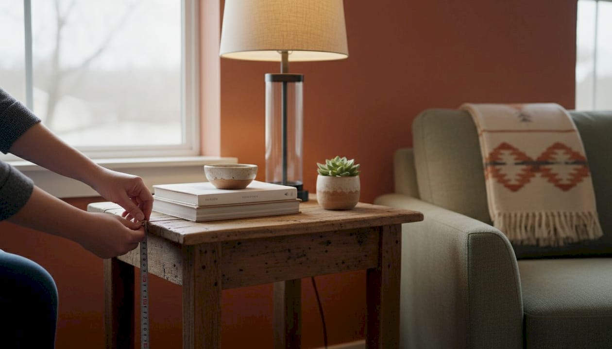
Undersized art is the most frequent error. A piece that looks large in a shop or online often looks tiny on a wall. Always measure your wall and your furniture before purchasing. The two-thirds rule exists precisely because human instinct consistently underestimates the size needed.
Mixing too many frame styles creates visual noise. Limit yourself to two frame finishes across any single wall or room. Black and natural wood work well together. Gold and white work well together. Three or more finishes compete for attention and undermine the cohesion of the display.
Choosing art purely for its colour or because it was affordable leads to rooms that feel generic. Art with personal meaning, whether a print from a place you have visited, a medium you love, or a subject that matters to you, creates warmth that purely decorative choices cannot replicate.
Key takeaways
The most effective wall art selection combines the two-thirds sizing rule, the 145–150 cm hanging height standard, and a personal connection to the work chosen.
| Point | Details |
|---|---|
| Apply the two-thirds rule | Artwork should be 60–75% the width of the furniture below it for visual balance. |
| Hang at eye level | Centre artwork at 145–150 cm from the floor to match standard gallery height. |
| Keep a 15–20 cm gap | Maintain this gap between furniture top and artwork bottom to avoid a floating look. |
| Match frame style to decor | Choose frame finishes that complement your interior style and limit finishes to two per room. |
| Protect delicate works | Use UV glazing for photography and paper-based art to prevent fading from sunlight. |
What I have learned from years of watching people hang art wrong
The most consistent mistake I see is timidity. People buy art that is too small, hang it too high, and then wonder why the room still feels unfinished. The answer is almost always scale.
I have watched homeowners spend considerable money on a beautiful print, then hang it in a spot where it disappears. The two-thirds rule sounds technical, but it is really just permission to be bold. When you hang a properly scaled piece at the right height with the right gap above the sofa, the room clicks into place in a way that no amount of cushions or candles achieves.
The other thing I would say is this: buy art you genuinely respond to. Generic prints chosen to match a colour scheme produce rooms that look like hotel lobbies. The homes that feel truly alive are the ones where the art tells you something about the people who live there. A photograph from a trip, a print by an artist whose work moves you, a piece made by someone you know. These choices cost no more than safe ones. They just require a little more confidence.
Test everything with tape before you commit to a single nail. It takes ten minutes and saves hours of regret.
— Cristiano
Complete your room with Homable’s curated home accessories
Wall art sets the tone of a room, but the pieces around it complete the picture. A well-chosen rug anchors the furniture beneath your new artwork and ties the colour palette together.

Homable carries a curated range of rugs and ornaments designed to work alongside wall art in modern homes. The Baluchi Cannon Pink Woolen Rug brings rich texture and warm colour to living spaces, complementing both bold statement pieces and gallery walls. For a natural, understated look, the Rectangular Bamboo Rugs work beautifully beneath furniture in rooms with botanical or organic-style art. Homable offers free shipping on orders over £100, making it straightforward to style a full room in one go.
FAQ
What is the two-thirds rule for wall art?
The two-thirds rule states that artwork should be approximately 60–75% the width of the furniture it hangs above. For a 2-metre sofa, this means choosing a piece between 1.2 and 1.5 metres wide.
How high should I hang wall art?
Hang artwork so its centre sits at 145–150 cm from the floor. This matches average eye level and is the standard used by professional galleries.
How do I stop a gallery wall looking cluttered?
Limit your colour palette to 2–3 tones, match your frames or mats, and keep spacing between frames consistent at 5–8 cm. An anchor piece at the centre of the arrangement holds the display together.
Should I use UV glass for framing?
UV-protective glazing is the right choice for photography, watercolours, and any work on paper. It blocks the wavelengths that cause fading without noticeably altering how the artwork looks.
How do I hang landscape prints correctly?
Centre the print at 145–150 cm from the floor and maintain a 15–20 cm gap between the bottom of the frame and the top of any furniture below it. Use quality hanging hardware rated for the weight of the piece.