Cart
0

Function wins by default for most projects. If your product fails at its core task, no amount of visual polish will save it. That said, once functional requirements are met, aesthetics become a genuine competitive lever, and in hedonic categories like home decor, they can be the deciding factor at the point of purchase.
Use this checklist to decide which to favour right now:
- Safety or regulation involved? Prioritise function without compromise.
- Core task failure would cause harm or frustration? Function first.
- Product is decorative, gift-oriented, or emotionally driven? Aesthetics can lead.
- Competing products are functionally identical? Design is your differentiator.
- Budget is tight? Spend on durability before surface finish.
Key takeaways
The most reliable rule in the design versus function debate is this: function sets the floor, and design determines how high above it you can go.
| Point | Details |
|---|---|
| Function sets the floor | No amount of visual appeal recovers a product that fails at its core task. |
| Context determines priority | Safety and regulated contexts demand function first; hedonic and gift categories can lead with design. |
| Use the 2x2 matrix | Plot functional risk against emotional value to classify any project quickly and consistently. |
| Sequence the process | Define non-negotiables before design work begins; run functional and aesthetic explorations in parallel. |
| Measure both dimensions | Track task success and return rates alongside NPS and conversion to catch imbalance early. |
Table of Contents
- What do “design” and “function” actually mean?
- The frameworks that explain the trade-off
- When should you prioritise function, and when does design lead?
- How to balance design and function during a project
- What the research and real examples show
- Common mistakes that push the balance off-course
- How to measure whether your balance worked
- A candid view on getting the balance right
- Sources
What do “design” and “function” actually mean?
These two words carry a lot of baggage, so it helps to pin them down before debating which matters more.
Design covers everything that shapes perception: colour, proportion, texture, material finish, and the emotional signals a product sends before anyone uses it. A terracotta vase communicates warmth and craft. A matte-black kitchen tap signals modernity and restraint. Design is the layer that makes someone pick something up in a shop or click on a product page. It also includes brand signalling, the way a product tells you something about its owner.
Function is what the object actually does reliably, day after day. For a physical product, that means usability, durability, ease of maintenance, and performance under real conditions. For a digital interface, it means task completion, load speed, accessibility, and error recovery. A functional home decor piece earns its place by doing a job, not just occupying space.
Two quick examples to make the distinction concrete:
- A doorstop shaped like a hedgehog is charming (design), but if it slides on hardwood floors and fails to hold the door open, it has failed at its one job (function).
- A mobile banking app with a beautiful colour palette but a checkout flow that takes nine taps to complete a transfer has prioritised surface over structure.
The frameworks that explain the trade-off
Three ideas have shaped how designers and makers think about this tension, and each one is still practically useful.

Form follows function was articulated by the American architect Louis Sullivan in the 1890s and became the rallying cry of modernist design. The principle holds that a building or object’s shape should emerge from its purpose, not be imposed on it. Applied to products, it argues against decorative elements that add cost and complexity without serving the user. It remains a useful corrective when a project is drifting towards over-styling, though taken too literally it produces objects that are correct but cold.
MAYA (Most Advanced Yet Acceptable) was Raymond Loewy’s answer to the limits of pure functionalism. Loewy, who redesigned everything from the Coca-Cola bottle to the NASA Skylab interior, observed that consumers reject products that feel too unfamiliar, even when those products are technically superior. MAYA says: push form as far forward as the market will follow, then stop. It explains why radical redesigns of familiar objects so often fail commercially, and why incremental aesthetic evolution tends to outperform revolutionary leaps. The Wikipedia article on form follows function traces this lineage clearly.
The five planes of UX, developed by Jesse James Garrett and summarised by the Interaction Design Foundation, offer a staged model for digital products: strategy, scope, structure, skeleton, and surface. The surface plane, where visual design lives, is the last layer to be decided, not the first. Teams that start with surface (colours, typography, illustration style) before resolving structure and skeleton routinely discover that their beautiful interface cannot accommodate the actual user flows. The framework disciplines the sequence: solve the strategic and structural problems first, then invest in aesthetics.
Contemporary design practice tends to reject the strict binary altogether. Many practitioners treat form and function as mutually reinforcing: a well-proportioned object is often easier to use because proportion signals affordance. That integration is the goal, but it requires deliberate process to achieve.
When should you prioritise function, and when does design lead?
Context determines the answer every time. Here is a compact decision framework.
Prioritise function when:
- Safety or regulatory compliance is involved (medical devices, children’s products, electrical fittings).
- The product’s core task is complex or high-frequency (a kitchen knife, a storage system, a checkout flow).
- Durability under heavy use is a requirement (bathroom accessories, door hardware, rugs in hallways).
- The user has no alternative if the product fails (a smoke alarm, a wheelchair, a navigation app).
Prioritise design when:
- Products are hedonic or gift-oriented, where emotional response drives purchase.
- Competing products are functionally equivalent and differentiation is the only lever.
- Brand identity is the primary value being communicated (luxury goods, decorative accessories).
- The product is low-touch and display-oriented (an ornament, a picture frame, a candle holder).
The Toptal practitioner guide is direct on this: in complex or safety-critical workflows, function must be the primary constraint, and aesthetic choices must be tested against compliance requirements before they are locked in.
A 2x2 decision matrix helps when the answer is not obvious. Plot your project on two axes: risk of functional failure (low to high) on the vertical, and emotional/hedonic value (low to high) on the horizontal.
| Low emotional value | High emotional value | |
|---|---|---|
| High functional risk | Function dominates (e.g. safety equipment) | Both required (e.g. premium kitchen appliances) |
| Low functional risk | Minimum viable design (e.g. utility storage) | Design leads (e.g. decorative accessories) |
For ambiguous cases, ask: “If this product fails at its core task, will the user blame the look or the performance?” The answer tells you where to invest first.
Pro Tip: When a project sits in the top-right quadrant (high risk, high emotional value), write a non-negotiables list before any design work begins. Every aesthetic choice must clear the functional bar before it is considered.
How to balance design and function during a project
A repeatable process matters more than good intentions. Here is a workflow that works across physical products and digital interfaces.
-
Define requirements before anything else. List non-negotiables: safety standards, accessibility requirements (WCAG 2.1 for digital; BS 8300 for physical spaces in the UK), budget ceilings, and maintenance constraints. These are the walls of the room; design happens inside them.
-
Run parallel explorations. Commission a functional prototype and a design exploration at the same time, not sequentially. A design spike (a rapid visual exploration with no engineering commitment) and a functional prototype (built to test the core task, not the look) can run in the same sprint. Comparing them early surfaces conflicts before they become expensive.
-
Test with real tasks, not opinions. Usability testing should use scenario-based tasks that force users to complete a real job. “Tell me what you think of this” reveals aesthetic preference. “Book a collection for next Tuesday” reveals functional failure. Both matter; neither replaces the other. Early and frequent usability testing reveals where aesthetics introduce cognitive load and where they genuinely improve discoverability.
-
Track the right metrics. For physical products: return rates, repair rates, and customer satisfaction scores. For digital interfaces: task success rate, time on task, and Net Promoter Score. Conversion uplift is a useful proxy for design effectiveness when functional parity is already confirmed.
-
Apply MVP trade-off rules at release. Before shipping, ask: does this product complete its core task reliably? If no, it is not ready, regardless of how good it looks. If yes, assess whether the aesthetic is good enough to compete in its category. “Good enough” is a deliberate standard, not a failure.
What the research and real examples show
The evidence on this is clearer than most practitioners expect. A Journal of Marketing study found that styling can compensate for minor functional flaws but not for major functional failures, and that the effect varies significantly between hedonic and utilitarian usage contexts. A beautiful product with a small quirk survives; a beautiful product that does not work does not.
Wiley research reinforces this: aesthetic design becomes influential after basic functionality is satisfied. Managers who expect styling to fix substantial usability faults are misreading the evidence.
Three examples across domains:
-
Digital interface. The original iPod’s click wheel was a design and function synthesis that became iconic precisely because the interaction was both beautiful and faster than any alternative. Cosmetic novelty alone rarely sustains long-term product success at that scale.
-
Household item. A storage basket that looks perfect on a shelf but has handles too short to lift when full, or a lid that warps after one wash, fails the function test. For home organisation systems, the functional constraint (what fits, how it is accessed, how it is cleaned) should drive the brief before material and finish are chosen.
-
Home decor. A decorative candle holder like Homable’s silver flower candle holder sits in the low-risk, high-emotional-value quadrant: stability and heat resistance are the functional floor, and visual impact is the primary purchase driver. Getting the functional floor right is what separates a piece that stays on a mantlepiece for years from one that gets returned.
For UK homeowners specifically, Homable’s guidance frames this as “function first, then lift the aesthetic,” which maps directly onto the research: solve the practical problem, then make it beautiful.
Common mistakes that push the balance off-course
- Over-styling that increases maintenance. Intricate surface textures and recessed details look striking but trap dust and are difficult to clean. Mitigation: test cleaning time as part of the design review.
- Hiding affordances. Flush-fit handles, invisible buttons, and unlabelled controls look minimal but confuse users. Mitigation: run a first-use test with someone unfamiliar with the product before finalising.
- Ignoring accessibility. Low-contrast colour schemes and small touch targets exclude users and, in the UK, may conflict with the Equality Act 2010 for digital products. Mitigation: check WCAG 2.1 AA compliance before any visual sign-off.
- Fragile materials in high-touch positions. Matte painted surfaces on door handles, or delicate ceramic fittings on bathroom accessories, degrade quickly. Mitigation: specify materials by use frequency, not by appearance alone.
- Designing for the shelf, not the workflow. A product that photographs well but fails in daily use is a design failure. Mitigation: include a maintenance and daily-use test in every product review.
How to measure whether your balance worked
KPIs to track:
- Task success rate and time on task (digital interfaces).
- Return rate and repair rate (physical products).
- Customer satisfaction score (CSAT) and Net Promoter Score.
- Conversion uplift versus a functional-only baseline (for design-led categories).
- Support contact rate (a proxy for functional confusion).
Short test protocols:
-
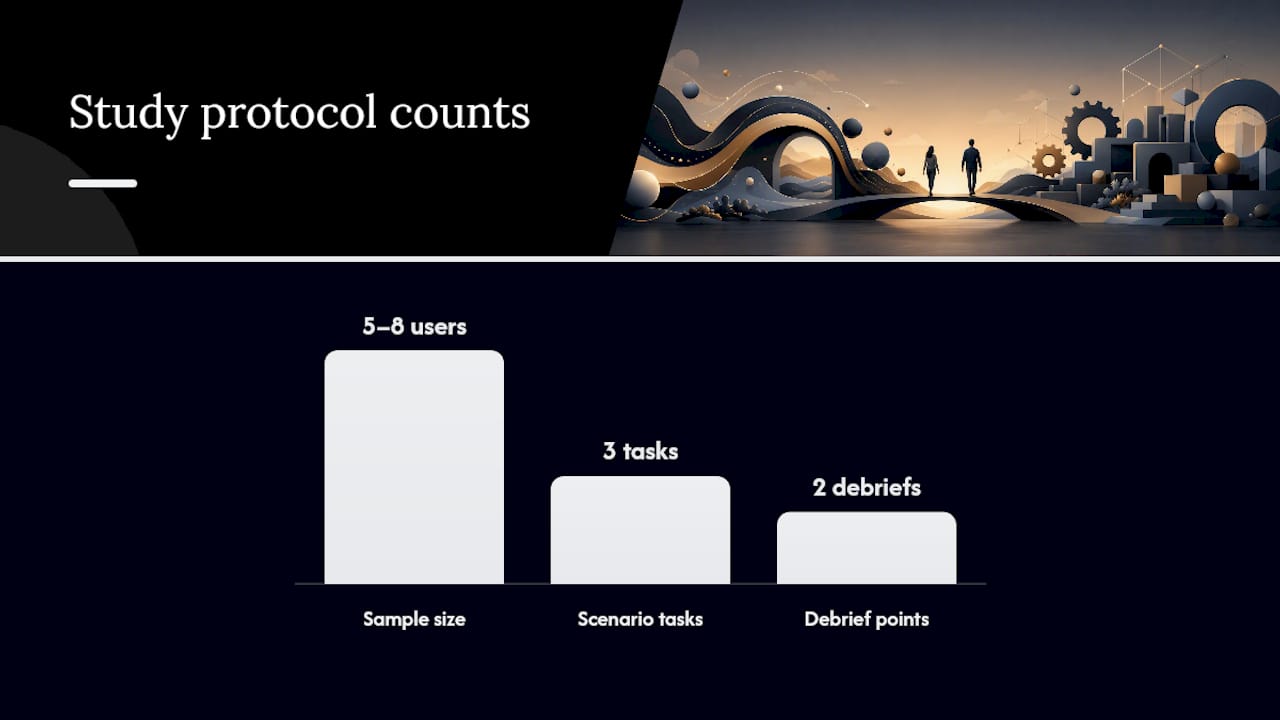
Physical product (two-week in-home trial): Recruit five to eight users matching your target profile. Ask them to use the product normally and log any moment of friction, confusion, or maintenance difficulty. Debrief at day three and day fourteen. Look for complaints that cluster around function, not preference.
-
Digital interface (moderated usability session, 60 minutes): Set three scenario-based tasks. Measure completion rate, time on task, and error count. After each task, ask one question: “Was there anything that slowed you down?” Separate functional complaints from aesthetic ones in your analysis.
Detecting cosmetic compensation: When users say “I love how it looks, but…” pay close attention to what follows. That construction is the clearest signal that aesthetics are masking a functional problem. Aggregate those “but” statements across your test group. If the same functional complaint appears in more than two sessions, it is a real issue, not a preference.
A candid view on getting the balance right
The debate between form and function is often framed as a philosophical argument, but in practice it is almost always a sequencing problem. Teams that struggle with it are usually trying to resolve aesthetic and functional questions at the same time, with no agreed hierarchy.
My view, shaped by working with home decor products at Homable: the functional floor is non-negotiable and should be defined in writing before any visual work begins. Once that floor is set, aesthetic investment is not a luxury; it is what makes a product worth keeping. A rug that does not lie flat, a curtain that blocks light unevenly, a storage box whose lid does not close properly — these are not style failures, they are functional failures wearing a style problem’s clothes.
At Homable, the product selection process starts with durability, maintenance, and usability criteria. Visual appeal is assessed only after those criteria are met. That sequence is not a constraint on creativity; it is what makes the creativity trustworthy.
Sources
- Journal of Marketing
- Interaction Design Foundation — Functionality
- Toptal — Design dilemma: aesthetics vs functionality