Cart
0
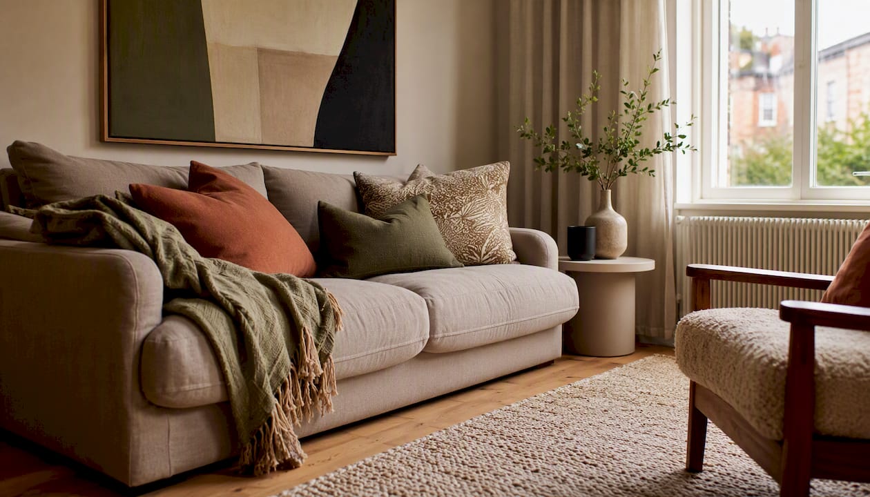
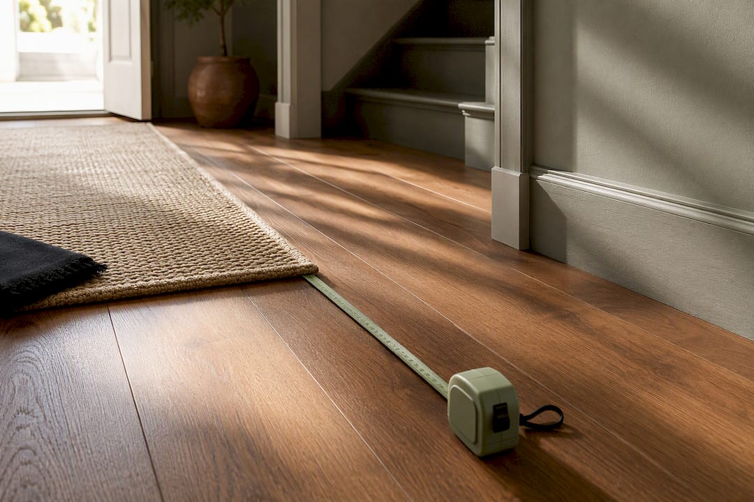
Interior styling for the home is a short set of repeatable principles and rules-of-thumb you can apply today to make any room feel cohesive, comfortable, and considered. Interior styling is the finishing layer — arranging accessories, textiles, and vignettes to make a space feel complete without structural changes. You do not need a design degree. You need a tape measure, a dominant colour, and one strong focal piece.
Three actions to start right now:
- Measure the room — length, width, and ceiling height, plus door swings and window positions.
- Choose a dominant colour — the one that will cover roughly 60% of the room (walls, large sofa, or floor).
- Pick a focal piece — the item every other decision orbits: a fireplace, a statement rug, or a large artwork.
The sections below cover the five core principles, the 60/30/10 colour rule, proxemics and layout, lighting, and a room-by-room checklist. The shopping section near the end ties everything to specific purchases.
Key takeaways
The five core principles — balance, rhythm, emphasis, proportion and scale, and harmony — are the foundation of every well-styled room, and the 60/30/10 rule is the fastest way to build a palette that holds them together.

| Point | Details |
|---|---|
| Five core principles | Balance, rhythm, emphasis, proportion and scale, and harmony underpin every well-styled room. |
| 60/30/10 colour rule | Allocate 60% dominant, 30% secondary, 10% accent colour for a professional-looking palette. |
| Rug sizing matters most | Front legs of all seating should sit on the rug; size up rather than down. |
| Measure before you buy | Sketch a scaled floor plan and mark 90 cm circulation paths before ordering any large piece. |
| Homable starter buy | A statement rug from Homable anchors a room and gives you a palette to build the rest around. |
Table of Contents
- What is a styling concepts overview, and what are the five core principles?
- How do you plan a layout before you buy anything?
- How does the 60/30/10 rule work for colour and scale?
- How do you use lighting and repetition to create rhythm and a focal point?
- Practical styling rules and a compact shopping checklist
- Room-by-room micro plans: where to start in each space
- Common styling mistakes and the quick fixes
- A note from Homable on getting started
- Homable’s curated categories make it easy to act on this guide
- Sources
What is a styling concepts overview, and what are the five core principles?
Homes & Gardens identifies five core principles that underpin every well-styled room: balance, rhythm, emphasis, proportion and scale, and harmony. Think of them as a checklist rather than a hierarchy — a room can fail on just one and feel inexplicably wrong.
Balance
Balance is the visual weight distributed across a room. There are three types:
- Symmetrical — identical items mirrored on either side of an axis. Two matching armchairs flanking a fireplace is the classic UK example.
- Asymmetrical — different objects with equivalent visual weight. A tall floor lamp on one side of a sofa balanced by a low side table with a stack of books on the other.
- Radial — weight arranged around a central point. A round dining table with chairs radiating outward, or a pendant light centred over a kitchen island.
Pro Tip: Before buying anything, photograph the room and squint at the image. Heavy dark masses in one corner that aren’t offset elsewhere are the most common cause of a room feeling ‘off’.
Rhythm
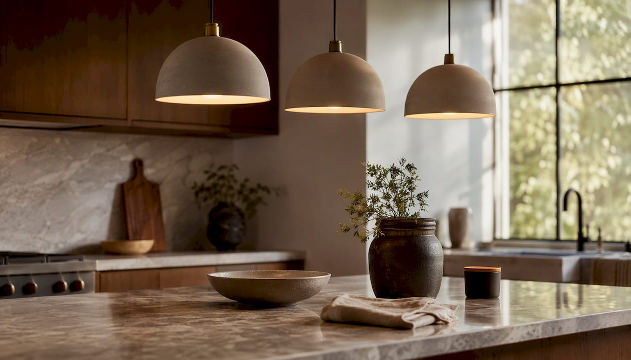
Rhythm is repetition with intention. Repeat a colour, a shape, or a material at intervals and the eye travels through the space rather than stopping dead. Three pendant lights over a kitchen island create rhythm; one pendant and two mismatched wall lights do not.
Emphasis
Every room needs one thing that wins. A bold architectural focal point — a chimney breast, a feature wall, a large artwork — gives the eye somewhere to land first. Without it, rooms feel flat regardless of how good the individual pieces are.
Proportion and scale
House & Garden notes that oversized furniture in a small room can actually create a sense of generosity rather than crowding — provided the scale is deliberate. A single large sofa reads better than three small mismatched chairs. Scale is relative: a 40 cm artwork above a king-size bed looks like a postage stamp.
Harmony
Harmony is the result when the other four principles are working. It is not sameness — it is coherence. A room can contain contrasting textures, colours, and eras of furniture and still feel harmonious if the underlying principles hold. For a deeper look at creating cohesive home decor, the Homable blog covers the ‘red thread’ approach in detail.
How do you plan a layout before you buy anything?
HouseJester recommends starting with layout and the fundamental principles before colour or accessories — a rule that saves most UK homeowners from buying furniture that physically does not fit.
Proxemics: the four spatial zones
Proxemics is the study of how people use space. Applied to interiors, it gives you minimum distances for comfortable seating arrangements.
Source: House & Garden
The coffee table gap (50–100 cm) is the one most people get wrong — they push it too close or leave it floating in the middle of the room with no connection to the sofa.
Measurement and layout checklist
Before you sketch or shop, work through this list:
- Measure the room in centimetres: length, width, ceiling height, door swing radius, and window sill height.
- Note fixed points: radiators, sockets, light switches, and any alcoves.
- Sketch a scaled floor plan on graph paper (1 square = 50 cm works well for most UK rooms).
- Mark a 90 cm clearance path around all major furniture for circulation.
- Position the largest piece first (sofa or bed), then build outward.
- Check the room layout guide for specific sizing advice on compact UK new-builds.
How does the 60/30/10 rule work for colour and scale?
The 60/30/10 colour rule is the fastest way for non-experts to build a palette that looks intentional.
Applying it in UK light conditions
North-facing rooms receive cool, bluish light for most of the day. Warm neutrals — off-white, soft terracotta, warm greige — offset that coolness and help wood tones and textiles read as cosy rather than flat. South-facing rooms can handle cooler greys and blues without feeling cold. For more on choosing colour schemes by room orientation, the Homable colour guide covers north/south facing rooms specifically.
A 2026 UK living-room trend summary highlights earthy colour palettes, curved furniture, and textured natural materials as the dominant direction — a useful reference point when choosing your 60% dominant colour.
Sizing rugs, art, and pendants
- Rugs: the front legs of all seating should sit on the rug, with equal margins on the sides. A rug that is too small floats like an island and makes the room feel smaller.
- Artwork: aim for art that is roughly two-thirds the width of the furniture below it. A 180 cm sofa suits artwork between 110–130 cm wide.
- Pendants: over a dining table, hang the bottom of the shade 70–80 cm above the table surface.
Pro Tip: Tape newspaper to the floor in the rug’s intended dimensions before ordering. It takes two minutes and prevents the single most common expensive mistake in home styling.
How do you use lighting and repetition to create rhythm and a focal point?
Layered lighting is the difference between a room that photographs well and one that actually feels good to live in. The three layers are:
- Ambient — the base level of light (ceiling fixtures, recessed spots). It sets the overall brightness.
- Task — directed light for specific activities: a reading lamp, under-cabinet kitchen lights, a desk lamp.
- Accent — light that draws attention to something: a picture light over artwork, a floor lamp behind a plant, LED strips inside shelving.
Most UK rooms are over-lit at ambient level and under-lit at accent level. The fix is simple: add one accent source per room and put the main ceiling light on a dimmer.
Choosing a focal point: three questions
Ask yourself these in order:
- Does the room have a strong architectural feature (fireplace, bay window, exposed brick)? If yes, that is your focal point — style toward it, not away from it.
- If not, is there one large piece of furniture or art that could anchor the space? A statement rug, a large canvas, or a bold interior door can all serve this role.
- If neither, create one: a gallery wall, a painted chimney breast, or a cluster of pendants over a seating area.
Repetition builds rhythm around that focal point. Repeat the accent colour from your focal piece in at least two other spots in the room — a cushion, a vase, a lampshade. Three instances of the same colour read as intentional; two read as coincidence.
Practical styling rules and a compact shopping checklist
Interior styling is the finishing layer — it works with what you already own before it asks you to buy anything new. The practical heuristics stylists use most are: height variation on surfaces, the rule of odd numbers (group objects in threes or fives, not pairs), texture contrast, and leaving negative space so the eye can rest.
Shopping checklist by category
Work through large pieces first, then layer down:
- Large pieces: sofa or bed, dining table, main storage unit — measure before ordering.
- Textiles: rug (front legs of seating on it), curtains (hang from ceiling height, not window frame), cushions in 60/30/10 colours.
- Lighting: one ambient, one task, one accent per main room.
- Storage: plan for double the storage you think you need — clutter is the fastest way to undo good styling.
- Finishing accessories: odd-numbered groupings, varied heights, one natural material (wood, linen, wool) per surface.
Rug sizing at a glance
Prioritising texture and natural materials — wood, linen, wool — creates warmth and visual depth without excessive ornament.
Pro Tip: Edit accessories ruthlessly. Remove everything from a surface, then add back only what earns its place. Most surfaces look better with three items than with seven.
Room-by-room micro plans: where to start in each space
For practical room-by-room decor tips, the Homable blog has short checklists for each space. Here is the condensed version:
Living room
- Measure the seating area and order a rug that fits (front legs on).
- Position the sofa facing the focal point (fireplace, TV wall, or window).
- Add one accent light source and put the ceiling light on a dimmer.
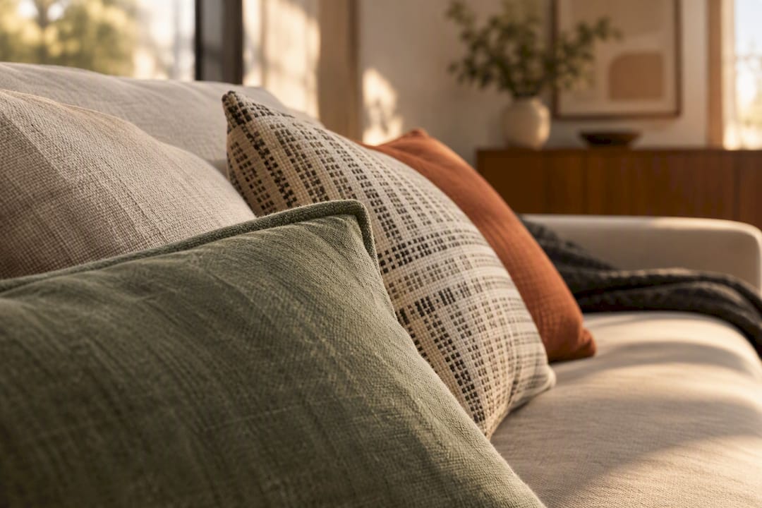
- Layer cushions in your 30% and 10% colours.
Bedroom
- The bed is the focal point — centre it on the main wall, not tucked into a corner.
- Hang artwork at eye level when seated on the bed (roughly 100–110 cm from floor to centre).
- Use bedside lamps rather than a central overhead for task and accent light.
- In small UK rooms, use under-bed storage and wall-mounted shelves to free floor space.
Kitchen
- A washable kitchen runner (45×150 cm) at the prep zone reduces fatigue and adds warmth.
- Repeat one material — brass, matte black, or brushed steel — across taps, handles, and light fittings for instant rhythm.
- Clear worktops of everything except items used daily; store the rest.
Hallway
- Hang a mirror to double perceived width — position it opposite the main light source.
- Use vertical storage (tall, slim console with hooks above) to keep the floor clear.
- A doorstop or small rug anchors the entry and signals the home’s colour palette immediately.
Bathroom
- Layer a bath mat and pedestal mat in coordinating tones for a finished look.
- Replace mismatched bottles with matching dispensers — the single fastest visual upgrade.
- A small plant or candle on the windowsill adds the accent layer without taking up floor space.
Common styling mistakes and the quick fixes
The most frequent problems and their one-line solutions:
- Room feels small: furniture pushed against every wall. Pull pieces away from walls by 10–15 cm and the room immediately reads as larger.
- Room feels cluttered: too many small objects competing. Edit to odd-numbered groupings and leave negative space.
- Room feels unbalanced: all the visual weight is on one side. Add a floor lamp or tall plant to the lighter side.
- No focal point: the eye wanders. Hang one large artwork or create a gallery wall on the main wall.
- Rug too small: it floats in the middle of the room. Size up — front legs of all seating on the rug.
- Lighting too harsh: only one overhead source. Add a floor lamp and a table lamp; put the overhead on a dimmer.
For a deeper diagnostic, the Homable guide on common home styling mistakes covers before-and-after fixes room by room.
A note from Homable on getting started
The principles in this guide are the same ones a professional stylist would use — the difference is that you are applying them to a home you already know and live in, which is an advantage, not a handicap. Start with one room, one focal piece, and one rug that is the right size. Those three decisions alone will change how the room feels.
A mid-sized statement rug is the single most impactful starter purchase for most UK living rooms. A piece like the Baluchi Cannon Pink Woolen Rug anchors a seating area, introduces colour and texture simultaneously, and gives you a palette to build the rest of the room around. Homable ships free on orders over £100 across the UK, with secure checkout and a curated range of rugs, curtains, storage, and accessories chosen for modern British homes.
Homable’s curated categories make it easy to act on this guide
Every rule-of-thumb in this guide maps to something you can buy today. Homable’s rug collection covers living-room anchors, bedroom warmth, and practical kitchen runners — including the washable kitchen rug in coffee black velvet at 45×150 cm, sized exactly for a prep-zone runner. The curtain range includes bamboo curtains for zoning and texture in open-plan spaces. Storage solutions, ornaments, and finishing accessories round out the categories so you can work through the shopping checklist in one place.
Free UK shipping on orders over £100. Browse the full range at Homable and start with whichever category your room needs most.
Sources
- The principles of interior design
- Essential design principles you need to know
- Living Room Design Guide UK 2026: Trends, Layouts & Styling Tips
- What Is Interior Styling? Expert Advice for a Stylish Home | Interior Style Host
- Interior Design Guide for UK Homeowners | HouseJester