Cart
0
Modern design principles are a concise set of decision rules — contrast, hierarchy, balance, proportion, repetition, rhythm, pattern, white space, movement, variety, emphasis, and unity — that make things easier to use, build, and live with. Industry sources commonly reference these 12 core principles, though some frameworks extend the list; the exact count matters far less than applying them with purpose. They work across every discipline: architecture, interior design, UI, and art all draw from the same underlying logic, even when the outputs look completely different.
Three things you can do right now, before reading further:
- Audit for noise. Scan your current project and remove any element that serves decoration alone. The Nielsen Norman Group’s usability heuristic on aesthetic and minimalist design is clear: unnecessary elements create noise and reduce usability.
- Name your hierarchy. Identify the single most important thing a viewer should notice first. If you cannot name it in one word, your hierarchy is not set yet.
- Check your contrast. Place your two most important adjacent elements side by side and ask whether the difference between them is obvious at a glance. If it is not, increase it.
Key takeaways
Modern design principles are decision frameworks, not aesthetic preferences, and applying them purposefully across any discipline produces work that is clearer, more durable, and easier to evaluate.
| Point | Details |
|---|---|
| Twelve core principles | Contrast, balance, emphasis, proportion, hierarchy, repetition, rhythm, pattern, white space, movement, variety, and unity are the canonical set. |
| Principles as decision filters | Select three to five principles per project and use them to justify or remove every element. |
| Minimalism is a framework | Minimalism means assigning a clear role to every element, not removing everything decorative. |
| Team alignment tool | Writing principles with explicit negative boundaries prevents stylistic drift and opinion-based feedback. |
| Checklist before sign-off | Run the 15-point checklist in this guide before finalising any design to catch accidental principle violations. |
Table of Contents
- What are the 12 modern design principles?
- How do you apply modern design principles to a real project?
- What are the most common mistakes when using design principles?
- How do the principles shift across architecture, interiors, UI, and art?
- Which resources and tools help you go deeper on design principles?
- A project-ready checklist for finalising any modern design
- Why design principles matter more than most designers admit
- Sources
What are the 12 modern design principles?
The 12 principles below are the canonical set. Each one is a decision filter, not a stylistic preference. The cross-discipline examples are deliberately brief so you can map the idea to your own context quickly.
-
Contrast draws attention by placing unlike elements together. Architecture: a concrete wall against floor-to-ceiling glazing. Interior: a dark oak sideboard on a white wall. UI: black text on a white background. Art: a single red figure in a monochrome composition.
-
Balance distributes visual weight so a composition feels stable. Architecture: symmetrical fenestration on a Georgian façade. Interior: two identical bedside lamps flanking a bed. UI: a centred hero layout with equal padding. Art: asymmetric balance in a Mondrian grid.
-
Emphasis creates a focal point that anchors the viewer’s eye. Architecture: a cantilevered entrance canopy. Interior: a statement interior door as a focal point in a hallway. UI: a primary call-to-action button in a contrasting colour. Art: a single illuminated figure in a Caravaggio painting.
-
Proportion governs the size relationship between elements. Architecture: the golden ratio in classical column spacing. Interior: a sofa scaled to the room’s square footage. UI: a type scale where headings are roughly 1.5× body text. Art: the deliberate distortion of scale in Surrealism.
-
Hierarchy orders elements so viewers process them in the intended sequence. Architecture: a grand staircase that commands the entrance hall. Interior: a layered lighting scheme from ambient to task to accent. UI: H1 → H2 → body copy with decreasing visual weight. Art: foreground, mid-ground, and background depth.
-
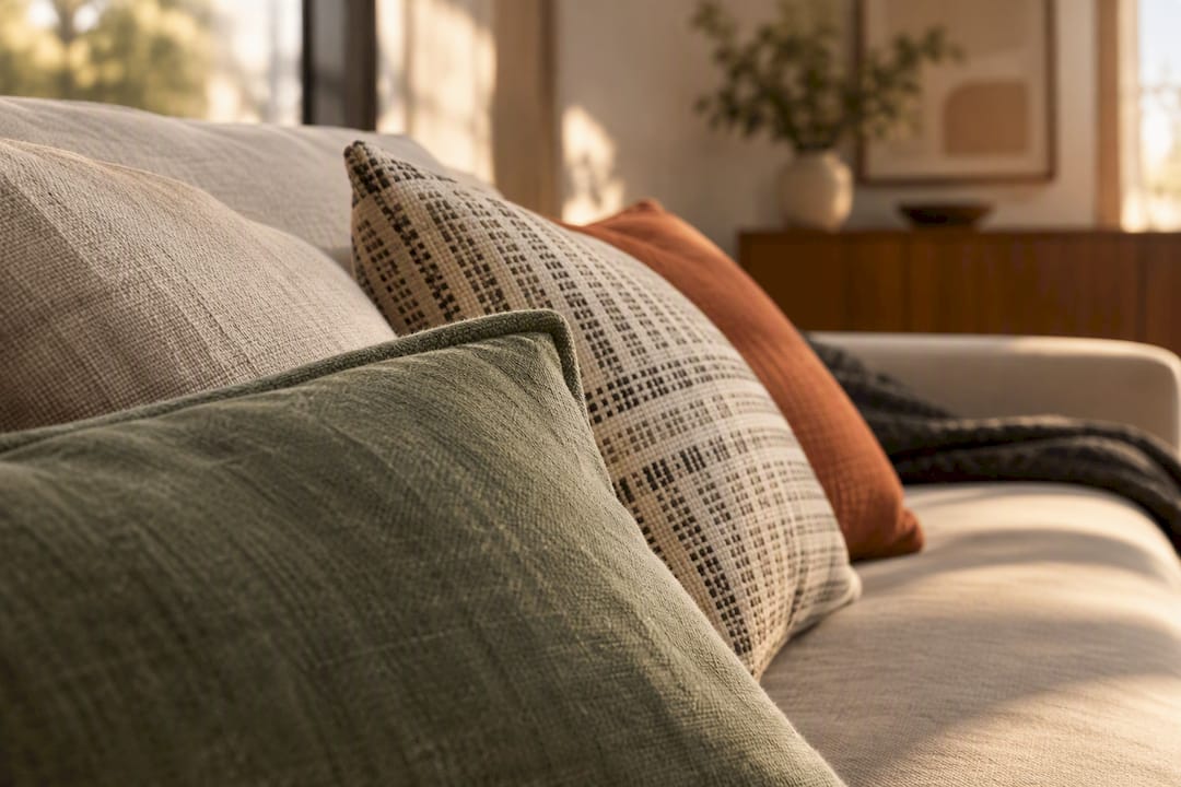
Repetition builds cohesion by reusing visual elements. Architecture: repeated arched windows along a terrace. Interior: a recurring terracotta tone across cushions, ceramics, and a rug. UI: a consistent card component across a product grid. Art: Warhol’s repeated screen-printed portraits.
-
Rhythm creates movement through predictable intervals. Architecture: evenly spaced structural columns in a colonnade. Interior: a gallery wall with consistent spacing between frames. UI: a 4px baseline grid that governs all vertical spacing. Art: the repeated brushstroke cadence in Van Gogh’s skies.
-
Pattern uses recurring motifs to create texture and visual interest. Architecture: a herringbone brick façade. Interior: a geometric tile floor in a kitchen. UI: a subtle dot-grid background on a landing page. Art: Islamic geometric tile work.
-
White space (negative space) gives elements room to breathe and directs attention. Architecture: an uncluttered courtyard between two wings. Interior: a deliberately empty shelf section beside a curated display. UI: generous padding around a headline. Art: the bare canvas surrounding a minimalist ink drawing.
-
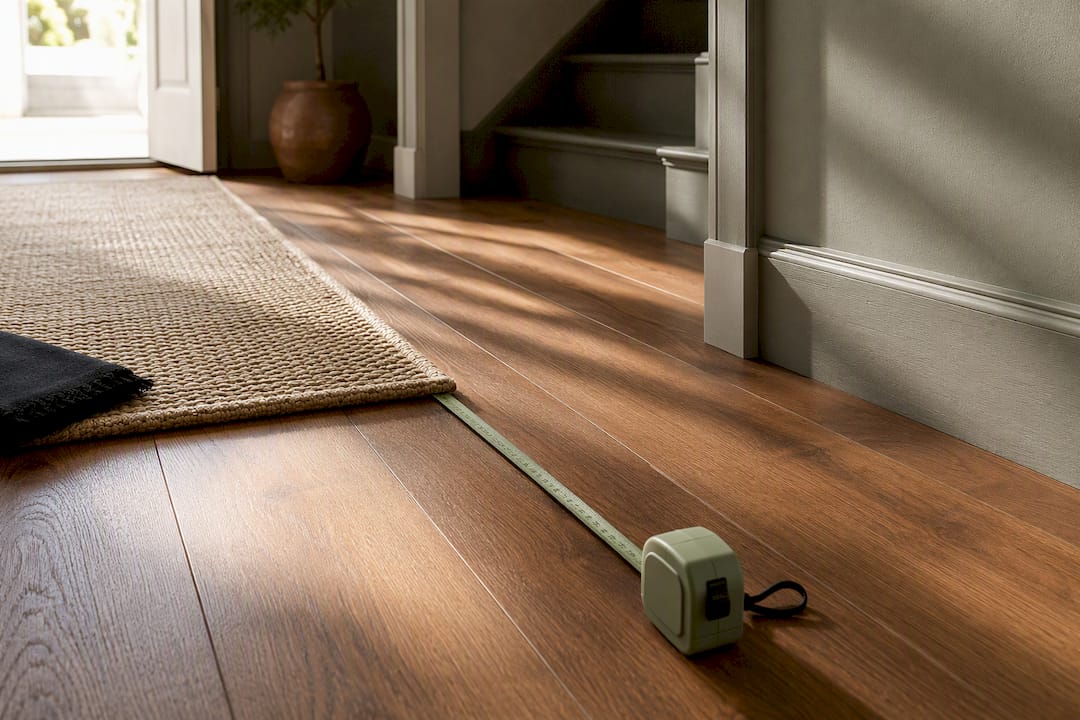
Movement guides the eye through a composition. Architecture: a curved ramp that draws visitors through a gallery. Interior: a runner rug that leads the eye down a hallway. UI: a progress indicator that steps users through a checkout. Art: the diagonal sweep of a Baroque composition.
-
Variety prevents monotony by introducing controlled differences. Architecture: mixing brick, timber, and glass on a single façade. Interior: pairing smooth ceramics with rough-woven textiles. UI: alternating full-width and card-based content rows. Art: varied mark-making within a single painting.
-
Unity ties all elements into a coherent whole. Architecture: a consistent material palette across interior and exterior. Interior: a colour story that runs from the entrance to the living room. UI: a design system that enforces consistent tokens across every screen. Art: a single dominant hue that unifies a multi-panel work.
A quick-reference comparison
| Principle | Concise definition | Architecture example | UI example |
|---|---|---|---|
| Contrast | Difference that creates attention | Concrete vs. glazing | Dark button on light background |
| Balance | Even distribution of visual weight | Symmetrical window placement | Centred hero with equal margins |
| Emphasis | A dominant focal point | Cantilevered entrance canopy | Primary CTA in accent colour |
| Proportion | Size relationships between elements | Column spacing ratios | 1.5× heading-to-body type scale |
| Hierarchy | Ordered sequence of visual importance | Grand staircase in entrance hall | H1 → H2 → body weight progression |
| Repetition | Reuse of elements for cohesion | Repeated arched windows | Consistent card component |
| Rhythm | Predictable intervals that imply movement | Evenly spaced columns | 4px baseline grid |
| Pattern | Recurring motifs for texture | Herringbone brick façade | Subtle dot-grid background |
| White space | Negative space that aids focus | Uncluttered courtyard | Generous headline padding |
| Movement | Eye-path guidance through composition | Curved gallery ramp | Progress indicator in checkout |
| Variety | Controlled differences to prevent monotony | Mixed brick, timber, glass | Alternating content row layouts |
| Unity | Coherence across all elements | Consistent material palette | Design system tokens |
Pro Tip: Ask the art team to produce a single A3 infographic mapping each principle to a visual thumbnail from each discipline. Pin it in the studio or share it in your project Slack channel. Teams that can see the principles side by side make faster, more consistent decisions.
How do you apply modern design principles to a real project?
The most reliable process runs five phases: discover, select, craft, review, and iterate. Each phase has a clear output, and the whole cycle for a small project typically fits inside two to three weeks.
Discover (1–2 days)
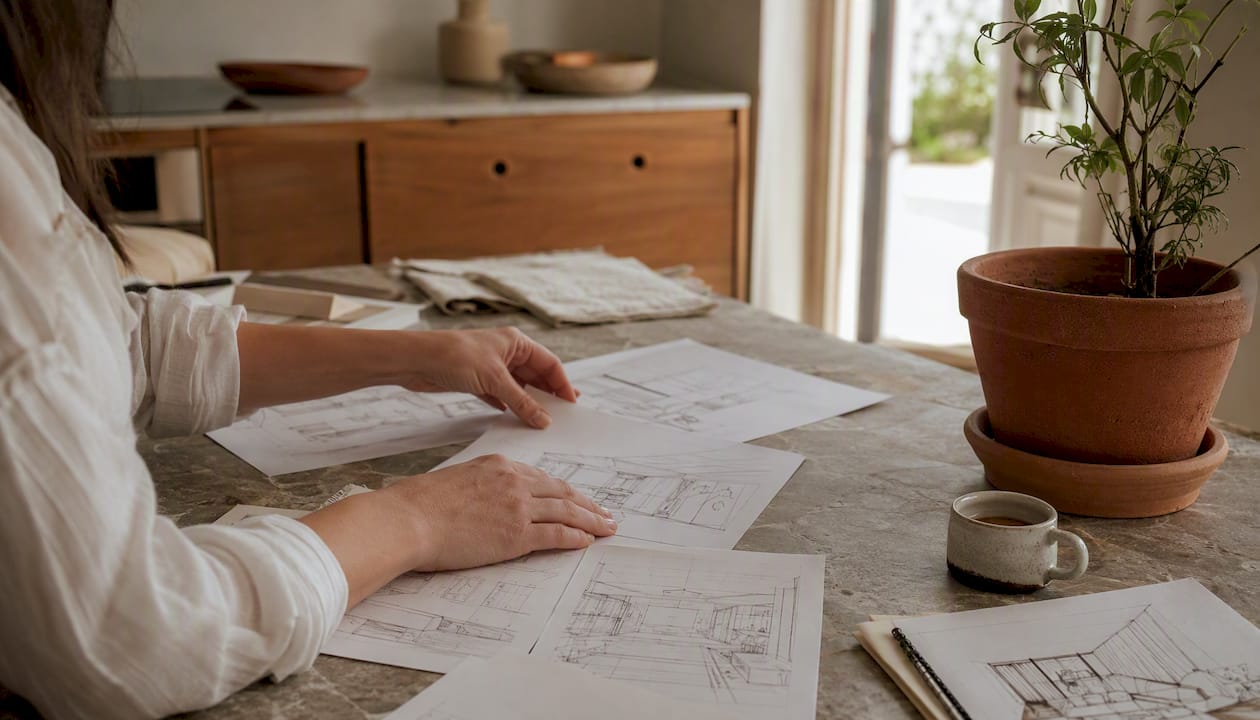
Start by understanding the context before touching any design tool. Who uses this space, screen, or object? What do they need to do first, second, and third? Gather reference images, user research notes, or site measurements. The output is a one-page brief that names the audience, the primary function, and two or three constraints (budget, material, platform).
Select principles (half a day)
Not all 12 principles carry equal weight in every project. A wayfinding system in a public building leans heavily on hierarchy and movement. A product landing page prioritises contrast and white space. Choose three to five principles as your primary filters and write them down explicitly. Smashing Magazine’s practical guide to design principles makes a point worth taking seriously: well-written principles state both what the team will do and what it will not do. That negative boundary is what stops scope creep.
Craft (3–10 days depending on scale)
Work in low-fidelity first. Sketch, wireframe, or produce a moodboard before committing to materials or high-resolution assets. Apply your selected principles as active filters at each decision point. Every time you add an element, ask: which principle does this serve? If the answer is none, remove it. For interior projects, a modern interior design workflow can help structure the move from concept to specification.
Review (1–2 days)
This is where principles earn their keep as team tools. Design principles function as team-alignment tools and should prevent stylistic drift and guesswork. Run a structured critique where each piece of feedback is anchored to a named principle. “The navigation feels cluttered” becomes “the navigation violates white space and hierarchy.” Specific language produces specific fixes.
Iterate (ongoing)
No design is final at first review. Use the checklist in Section 7 of this guide as your sign-off gate. For digital products, operationalising principles via design systems — encoding spacing, colour, and interaction tokens into components — means future iterations inherit the rules automatically rather than relying on individual memory.
Pro Tip: Run a 30-minute principle-led critique by printing each selected principle on a card. Reviewers must cite a card when raising a concern. This stops opinion-based feedback (“I don’t like the colour”) and forces every comment back to a shared decision framework.
What are the most common mistakes when using design principles?
The four most common pitfalls are treating principles as rigid rules, pursuing minimalism at the expense of usability, chasing trends instead of evidence, and writing principles that are too vague to act on. Each one is fixable.
Treating principles as rigid rules
Principles are guardrails, not laws. A designer who refuses to add a decorative element because “white space is sacred” has confused the tool with the goal. The goal is always clarity and function. When a principle conflicts with a genuine user need, the user need wins. Use principles to challenge decisions, not to veto them.
Minimalism that breaks usability
This is the most common trade-off in contemporary design. Removing visual cues in the name of clean aesthetics can strip away the affordances users rely on. A button with no border, no shadow, and no label is minimal. It is also invisible. The Nielsen Norman Group’s heuristic on aesthetic and minimalist design is precise on this point: include only elements that support user tasks, but do not remove elements that are the task. The corrective action is to test with real users before finalising any stripped-back design. If users cannot find a control in under three seconds, the minimalism has gone too far.
A real-world consequence: several UK retail websites redesigned their mobile checkout to remove “visual clutter,” eliminating the progress indicator and the back button. This led to increased cart abandonment. The fix was restoring the progress indicator (movement principle) and adding a clearly labelled back link (hierarchy principle). Two elements, measurable result.
Over-reliance on trends
Trends are observations about what is popular now. Principles are observations about how human perception works. Applying a trend without a principle behind it produces work that looks dated within 18 months. Before adopting any trend — whether that is bento-grid layouts, earthy palettes, or AI-generated textures — ask which principle it serves. If the answer is “it looks current,” that is not a principle.
Vague principles that cannot be acted on
“Be bold” is not a design principle. “Use a maximum of two typefaces and ensure the primary heading is always the largest element on the page” is. Authoring clear principles should include explicit negative statements to stop stylistic drift. If a principle cannot tell you what to do in a specific decision, rewrite it until it can.
- Extreme contrast vs. visual comfort: High contrast aids legibility but can cause eye strain in long-form reading. Mitigation: use near-black (#1a1a1a) rather than pure black (#000000) on white for body text.
- Rigid repetition vs. variety: Too much repetition produces monotony; too much variety produces chaos. Mitigation: repeat structural elements (grid, spacing) while varying surface elements (colour, texture).
- White space vs. information density: Data-heavy interfaces (dashboards, spreadsheets) cannot afford the same white space as a marketing page. Mitigation: apply white space at the macro level (section padding) and accept tighter spacing at the micro level (table rows).
How do the principles shift across architecture, interiors, UI, and art?
Each discipline applies the same 12 principles but weights them differently, works at a different scale, and faces different constraints. Understanding those differences stops you from importing assumptions from one field into another.
Architecture
In architecture, proportion and balance operate at a scale that affects how people move through and feel inside a space. A poorly proportioned room — ceiling too low for its floor area, windows too small for the wall — creates discomfort that no amount of interior styling can fully correct. Hierarchy is expressed through circulation: the path from entrance to primary space should be legible without signage.
Contemporary architecture increasingly uses adaptive reuse and biophilic design to connect occupants to nature and history. In a UK context, adaptive reuse is particularly relevant: converting a Victorian warehouse or a Georgian terrace requires working with existing proportions and rhythms rather than overriding them. The principle of unity demands that new interventions speak to the existing fabric, not fight it.
For UK projects, the RIBA Plan of Work provides a stage-by-stage framework that maps naturally onto the discover-select-craft-review-iterate process described above.
Interiors
Interior design applies principles at a human scale, where proportion is felt rather than measured. A statement furniture piece that is too large for a room violates proportion and dominates the space in a way that feels oppressive rather than impressive. Emphasis is typically achieved through a single focal point per room: a fireplace, a piece of art, or an architectural feature.
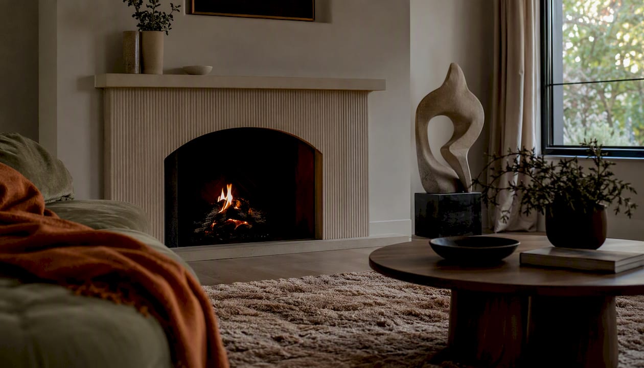
Repetition is the interior designer’s most reliable tool for creating cohesion across a space. Repeating a colour, material, or form in three places — cushion, ceramic, rug — creates unity without requiring identical objects. Contemporary home design that applies this principle well feels curated rather than matched.
UK sustainability considerations are increasingly shaping material choices. Biophilic approaches — natural fibres, stone, timber, living plants — serve both the principle of variety (texture contrast) and broader wellbeing goals. Sourcing from UK suppliers where possible reduces embodied carbon and supports traceability.
UI design
UI applies principles at the smallest physical scale but the highest interaction frequency. Hierarchy is the dominant principle: a user scanning a screen for three seconds will only register the top two or three levels of visual weight. Everything below that threshold is background.
Apple frames its platform design principles around purpose, agency, responsibility, familiarity, flexibility, simplicity, craft, and delight — a set that maps closely onto the 12 visual principles but adds an ethical and intentional dimension. Responsibility, for instance, asks designers to consider the downstream consequences of their choices, not just their immediate usability.
UX design principles are evidence-based rules grounded in cognitive psychology, and the most effective way to enforce them at scale is through a design system. When spacing, colour, and interaction patterns are encoded as tokens in a component library, teams cannot accidentally violate core principles — the system enforces them by default. Figma’s component and variable system makes this practical for teams of any size.
Accessibility is non-negotiable in the UK context. The Web Content Accessibility Guidelines (WCAG) 2.2 set a minimum contrast ratio of 4.5:1 for normal text, which is a direct operationalisation of the contrast principle. Meeting WCAG is not a separate task from applying design principles; it is what applying them correctly looks like.
Contemporary art
In art, the principles function as compositional tools rather than functional requirements. An artist can violate balance deliberately to create tension, or abandon unity to produce deliberate fragmentation. The key difference from the other disciplines is that art can use principles subversively: breaking a rule is only meaningful when the rule is understood.
Pattern and rhythm are particularly central to contemporary art practice. From geometric abstraction to textile-based installation, the deliberate repetition and variation of motifs creates the visual language through which meaning is communicated. White space in a gallery context is as much a curatorial decision as a compositional one: how much wall surrounds a work changes how it is perceived.
Which resources and tools help you go deeper on design principles?
The most useful categories are foundational books, professional organisations, and discipline-specific software. A short, curated set beats a long list you will never work through.
Books worth owning: The Elements of Typographic Style by Robert Bringhurst remains the clearest account of proportion, hierarchy, and rhythm in two-dimensional design. Thinking with Type by Ellen Lupton translates those ideas into practical application. For spatial design, Francis Ching’s Architecture: Form, Space, and Order covers proportion, balance, and movement at architectural scale with exceptional clarity.
Organisations: The Design Council is the UK’s primary authority on design practice and publishes research on design’s economic and social impact. RIBA provides professional guidance for architects and publishes the Plan of Work, which is the standard project framework for UK building projects. The Nielsen Norman Group publishes evidence-based UX research, including the usability heuristics that underpin most contemporary UI design practice.
Software by discipline: Figma is the standard tool for UI and product design, with component and variable systems that make design-system governance practical. For architecture and interior design, Autodesk Revit and ArchiCAD handle BIM workflows, while SketchUp remains useful for early-stage spatial exploration. For art and interior moodboarding, Adobe Photoshop and Procreate are the most widely used tools in UK studios. Canva is a practical entry point for non-specialists who need to apply visual principles without a steep learning curve.
Biophilic design guidance is increasingly available through UK-specific sources, including WELL Building Standard guidance and the Living Future Institute’s materials red list, both of which connect design principles to measurable wellbeing and sustainability outcomes.
For parametric and generative design, research into hierarchical reinforcement learning for parametric design optimisation is maturing rapidly and is worth tracking if you work in computational architecture or product design.
A project-ready checklist for finalising any modern design
Use this checklist to validate whether a design meets its chosen principles before sign-off. Work through it as a solo review or as a 20-minute team session. Each item is a yes/no gate: if the answer is no, fix it before proceeding.
- Is there a single, clearly identifiable focal point or primary element?
- Can you name the hierarchy in three levels (primary, secondary, tertiary)?
- Does every element serve at least one of the selected principles?
- Have you removed all elements that serve decoration alone?
- Is the contrast between adjacent key elements immediately obvious at a glance?
- Does the colour palette have a defined role for each colour (primary, accent, neutral)?
- For digital work: does the text contrast ratio meet WCAG 2.2 minimum (4.5:1 for normal text)?
- Is white space used deliberately around the most important element?
- Does repetition create cohesion without producing monotony?
- Is there sufficient variety to maintain visual interest across the full composition?
- Does the composition feel balanced, whether symmetrically or asymmetrically?
- Are proportions consistent with the scale of the space, screen, or medium?
- Does movement or rhythm guide the viewer through the composition in the intended sequence?
- For physical spaces: are materials sourced with sustainability and traceability in mind?
- Does the whole feel unified — would removing any single element break the coherence?
For team sessions, print this list and assign one person to argue for each “no.” The goal is not to pass every item but to make a conscious decision about every trade-off. A deliberate “no” is a design decision; an accidental “no” is a mistake.
Applying these checks to your home before purchasing new accessories or making layout changes can save significant cost and effort.
Why design principles matter more than most designers admit
Most articles on this subject treat design principles as a beginner’s checklist. That framing undersells them considerably.
The deeper value of principles is that they give teams a shared language for disagreement. Without them, design reviews collapse into personal preference: “I like it,” “I don’t like it,” “make it pop.” With them, every critique is anchored to something testable. “This violates hierarchy because the secondary action is larger than the primary one” is a statement that can be verified and fixed. “I don’t like it” cannot.
There is also a more pressing reason to take principles seriously right now. As AI-generated design outputs become faster and cheaper, the volume of work that looks plausible but lacks underlying logic is increasing. Principles are the filter. A layout generated in seconds by an AI tool may satisfy surface-level aesthetics while violating hierarchy, proportion, and unity simultaneously. The designer’s job is not to produce outputs; it is to evaluate them against a standard. Principles are that standard.
The minimalism conversation is worth addressing directly, because it is widely misunderstood. Minimalism is not a style. It is a decision framework that assigns a clear role to every element and uses negative space deliberately. A room with three carefully chosen objects can be more visually rich than one filled with twenty. The discipline is in the selection, not the subtraction. Homable’s approach to curation reflects this: a well-chosen ornament or textile does more work than a shelf of undifferentiated objects, because it has been selected to serve contrast, emphasis, or repetition within the broader composition of the room.
The principles also age well. Trends do not. A design built on contrast, hierarchy, and proportion will still read clearly in ten years. A design built on whatever was trending in the year it was made will look dated within three. That longevity is the practical argument for learning the principles properly rather than following the current aesthetic.
Sources
Start here for deeper reading on the principles covered in this guide.
- Aesthetic and minimalist design (Usability Heuristic #8) — Nielsen Norman Group
- UX design principles: The 16 rules every product team must follow in 2026 — UXPin
- A practical guide to design principles — Smashing Magazine
- Principles of design — Toptal