Cart
0
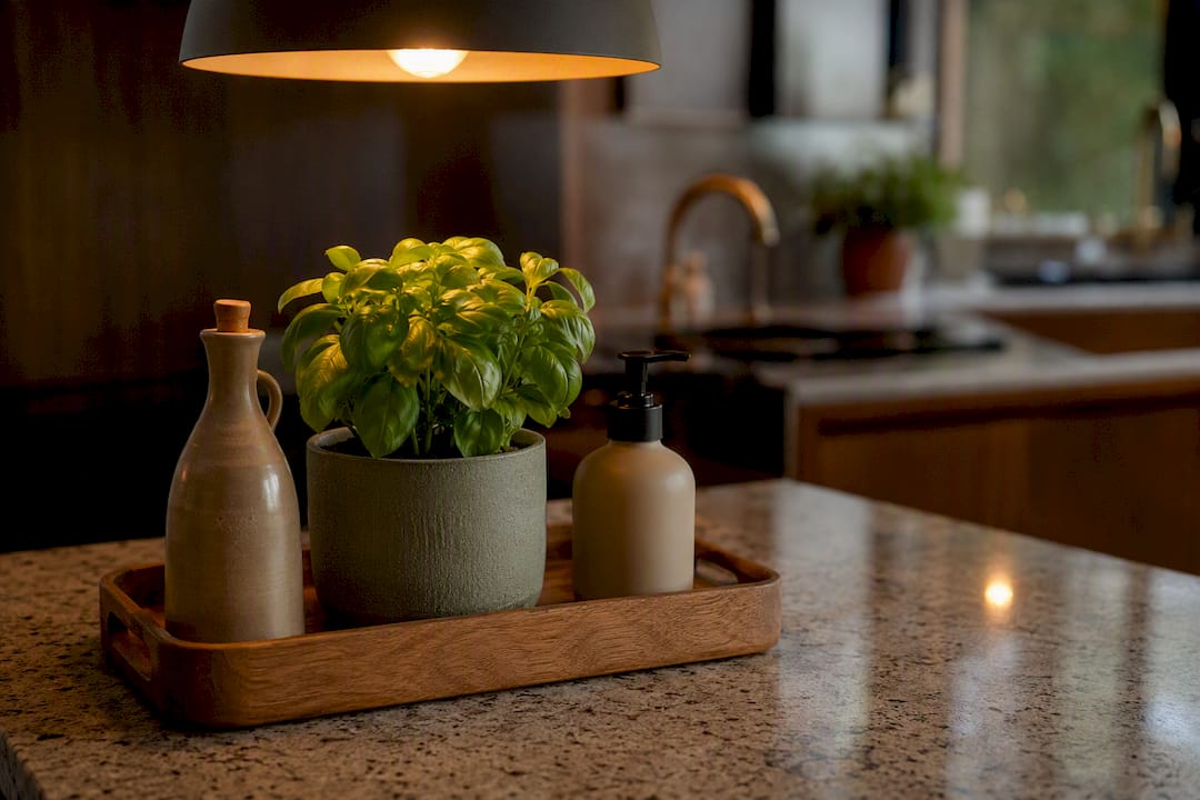
Style your counters by clearing everything off first, mapping out prep, appliance and display zones, then dressing the display areas with a handful of tactile, useful objects. That’s the whole method. For 2026, the look leans warmer and more textural, terracotta, matte ceramic, oiled wood, softened with lamp light rather than spotlights, so quick swaps and a short shopping list are usually enough to get there.
TL;DR:
- Save space by zoning countertops into prep, appliance, and display areas, keeping the prep zone clear for cooking activities.
- Use trays, boards, and vignettes to visually organize objects, selecting sizes and materials that contrast gently with the worktop.
- Replace unattractive, functional items with stylish, food-safe versions that hold up to daily use and cleaning requirements.
- Incorporate seasonal produce, herbs, and small plants for natural color and freshness that also serve as living decor.
- Prioritize objects that are useful, durable, and easy to clean, avoiding purely ornamental items that can gather grease and dust over time.
Table of Contents
- Kitchen countertop decor ideas you can copy today
- Edit, zone and clear: the prep your counters need before styling
- Trays, boards and vignettes: the styling tools that do the heavy lifting
- Functional beauty: replace the ugly essentials, don’t hide them
- Plants, produce and seasonal swaps that keep counters feeling alive
- Lighting and mood: small lamps and under-cabinet LEDs
- Small kitchens: scale, vertical space and the one-vignette rule
- Keeping countertop decor clean and hygienic
- Making countertop decor feel like yours
- Choosing decor that looks good and actually works
- Safety first: heat, hygiene and material choices
- Author perspective: Homable’s practical approach to countertop styling
- Curated Homable picks to style your counter
- Sources
Kitchen countertop decor ideas you can copy today
Good countertop styling isn’t about buying more things. It’s about choosing fewer, better ones and giving them room to breathe. The ideas below are the ones interior stylists return to again and again because they’re fast to set up, cheap to get wrong (and fix), and genuinely useful day to day.
-
The tray vignette. Group a hand soap, a squat candle and a small trailing plant on a single tray near the sink. The tray does the work of visually corralling three unrelated objects into one tidy display, and lifting it away for a wipe down takes two seconds.
-
A proper coffee station. Corral the kettle, a canister of beans or pods, and two mugs on a wooden board or tray at one end of the counter. It reads as intentional rather than left out.
-
A fruit bowl that earns its keep. A ceramic or woven bowl piled with lemons, apples or pears adds instant colour and gets eaten within the week, so it never goes stale as decor.
-
A leaning cutting board. Prop a wooden board upright against the splashback behind a small grouping. It adds height, warmth and a rustic backdrop without taking up worktop depth.
-
A utensil crock grouping. Stand wooden spoons, a whisk and tongs in a ceramic or stone crock near the hob. It’s the definition of functional beauty: an item you reach for daily that also anchors a display.
-
A decorative lamp corner. A small table lamp at the end of a run of counter, away from the sink, softens the whole kitchen after dark far more effectively than another pendant.
Material pairing matters more than most people think. Wood against matte black hardware photographs beautifully and, more importantly, still looks good after six months of actual cooking. Ceramic against warm brass or copper does the same job. The rule worth remembering: pick finishes that contrast gently with your worktop rather than blending into it, and pick objects that do double duty, a jug that’s actually used for water, a bowl that’s actually washed and refilled, rather than props that just sit there gathering grease.
Edit, zone and clear: the prep your counters need before styling
Nothing you buy will fix a counter that’s still covered in six months of accumulated clutter. Start with a full clear-out, not a tidy-round.
Take everything off every surface. All of it. Then wipe the worktop down properly, you’ll usually find crumbs, grease film and dust you’d stopped noticing. As you go, sort every item into one of four piles: keep out (used daily), use but store (used weekly, doesn’t need to live on show), store elsewhere entirely, or donate/bin. Most kitchens find that only a third of what was sitting out actually needs to stay visible.
Once the counter is bare, think in zones rather than one continuous surface:
- Prep zone: the stretch either side of the hob and by the main chopping area. Keep this clear, always. This is where cooking actually happens.
- Appliance zone: toaster, kettle, coffee machine, whatever gets used daily. Group these together rather than scattering them.
- Display zone: a corner, an end run, or the space beside the sink. This is the only area that gets styled.
Seldom-used appliances, the slow cooker, the stand mixer, the juicer you used twice, belong in a cupboard or on a decorative storage solution that keeps them accessible without keeping them visible. Interior guides consistently point to decanting and corralling as the fastest route to a calmer counter, and it costs nothing beyond the time it takes.
Pro Tip: Do the clear-out at the end of a working week, not the start. You’ll spot exactly which appliances you reached for and which ones just sat there, which makes the keep/store decision obvious rather than guesswork.
Trays, boards and vignettes: the styling tools that do the heavy lifting
A tray is the single most useful prop in countertop styling. It gives disparate objects, a candle, a plant, a bottle of hand wash, a visual boundary, so they read as one considered display rather than three random things someone left out.
Sizing matters more than style here. On a narrow counter, a tray wider than about 30cm will crowd the prep zone; on an island or a generous run, you can go bigger and add a fourth item. Match the material to your scheme: wood and rattan for a warmer look, marble or matte metal for something crisper.
Cutting boards do double duty as both a display surface and a way to introduce height. Lean one upright behind a vignette, or lay one flat and stack a bowl on top of it to lift an item off the worktop.
For the arrangement itself, designers reach for the same rule again and again:
- Tall: a vase, a bottle, a taller plant.
- Medium: a jar, a canister, a stack of bowls.
- Low: a small dish, a candle, a piece of fruit.
Grouping objects in odd numbers with varied height creates a balanced vignette that works on a small counter just as well as a full kitchen island, and the same three-height trick scales up or down depending on how much space you actually have.
Functional beauty: replace the ugly essentials, don’t hide them
Every kitchen has three or four objects that are useful but genuinely unattractive, the plastic squeezy bottle of washing-up liquid, the takeaway tub full of teabags, the cardboard box of cooking oil. The fix isn’t to hide these away. It’s to swap them for a version that’s just as functional but actually worth looking at.
A few easy upgrades:
- A glass or ceramic oil decanter instead of the supermarket bottle.
- Matching ceramic crocks or canisters for tea, coffee, sugar and pasta instead of mismatched packaging.
- A refillable soap dispenser in stone or ceramic rather than the branded plastic pump.
Getting the finish right stops these pieces disappearing into the background. On a strongly veined marble or busy stone worktop, white-on-white objects tend to vanish visually, so go for a colour or material with real contrast, terracotta on pale stone, matte black on a warm wood-effect counter.
None of this should come at the cost of hygiene. Choose materials that wipe clean easily and hold up to daily contact with food and water: glazed ceramic, sealed wood, powder-coated metal and glass all perform far better over time than unsealed or porous finishes.
Plants, produce and seasonal swaps that keep counters feeling alive
Living colour is the cheapest styling tool in the kitchen, and it’s the one that changes on its own. Basil and other kitchen herbs cope well with the light and warmth most kitchens offer, and you get to eat the result. Pothos and succulents tolerate the odd missed watering and steam from cooking far better than most houseplants would.
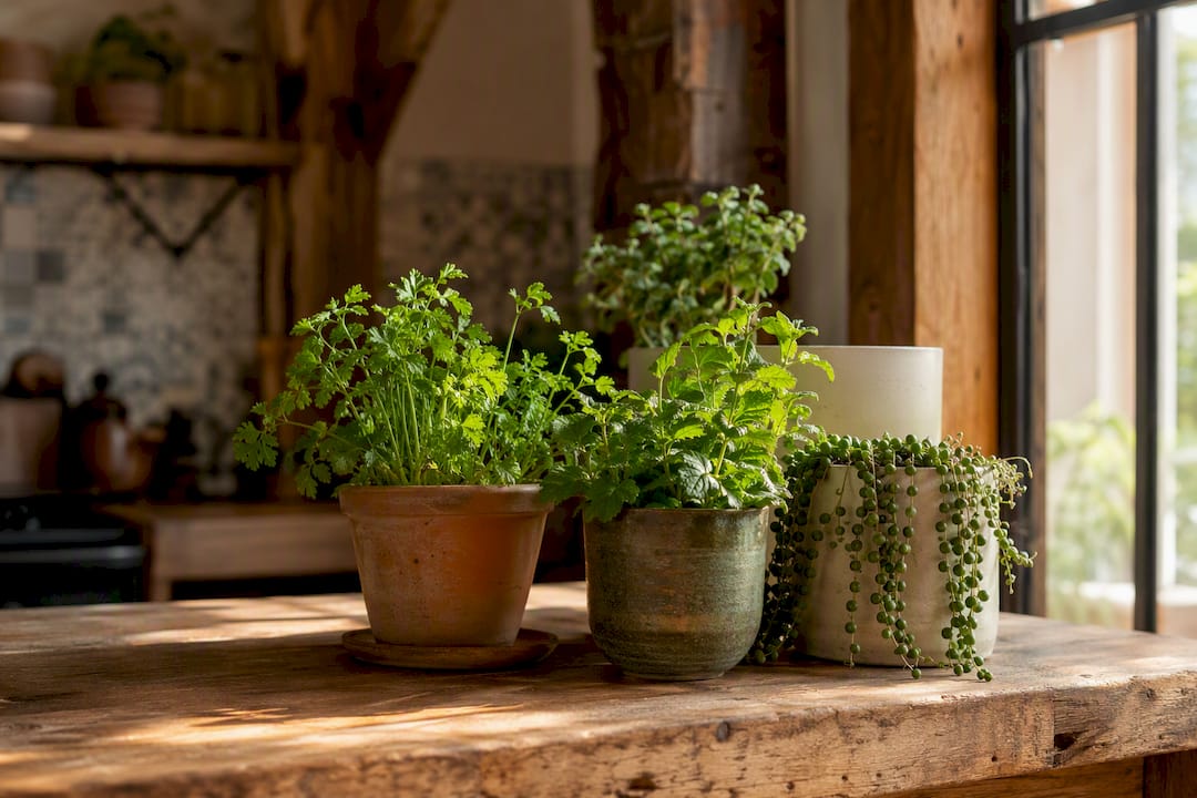
A bowl of seasonal fruit does two jobs at once: it’s an instant, low-cost way to add colour that also gets eaten and replaced, so it never becomes stale clutter the way a permanent ornament can.
Keep the rotation simple:
- Swap two small pieces, a plant, a candle colour, a runner, each season rather than restyling the whole counter.
- Lean into what’s actually in season: citrus in winter, stone fruit in summer.
- Refresh herbs every few weeks rather than letting a leggy basil plant sit there past its best.
Lighting and mood: small lamps and under-cabinet LEDs
Overhead spotlights make a kitchen functional. They don’t make it feel warm. That’s the gap a small table lamp fills, and it’s one of the clearer shifts in countertop styling for 2026, where designers are leaning on lamps and softer light over pure task lighting.
- Place a small lamp at the end of a counter run, well away from the sink and hob, never in a splash zone.
- Pair it with something organic nearby, a dried branch, a small plant, for the cosiest effect.
- Choose warm white bulbs, roughly 2700K to 3000K, rather than daylight-toned LEDs, which read as clinical rather than lived-in.
- Under-cabinet LED strips fitted along the underside of wall units add ambient glow in the evening without switching on the main light, and affordable kits make this one of the easiest upgrades in the whole list.
Small kitchens: scale, vertical space and the one-vignette rule
Small counters punish clutter faster than large ones, so the rules tighten rather than loosen.
- One strong vignette per section, not several small ones. A single well-composed grouping beats three scattered attempts, and you should be able to see clear worktop, ideally around 60% of it, at any given moment.
- Go vertical. Wall-mounted rods for utensils, a hanging planter above the sink, or an under-shelf rack for mugs all free up worktop without sacrificing anything you actually use. Homable’s guide to decorative solutions for small spaces covers several of these in more depth.
- Measure before you buy. A tray or crock that looks modest online can swallow a third of a narrow counter in person. Check the width against your actual clear space, not the photographed kitchen it’s styled in.
Keeping countertop decor clean and hygienic
Styling and hygiene aren’t in competition, but they do need the same amount of attention. Every object you leave on display collects the same grease and dust as the rest of the kitchen, so the objects themselves need to be easy to clean, not just nice to look at.
Favour non-porous, wipeable materials, glazed ceramic, sealed wood, glass, stainless steel, over anything raw or absorbent that traps moisture and odour. A trailing plant near the hob will pick up cooking residue faster than one at the far end of the counter, so position living decor away from splash and steam where you can.
Build a light wipe-down into your existing cleaning routine rather than treating decor as separate from the rest of the kitchen: lift the tray, wipe underneath, replace it. That single habit is what stops a good-looking vignette turning into a hidden grime trap within a month.
Anything with a lid or a pump, a soap dispenser, a sugar canister, needs washing out occasionally, not just wiped on the outside. And keep decorative items separate from anything that touches raw food directly. A decorative board for display is a different object from your everyday chopping board, even if they look identical, since raw meat and poultry need a board that’s cleaned to food safety standards after every use, not one doing double duty as a photogenic backdrop.
Making countertop decor feel like yours
The zones-and-vignette method gives you the structure. What fills it should reflect how you actually cook and live, not a showroom template.
If you collect ceramics, let the crockery you already own be the display rather than buying new pieces to match a scheme. A coastal kitchen might lean into pale wood, rope and glass; a Scandinavian-leaning one might favour matte black, warm oak and a single trailing plant; a maximalist collector might prefer a denser cluster of colour and pattern in one corner, provided the prep zone stays untouched.
Seasonal and cultural touches work well precisely because they’re temporary: a small dish for Diwali, a bowl of pomegranates at Christmas, a jug of wildflowers in spring. These rotate naturally with the fruit and plant swaps already built into the routine, so personal style becomes part of the maintenance cycle rather than an extra job.
The objects that end up meaning the most on a counter are usually the ones with a story, a jug from a grandparent, a board bought on holiday, rather than anything picked purely to fill space. Let two or three of those anchor the display and build the rest of the vignette around them.
Choosing decor that looks good and actually works
The strongest test for any object before it earns counter space: would you be annoyed if it broke, and would you actually use it if it wasn’t sitting there for show? If the answer to either is no, it’s probably filler.
Weigh looks against daily function on every purchase. A beautiful oil bottle that’s a nightmare to pour from will end up in a cupboard within a fortnight. A utensil crock with a base too narrow to hold a full set of spoons upright will topple constantly. Test the practical side, not just the finish, before it goes on the counter.
Multi-purpose pieces are worth prioritising over purely decorative ones: a tiered stand that holds fruit and also adds height to a vignette, a lidded jar that stores pasta and looks considered doing it, a vase that works for both fresh flowers and dried stems depending on the season. Items that double as storage or serve a genuine function tend to outperform decorative-only pieces, particularly in kitchens without much spare surface to begin with.
Finish and colour need to earn their place against your specific worktop, not a general trend. Hold a sample against the actual surface before committing. What looks striking in a shop can vanish or clash entirely once it’s sitting on your own stone or laminate.
Safety first: heat, hygiene and material choices
Not every beautiful object belongs directly next to the hob. Heat resistance matters more than most styling guides mention, and it’s worth checking before anything gets placed permanently.
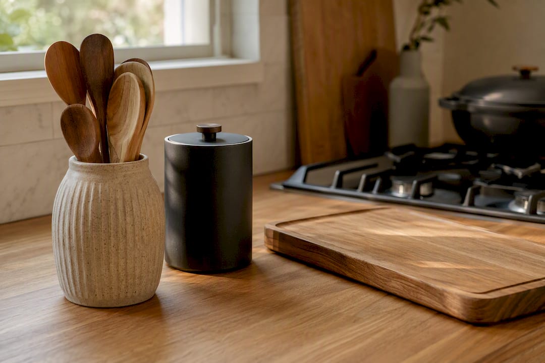
Anything positioned within reach of a hob or a kettle’s steam should be heat-tolerant, ceramic, stainless steel, sealed stone, rather than untreated wood, plastic or anything with an adhesive finish that can warp or discolour. Candles are lovely in a vignette but need a stable, heat-safe base and enough clearance from anything flammable, including trailing plants and paper labels.
If a board or crock will ever come into contact with food directly rather than just sitting decoratively, it needs to be genuinely food-safe: food-grade sealed wood, glazed ceramic, or lead-free glass, not a painted or varnished finish intended purely for display. Cheap decorative ceramics aren’t always rated for food contact, so check before using a “just for looks” bowl to actually serve fruit you’ll eat.
Electrical decor carries its own rules. Keep table lamps and any plugged-in lighting away from the sink and hob splash zones, and route cables so they don’t trail across a prep area where a knife or a spill could reach them. Under-cabinet LED strips should be fitted with proper clips rather than loose adhesive near heat sources, and it’s worth checking the manufacturer’s rating before running them anywhere near steam.
Author perspective: Homable’s practical approach to countertop styling
The kitchens that photograph well and function well share one habit: nothing on the counter is purely ornamental. A tray, a crock, a lamp, each one earns its spot by being used, not just looked at. That’s the bias worth having when you shop, tactile materials over glossy ones, one good vignette over five small ones.
Homable’s own kitchen decor editorial leans on exactly this logic: warm wood, matte ceramic, soft lighting. A typical build from stock might pair a ceramic tray, a small lamp and a single sculptural piece, three objects, three heights, nothing more.
— Cristiano
Curated Homable picks to style your counter
Once the counter is cleared and zoned, the easiest way to finish it is with a handful of pieces that do more than one job. Homable’s own range leans into exactly the tactile, warm materials this whole approach depends on.

For a display-zone vignette, the Star & House Scene Ornament works well as the “tall” anchor piece, sitting near the back of a tray where it catches lamp light in the evening. Add the Abstract Ornament in silver and wooden circle as a medium-height companion piece for a two or three-item grouping with genuine sculptural interest. If you’re leaning into a more seasonal, larger display, the Stars on Wooden Base Ornament anchors a corner run without needing a second prop.
None of these need matching, they need contrast, so mix finishes rather than buying a single boxed set. Position them in the display zone only, never on the prep run, and let the rest of the counter stay clear. Browse the full range at Homable to build a vignette around whatever tone your kitchen already leans towards.
Sources
- Design experts say you’re styling your kitchen counters all wrong—here’s what to do instead
- Organized kitchen counters
- Kitchen counter decor ideas – without the clutter