Cart
0
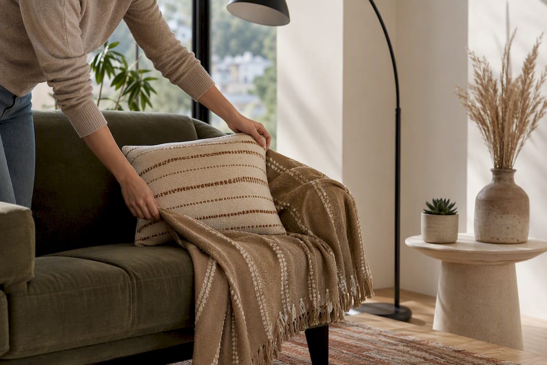
Swap the cushions, layer in a rug, and fix the lighting. Do those three things properly and your living room will read modern within a weekend, before you touch a single piece of furniture. The accents that move the needle fastest, according to designers surveyed by Houzz, are cushions and throws, an area rug, layered lighting, a statement artwork or mirror, and at least one houseplant.
Spend where it shows and lasts: lighting and a good rug earn their keep for years, while a stack of small trinkets rarely does. Save the smaller budget for cushions, throws, and a couple of well-chosen objects you can swap seasonally.
Before you buy anything, prioritise in this order:
- A rug that properly anchors your seating (get the size right before the colour)
- Three light sources per seating area, not one central pendant doing all the work
- New cushions and a throw in mixed but coordinated textures
- One large piece of art or a mirror instead of several small frames
- A plant with real height and presence, not a windowsill succulent
The shortlist below breaks each of these down with finishes and proportions, so you know exactly what to look for before you open a browser tab.
Key Takeaways
Lighting, rug scale, and cushion texture deliver the fastest visible change in a modern living room, ahead of any decorative object or artwork purchase.
| Point | Details |
|---|---|
| Prioritise the rug | Size it to sit under the front legs of your main seating; undersizing is the most common styling error. |
| Layer three light sources | Combine ambient, task, and accent lighting per seating area, and fit a dimmer where possible. |
| Apply 60-30-10 to colour | Use one neutral base, one secondary tone, and a 10% punch colour in a single cushion, vase, or artwork. |
| Mix, don’t match, metals | Choose one dominant metal finish with a single accent metal for a layered, current look. |
| Shop the priority categories at Homable | Homable’s rug, cushion, and curtain ranges map directly onto the highest-impact accents, with free shipping over £100. |
Table of Contents
- Six modern living room accents worth prioritising first
- Cushions and throws: sizes, fills and pattern mixing that read modern
- Rugs and floor accents: choose scale, material and layering
- Lighting accents: three-source layering that also looks good switched off
- Art, mirrors and wall accents: scale, placement and frame choices
- Plants and planters: choosing species and pots that suit modern interiors
- Decorative objects and vignettes: three-step templates to style surfaces
- Storage and functional accents that stay stylish
- Textiles, curtains and window treatments that modernise the room
- How to combine accents: the colour rule, odd numbers and a step-by-step workflow
- Small-space adaptations: make accents work in compact or open-plan rooms
- Materials, finishes and colour trends to favour for 2026
- Cristiano’s practical tips and how Homable’s curation helps you source accents
- Seasonal accent swaps and updating accents over time
- How to choose accents that reflect your style and suit your existing furniture
- Common mistakes to avoid when selecting and placing modern living room accents
- What the research actually supports about modern living room styling
- Curated Homable picks to put these ideas into practice
- Sources
Six modern living room accents worth prioritising first
Not every accent deserves equal attention. These six give the fastest visual return, in the order they tend to matter most once your sofa and walls are sorted.
- A statement rug. Choose one large enough to sit under the front legs of your sofa and armchairs; this single change fixes more “off” living rooms than any other purchase. Go for wool, jute, or a washable weave in a warm neutral, and size up rather than down.
- Layered lighting. A floor lamp, a table lamp, and one accent light (picture light, LED strip, or a sculptural pendant) replace the single overhead bulb that flattens every room. Warm white bulbs (2700K to 3000K) suit most modern schemes far better than cool white.
- Cushions and a throw. Three to five cushions in mixed sizes, plus one substantial throw draped rather than folded, do more for “cosy but current” than any accessory on this list.
- A large artwork or mirror. One confident piece beats a gallery wall of small frames in a modern scheme. A mirror also bounces light around, useful in rooms that lack a second window.
- A tall plant. A fiddle leaf fig, olive tree, or large snake plant fills a corner that photographs and feels empty otherwise. Height matters more than variety here.
- A styled vignette on the coffee table or console. A tray, a stack of books, and one sculptural object turns a flat surface into something worth looking at, and it costs almost nothing if you already own the pieces.
Texture is the thread running through all six. Linen cushions against a bouclé throw, a jute rug under a lacquered coffee tray, matte ceramic beside a brushed-brass lamp base: contrast in finish is what separates a modern room from a matched showroom set. Save the fully coordinated look for hotel lobbies. At home, pieces that are slightly different in finish but consistent in tone read as considered rather than assembled from a single catalogue page.
Cushions and throws: sizes, fills and pattern mixing that read modern
Cushion sizing is where most living rooms go wrong before they go right. A three-seat sofa generally wants either three large cushions (55cm to 60cm) arranged symmetrically, or an asymmetric mix: two large corner cushions plus one or two smaller accent sizes (45cm) layered in front. Odd numbers of cushions per seat tend to look more relaxed than even pairs, which can read a little formal for a modern scheme.
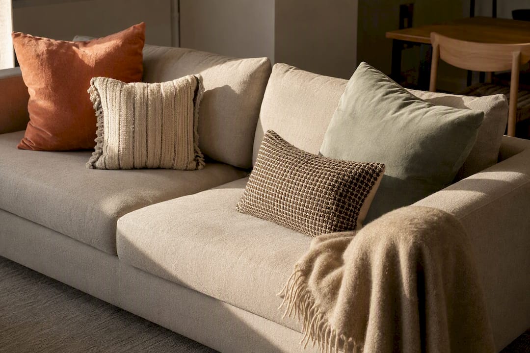
Fill matters more than most shoppers realise. A feather or feather-blend insert holds its plumped shape and drapes properly over the cover, while a polyester-filled cushion goes flat within weeks and never quite recovers its structure. If you’re buying covers separately, size the insert 2cm larger than the cover for that full, slightly overstuffed look designers favour.
Mixing textures is simpler than it sounds if you follow one rule: pick one dominant texture (linen or a plain weave), one textural contrast (bouclé, velvet, or chunky knit), and one pattern or colour accent. Three cushions, three jobs, no clashing.
- Linen or cotton for the base layer, in a neutral that matches your wall colour
- Velvet or bouclé for at least one cushion to add tactile depth
- A single patterned or textured throw draped over the arm, never folded flat
Pro Tip: Buy cushion covers, not fixed cushions, wherever you can. It’s far cheaper to update three covers each season than replace whole cushions, and it means your good-quality inserts last for years.
Rugs and floor accents: choose scale, material and layering
Get the size wrong and nothing else in the room quite works, however good your cushions are. The rule designers return to again and again: the rug should sit under the front legs of your main seating, at minimum, and ideally under all of it. A rug that floats in the middle of the floor with furniture pushed to its edges is the single most common styling mistake in living rooms.
For an average UK living room, that generally means a sufficiently large rug for your seating arrangement, typically sized to accommodate a three-piece suite or a smaller two-seat and armchair layout. If your room can’t fit a rug that large, it’s usually a sign the furniture itself needs rearranging closer together, not that you should settle for a smaller rug.
- Size up rather than down; a slightly oversized rug reads more intentional than an undersized one
- Layer a smaller textured rug (sheepskin, flat weave) over a larger neutral jute or wool base for visual depth without overwhelming the floor
- Choose wool or a wool blend for softness underfoot and longevity; choose a washable synthetic weave for high-traffic households with kids, pets, or muddy boots
- Keep pattern on the rug OR the cushions, rarely both at full strength, so the eye has somewhere to rest
Maintenance is worth thinking about before you buy, not after the first spill. A washable option like a bath and pedestal rug set suits smaller floor accents near entryways, while a proper statement piece such as a woollen rug in a warm pink tone works as the room’s anchor if you want colour to do some of the work.
Lighting accents: three-source layering that also looks good switched off
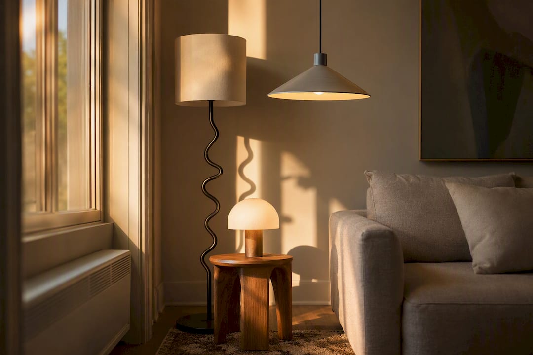
One ceiling pendant lighting an entire living room is the fastest way to make a nicely furnished space look flat and slightly clinical. Designers consistently recommend layering at least multiple light sources per seating area: ambient, task, and accent, each doing a different job.
Ambient light fills the room generally, usually from a ceiling fixture or wall-mounted uplighters bouncing light off the ceiling. Task light is functional and directional, a reading lamp beside an armchair or a floor lamp angled over the sofa arm. Accent light is purely atmospheric: a picture light over your artwork, an LED strip behind a media unit, or a small table lamp in a corner that never needs to illuminate anything, just to glow.
- Fit a dimmer on at least your main ambient circuit; a modest retrofit cost buys you the ability to shift a room from bright and functional to soft and evening-ready in seconds
- Choose one sculptural lamp, an arc floor lamp, a ceramic table lamp, or a paper pendant, and let it double as a decorative object rather than a purely functional fitting
- Match bulb temperature across all your fittings (warm white bulbs in the range usually recommended by designers) so the room doesn’t feel patchy when everything’s on at once
Pro Tip: If you only upgrade one thing this month, make it a dimmer switch. It’s one of the cheapest changes on this entire list and it’s the one guests actually notice, even if they can’t say why the room feels different.
Art, mirrors and wall accents: scale, placement and frame choices
Hang artwork so its centre sits at roughly eye height from the floor, a rule design editors return to consistently because it works regardless of ceiling height or room size, according to The Spruce. Above a sofa, the bottom of the frame should sit roughly a small gap above the top of the backrest, close enough to feel connected, far enough to avoid looking cramped.
One large, confident piece beats a scattered gallery wall in most modern living rooms. If you already own several smaller pieces you love, group them tightly with consistent spacing (5cm to 8cm between frames) rather than spreading them loosely across the wall, which reads as unfinished rather than curated.
- A mirror opposite or beside a window doubles the perceived light in the room and works especially well in north-facing spaces
- An oversized mirror leant against the wall (rather than hung) is a genuinely modern move, but only in rooms with enough floor space to spare
- Match your frame finish to your room’s dominant metal: warm brass frames against warm brass hardware, matte black against matte black switch plates, rather than mixing cold chrome with warm wood tones
Plants and planters: choosing species and pots that suit modern interiors
A single tall plant does more for a modern living room than five small ones scattered across surfaces. A fiddle leaf fig, a rubber plant, or an olive tree in the an appropriate tall size range fills the kind of empty corner that otherwise never quite works, whatever furniture you put there.
Smaller groupings have their place too, three or four pots of varying heights clustered on a console or windowsill, but they need more editing than a single statement plant. If you’re not confident with grouping, one large plant is the safer, faster route to a finished look.
- Planter material should echo something else in the room: a concrete pot against a concrete-look coffee table, a rattan basket against a jute rug, a glazed ceramic against warm brass fittings
- Raise floor plants slightly on a simple wooden or metal stand rather than sitting the pot directly on the rug, which protects the fibres and adds a touch of height
- Faux plants have improved enormously and work well in low-light corners or for households that travel often, but they read best in larger, structural species (fiddle leaf, olive) rather than delicate trailing varieties, which tend to give the game away up close
Decorative objects and vignettes: three-step templates to style surfaces
A coffee table or console with nothing on it looks unfinished. One with too much on it looks cluttered. The fix designers use is a simple height template, borrowed from retail visual merchandising and genuinely easy to replicate at home, as outlined in guidance from HomeDecorFull.
- Tall. One object with real height, a vase, a sculptural candle holder, or a small stack of oversized books, gives the vignette an anchor point for the eye.
- Medium. A textured bowl, a smaller vase, or a single interesting object at roughly half the height of your tall piece, placed slightly offset rather than centred.
- Flat. A tray or a single flat book underneath the grouping, which visually “grounds” the taller objects and stops them looking like they’ve been dropped at random.
Stick to three or five objects total per surface, never four or six; odd numbers consistently look more intentional than even ones. Mix at least two materials, a ceramic vase with a wooden tray, a glass candle holder with a woven bowl, and leave genuine negative space around the grouping. A vignette that fills every available centimetre of surface stops being a vignette and starts being clutter.
Storage and functional accents that stay stylish
The best storage accents do double duty: they hide clutter and they look intentional sitting out in the open. A woven seagrass or rattan basket beside the sofa for throws and magazines works far better than a closed cupboard you have to walk to, because it stays part of the room’s texture story rather than disappearing into it.
- Choose baskets and trays in natural materials, rattan, jute, or turned wood, which suit modern schemes far better than plastic or high-gloss finishes
- A large ottoman with internal storage doubles as extra seating, a footrest, and a place to hide remotes and chargers
- Group remotes, coasters, and charging cables inside a single lidded box on the coffee table rather than leaving them loose; it’s a five-minute fix that changes how the whole surface photographs
Textiles, curtains and window treatments that modernise the room
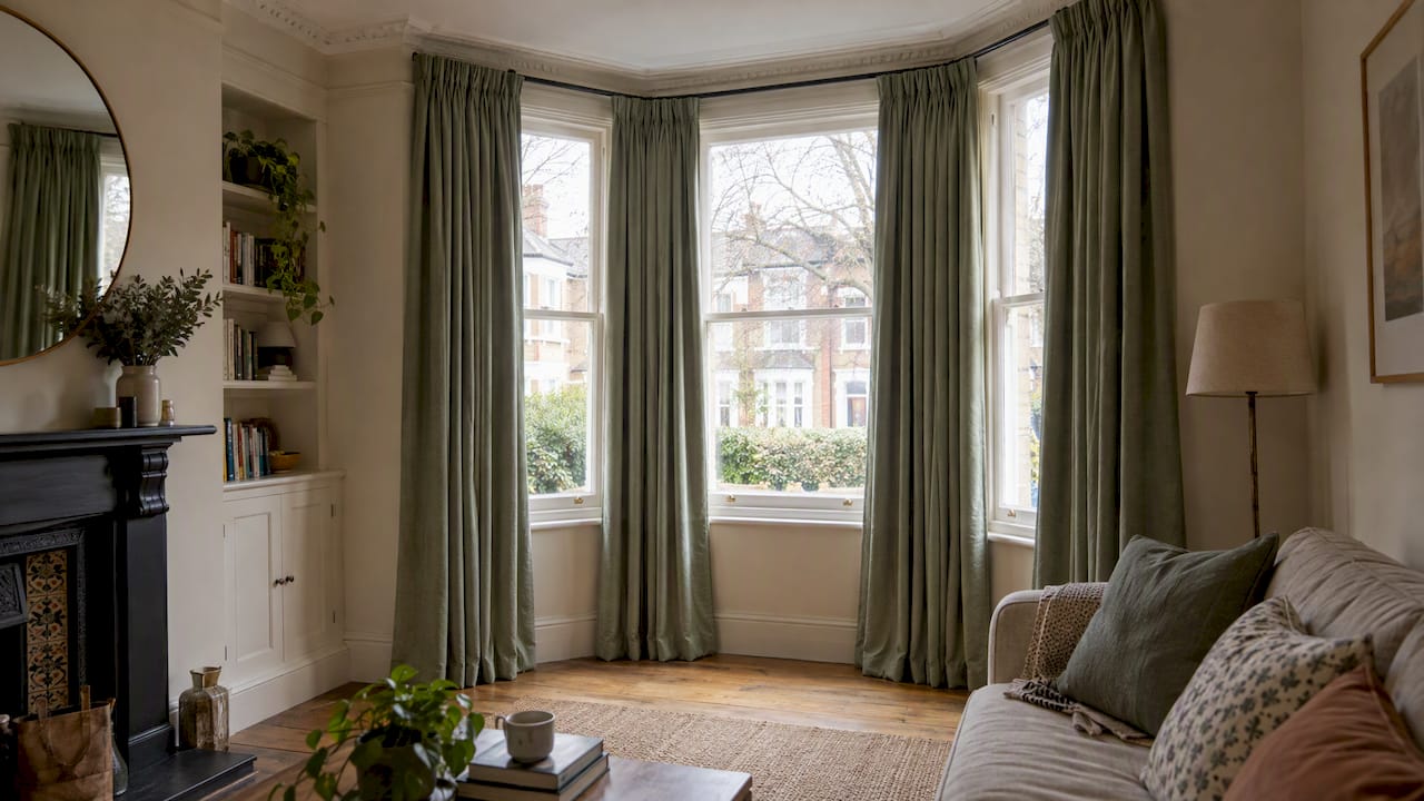
Curtains hung too low and too narrow are one of the quickest ways to make a room feel smaller than it is, and one of the cheapest to fix. Hang the curtain track or pole as close to the ceiling as practical, and extend it 15cm to 20cm beyond the window frame on each side. The window itself doesn’t get bigger, but the room reads taller and wider the moment the fabric frames more wall than glass.
- Linen or a linen blend in a neutral tone suits most modern schemes and softens light without blocking it entirely
- A natural woven texture, such as a bamboo curtain, adds texture and works well as a room divider or door treatment in open-plan spaces
- In compact rooms, a Roman blind in a plain fabric keeps the window line clean, while sheer curtains layered behind heavier drapes give you light control without losing softness
How to combine accents: the colour rule, odd numbers and a step-by-step workflow
Design editors keep returning to the same two frameworks for a reason: they work regardless of your personal style, and they stop a room accumulating “stuff” without any logic holding it together, a point confirmed by styling guidance from House & Garden.
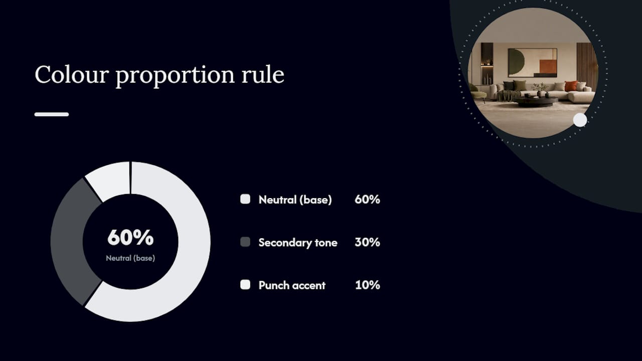
The 60-30-10 rule applies neatly to accents. Sixty percent of your colour is your neutral base (walls, sofa, large rug). Thirty percent is a secondary tone that appears in cushions, throws, and curtains. The final ten percent is your punch colour, used sparingly in a vase, one cushion, or a piece of art, and it’s this ten percent that stops a room looking flat.
Pair that with the odd-number rule for grouped objects (three candles, not two; five books, not six) and pick one dominant metal finish, with a single accent metal for contrast rather than matching everything.
A simple one-session workflow:
- Pick your anchor piece first, either the rug or a large artwork, since everything else gets chosen to sit alongside it
- Choose your dominant metal finish and your an accent colour used sparingly before buying anything else
- Place three light sources across the seating area and check the bulb temperatures match
- Style one vignette on your main surface using the tall, medium, flat template
- Step back, edit down by a third and stop (The last step matters more than it sounds: editing down can improve the room significantly.)
That last step matters more than it sounds. Most rooms improve the moment you remove one object, not add another.
Small-space adaptations: make accents work in compact or open-plan rooms
Small rooms genuinely do better with fewer, larger accents rather than many small ones scattered across every surface, a pattern designers note consistently in compact living room layouts. One large cushion reads as intentional; five tiny ones on a two-seat sofa reads as cluttered, however nice each individual cushion is.
- Choose one statement piece per category (one large plant, one bold cushion, one striking object) rather than several smaller versions of each
- Glass, acrylic, and mirrored surfaces reduce visual weight because they let the eye continue past them rather than stopping at a solid block of colour
- Multi-functional accents earn double their footprint: a storage ottoman, a nest of tables, a mirror that’s also a room divider
For a deeper look at compact-room layouts specifically, Homable’s guide to styling small spaces covers furniture scale alongside accent choices.
Materials, finishes and colour trends to favour for 2026
Cool greys are losing ground to warmer, earthier palettes. Terracotta, sage, and mushroom tones are becoming the dominant direction in contemporary living rooms heading into 2026, alongside a clear preference for tactile, handmade-looking finishes over anything glossy or uniform, according to trend guidance from B&Q.
Metal mixing has also shifted. The old rule of matching every metal finish in a room has given way to pairing one dominant metal with a single accent metal, brushed brass as the lead with a touch of matte black, for instance, which reads more layered and considered than an all-matching set.
- Favour natural fibres, wool, jute, linen, rattan, over synthetic finishes wherever budget allows
- A natural bamboo rug or similar organic-material piece fits this palette shift well and works across several room styles
- Secondhand and vintage pieces are increasingly treated as a design choice rather than a budget compromise, particularly for coffee tables and lamp bases
For a broader view of where UK interiors are heading this year, Hide Rugs’ 2026 trend guide covers material direction in more depth.
Cristiano’s practical tips and how Homable’s curation helps you source accents
The fastest wins are almost always the ones people skip: a dimmer switch, a properly sized rug, cushion covers instead of whole new cushions. None of that requires a big budget, just the right order of operations.
Homable’s categories map fairly directly onto the accents covered here. Rugs sit under floor accents and room anchoring; cushions, throws, and curtains cover the textile layer; planters and decorative objects handle the vignette and greenery advice above.
- Check the exact dimensions listed on a product page against your own room measurements before ordering, particularly for rugs and curtains, where a few centimetres out changes how a piece reads in the room
- Homable ships free on orders over £100, worth bundling a rug with cushions or curtains to reach the threshold in one order
- Read the returns policy before ordering anything you’re unsure will suit the space, especially larger pieces like rugs that are harder to judge from a photo alone
For a fuller walkthrough of pulling these choices together, Homable’s interior design workflow guide covers the process room by room.
Seasonal accent swaps and updating accents over time
A living room doesn’t need a full redecoration every year to feel current. Swapping a handful of accents seasonally keeps the space feeling looked after without touching furniture, paint, or flooring.
Autumn and winter suit heavier textures: a chunky knit throw, deeper cushion tones (rust, plum, forest green), and a scented candle or two on the coffee-table vignette.
Treat your rug and your main sofa as the fixed points that rarely change, and treat cushion covers, throws, candles, and the coffee-table vignette as the layer you refresh two or three times a year. This is also the cheapest way to keep a room current between bigger updates: a new set of cushion covers costs a fraction of a new sofa and changes the room’s temperature completely.
Keep a small box or drawer for off-season textiles rather than storing them loose. It makes the seasonal swap something you can do in twenty minutes rather than a weekend project, which is usually the difference between actually doing it and putting it off for another year.
How to choose accents that reflect your style and suit your existing furniture
Start with what you already own, not with what’s trending. A room full of on-trend pieces that clash with your existing sofa colour or your flooring tone looks worse than a slightly dated room with everything coordinated properly.
Pull your undertone from your biggest fixed piece, usually the sofa or the floor, and build your accent colours from there. A warm-toned wooden floor wants terracotta, mustard, and warm greys rather than cool blues and stark whites, which will fight the wood rather than complement it.
If your personal style leans traditional but you want a more modern living room, accents are the lowest-risk way to bridge the two. Keep an inherited or classic sofa shape, then modernise through a graphic rug, sculptural lighting, and a bolder art choice, rather than replacing furniture you actually like. The accents can carry a huge amount of stylistic weight on their own, which is exactly why they’re worth getting right before you consider anything bigger.
Homable’s guide to elegant room accents has more on translating personal taste into specific accent choices without a full furniture overhaul.
Common mistakes to avoid when selecting and placing modern living room accents
The same handful of errors turn up in almost every living room that “doesn’t quite work,” and every one of them is fixable without spending much.
Undersizing the rug is the single biggest culprit, leaving furniture legs floating off the edge rather than anchored on top of it. Matching every metal finish in the room too closely runs a close second, which flattens a scheme that would otherwise have depth. Relying on one central ceiling light instead of layering three sources leaves rooms looking functional rather than considered, particularly in the evening.
- Buying too many small decorative objects instead of one or two larger, more considered pieces
- Hanging artwork too high, above eye height, rather than centring it around around eye height from the floor
- Choosing pattern on both the rug and the cushions at full strength, which competes rather than layers
- Skipping the “edit down” step and leaving every surface fully styled with no negative space at all
Most of these come from adding rather than editing. The workflow outlined earlier in this guide, pick the anchor, set the colour and metal, layer the light, style one vignette, then remove a third, exists specifically to catch these mistakes before they become permanent.
What the research actually supports about modern living room styling
Most advice on this topic treats every accent as equally important, which is where it goes wrong. The evidence, and frankly a decade of watching which changes actually get noticed, points to a clear hierarchy: lighting and rug scale do more work than any decorative object you’ll ever buy, and yet they’re consistently the last thing people think to update.
The odd-number rule and the 60-30-10 colour split get treated as decorating trivia, but they’re closer to load-bearing principles. Skip them and a room full of individually good pieces still won’t cohere.
If you take one thing from this guide, prioritise the rug and the lighting before you touch a single cushion. Everything else is genuinely secondary, however much more fun it is to shop for cushions than to think about bulb temperature. The homeowners who get the fastest, most convincing results are the ones who resist buying more and instead fix the two or three things that were wrong to begin with.
Curated Homable picks to put these ideas into practice
Homable’s product range is built around exactly the categories covered in this guide, so putting the advice into practice doesn’t mean hunting across a dozen different retailers. Rugs are the priority purchase, since scale and material make the biggest visual difference of anything on this list; browse Homable’s rug collection for options ranging from washable everyday weaves to statement wool pieces like the Baluchi Cannon Pink rug.
Cushions and throws come next, the cheapest, fastest category to refresh seasonally, followed by planters and natural-material curtains such as the bamboo curtain range for anyone leaning into the warmer, textural palette trending this year. For durable, high-traffic spaces, the washable kitchen rug in coffee black velvet shows how a practical material choice doesn’t have to look utilitarian.
Orders over £100 ship free, and Homable’s returns policy covers sizing mistakes, genuinely useful when judging a rug’s scale from a product photo alone. Start with the rug, check the measurements against your own room, and build outward from there.
Sources
- 75 Modern Living Room Ideas You’ll Love - August, 2026 | Houzz
- Modern living room ideas | Martha Stewart
- The Ultimate Guide to Decorative Accessories for Living Room Refreshes
- 129 living room ideas from the House & Garden archive
- Living Room Decor Ideas: The Complete Guide | The Spruce