Cart
0
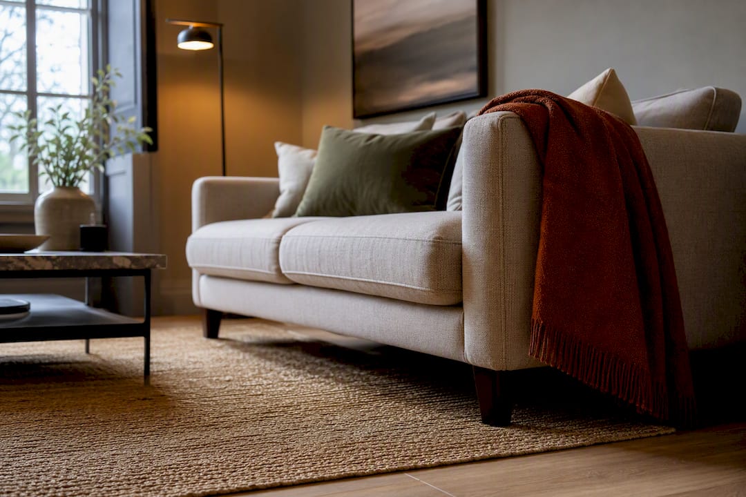
Pick a role for the rug first, anchor, bridge, statement or neutral foundation, then choose a colour that supports that role rather than one you simply like in isolation. Check wall colour, floor tone and your main sofa or bed fabric before anything else, and always view a physical sample in the room itself under its usual light before you commit.
TL;DR:
- Choosing a rug’s color depends heavily on its intended role, with neutral foundation and bridge options being the most versatile for different spaces.
- The room’s existing elements, including wall and floor undertones, upholstery, and lighting at different times of day, are critical to prevent color clashes.
- Mid-tone, low-contrast patterns and textured solids are the most practical choices for busy households, offering durability and ease of maintenance.
- Test rug samples in natural light over several days, placing them where they will be used, to accurately assess their true color and undertones.
- Avoid matching the rug exactly to furniture or walls; instead, select a rug that complements existing colors while adding subtle contrast or texture.
Table of Contents
- How to choose rug colour: start with the rug’s role
- Assess the room: walls, floor, upholstery and light
- Colour recommendations by room and use
- Pattern, scale and contrast: solid, tonal or patterned?
- Light, undertones and how colour reads through the day
- How to test rug samples and make a confident choice
- Practical maintenance and durability trade-offs
- Designer tips and common mistakes to avoid
- Homable’s approach to helping you see the colour before you buy
- What else in the room should shape your decision?
- Does rug texture change how a colour looks?
- Do seasons and mood affect the right rug colour?
- How does rug colour affect the feel of a room psychologically?
- Cristiano’s five-step rapid test
- Where Homable fits if you want to see samples before you buy
- Sources
- FAQ
How to choose rug colour: start with the rug’s role
Before you look at a single swatch, decide what job the rug needs to do. That decision, more than any colour chart or trend list, determines whether you end up happy with it in six months. Painting Tips frames this as the first move in any rug decision: figure out whether it’s a foundation, a bridge, a soft contrast, or a statement, because each role points you towards a different colour family.
An anchor rug grounds the room. It’s usually a darker or richer tone that sits beneath the furniture and gives the eye somewhere stable to land, ideal for open-plan living rooms where sofas, coffee tables and shelving all compete for attention.
A bridge rug does diplomatic work. It pulls together two or three colours already in the room (a green cushion, a rust throw, a mustard lampshade) without matching any of them outright. This is the role that suits most family living rooms, because it forgives a slightly mismatched sofa and curtains.
A statement rug is the one you choose deliberately to stand out, bold colour, strong pattern, and everything else in the room is dialled back to let it shine. Works well in a formal sitting room or a hallway with little else competing for attention.
A neutral foundation rug is there to disappear. Stone, oatmeal, soft grey. It’s the safest option when you’re not sure what’s coming next in terms of furniture or when you rent and can’t commit to strong colour.
- Family living room: bridge or neutral foundation, since both tolerate mess and changing decor
- Formal sitting room: anchor or statement, where you’re styling for effect rather than flexibility
- Bedroom: neutral or soft bridge, calm rather than commanding
- Home office or study: anchor in a muted tone, to create focus without visual noise
Assess the room: walls, floor, upholstery and light
Once you know the rug’s role, work through the room in a fixed order. Skipping straight to “what colour rug do I like” without this step is the single most common reason people end up returning rugs. Pasha Rug recommends checking wall colour, then flooring, then upholstery, then light and use level, in that sequence, because each layer narrows your options before you even open a rug catalogue.
- Check the wall colour first. Note whether it leans warm (cream, buttery white, terracotta) or cool (blue-grey, stone, pure white). This single check eliminates half the rugs you’d otherwise consider.
- Look at your floor tone. Golden oak, grey-washed boards, dark walnut, pale tile. A rug that clashes with the floor’s undertone will look wrong no matter how well it matches everything else.
- Identify your main upholstery colour. The sofa, the bed frame, whatever dominates the room visually. This is where most people stop, but it’s step three, not step one.
- Note your accent textiles. Cushions, curtains, throws. These are where you can afford a bolder pick-up colour even if the rug itself stays neutral.
- Test for undertones under natural light. Hold a white sheet of paper against the wall and the floor in daylight. If both look slightly yellow against the white, you’re in a warm room; if they look slightly blue or grey, you’re cool.
Neutrals aren’t one category, and this is where people trip up. Interiors Nouveau points out that warm neutrals (camel, oatmeal, terracotta undertones) and cool neutrals (greige, dove grey, stone) behave completely differently depending on the room. Put a cool grey rug in a warm-toned oak-floored room and it will look slightly dead, even though “grey” seems like a safe, neutral choice on paper.
Keep the checklist handy. It works equally well scribbled on your phone in a showroom or run through mentally while standing in your own living room with a cup of tea.
Colour recommendations by room and use
Colour needs shift depending on which room you’re furnishing, and the SERP-favourite answer, “just pick something you like”, ignores how differently each space behaves once people are actually living in it.
Living room. This is where the role decision matters most. If the room already has strong colour (a bold sofa, patterned curtains), a grounding neutral rug lets everything else breathe. If the room is currently quite flat, a warm accent tone—rust, ochre, deep teal—gives it life without a full redecoration. Choose a statement colour only when you’re prepared to keep the rest of the room deliberately restrained.
Bedroom. Rest matters more than impact here. Soft, muted tones, dusty blue, warm putty, gentle sage, do more for a bedroom than anything punchy. A rug is one of the largest textile surfaces in the room and sits right where your eyes land first thing in the morning, so calmer wins over clever.
Dining room and other high-traffic areas. Mid-tones and low-contrast patterns are more forgiving here than either very light or very dark solids, because they hide the inevitable crumbs, spills and chair-drag marks between cleans.
Small rooms and flats. Hennens notes that lighter rugs make a room read larger, while darker rugs ground the space and make it feel cosier and more defined. In a genuinely small room, that trade-off usually favours light tones or a low-contrast pattern that doesn’t chop the floor visually into smaller sections.
- Living room with bold furniture: grounding neutral (stone, warm grey, soft taupe)
- Living room that feels flat: warm accent (rust, ochre, deep teal)
- Bedroom: dusty blue, sage, warm putty
- Dining room: mid-grey, warm camel, low-contrast trellis pattern
- Small flat living room: pale oatmeal or soft blush with subtle tonal pattern
Pattern, scale and contrast: solid, tonal or patterned?
A textured solid, one colour with a subtle woven or looped texture rather than flat pile, tends to suit busy rooms and minimalist ones equally well, because it adds interest without adding visual noise. It’s the safest choice when you’re not confident reading a room’s existing pattern mix.
Tonal patterns, where the pattern sits in shades of one colour family, work as a bridge between several existing colours in a room without introducing anything jarring. High-contrast patterns do the opposite: they demand attention and work best when you actually want the rug to be the first thing anyone notices.
Scale matters as much as colour. Interiors Nouveau advises that low-contrast or faded patterns are safer in smaller rooms, while large-scale, bold patterns need a bigger space and larger furniture to look proportionate rather than cluttered.
- Textured solid: busy rooms, minimalist rooms, anyone unsure about pattern
- Tonal pattern: rooms with several existing colours that need tying together
- High-contrast pattern: rooms built around the rug as the statement piece
- Match pattern scale to room size, a large medallion pattern will overwhelm a small flat
Pro Tip: Hold a rug sample at arm’s length and squint. If the pattern turns into a blur of one colour rather than distinct shapes, it’s reading as a solid from across the room, which is often exactly what you want in a smaller space.
Light, undertones and how colour reads through the day
A rug that looks perfect in the shop can look completely different once it’s home, and the culprit is almost always light direction rather than the rug itself. North-facing rooms get cooler, flatter daylight, which can make warm rugs look slightly muddy and cool rugs look colder still. South-facing rooms get warmer, stronger light that flatters warm tones but can wash out pale, cool colours by midday.
Spotting undertones takes a specific test rather than a glance. Named colours lie constantly, a rug labelled “grey” can carry a green, blue, or purple undertone that only shows up next to another colour. Painting Tips recommends viewing samples at different times of day specifically because light shifts a rug’s apparent colour and undertone more than most people expect.
- View the sample in the morning and again in the evening, under whatever lighting you actually use at night
- Hold it directly against your sofa or curtain fabric, not just near it
- Check it under artificial light too, warm bulbs push everything towards yellow, cool LED strips push towards blue
- Compare it against a plain white sheet of paper to isolate the undertone honestly
How to test rug samples and make a confident choice
- Order swatches or a returnable sample, and photograph it in the room at the time of day you’ll actually be using that space most.
- Place the sample where the rug will sit, partly under the sofa or bed frame if that’s how it will be positioned, not floating in the middle of the room.
- View it from every angle you’ll actually see it from, standing at the doorway, sitting on the sofa, and from the kitchen if it’s open-plan.
- Run the contrast check: does it clash or blend awkwardly with the sofa and floor, or does it sit comfortably between the two?
- Note any undertone surprises and cross-check against your maintenance needs before ordering the full size.
Painting Tips calls sample-testing in the room’s own light the single most effective way to avoid colour regret, and it’s hard to argue otherwise once you’ve been caught out by a rug that looked beige in the shop and slightly pink at home.
Pro Tip: Leave the sample down for at least three full days, not just an afternoon. Cloud cover, curtains open or closed, and lamps on or off all change how a colour reads, and one sunny afternoon isn’t a fair test.
Practical maintenance and durability trade-offs
Colour choice isn’t only about looks. It’s also a maintenance decision, and this is the part most colour guides skip entirely.
Mid-tones and low-contrast patterns are the most forgiving option for busy households, Pasha Rug confirms this is specifically why they suit homes with pets or children, because crumbs, muddy paw prints and general everyday wear simply don’t show up against a mid-grey or warm camel pattern the way they do against pale cream or deep charcoal.
Light rugs make a room feel larger and brighter, but they show every mark, and that trade-off is worth being honest with yourself about before you buy. Very dark rugs hide stains well but show shed pet hair and dust with brutal clarity, especially in strong daylight.
- Households with pets or young children: mid-tone, patterned, synthetic or wool blend that can be spot-cleaned
- Adult-only, low-traffic room: light or pale tones work fine and look brighter
- High-traffic hallway or dining area: avoid pure white or pure black, both show wear fastest
- Wool rugs hide stains better than most synthetics but need more careful cleaning
- Flatweave cotton or synthetic rugs in mid-tones are easiest to wash and rotate
Designer tips and common mistakes to avoid
The single biggest mistake is matching the rug exactly to the sofa or the walls. RealSimple reports that designers specifically warn against this because it creates what they call visual flatness, a room where nothing has enough contrast to feel intentional, just matched.
Instead, pull one or two tones already present in the room and add something new, a texture, a slightly different accent shade, rather than trying to copy what’s already there. A green sofa doesn’t need a green rug. It needs a rug that acknowledges the green somewhere in its pattern or fringe detail while bringing something the room doesn’t already have.
- Never match rug colour exactly to the sofa or wall paint
- Change one variable at a time, texture or colour, not both simultaneously
- Watch for a rug that nearly matches the floor tone, it visually shrinks the room rather than defining it
- Check pattern scale against your actual furniture, not just the room’s square footage
Pro Tip: If you’re stuck between two rugs, choose the one that ties together the most existing colours in the room rather than the one you find prettiest on its own. A rug that does structural work earns its place; one that’s just decorative often ends up feeling wrong within a year.
Homable’s approach to helping you see the colour before you buy
Some retailers photograph rugs in natural, realistic room settings rather than heavily edited studio shots, because a rug’s colour only means anything once you can picture it on your own floor. Product pages are sometimes built to show texture and tone as accurately as possible, which matters given how much light and undertone shift a colour’s appearance.
For readers building a full palette rather than just choosing one rug, Homable’s guide to colour theory and undertones covers the groundwork in more depth, and the room-by-room styling guide is worth a look before you commit to a final shortlist. Both are written as practical next steps, not sales pages.
What else in the room should shape your decision?
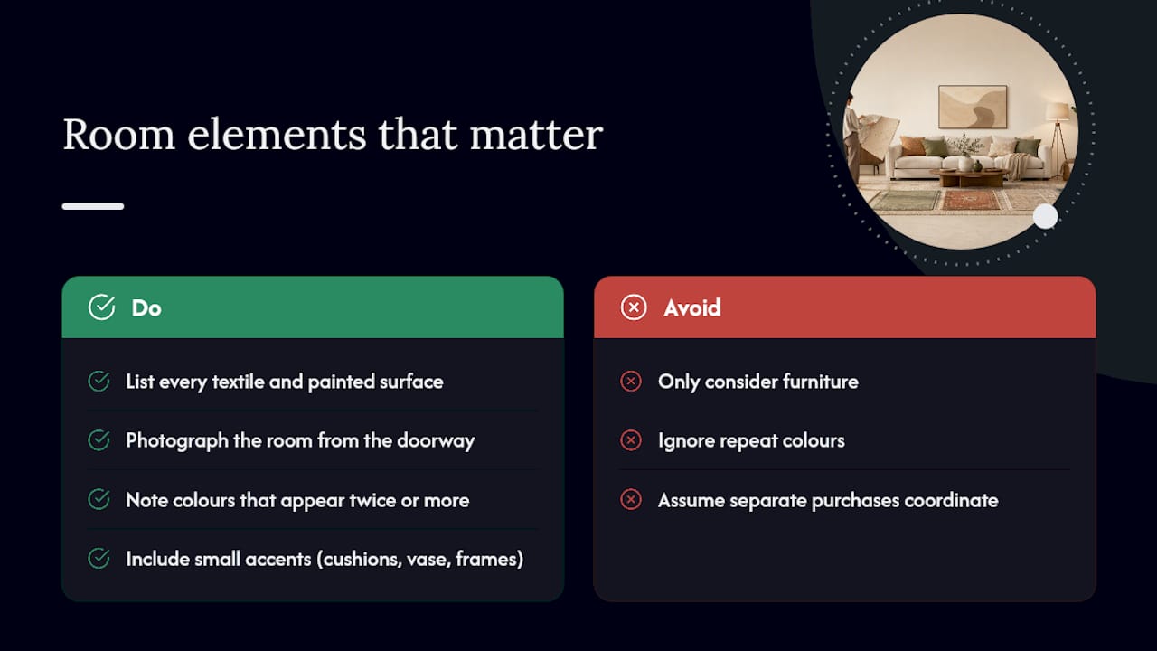
Furniture gets all the attention in rug advice, but it’s rarely the whole story. Curtains, lampshades, artwork, even the finish on door handles and light switches, all contribute to the palette a rug needs to sit within.
A room can have a perfectly matched sofa and rug and still feel off if the curtains introduce a colour nobody accounted for. Before finalising a rug, walk the room and list every textile and painted surface visible from the main seating position, not just the big-ticket items. Homable’s palette examples show how a handful of small accent pieces, cushions, a vase, a picture frame, can shift what “matching” actually means for a rug.
This matters most in rooms that have accumulated decor over several years rather than being furnished all at once. You might have a grey sofa bought in 2019, curtains from 2022, and a gallery wall added last spring, three separate colour decisions that were never meant to speak to each other. A rug is often the piece that has to reconcile all three, which is exactly why the “bridge” role described earlier tends to be the most commonly needed one in real homes, not the boldest.
If you’re genuinely unsure, photograph the room from the doorway and list every colour you can see in the frame. Anything appearing twice or more is a strong candidate for the rug to pick up on. Anything appearing once can probably be ignored.
Does rug texture change how a colour looks?
Yes, and this catches people out constantly. The exact same dye lot will look noticeably different on a flatweave cotton rug than on a deep-pile wool one, because pile height and fibre type both affect how light bounces off the surface.
A high-pile wool rug tends to look richer and slightly darker than the same colour on a flatweave, because the longer fibres trap shadow between them and deepen the tone. A flatweave or jute rug in the same shade looks flatter and often a touch lighter, since light hits the surface more directly with less texture to absorb it.
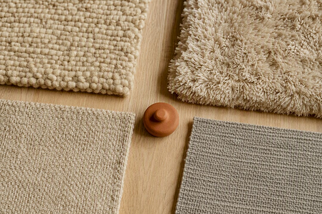
Sheen matters too. A silk or viscose rug reflects light and can shift colour depending on the angle you view it from, sometimes dramatically, which is striking in showrooms but occasionally frustrating once it’s home and the sofa’s shadow falls across half of it every afternoon. Wool and cotton are more consistent regardless of viewing angle, which is one reason they remain the safer choice for anyone who’s been caught out by a shimmering rug that looked one colour in the shop and another at home.
Practically, this means you should never judge a rug’s colour from a flat swatch alone if the full rug has significant pile height. Ask for a larger sample piece where possible, or check product photography that shows the rug’s actual texture rather than a smoothed-out image.
Do seasons and mood affect the right rug colour?
There’s no rule that says a rug has to change with the seasons, most people keep the same one year round, but colour temperature does interact with how a room feels across the year. A cool grey or icy blue rug that feels fresh in July can read as slightly cold and uninviting come January, particularly in a room that relies on natural light rather than strong artificial lamps.
Warmer neutrals, oatmeal, warm taupe, soft terracotta, tend to hold up better across the full year because they don’t swing between “fresh” and “cold” the way true greys and blues can. If you live somewhere with genuinely dark winters, this is worth weighing more heavily than the way a rug looks in a bright showroom in spring.
Mood is a separate but related consideration. Rooms meant for winding down, bedrooms, snugs, reading corners, generally benefit from warmer, softer, lower-contrast rugs regardless of season. Rooms meant for energy and activity, home gyms, playrooms, busy kitchens, can carry brighter or bolder colour without it feeling wrong, because the room’s function already sets an energetic tone the rug can match rather than fight.
How does rug colour affect the feel of a room psychologically?
Colour genuinely changes how a room feels to spend time in, and different rooms benefit from different psychological effects. This isn’t about trend charts, it’s about what each space is actually for.
Living rooms tend to work best with grounding, warm tones, terracotta, deep gold, warm grey, because these read as welcoming rather than sterile, and they support conversation and relaxed socialising rather than making the room feel clinical.
Bedrooms benefit from cooler or muted tones that calm the nervous system rather than stimulate it, dusty blue, sage, soft heather. Bright, saturated colours in a bedroom can look striking in photographs but tend to feel a bit much once you’re trying to switch off for the night.
Home offices and studies do well with either a grounding neutral or a single controlled accent colour, deep blue or forest green in small doses, because too much colour variation in a workspace becomes visually distracting rather than energising.
Hallways and entryways can afford to be bolder than any other room in the house, since you pass through rather than linger, which is exactly why so many statement rugs end up there rather than in the living room.
Cristiano’s five-step rapid test
When helping someone pick a rug colour under time pressure, I run through the same five checks every time: role first (anchor, bridge, statement, neutral), then wall undertone, then floor tone, then main upholstery, then a physical sample viewed at two different times of day. Skip any one of these and you’re guessing.
The honest trade-off is that the most practical colour, mid-tone, low-contrast, pet-friendly, is rarely the most exciting one on a mood board. That’s fine. A rug you can live with for five years beats one that photographs beautifully once and shows every mark by March. Whatever you’re drawn to, live with a sample for a full week before you order the real thing.
— Cristiano
Where Homable fits if you want to see samples before you buy
There are plenty of ways to research rug colour, mood boards, paint charts, showroom visits, but seeing an actual sample against your own walls and floor is what actually prevents the wrong purchase. Homable’s curated rug range is built around that same principle: clear, realistic photography and a range of tones from grounding neutrals to warmer statement colours, so you’re choosing from options that were photographed to look like they will in a real home, not a studio.

If you’ve worked through the role, the room checklist, and the light test covered above, the next practical step is browsing Homable’s rug and interior accessories range to shortlist two or three options in the tone you’ve settled on. Pair that with the contemporary rug design guide if you’re still deciding between a textured solid and a patterned option. Some e-commerce stores offer curated ranges and clear photography to help with rug selection, avoiding hundreds of near-identical listings.
Sources
- How to Pick a Rug Color For Living Room: By Wall Color and Sofa - Painting Tips
- How to Choose a Rug Color
- How to Choose an Area Rug Color You Won’t Regret
- The most popular modern rug colors and where they work best - Interiors Nouveau
- Designers say this is the easiest way to pick the perfect rug - RealSimple
FAQ
Should a rug be lighter or darker than your sofa?
Neither rule holds universally. What matters is enough contrast that the rug doesn’t visually merge with the sofa, so a mid-tone rug against a light sofa, or a slightly lighter rug against a dark sofa, both work well.
What is the rug rule everyone talks about?
The most common version is a sizing guideline (rug large enough for furniture to sit partly on it), but for colour, the closest equivalent rule is to decide the rug’s role first, anchor, bridge, statement or neutral, and let that decision guide the shade.
What are the best rug colours for most homes?
Warm neutrals like camel, oatmeal and soft stone, and mid-tones like warm grey or muted terracotta, work in the widest range of rooms because they pair with both warm and cool undertones and hide everyday wear well.
What are the main rug trends heading into 2026?
Warm, earthy neutrals and tonal patterns that bridge several existing colours remain the strongest trend, alongside textured solids that add depth without introducing a new colour to balance.
How do I choose rug colour for a small room?
Favour light tones or a low-contrast pattern, since these visually expand a smaller space, and avoid large-scale bold patterns that can make a compact room feel cluttered rather than defined.