Cart
0
TL;DR:
- Textures in interior design influence mood and visual depth beyond color alone, creating lively or calming spaces. Applying the 70-20-10 rule and limiting major material categories ensures balanced layering, while lighting variations reveal true texture qualities and impact room atmosphere. Thoughtful texture choices tailored to room function, light, and durability transform spaces into tactilely engaging and cohesive environments.
Colour gets all the credit. Layout gets debated endlessly. But the role of textures in interior design is the element that quietly determines whether a room feels alive or lifeless. Touch a rough linen cushion versus a smooth leather sofa in the same space and you have already felt the difference, even if you couldn’t name it. Texture shapes mood, alters how light behaves, and gives a room the kind of sensory depth that no paint colour alone can achieve. This guide will show you exactly how to use it with intention.
Table of Contents
- Key takeaways
- The role of textures in interior design explained
- Balancing and layering textures effectively
- Choosing textures by room, light, and lifestyle
- Common pitfalls and how to avoid them
- My honest take on texture in the home
- Bring texture to life with Homable
- FAQ
Key takeaways
| Point | Details |
|---|---|
| Texture shapes mood | Tactile and visual textures together influence how warm, calm, or dynamic a space feels. |
| Use the 70-20-10 rule | Distribute textures across dominant, secondary, and accent roles to keep spaces cohesive. |
| Limit material categories | Stick to three major material types per room to prevent visual chaos while still adding variety. |
| Lighting changes everything | Test texture samples under both natural and artificial light before committing to materials. |
| Scale and contrast matter | Mixing texture scales and gloss levels creates dimensionality that prevents flat, cold interiors. |
The role of textures in interior design explained
Before you can use texture well, you need to understand what it actually is. In design terms, texture falls into two categories: tactile texture, which is the physical feel of a surface, and visual texture, which is the illusion of depth or roughness created by a pattern or material finish. A wallpaper printed with a stone effect is visual texture. A genuine brick wall is tactile texture. Both affect the room, but in different ways.
How textures affect interiors goes well beyond whether something is rough or smooth. A chunky knit throw introduces warmth and informality. Polished marble reads as cool, precise, and grand. A sisal rug adds an organic, grounded quality that a patterned wool rug does not. These are not subtle differences. They are the difference between a room that feels curated and one that feels assembled.
The relationship between texture and colour is particularly interesting. Matte finishes absorb light, making colours appear deeper and richer, while glossy surfaces reflect light and make the same colour look brighter and airier. This means you can adjust the perceived temperature and intensity of a colour simply by changing the surface finish, without repainting a single wall.
Here is what texture does for a room:
- Creates visual depth by introducing shadow and contrast across surfaces
- Regulates atmosphere, with soft textures encouraging relaxation and hard, polished surfaces suggesting energy or formality
- Anchors or lifts a colour scheme, depending on the finish used
- Adds tactile satisfaction, which contributes to how comfortable and liveable a space actually feels
Without texture, a room can look perfectly colour-coordinated and still feel oddly flat. Colour and texture are inseparable in ways that even experienced decorators sometimes underestimate.
Balancing and layering textures effectively
Knowing that texture matters is one thing. Knowing how to layer textures in design without creating visual chaos is quite another. Professional designers work with a framework that most homeowners have never heard of: the 70-20-10 rule for texture distribution.
The principle works like this. Roughly 70% of the room’s textural presence comes from dominant materials, such as flooring, walls, and large upholstery pieces. These form the calm base. About 20% comes from secondary textures, typically curtains, rugs, and mid-sized accessories. The remaining 10% is reserved for accent textures, small decorative objects, candles, cushion trims, and metallics that catch the eye. This hierarchy keeps a room feeling intentional rather than accidental.
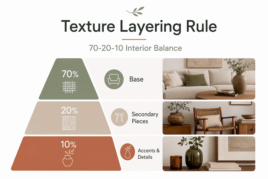
One of the most common mistakes homeowners make is treating all surfaces as equally important. When everything competes for attention, nothing wins. Following a 60-30-10 hierarchical distribution of dominant, secondary, and accent materials prevents this and creates the natural visual rhythm that makes professionally designed rooms feel so coherent.
The number of textures in a room also matters. A well-balanced interior typically uses 5 to 6 distinct textures but stays within three major material categories. More than three categories and the eye starts to feel overwhelmed, even if you cannot pinpoint exactly why the room feels busy.
- Start with your dominant texture (flooring, walls, largest sofa fabric) and treat this as the foundation.
- Choose one contrasting secondary texture that creates dialogue with the first. If your dominant is smooth plaster, consider a woven or ribbed fabric for upholstery.
- Add a third material category for accent pieces only, something like metal, glass, or natural stone.
- Within each category, vary the finish level. Mixing matte and gloss within the same material type adds depth without adding complexity.
- Review the result from the room’s natural entry point, where the eye lands first, and adjust accordingly.
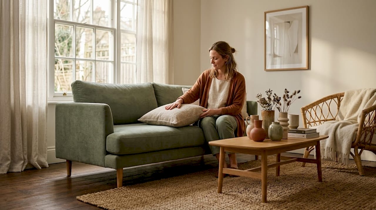
Pro Tip: Try “tonal clashing,” which means layering different textures in the same colour family. A sofa, cushions, and throw that are all soft grey but in linen, velvet, and knit will read as sophisticated rather than monotonous. It is one of the most forgiving techniques in design.
Choosing textures by room, light, and lifestyle
Using texture to enhance spaces well requires thinking beyond aesthetics. The room’s function, its light conditions, and how much wear materials will endure all need to inform your choices.
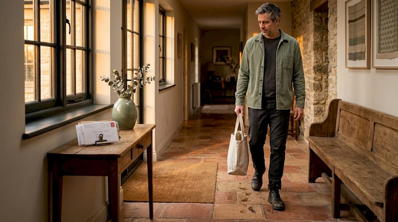
Durable textures like leather and hard stone are best suited to high-traffic areas such as hallways, kitchens, and family living rooms. These materials hold up to daily use and are far easier to maintain over time. Soft textures, including velvet, bouclé, and knit, belong in spaces designed for rest: bedrooms, reading nooks, and quiet sitting rooms. Placing delicate materials in busy zones is one of the fastest ways to create both a maintenance problem and a design disappointment.
Lighting deserves its own paragraph here. Reflective materials like glass and metal bounce light around the room, making spaces feel larger and more open. Absorptive materials like heavy fabric, matte wood, and woven baskets pull light in and create cosy, intimate pockets. A north-facing room that gets little natural light will benefit enormously from a mix of reflective accents alongside warm-toned matte textures, avoiding the trap of making a dim room feel even heavier.
The practical steps for selecting textures are straightforward once you know them:
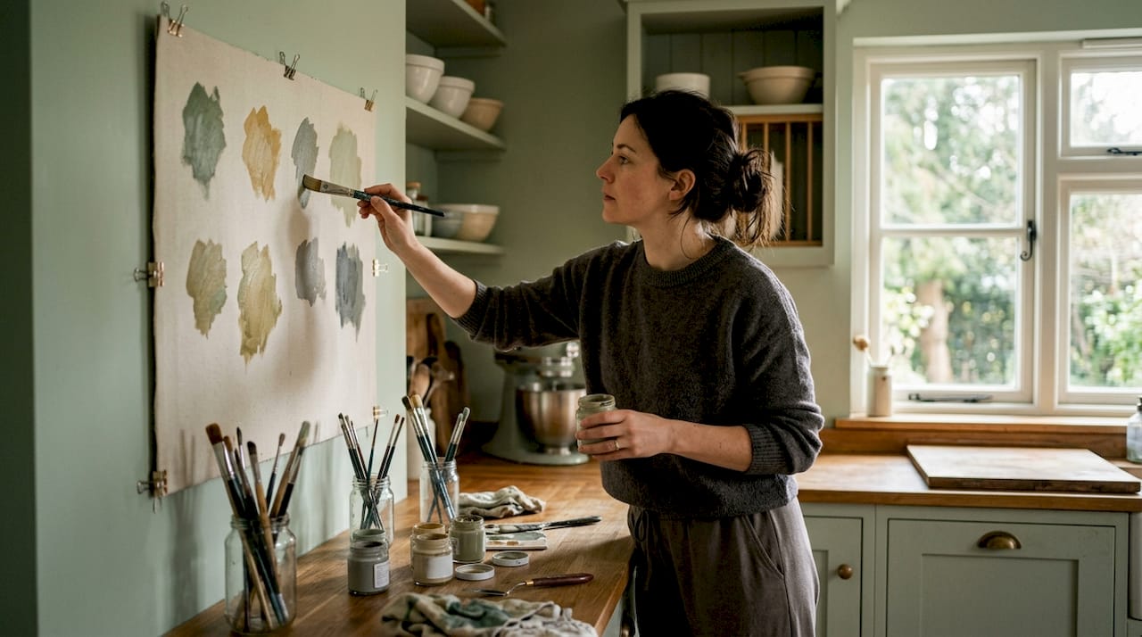
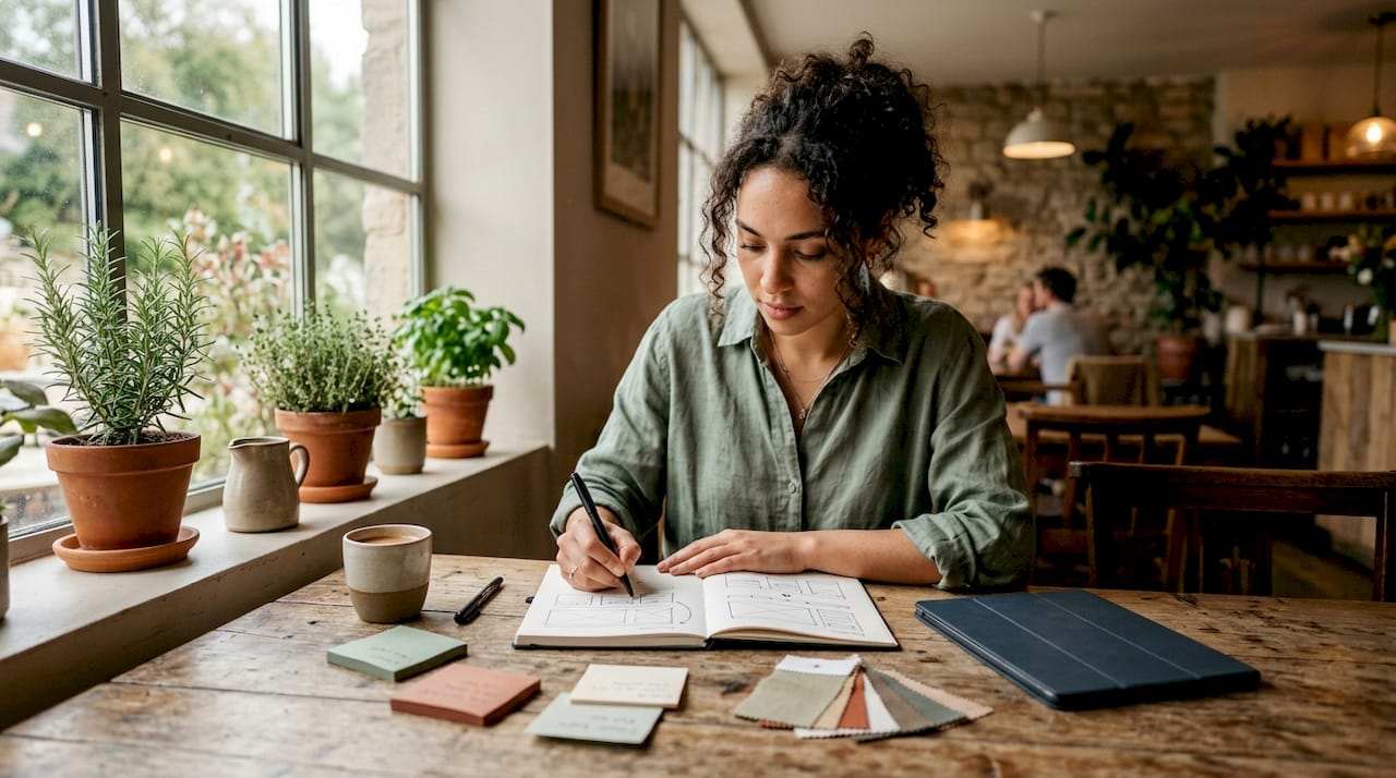
- Gather physical samples of your shortlisted materials before buying anything. Online images cannot show you how a texture actually behaves.
- Test samples under different lighting conditions: morning light, afternoon sun, and evening lamplight. A velvet cushion that looks luxurious at midday can look flat under a warm-toned bulb.
- Place samples at the same distance you would normally view the finished surface. A texture that looks dramatic up close can disappear from across the room.
- For bathrooms and bedrooms, consider pairing plush textiles with a contrast material. Soft, spa-quality linens alongside a smooth ceramic or stone surface create the kind of sensory balance that makes a room feel genuinely restful.
Pro Tip: When working with a smaller room, resist the temptation to keep everything smooth to avoid visual clutter. A single boldly textured element, such as a chunky rug or a woven wall hanging, creates a focal point that actually makes the room feel more considered and spacious, not busier.
Common pitfalls and how to avoid them
Even with the best intentions, textural mistakes are common. The good news is that most of them follow recognisable patterns, which means they are easy to spot once you know what to look for.
Monochrome texture schemes are one of the most frequent problems. A room decorated entirely in smooth, flat surfaces of the same neutral tone will feel clinical and cold regardless of how good the furniture is. This is where varying gloss levels and texture scales becomes non-negotiable. A matte wall paired with a satin-finish cushion and a glossy ceramic vase creates visual movement without changing the colour palette at all.
The opposite problem is also real. Competing textures, when too many strong textures fight for dominance in a single room, the result feels chaotic rather than layered. Textural contrasts in home decor work best when one element is clearly leading and the others are supporting it. If your rug is heavily textured, your walls should be relatively calm.
Scale is frequently underestimated. A very fine texture, such as delicate embroidery or a thin herringbone weave, can disappear in a large room and look completely out of proportion. Bold, open weaves and chunky surface finishes read better in generous spaces, while refined, subtle textures work best in smaller, more intimate rooms.
Texture should be felt before it is seen. When a room has been layered thoughtfully, most people cannot identify why it feels so good. They just know that it does.
Neglecting durability is perhaps the most expensive mistake. Beautiful materials that are not suited to real-life use look worn within months. Always check care requirements, abrasion ratings for upholstery fabrics, and whether a surface material is appropriate for the room’s humidity and traffic levels before you fall in love with it.
My honest take on texture in the home
I’ve seen hundreds of rooms and the ones that stay with me almost always share one quality: they have texture that you want to touch. Not rooms with the most expensive furniture or the most photographed colour palettes. Rooms where someone made deliberate choices about how every surface would feel, not just how it would look.
What I’ve learned is that homeowners consistently underestimate this. They’ll agonise over the exact shade of a wall colour and then place a single smooth linen cushion on a leather sofa and wonder why the room feels a bit flat. The interplay between texture and visual interest in a room is like a conversation. When all the voices are at the same volume and the same pitch, there’s nothing to listen to.
My honest opinion is that one genuinely textured accent piece will do more for a room than a second lamp or an additional plant. A rough terracotta pot, a matte woven cushion, a metallic object that catches light differently across the day. These are the things that make a room feel alive rather than staged. Texture is not a finishing touch. It’s the underlying grammar that makes everything else make sense.
— Cristiano
Bring texture to life with Homable
If this guide has sparked ideas, the next step is finding pieces that actually deliver the textural layering you’re after. Homable curates home accessories specifically for this purpose: objects with visual and tactile presence that earn their place in a room.
The decorative silver flower candle holder is a perfect example of an accent piece that works on multiple levels. Its reflective metallic surface adds gloss contrast to matte surroundings, and its sculpted form creates visual texture without adding visual noise. It functions as that 10% accent element that makes the other 90% of a room feel complete. Browse Homable’s full range of textured home accessories to find the pieces that will give your rooms the depth and warmth they deserve.
FAQ
What exactly is the role of textures in interior design?
Texture controls how a room feels both visually and physically, shaping mood, altering light perception, and adding depth that colour alone cannot provide. It is one of the fundamental design elements alongside colour, form, and pattern.
How do textures affect interiors in practical terms?
Soft textures like velvet and knit encourage relaxation, while hard, smooth surfaces such as marble and glass suggest formality or energy. The combination of both within one space creates sensory balance and prevents rooms from feeling one-dimensional.
How many textures should a room have?
A well-balanced room typically features 5 to 6 distinct textures within three major material categories. Exceeding three categories tends to create visual chaos even when individual elements are attractive on their own.
What is the 70-20-10 rule for texture in design?
The rule divides textural presence across dominant materials (70%), secondary pieces like rugs and curtains (20%), and accent objects (10%). Following this hierarchy keeps rooms feeling cohesive and intentional rather than cluttered.
How does lighting affect texture in a room?
Reflective surfaces make rooms feel larger and brighter, while absorptive, matte textures create warmth and intimacy. Testing material samples under your room’s actual light conditions before purchasing is the most reliable way to avoid unexpected results.