Cart
0
TL;DR:
- Texture adds depth and warmth to interior spaces, transforming flat rooms into inviting environments.
- Layering 5 to 7 textures using the 60-30-10 rule creates visual interest and balance.
- Practical, durable, and seasonally adaptable textures enhance comfort and style in British homes.
Most homeowners spend hours agonising over paint swatches and furniture shapes, yet the one element that genuinely separates a flat, forgettable room from a warm, welcoming space often goes unnoticed. Texture is that missing ingredient. It is what makes you want to sink into a sofa, run your hand along a wall, or linger in a room longer than you planned. As texture decorating ideas from leading interiors experts confirm, textures add depth, warmth, and tactile interest to interior spaces, transforming flat rooms into inviting, multi-dimensional environments. This guide will show you exactly what texture is, how it works, and how to use it confidently in your own home.
Table of Contents
- What is texture in interior design?
- Layering textures: Turning ordinary rooms into multidimensional spaces
- Nuance and balance: Avoiding overload or chaos
- Practical applications: Matching textures to lifestyle and function
- Thoughts from experienced stylists: What most guides miss about texture
- Find stylish home essentials for every texture need
- Frequently asked questions
Key Takeaways
| Point | Details |
|---|---|
| Texture creates depth | Layering different textures in a room adds warmth and visual interest, transforming flat spaces into welcoming environments. |
| Balance prevents chaos | Keeping the number of textures in check ensures your rooms feel cohesive and stylish rather than cluttered. |
| Lifestyle matters | Choosing textures suited to your household’s needs—like pet-friendly fabrics—makes style practical and long-lasting. |
| Minimalism uses texture | Minimalist spaces depend on carefully chosen textures to create calm, elegant interiors without excess decoration. |
What is texture in interior design?
Texture in home décor refers to the surface quality of materials, both how they feel to the touch and how they appear visually. A chunky knit throw feels rough and cosy. A polished marble countertop looks smooth and cool even before you touch it. This distinction is important because texture operates on two levels: tactile texture, which is the physical sensation of a surface, and visual texture, which is the impression a surface gives from a distance.
Understanding both types helps you make smarter choices. Visual texture is particularly powerful in smaller UK homes where space is limited. A linen curtain, for example, adds the appearance of softness and warmth without taking up any floor space at all.
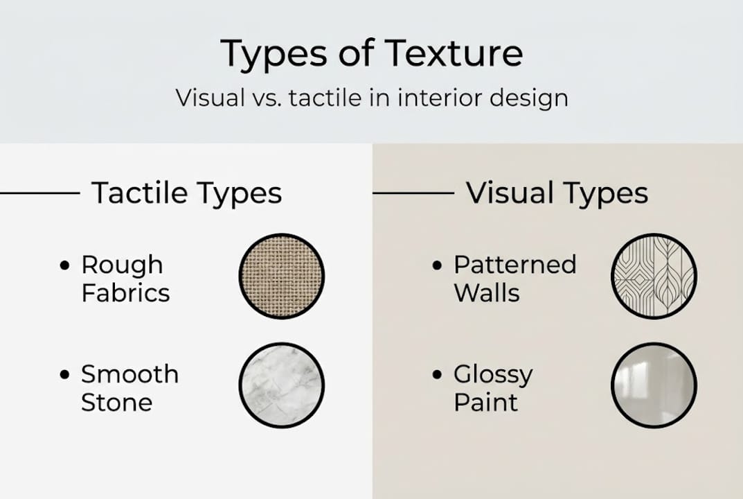
Here is a quick overview of the most common texture types used in British interiors:
| Texture type | Examples | Mood created |
|---|---|---|
| Natural/organic | Jute, rattan, linen, stone | Earthy, grounded, relaxed |
| Soft/woven | Velvet, wool, cotton, bouclé | Cosy, luxurious, inviting |
| Hard/smooth | Glass, metal, lacquered wood | Sleek, modern, crisp |
| Rough/raw | Exposed brick, reclaimed wood | Industrial, characterful |
| Synthetic/sheen | Faux leather, satin, polyester | Glamorous, easy-care |
Each texture type carries its own emotional weight. Rough, natural surfaces tend to feel grounded and relaxed. Smooth, glossy finishes feel more contemporary and polished. The importance of texture in a room lies in how these contrasting qualities interact with one another.
Some of the most impactful ways texture appears in everyday British homes include:
- Soft furnishings: cushion covers, throws, curtain fabrics
- Flooring: rugs, carpets, natural fibre matting
- Wall treatments: textured wallpaper, limewash paint, tongue-and-groove panelling
- Decorative objects: ceramic vases, woven baskets, wooden ornaments
- Hard surfaces: tiled splashbacks, stone worktops, metal lamp bases
Texture is often described as the subtle hero of interior design for good reason. Colour grabs attention first. Shape gives a room its structure. But texture is what determines whether a space actually feels good to be in. A room with beautiful colours and interesting furniture can still feel cold and unwelcoming if every surface is smooth and uniform. Texture is the difference between a room that looks good in photographs and one that feels genuinely lovely to live in.
Layering textures: Turning ordinary rooms into multidimensional spaces
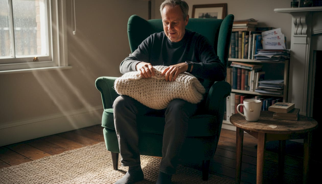
Once you understand what texture is, the next step is learning how to layer it. Layering simply means combining multiple textures in a single space so they work together rather than compete. Think of a living room sofa dressed in a smooth linen fabric, topped with a chunky wool cushion and a faux fur throw. Each element adds something different, and together they create a richness that no single material could achieve alone.
As confirmed by leading texture decorating ideas, texture is the subtle hero adding dimension, and layering rough with smooth, matte with glossy is what brings that dimension to life. This principle applies across every room in your home.
The contrast between a single-texture room and a layered one is striking:
| Feature | Single-texture room | Multi-texture room |
|---|---|---|
| Visual depth | Flat and one-dimensional | Rich and dynamic |
| Atmosphere | Cold or sterile | Warm and inviting |
| Tactile interest | Minimal | High |
| Flexibility | Limited | Easy to update seasonally |
A practical framework many stylists use is the 60-30-10 rule. Apply your dominant texture to 60% of the space (typically walls and large furniture), a secondary texture to 30% (soft furnishings, rugs, curtains), and an accent texture to the remaining 10% (decorative objects, cushions, lamp bases). This keeps layering intentional rather than accidental.
If you want to try layering textures in your own home, here is a simple approach to follow:
- Start with your largest surface: a sofa, bed, or main rug
- Add a contrasting fabric in a secondary furniture piece or large throw
- Introduce a hard or shiny surface through accessories such as a lamp or vase
- Layer smaller tactile elements like cushion covers or a woven basket
- Step back and assess the overall balance before adding anything more
Pro Tip: Take a black and white photograph of your room. Without colour to distract, you will immediately see whether your textures are balanced or whether one type dominates. Interior stylists use this technique regularly because carpet design trends and fabric choices that look great in colour can sometimes flatten out when stripped of their hue.
Layering does not require a large budget. Swapping out a single cushion cover or adding a jute rug to a wooden floor can shift a room’s entire character.
Nuance and balance: Avoiding overload or chaos
Layering textures is exciting, but more is not always better. One of the most common mistakes in textured decorating is adding too many competing surfaces until the room starts to feel visually noisy and exhausting. The expert guidance is clear: avoid texture overload by sticking to a maximum of five to seven textures per room.
Five to seven might sound like a lot, but consider how quickly they add up. Your sofa fabric, the rug, the curtains, a ceramic vase, a wooden shelf, a velvet cushion, and a metal light fitting. That is seven textures already, and the room is not even fully furnished.
Balance is also about practicality. Some texture choices look beautiful in a showroom but create real headaches at home. Dark, heavily woven fabrics are a classic example. They look dramatic and luxurious, but pet hair clings to them visibly. If you have animals or young children, the functionality of your texture choices matters as much as the aesthetics.
Here are the key principles for maintaining balance:
- Limit yourself to five to seven distinct textures per room
- Use the 60-30-10 rule to distribute them intentionally
- Contrast hard and soft textures for maximum visual interest
- Consider your lifestyle before committing to high-maintenance surfaces
- Test texture combinations under both natural daylight and artificial evening light
“In minimalist spaces, texture does all the heavy lifting. Without pattern or colour variation to rely on, the quality and contrast of surfaces become the entire design statement.”
Minimalism is a particularly interesting case. Many people assume a minimalist room means plain and featureless. In fact, minimalist design examples show that minimalism relies very heavily on texture precisely because there is so little else to create visual interest. A matte plaster wall next to a polished concrete floor next to a linen sofa creates a deeply satisfying room without a single pattern in sight.
Research into angular furniture and how shapes interact with textures also suggests that sharp-edged furniture benefits from softer surrounding textures, and vice versa. Round, curved forms can absorb slightly harder surface finishes without feeling cold. Understanding this dynamic helps you make more confident choices when combining different pieces.
A calm minimalist home often achieves its serene quality not through emptiness but through exceptionally considered texture choices.
Practical applications: Matching textures to lifestyle and function
Getting the theory right is one thing. Making it work in a real British home, with muddy boots at the door, a cat on the sofa, and grey skies outside for six months of the year, is another challenge entirely. Texture choices need to be rooted in your actual lifestyle, not just your Pinterest board.
For households with pets or children, durability and ease of cleaning should drive your texture decisions. As expert guidance confirms, pet hair on dark textures is one of the most overlooked practical problems in home styling. Light-coloured, low-pile fabrics are far more forgiving. Leather and faux leather surfaces wipe clean easily. Flat-woven or looped rugs are easier to vacuum than deep-pile shag options.
For more guidance on keeping your home both stylish and animal-friendly, our pet-friendly decor advice is an excellent starting point, along with our guide to pet-friendly accessories that do not compromise on style.
Seasonal adaptation is another underrated benefit of texture. The UK’s climate naturally invites a layered approach. In autumn and winter, leaning into heavier fabrics such as wool throws, velvet cushions, and thick curtains adds genuine warmth to a room. In spring and summer, swapping to lighter linen, cotton, and rattan accessories refreshes the space without repainting a single wall.
Here is a room-by-room checklist for choosing textures wisely:
- Living room: Balance soft upholstery with hard accent surfaces; choose durable fabrics if you have pets
- Bedroom: Layer soft textures for comfort; use contrast through a bedside lamp or wooden frame
- Kitchen: Hard surfaces dominate naturally; add warmth through a woven rug or linen blind
- Hallway: Use hardwearing textures at floor level; add interest higher up with a textured wall treatment
- Bathroom: Combine smooth tiles with soft towels and a natural fibre mat for balance
Floor texture choices also carry long-term value. Flooring for resale research shows that natural wood and stone surfaces consistently appeal to buyers, making them a smart investment beyond their immediate aesthetic value.
Thoughts from experienced stylists: What most guides miss about texture
Most texture guides focus on the visual. They tell you what looks good together and leave it there. But the stylists we admire most always talk about texture in terms of feeling, both the physical sensation and the emotional one.
Rushed texture choices are one of the most common and costly mistakes we see in British homes. A homeowner falls in love with a bouclé sofa in a showroom, brings it home, and discovers it is impractical with children or impossible to keep lint-free. The aesthetic was right but the lifestyle fit was wrong.
The UK climate also shapes texture decisions in ways that generic guides ignore. Damp winters and limited natural light mean that matte, absorbent textures often feel cosier and more appropriate here than the glossy surfaces that dominate warmer-climate interiors.
Contrary to popular advice, minimalism in home design is not about stripping everything back. As experts consistently note, minimalism relies heavily on texture because surface quality becomes the primary design language. Choosing fewer, better textures takes more thought, not less.
Find stylish home essentials for every texture need
If this guide has inspired you to rethink the surfaces and fabrics in your home, the next step is finding pieces that genuinely deliver on both style and practicality. That is precisely what we set out to do at Homable.
Our curated collections at Stylish home essentials include rugs, cushion covers, curtains, decorative ornaments, and storage solutions chosen with layered, textured interiors in mind. Whether you are building a cosier living room, refreshing your bedroom for the new season, or sourcing pet-friendly alternatives that do not sacrifice style, you will find options that speak to real UK home living. Free shipping on orders over £100 makes it even easier to experiment.
Frequently asked questions
How many textures should I use in one room?
Aim for 5 to 7 textures to keep your space visually balanced and engaging without overwhelming it. The 60-30-10 rule helps you distribute them intentionally across dominant, secondary, and accent roles.
What’s the easiest way to balance textures in a minimalist space?
Minimise variety but maximise contrast. Use fewer, high-quality textures and keep your colour palette calm, since minimalism relies heavily on texture as the primary design tool in the absence of pattern.
How do I choose textures that are pet-friendly?
Select durable, low-pile fabrics and lighter colours to reduce visible pet hair on dark textures and minimise your cleaning effort without compromising the overall look of your room.
Can texture improve a small space’s style?
Absolutely. Layering a few contrasting textures makes small rooms feel richer and cosier, as textures add depth and warmth to interior spaces without requiring more floor area or furniture.
Recommended
- Role of Texture in Home Styling – Why It Matters – Homable
- Transform your home: 12 creative decor ideas for stylish living – Homable
- Why Layer Textures in Design: Adding Depth and Warmth – Homable
- Guide to stylish room accents for elegant UK homes – Homable
- Role of Interior Paint Finishes in Home Value
- Top interior painting tips for a flawless home makeover