Cart
0
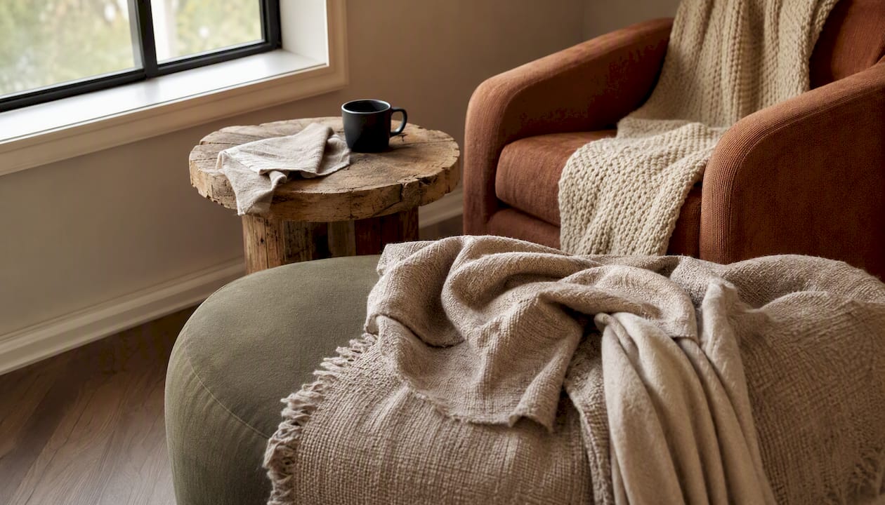
The direction is clear: sensory and analogue textures are pushing back against AI-generated sameness, personalisation is moving from marketing buzzword to genuine product feature, and flexible, modular systems are replacing single-style commitments across graphic, product, interior and digital design. Add sustainable material choices and a return to warm, imperfect surfaces, and you have the shortlist worth your attention this quarter.
These trends are converging for three reasons: AI has made generic output cheap and instantly recognisable, sustainability pressure has moved from compliance to competitive advantage, and buyers across generations now expect design that reflects them rather than a template. Homestyler’s analysis of 18.48 million real interior projects confirms the era of one dominant style is over.
Do this before Friday: pick one live project and run a single tactile or imperfect-texture test against your current polished default, then measure how people react. That small pilot tells you more about 2026 direction than any trend report, including this one.
Key Takeaways
Global design trends for 2026 succeed only when sensory, personalised and modular approaches are tested individually against a real business outcome rather than adopted as a full package.
| Point | Details |
|---|---|
| Test imperfect aesthetics first | Swap one polished asset for a lo-fi or hand-crafted alternative and measure engagement before rolling out further. |
| Pair personalisation with a metric | Vary one element by visitor segment and track conversion for at least two weeks before scaling. |
| Specify modular over fixed | Choose a reconfigurable product or layout in your next brief rather than a one-off, fixed alternative. |
| Set a performance budget before adding 3D or motion | Cap image and asset weight before approving any new immersive feature to protect page speed. |
| Localise before multi-market launch | Brief a regional variant of your visual system rather than assuming one global asset works everywhere. |
Table of Contents
- Global design trends 2026: the perspectives that matter
- The trends shaping graphic, product, interior and digital design
- What these trends mean sector by sector
- A rollout checklist for testing and scaling design trends
- The data behind the shortlist
- How these trends look in practice
- Where global design trends go wrong in practice
- Priorities for the next quarter
- Global design trends: what creative leaders need now
- Sources
Global design trends 2026: the perspectives that matter
Trend lists date fast. Frameworks last longer, which is why it’s worth borrowing the lens JLL uses in its Global Design Perspectives 2026 report: flexibility, human connection, personalisation and connected outcomes. These aren’t trends themselves. They’re the four questions you should ask of every trend before adopting it.
Flexibility means designing systems that can be reconfigured rather than replaced. A modular sofa system or a component-based design file scores well here; a bespoke one-off does not.
Human connection asks whether a design choice makes something feel more handled by a person or more processed by a machine. JLL’s report notes that as technology becomes more pervasive, demand for tactile, analogue-feeling spaces rises in response rather than falls.
Personalisation has shifted from “customer segments” to genuinely individual output, largely because AI tools now make one-off variation cheap to produce at scale.
Connected outcomes means judging a design decision by what it does for the business or the resident, not by how it looks in isolation, JLL argues, and this is where investor appetite for technology-enabled properties is concentrated.
Strategically, these four perspectives compete for budget, and most teams can’t lead on all of them simultaneously.
- If you’re resourcing a roadmap, flexibility and connected outcomes tend to justify budget more easily than aesthetic-led personalisation, because they map to measurable business cases.
- Human connection projects often need the smallest budget but the most cultural buy-in, since they usually mean slowing something down rather than adding a feature.
- Personalisation is the most technically demanding of the four and the easiest to overpromise, so scope it tightly before committing a sprint.
- iF Design’s framing of four diametrical trend pairs, such as convenience culture versus skillization, is a useful sanity check when two perspectives pull in opposite directions on the same brief.
Pro Tip: When a client or stakeholder can’t decide which trend to prioritise, ask which of the four JLL perspectives their budget already sits closest to. Nine times out of ten, the answer picks the trend for you.
The trends shaping graphic, product, interior and digital design
1. Imperfect by design
Lo-fi aesthetics, hand-drawn marks and visibly human textures are rejecting the smoothed-over sameness of AI-generated imagery. Canva reports a 527% jump in searches for lo-fi aesthetics, a clear signal that audiences are actively seeking texture over polish. Recipe: swap one hero image per campaign for a grain-textured or hand-lettered alternative and A/B test engagement. Think risograph prints, not stock photography.
2. Data-driven motion
Animation built from real datasets, not decorative loops, is having a moment. Canva’s newsroom data shows interest in data-driven animation has significantly risen. Recipe: take one static chart from a report and animate its build sequence to show change over time rather than a static endpoint. Think live counters, not spinning logos.
3. Sensory and analogue materials
As screens dominate more of daily life, physical texture becomes the differentiator. JLL links this directly to workplace and residential design, where tactile materials are being used to offset high-tech environments. Recipe: introduce one raw or natural-finish material (unlacquered wood, boucle, raw linen) into an otherwise digital-first space. Think warm oak, not glossy laminate.

4. AI-enabled personalisation
Figma’s roundup of web trends places AI-driven personalisation among the defining features of 2026 web design, where layouts and content adapt to the individual visitor rather than a fixed template. Recipe: use an AI layer to vary one on-page element (hero copy, product recommendation, or colour accent) per visitor segment and track conversion delta. Think dynamic hero banners, not static homepages.
5. Immersive 3D and spatial interfaces
Interactive three-dimensional elements are moving from novelty to expected feature, powered largely by WebGL and similar rendering technologies that put real-time 3D in a browser without a plugin. Recipe: replace one flat product shot with a rotatable 3D model on a key landing page and measure time-on-page. Think spinnable product views, not gallery carousels.
6. Modular and flexible systems
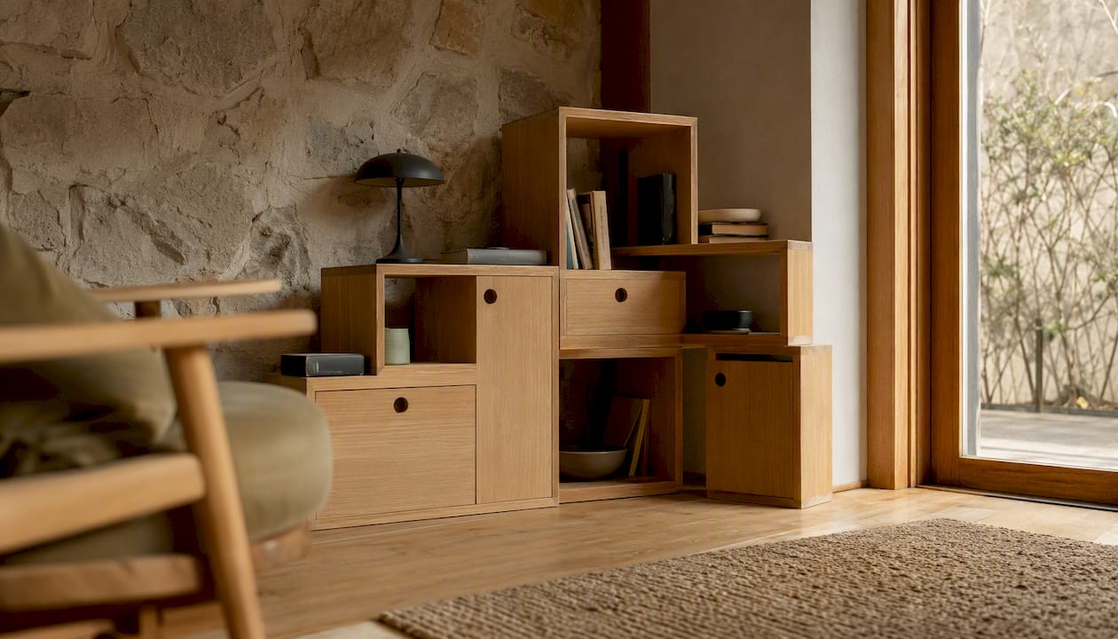
Homestyler’s project data shows modular furniture and reconfigurable layouts rising sharply as households demand rooms that do more than one job. Recipe: specify one modular piece (a sectional, a stackable storage unit) instead of a fixed equivalent in your next interior brief. Think configurable shelving, not built-in units.
7. Warm colour and natural texture returns
Cooler, corporate palettes are giving ground to warmer neutrals, terracottas and sage tones paired with natural fibres. Recipe: audit your current palette and shift one accent colour toward a warmer, earthier tone without changing the base scheme. Think terracotta accents, not beige-on-beige.
8. Sustainable, low-impact digital practice
Sustainability now extends into code and asset weight, not just materials. Leaner image compression and efficient front-end code reduce the energy cost of a website, an angle Figma’s trend coverage now treats as core practice rather than an add-on. Recipe: audit your heaviest page for image weight and cut it by a third before adding any new visual trend. Think optimised WebP files, not uncompressed hero video.
9. Local cultural flavour
Adobe’s forecast singles out local flavour as one of its four defining 2026 themes, arguing that global brands increasingly need region-specific visual language rather than one template rolled out everywhere. Recipe: brief one regional variant of your core visual system using local colour, pattern or typographic reference before your next multi-market launch. Think regionalised campaign art, not a single global asset.
What these trends mean sector by sector
Graphic design
Lean into imperfect textures and hand-crafted marks in place of default AI output, and treat data-driven motion as a standard deliverable for reports rather than a nice extra. Adobe’s own trend report recommends building short “recipes” designers can brief quickly, and Adobe Express is built around exactly that kind of fast, templated experimentation, letting a small studio test a lo-fi variant of a campaign asset in under an hour.
Product design
Modularity should be the default assumption for anything with a lifespan over a few years, not a premium feature. Pair it with visible sustainable material choices, since Homestyler’s data shows buyers showing a preference for warmer, more sustainable textiles over synthetic finishes. Homable’s own range of modular storage and modern home design pieces reflects this shift toward reconfigurable rather than fixed furniture.
Interior design
Hybrid styling beats commitment to a single aesthetic. Combine one warm material trend (natural wood, boucle, terracotta accents) with one flexible layout trend (modular seating, reconfigurable storage) rather than chasing a single “look.” Homable’s guide to design trends shaping modern UK homes covers several of these material and layout combinations in more depth, and contemporary styling approaches for 2026 show how a warm palette shift works in practice.
Digital design
Prioritise AI-driven personalisation for anything with repeat visitors, and immersive 3D for anything with a physical product to sell. Figma’s plugin ecosystem and native prototyping tools now support both natively, and WebGL-based product viewers are increasingly standard on e-commerce sites rather than a luxury feature. Layer in the sustainability angle by auditing page weight before adding new interactive elements, not after.
Regional variation matters more than most global trend reports admit. Gensler’s forecast explicitly breaks its six shaping trends down by region, a reminder that a warm-material trend reading as premium in one market can read as dated in another. Test locally before rolling a trend out across markets.
A rollout checklist for testing and scaling design trends
- Discovery (week one). Pick two trends from the shortlist that map most closely to a live brief, and rule out anything that doesn’t serve a current business goal.
- Prototype (weeks two to three). Build one small, low-cost version of each trend, a single animated chart, one modular product SKU, one AI-personalised landing page variant, nothing more.
- Test (week four). Run the prototype against your current default with a real audience segment, even a small one, and track a single metric per test rather than five.
- Measure (month two). Compare engagement, conversion or satisfaction against baseline. If a trend doesn’t move the needle inside a month, park it rather than scaling it on faith.
- Scale (quarter one to two). Roll out only what tested positively, and build the modular or flexible version first so future iteration doesn’t mean starting again.
Guardrails matter as much as the checklist itself. Keep any new hero image or 3D asset under a sensible weight budget so page speed doesn’t quietly erode the gains a trend was meant to deliver. Run a contrast and colour-blindness check on any new warm palette before launch, since terracotta and sage tones can fail accessibility standards if used carelessly against light text. For any AR or 3D feature, build a static fallback for browsers or devices that can’t render WebGL smoothly. Homable’s own weekend workflow guide is a useful model for compressing this kind of testing into a short, low-risk sprint.
Pro Tip: Run your riskiest trend experiment on your lowest-traffic page first. You get real user data without risking your highest-converting asset if the experiment flops.
The data behind the shortlist
The clearest single number in this year’s trend data is Canva’s reported 527% increase in searches for “lo-fi” aesthetics, alongside a 201% rise in interest for data-driven animation. Both point the same direction: audiences are actively searching for visible imperfection and real information, not more polished abstraction.
| Signal | Source | What it shows |
|---|---|---|
| Lo-fi aesthetic search interest | Canva | Up 527%, reflecting demand for tactile, imperfect visuals over polished AI output |
| Data-driven animation interest | Canva | Up 201%, showing motion built from real data is overtaking decorative animation |
| Real project data on interiors | Homestyler | 18.48 million projects analysed show hybrid styling and modular furniture displacing single-style commitment |
| Investor sentiment on tech-enabled property | JLL | Strong investor interest reported in properties designed around flexibility and connected outcomes |
Homable’s own product data tells a smaller but consistent story: warmer, earthier accent pieces and modular storage solutions have moved up steadily in customer interest over recent seasons, echoing the material shift Homestyler documents at global scale. Homable’s piece on how styling choices affect home value and wellbeing is worth tracking against your own metrics if you want a concrete next indicator: measure time-to-sale or resident satisfaction before and after a warm-material refresh, rather than relying on aesthetic judgement alone.
How these trends look in practice
A Northern European co-working operator combined JLL’s human connection perspective with sensory material trends, replacing glass partition walls with woven textile screens in shared spaces. The move was framed as a response to feedback that all-glass offices felt cold despite being efficient. What to copy: swap one hard-surfaced divider for a soft, tactile equivalent before assuming a bigger renovation is needed.
A consumer electronics brand used AI-driven personalisation on its product configurator, letting shoppers preview colourways in real time rather than picking from static swatches. The approach mirrors what Figma’s trend coverage flags as a defining shift in how web interfaces adapt to individual visitors. What to copy: start personalisation with a single visual variable, colour or material, before attempting full layout personalisation.
A residential developer leaned on Homestyler-style project data showing modular furniture and flexible layouts to justify offering modular kitchen islands instead of fixed units across a new-build range, citing buyer demand for reconfigurable layouts as households changed size or use over time. What to copy: treat modularity as a sales feature to mention explicitly, not a quiet spec detail buried in the floor plan.
A regional homeware retailer localised its core visual identity for a Southeast Asian market launch, adjusting colour palette and pattern references rather than translating existing assets verbatim, following the local-flavour principle Adobe’s forecast highlights.
The lesson across all four cases is the same: the trend only works when it’s applied to solve a real, named friction point, not layered on as decoration.
What to copy: brief a regional variant before a multi-market launch rather than assuming one visual system travels everywhere. (Editor’s note: consider a split image here showing the woven-screen office alongside a standard glass-partition space for visual contrast.)
Where global design trends go wrong in practice
The most common failure isn’t picking the wrong trend. It’s adopting several at once without checking whether they contradict each other. A brief that asks for maximum personalisation and rapid rollout across ten markets simultaneously is setting up a conflict between two of JLL’s own perspectives, since deep personalisation and fast scale rarely sit comfortably together.
Performance debt is the second recurring problem. Immersive 3D and heavy motion look impressive in a pitch deck and then quietly wreck page load times once they’re live, particularly on mobile connections outside major markets. Sustainable web practice, leaner assets, compressed imagery, efficient code, has to be built in from the first prototype, not bolted on after a client complains about speed.
Accessibility gets skipped under time pressure more often than anyone likes to admit. Warm, muted palettes can fail contrast standards; 3D interfaces without keyboard navigation or screen-reader support quietly exclude a meaningful share of users; imperfect, hand-drawn type can become genuinely unreadable at small sizes. None of this is a reason to avoid the trend. It’s a reason to test it properly before it ships.
Cultural mismatch is the pitfall specific to global rollouts. Gensler’s regional breakdown exists precisely because a material or colour choice that reads as premium in one market can read as cheap or dated in another. Rolling out one visual system globally without local testing is the fastest way to undermine an otherwise sound trend.
Finally, there’s the trap of chasing a trend for its own sake rather than the outcome it serves. A modular furniture system that never actually gets reconfigured by the end user is decoration wearing the language of function. Before committing budget, ask what specific problem the trend solves for a specific person, not what it signals about your studio’s awareness of the trend itself.
Priorities for the next quarter
Global design trends succeed only when teams pair one sensory or imperfect-aesthetic move with one flexible or personalised system, then measure the combination against a single business outcome rather than chasing every trend at once.
- Pilot one tactile material swap. Replace a single hard, glossy surface with a warm, natural-finish alternative in a live project and note resident or customer reaction. Assign to: interior lead, this sprint.
- Run one AI-personalisation test. Vary a single visual element by visitor segment on one page and track conversion for two weeks. Assign to: digital product owner, this month.
- Specify one modular product line. Swap a fixed furniture or storage spec for a reconfigurable equivalent in your next brief. Assign to: product lead, next quarter.
- Audit page weight before adding 3D or motion. Set a hard image and asset budget before approving any new immersive feature. Assign to: front-end lead, before next sprint kickoff.
- Localise one visual asset for a secondary market. Brief a regional variant of your core visual system ahead of the next multi-market campaign. Assign to: brand lead, this quarter.
Global design trends: what creative leaders need now
The gap between what most trend reports promise and what actually moves a project forward is wider than the industry likes to admit. Reports hand you a list of aesthetic directions. What they rarely tell you is that the same trend can succeed in one context and fail badly in another, depending entirely on whether it’s solving a real problem or just decorating a brief.
The conventional read on 2026 treats AI and analogue textures as opposing forces, one rising as the other declines. That framing misses what’s actually happening. AI has made the imperfect, human-made mark more valuable precisely because it’s now the rarer thing. Lo-fi aesthetics aren’t a rejection of AI so much as a market correction against AI’s most obvious output. Teams that treat them as separate trends, rather than two sides of the same shift, tend to overinvest in one and under-resource the other.
What’s most underestimated is how much cultural translation work global trends actually need before they land anywhere specific. It’s tempting to treat a Homestyler dataset or an Adobe forecast as a template you can lift wholesale into any market. Gensler’s regional breakdown exists because that assumption fails constantly in practice. A warm terracotta palette that signals craft and warmth in one market can read as dated in another. The work isn’t adopting the trend. It’s knowing which version of it your specific audience actually wants.
If there’s one priority worth putting above the others, it’s this: pick fewer trends and test them properly rather than adopting a broad slate at surface level. A single well-tested modular product line or one genuinely personalised digital touchpoint will do more for a brand than five trends applied thinly across a whole portfolio. The data backing this article, from Canva’s search figures to Homestyler’s project analysis, rewards depth of application over breadth of adoption every time.
Sources
- Adobe 2026 Creative Trends report — Adobe Business
- iF Design trend report 2026 — designboom coverage